Aquinsa Corporate Redesign
Unification of the elements
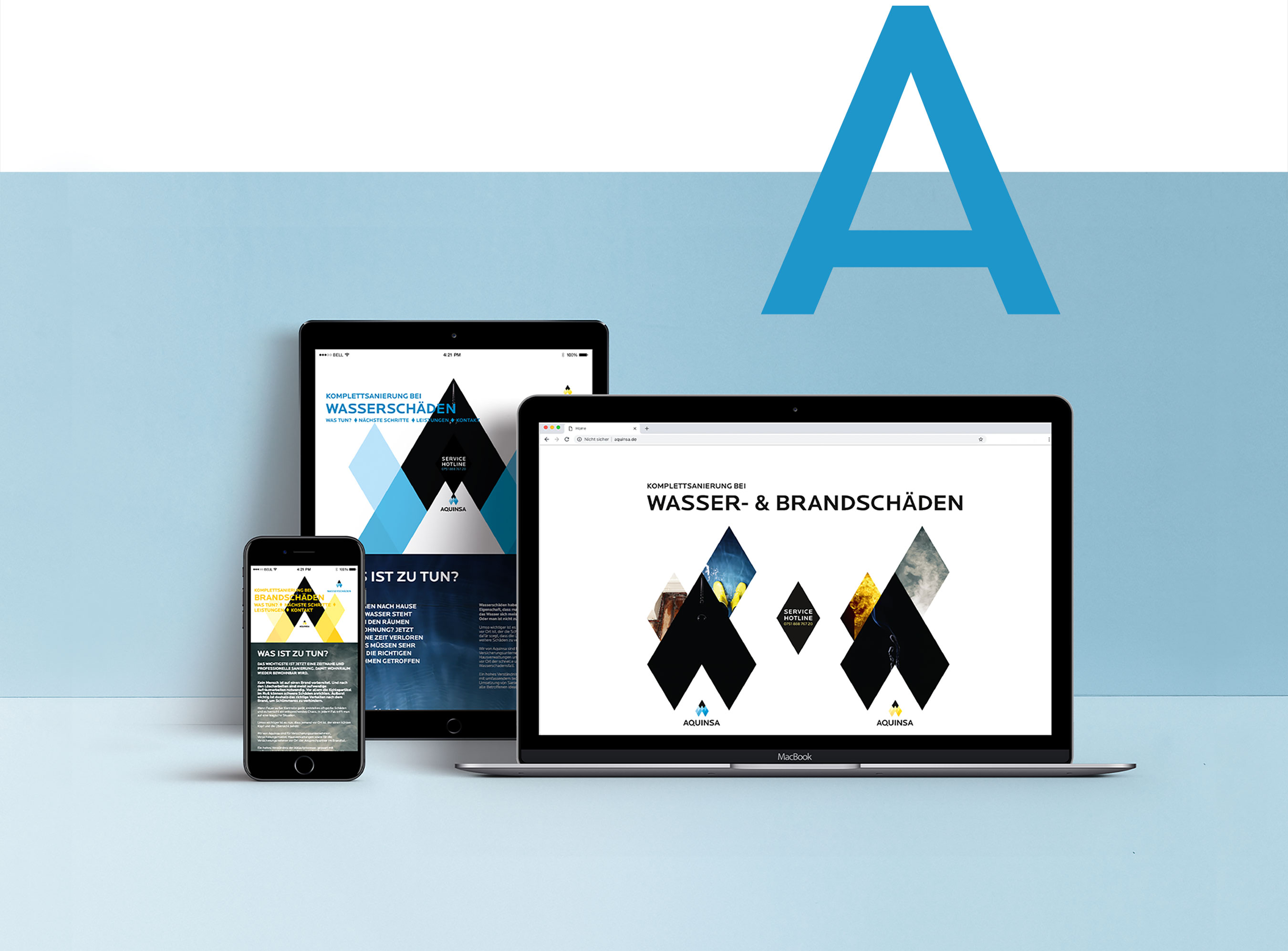
Aquinsa is a holistic service provider for complete renovations after fire or water damage. The core element of the corporate redesign is a diamond, which functions as the smallest particle – quasi as an atom – of the design concept. A striking feature of the company name AQUINSA is the letter A at the beginning and at the end. This letter A is the starting point for the logo. It first becomes a stylized house roof. The house roof can be broken down into diamonds that resemble the shape of a drop and a flame.
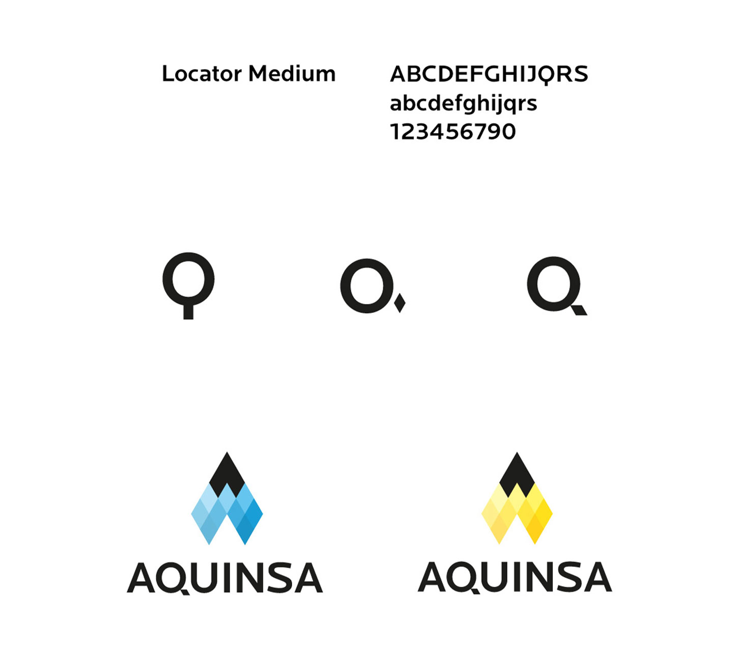
From this smallest building block, the logo is constructed in two variants: a blue one for a drop, a yellow one for a flame. The flame stands for the fire damage, the drop for the water damage. Thus, these elements unite with a diamond.
The diamond is also used in the word mark to optimize the letter Q as a cauda. And it becomes the basis of the entire graphic system for all printed materials and the website.
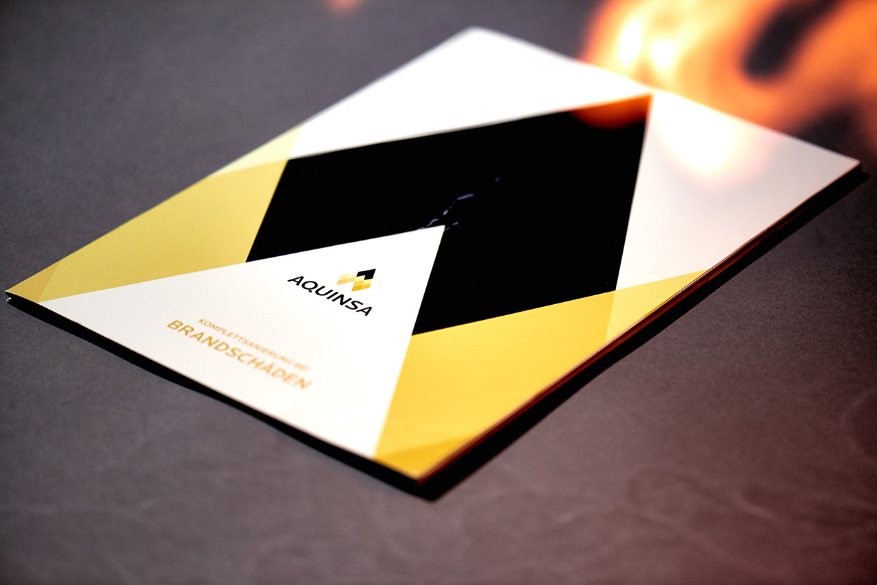
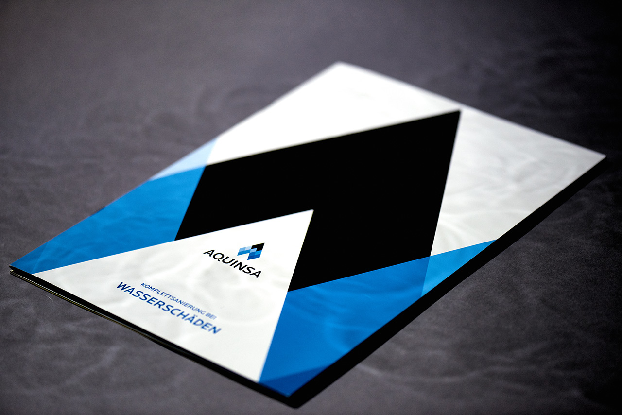
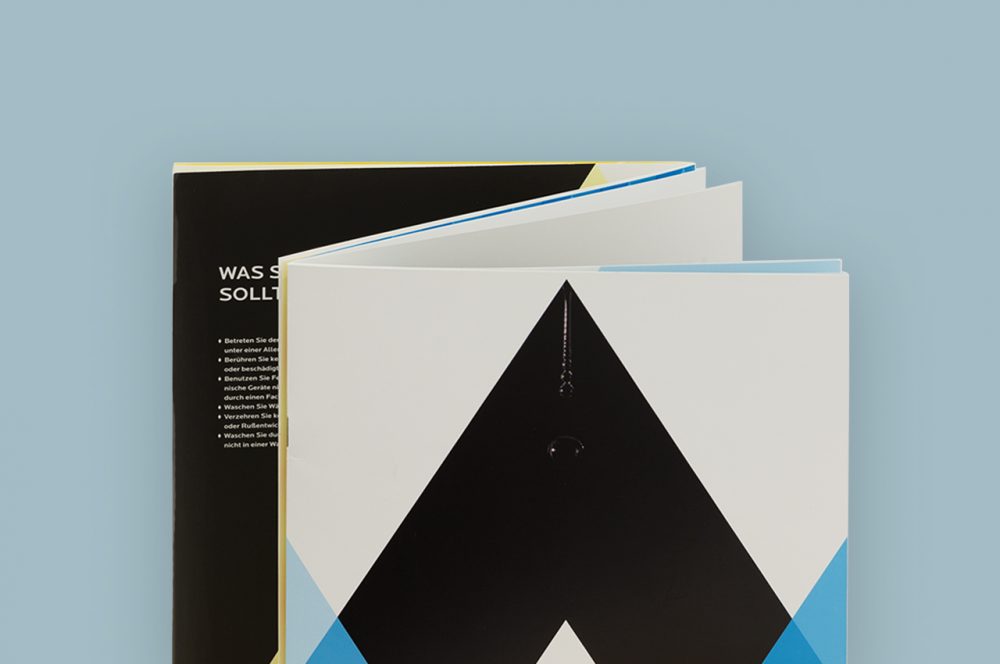
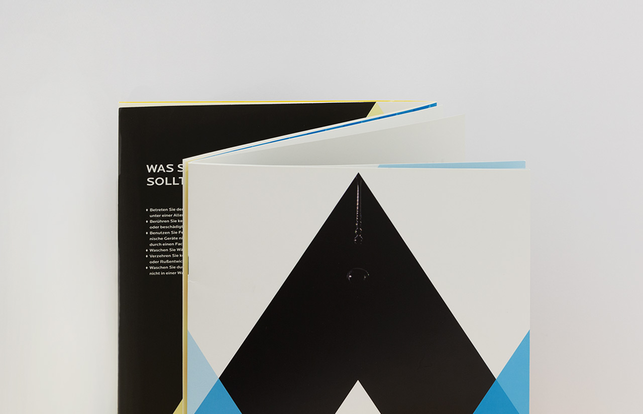
The new corporate design is used in various media. One of these is an image brochure with a special feature that only becomes apparent to the viewer on closer inspection: It can be flipped through endlessly.
This is made possible by a special binding method in which the cover is given three wings as a Z-fold. Both folds are staple-bound to form the center of two halves of the brochure.
One half plays the theme of fire and the other the theme of water. Once one theme has reached the end, the other theme starts automatically when the last page is turned.
A kind of perpetual motion machine of print design.
Simi Sicherli Didaktische Konzeption
Simi Sicherli – playful learning
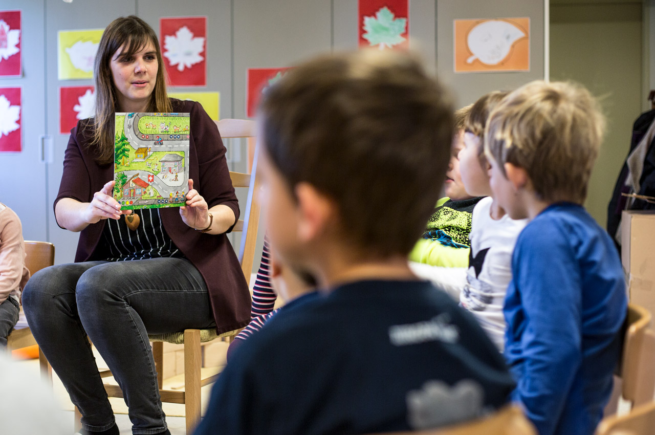
The instruction service of the Thurgau cantonal police, together with the cartoon character Simi Sicherli, visits several hundred kindergartens every year and practices with the youngest children how to be safe pedestrians. The new Simi Sicherli box from “Verkehrssicherheit Thurgau”, which includes a board game and an audio CD with a radio play, provides additional support for this work.
Kantonspolizei Thurgau, Schweiz

To really understand how children of kindergarten age are taught about safety on the sidewalk and when crossing crosswalks, we took part in a visit by a police officer to a kindergarten and observed very closely the way they were addressed and the learning content conveyed. In addition, we conducted an interview with the president of the Thurgau Kindergarten Conference, Tanja Kroha, who is a kindergarten teacher herself and was able to contribute valuable experience from everyday kindergarten life.
On this basis, we then developed an integrated overall concept. We divided the learning content into five main chapters and wrote a story based on these chapters. It was important to us that each chapter also works on its own. This means that we don’t have to tell the whole story each time, but can also focus on individual topics that seem particularly important at the time.
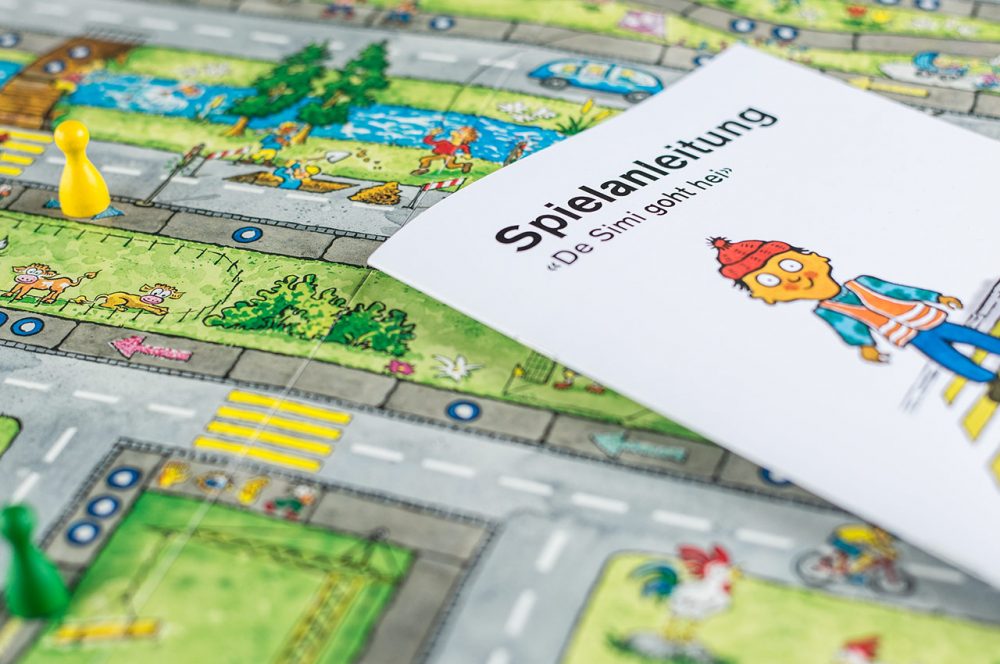
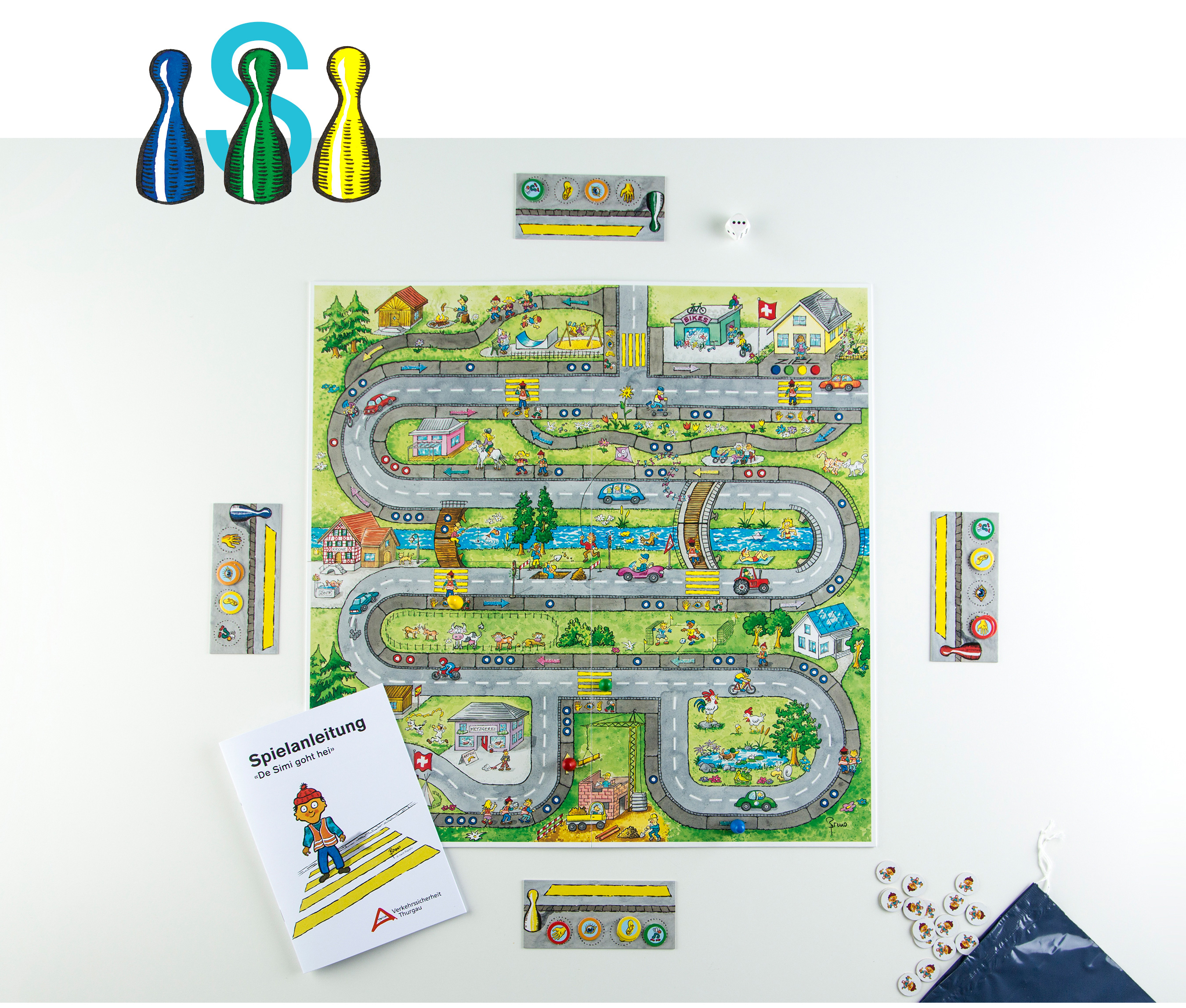
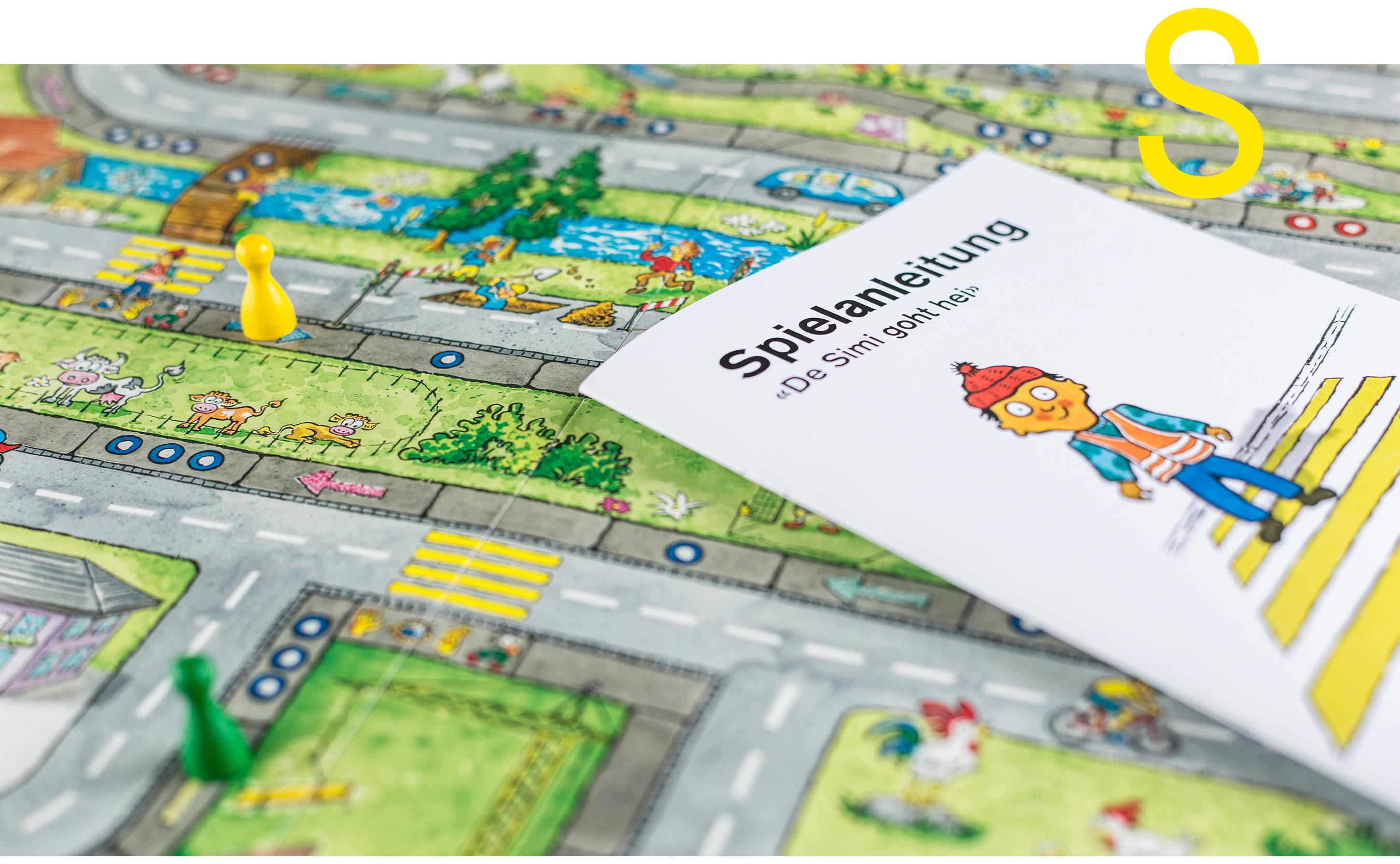
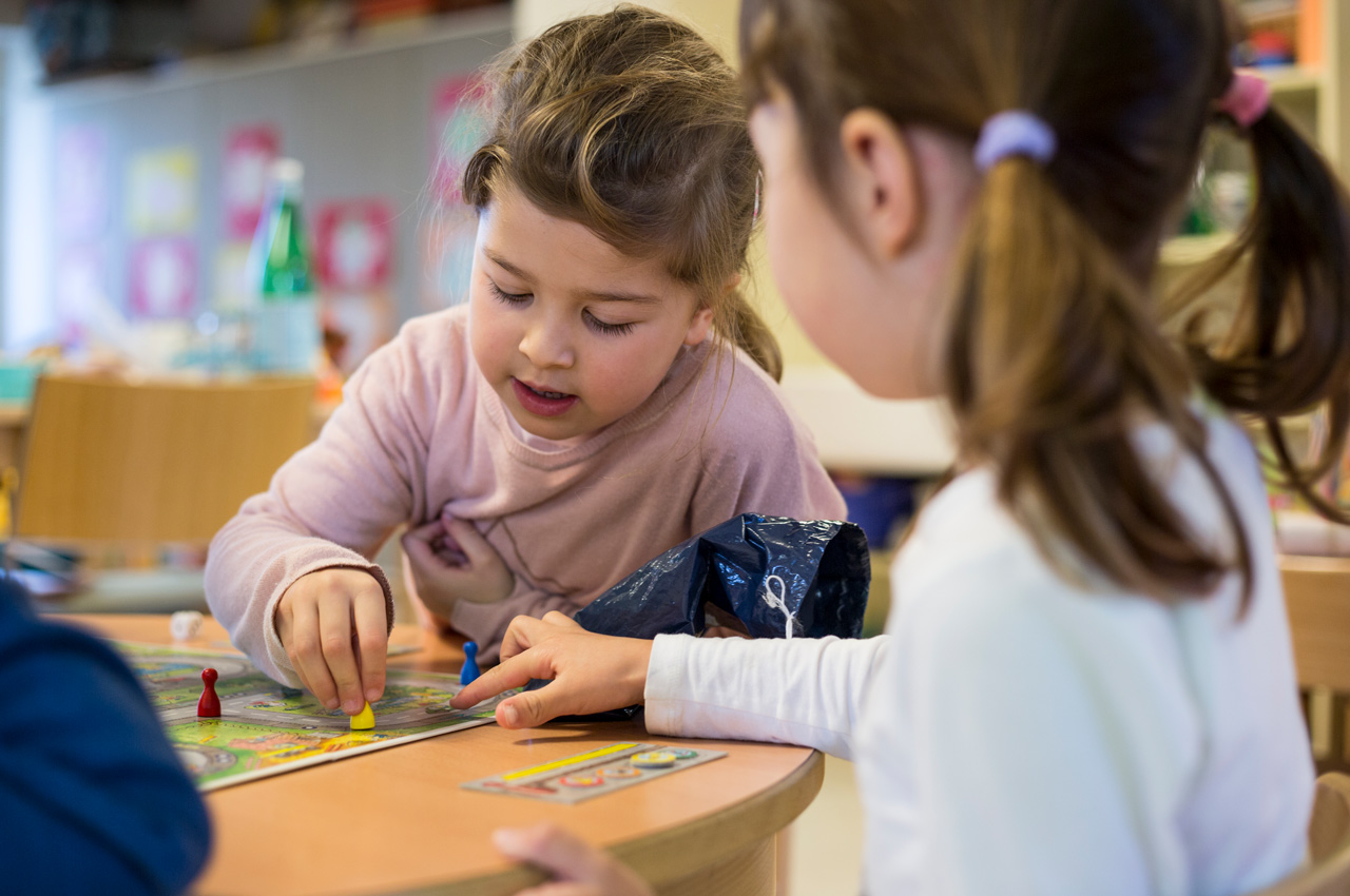
With this method, we succeeded in accommodating all learning content in the story. In parallel, we developed the board game in which Simi walks home from kindergarten and experiences many situations. The situations are based 1:1 on the story, which means that the children can find all the learning content on the board. The goal of the game is to be the first to arrive home, but to follow the traffic rules.
On the way, Simi passes several crosswalks that shorten the route, but he can only cross them if he has first drawn all four collectible coins from a small bag. The different collecting coins stand for the four-sounding phrase “warte, luege, lose, laufe” (wait, look, listen, go), which is familiar to children in Thurgau. After all, according to this concept, children at the crosswalk should ensure that they cross the road well and safely.

In addition to the board game and the CD with the story and songs, the Simi box also contains a Simi hand puppet, which was designed by the Simi project group with the participation of graphic designer Herbert Schreiner in collaboration with the team of traffic instructors from the Thurgau Cantonal Police.
To round off the overall concept of story and board game, we produced an enlargement of the partial section of the game board for each of the five partial stories on a solid cardboard, which has the respective partial story printed on the back for the kindergarten teacher to read aloud. In this way, the story can also be told in a circle of chairs.
The project was accompanied by Lea Meili, who summarized the didactic concept for the kindergarten teachers in the accompanying booklet and thus ensured that the Simi-Box will stand up to critical scrutiny.

Volksbank Konstanz Mitgliedermehrwertkampagne
Members benefits campaign Volksbank
Volksbank is more than just a bank. It is locally anchored, nationally networked, committed to its members and democratically organized. This is also how Volksbank Konstanz puts it on its website. The cooperative idea “What one cannot do alone, many can” is even part of the UNESCO cultural heritage. We were allowed to design and implement the member advertising campaign for our Volksbank Konstanz.
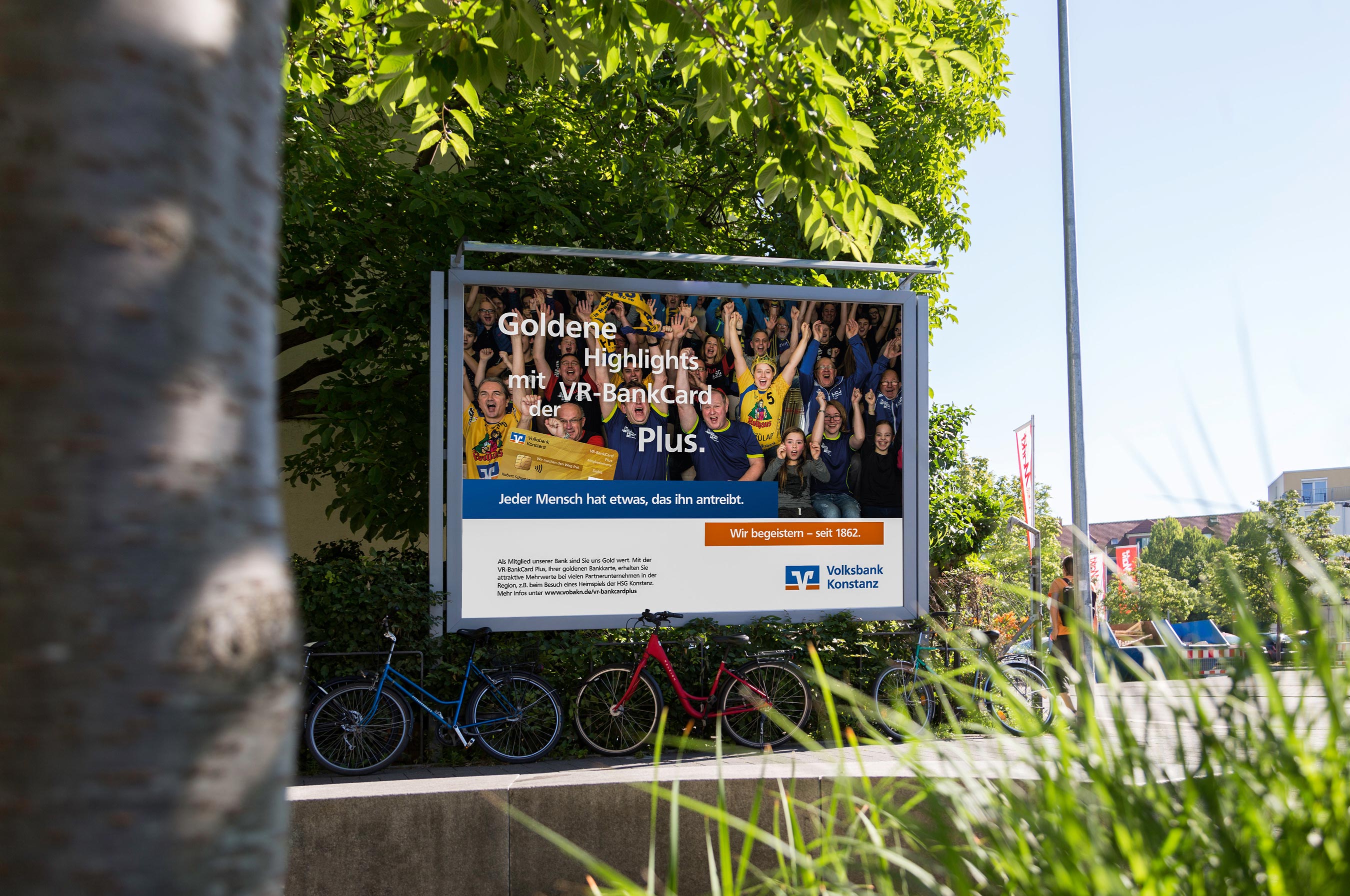
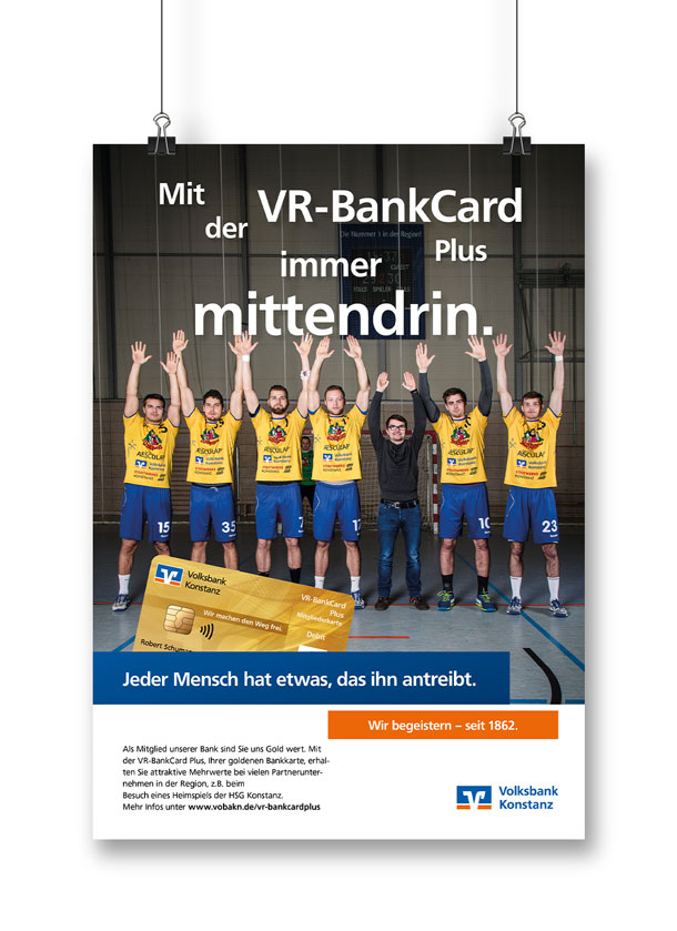
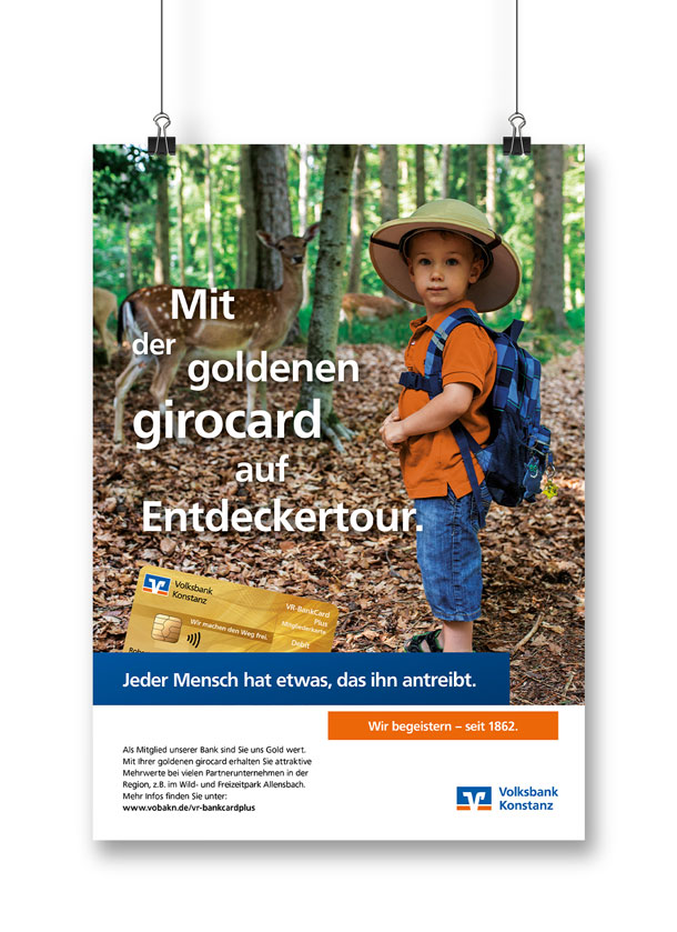
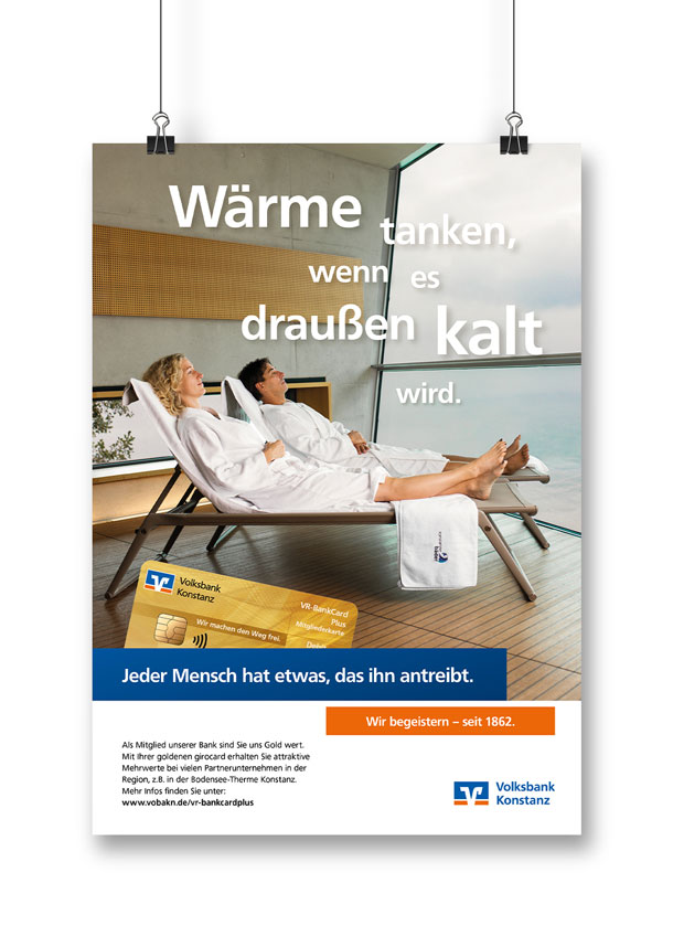
The campaign’s chain of reasoning, which is based on the nationwide benefits program for members, is coherent: Members have advantages with many providers thanks to their golden BankCard. This is particularly interesting for regional companies, as it is sufficient to pay with the golden Volksbank card to receive the added value. And vice versa, this also creates added value for these regional companies, as it enables them to find and retain customers in the region. And the third winner is the Volksbank, which thus makes membership even more attractive.
To illustrate these benefits, we featured four selected regional partners in the advertising campaign, addressing different segments of the overall target group. From young to old, from sports enthusiasts to nature lovers. In the process, Volksbank’s regional partners became part of the advertising backdrop, whether it was the iconic architecture of the relaxation room at Bodensee-Therme Konstanz, a deer at Allensbach Wildlife and Leisure Park, or the team and even fans of HSG Konstanz. We think: It doesn’t get more regional than this.
Strobobrille Corporate Design
Strobobrille
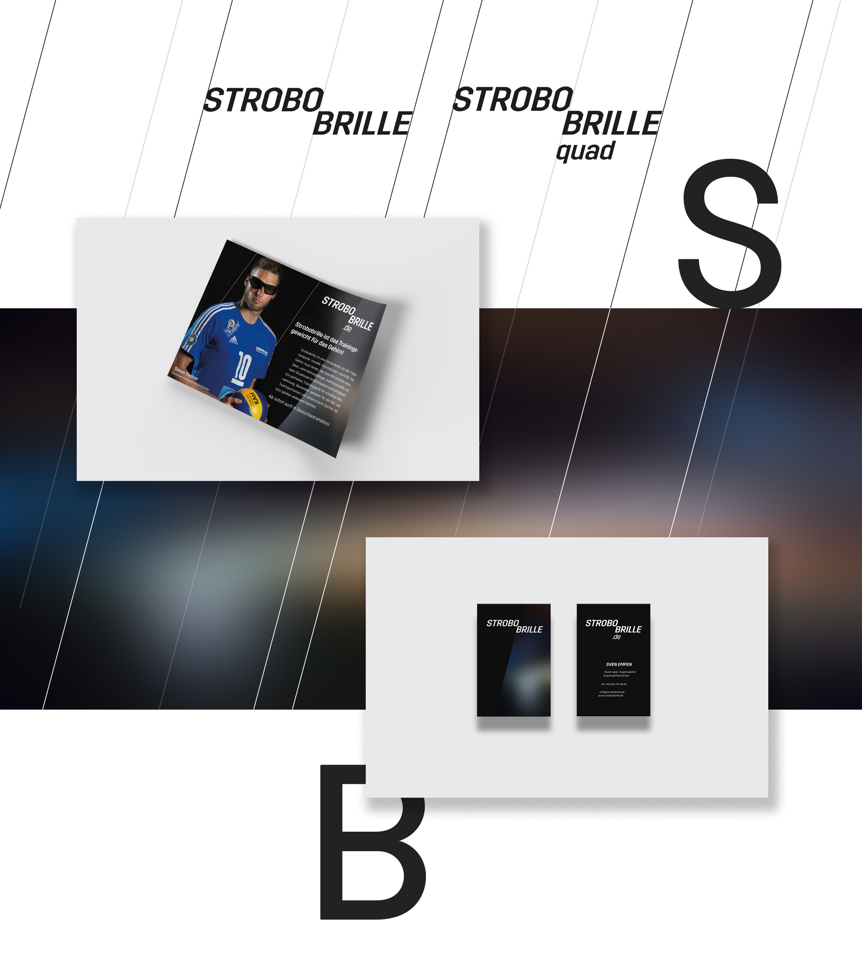
Strobo goggles are a professional optical training device from the USA for ambitious athletes. The concept of strobo goggles is that the wearer of the goggles is partially deprived of visual information. This is done by the lenses of the glasses alternately becoming dark and then light again. The user’s brain must learn to do what it wants to do without complete visual information.
On the occasion of the marketing launch in Europe, we were commissioned with the complete brand concept. Within four weeks we designed the appearance, which is based on the principle of changing brightness levels. The appearance was subsequently used for the website, for a flyer, for the packaging as well as for a testimonial film.

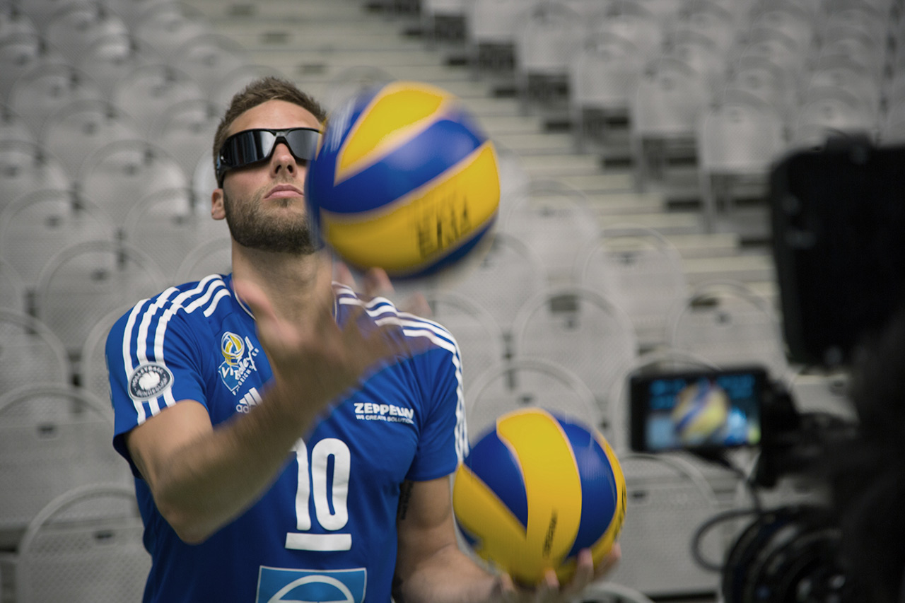
We filmed with the 210-time national volleyball player Simon Tischer at the ZF-Arena in Friedrichshafen. Simon trained with the strobo glasses and then talked about his first impressions in an interview. The strobo glasses will be presented to the trade public at the opti trade fair in Munich at the start of 2017. Further testimonial stories with prominent athletes are being planned.
Ruch Medien Website-Relaunch
Website Relaunch Ruch Medien
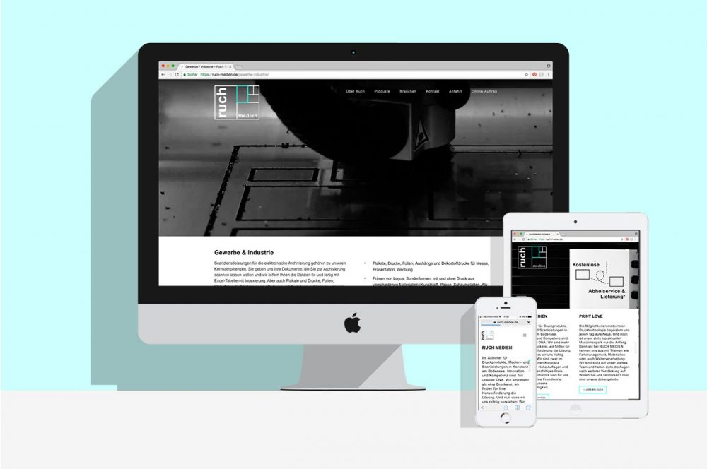
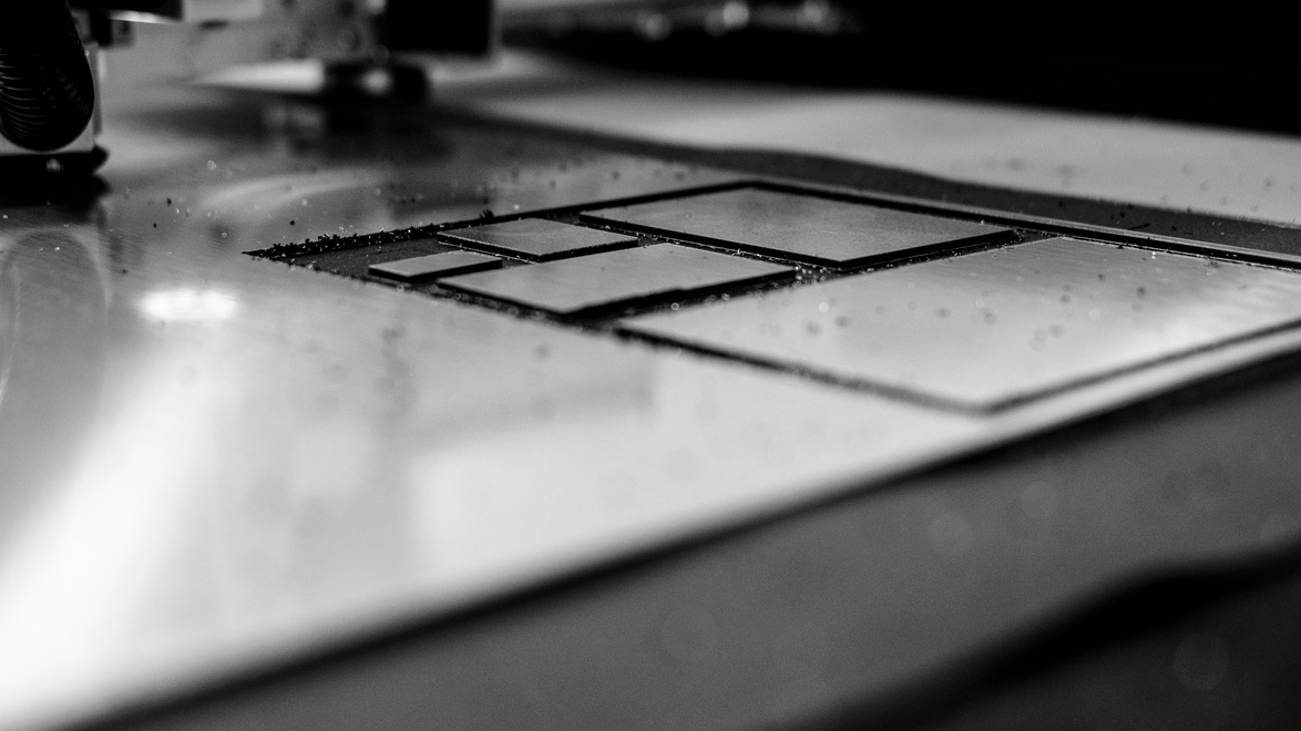
Ruch Medien from Constance is so much more than just a digital print shop. There are a fabulous number of options and machines there that no one else has far and wide. More reality than appearance is the program here. The new website therefore works with the technique of implicit storytelling and confidently positions Ruch Medien in the style of a “Berlin backyard pearl”.
In Berlin, there are countless agencies, print shops and other service providers whose skills are not visible from the outside because they don’t have a glossy facade. And so is Ruch Medien, the “unplugged concert” of the scene: raw and without unnecessary effects, but uncompromisingly good at what it does. The color climate of the new website is noble monochrome with a confident color accent, as a stylistic device we used moving images and atmospheric photography. The logo in minimal form responsive. A one-pager plus that certain something. And an intro that completely reinterprets the concept of the top slider.

BWL 25 Kampagne
25 Jahre – We still inspire
The 25th anniversary of a course of studies is a great opportunity for a dignified celebration, for which it is worthwhile for alumni to return to their alma mater. The people in charge at Konstanz Business Administration also recognized this. In order to communicate the seriousness of this undertaking to the many graduates, we were commissioned to design the anniversary communication.

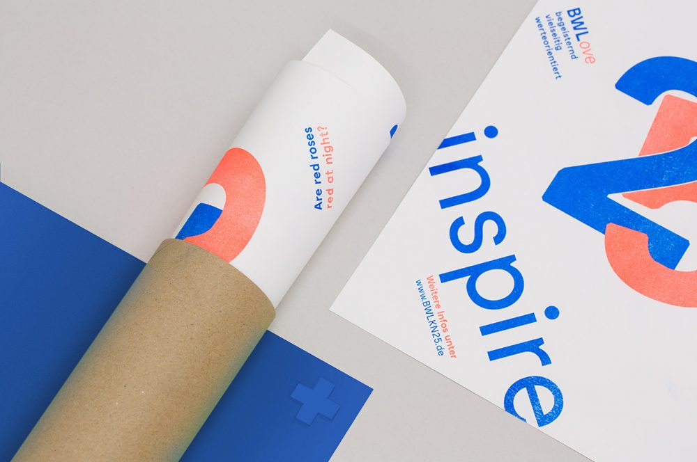
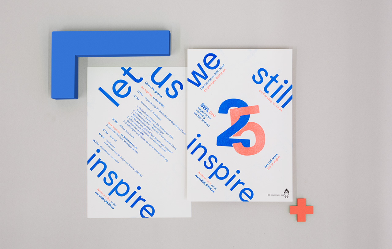
The design concept is based on a grid that is deliberately out of the ordinary. Just as the Constance BWL has never been adapted in all these years. The striking “25” is an allusion to a silver wedding anniversary between students and the course, and the wedding rings associated with it form the focal point of the communication as an intertwined signet. The 25 thus serves as the overarching identification element of the event.
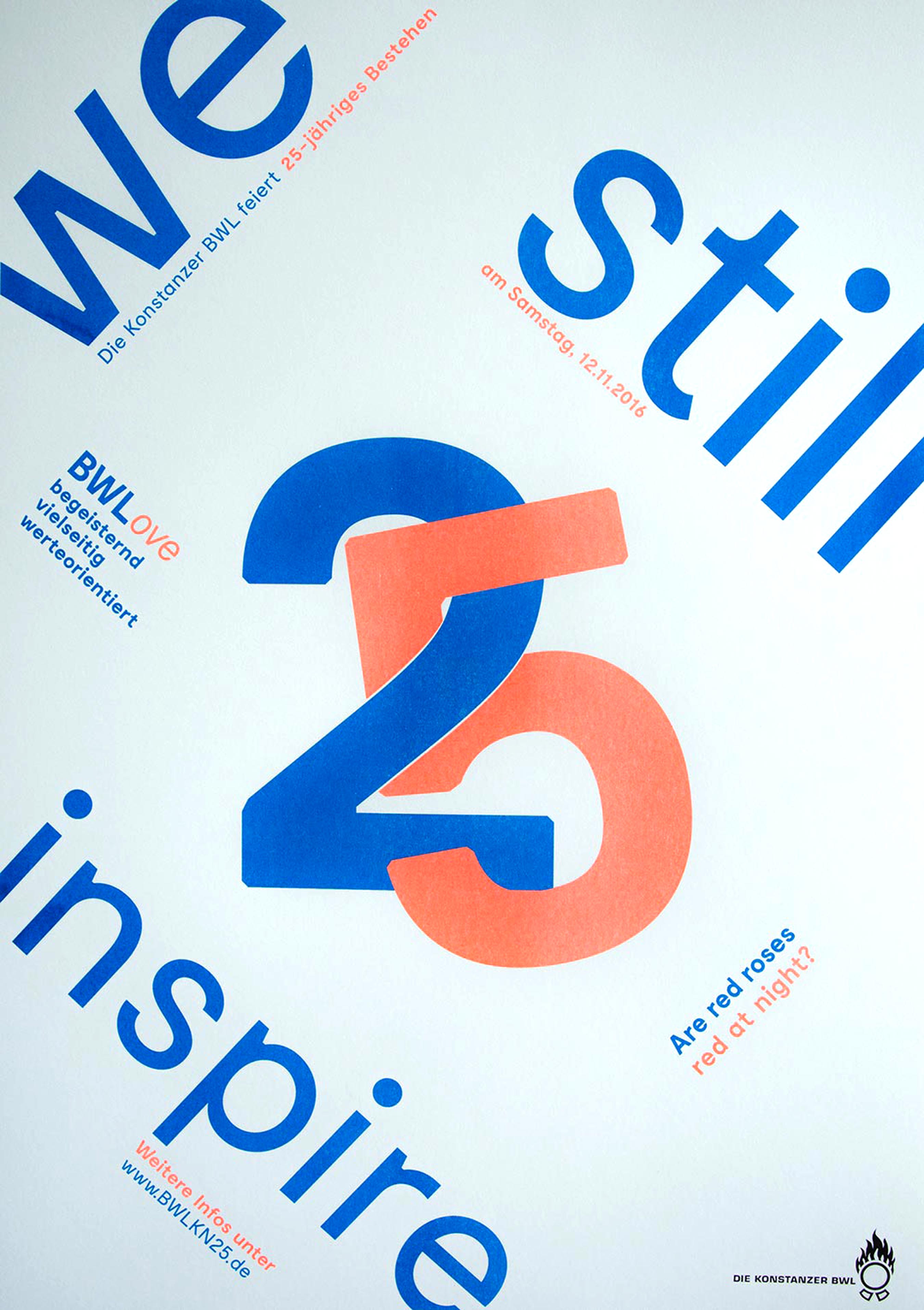
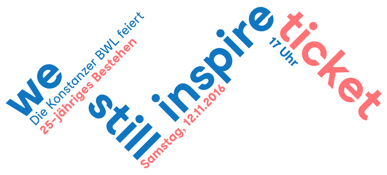
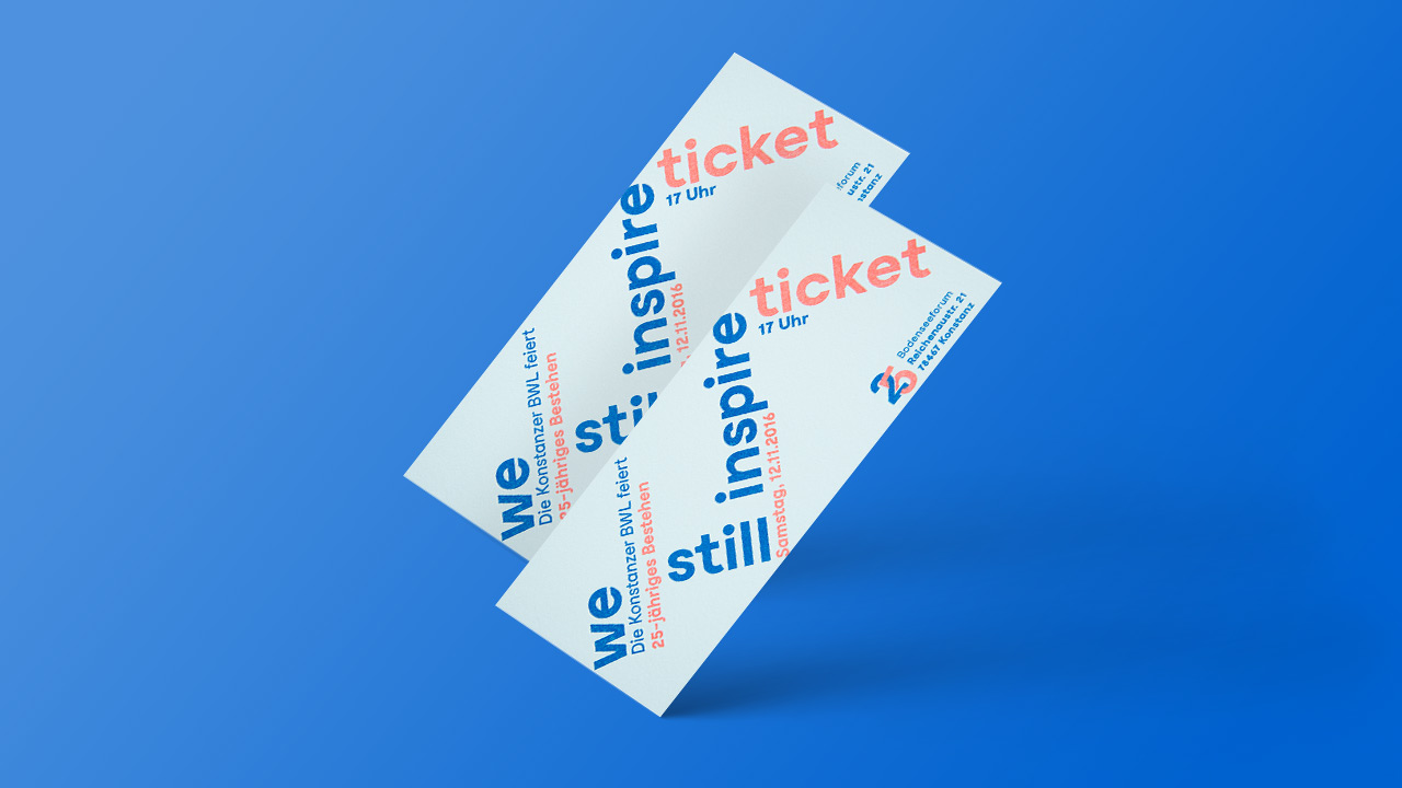
The graphic design is deliberately contrasting and diverse – just like the degree program and its offerings. The striking, fresh design with small details to discover shows: Constance Business Administration has remained young even after 25 years. The color combination and also the special risography printing process create a very unique, unmistakable look, which, in conjunction with the wonderful feel of the chosen paper, is a pleasant analog counterpoint to the thoroughly digitalized world. The anniversary communication was rounded off by a temporary event website and an anniversary film, which was shown at the gala in the Bodenseeforum Konstanz.
Yachtwerft Keppler Corporate Redesign
Yachtwerft Keppler
The former shipyard G & B in Kressbronn was taken over by the master boat and ship builder Moritz Keppler in 2017. The shipyard was to receive a new and modern appearance. The passion for regatta sailing and the family then also formed the cornerstones for the naming and the new appearance.
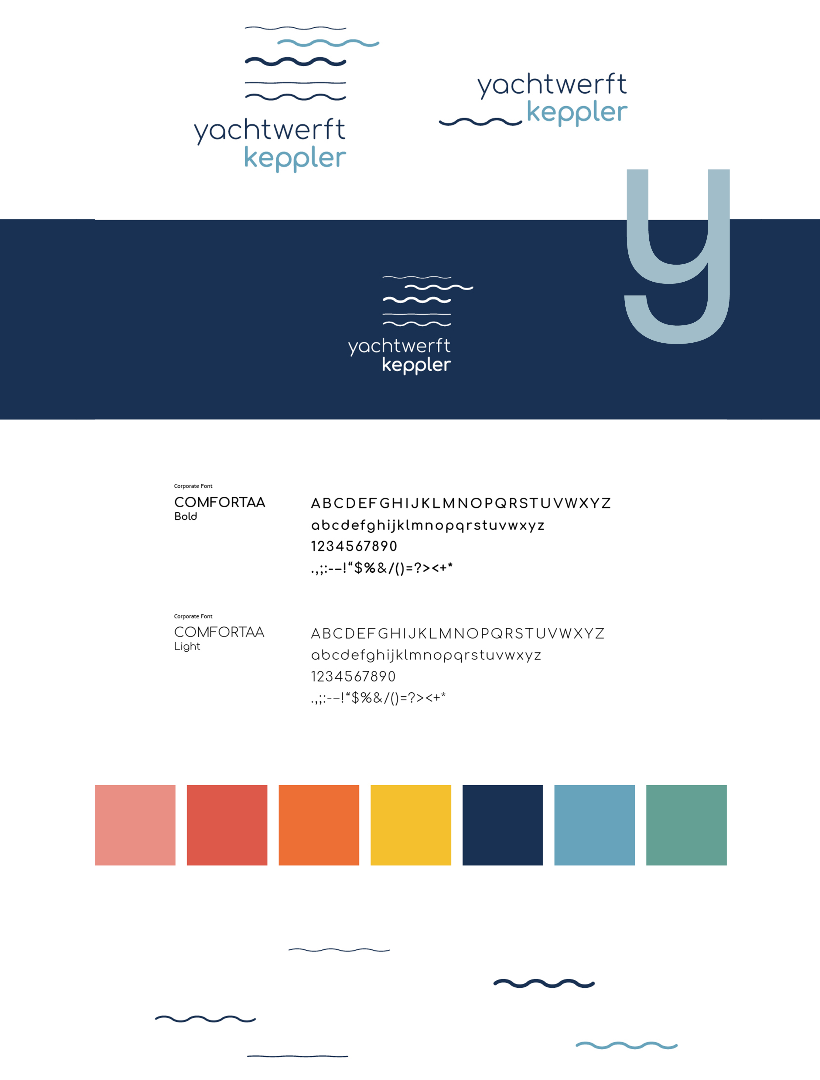
The name finding was quickly completed. Since the Keppler family had fulfilled a lifelong dream by taking over the shipyard, the family name could not be missing.
Lake Constance should appear in the logo. The waves with different heights, lengths and colors symbolize the constant change of the lake over time. Accordingly, typography and the color space were suitably defined.
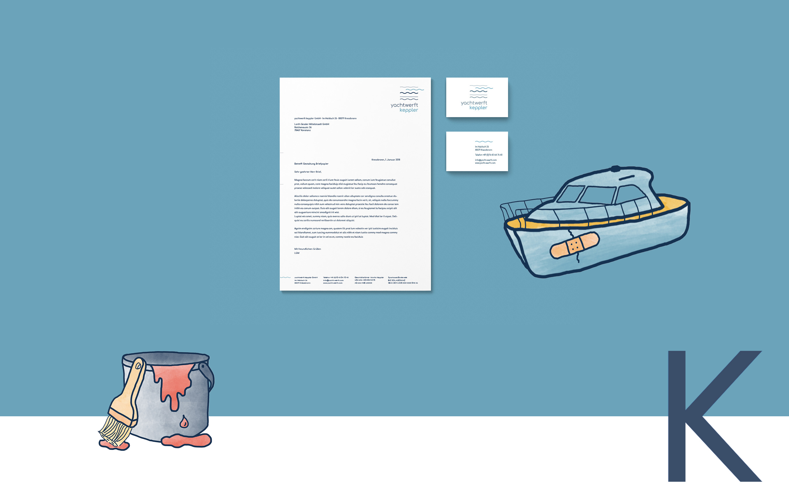
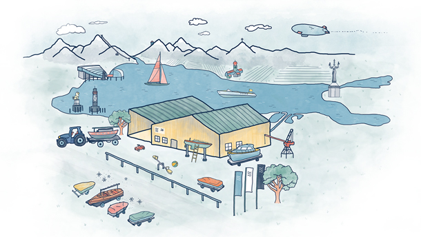
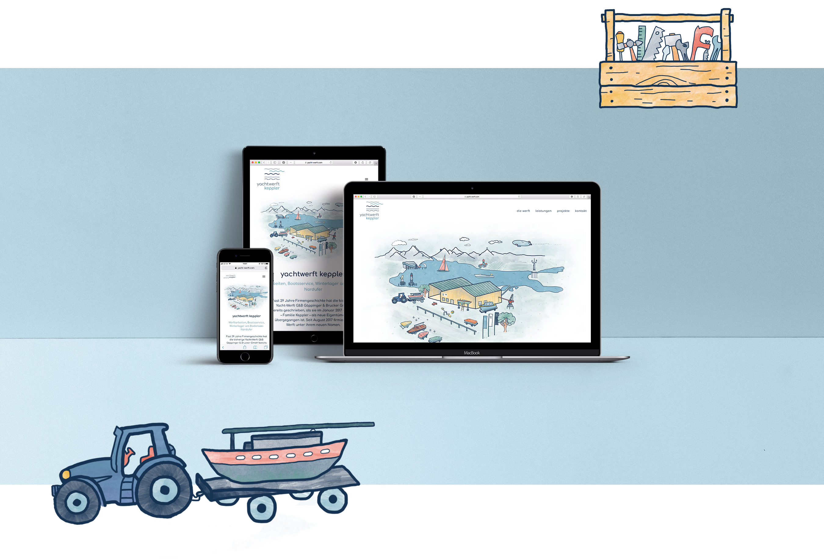
An individual, hand-drawn illustration world was developed for the website. The focus is on the company location in Kressbronn, which is embedded in the landscape of Lake Constance with all its “landmarks” such as the Zeppelin, the Bregenz lake stage, the Lindau Lion or the Imperia in Constance. In the background, the Säntis mountain looks down on the new shipyard.
Internationale Bodensee Hochschule Erklärfilme
Explanatory films IBH
The Internationale Bodensee-Hochschule (IBH) is the largest inter-university network in Europe. Under the umbrella of the IBH, the 30 member universities form a network that both links researchers and employees in the member universities across countries and academic disciplines and contributes to relevant topics in the Lake Constance region.
The concept of the info film series, which relies entirely on motion design in its implementation, is to tell the various sub-target groups individual, self-contained sample stories about IBH’s services. In this way, not everything is told to everyone, but rather an appropriate message is conveyed to each addressee. We deliberately refrain from explicitly naming the target groups, so that the films also work for all other interested parties. In the course of time, several films are produced, which are “digestible” due to their brevity and which, in their entirety, paint a holistic picture of the complex work of IBH. Sometimes it is simply good to break down a large topic into several smaller ones. After all, a pizza is much easier to eat if you have first made bite-sized slices out of it.





Goldschmiede Lang Film
Goldschmiede Lang: Tango De La Luz
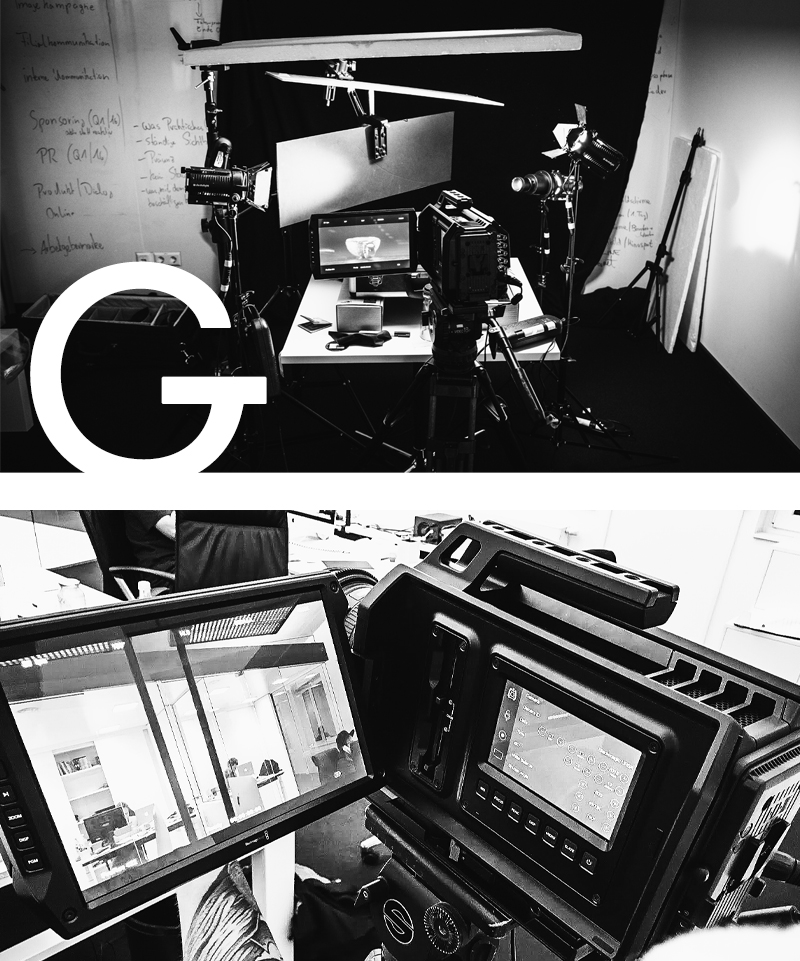
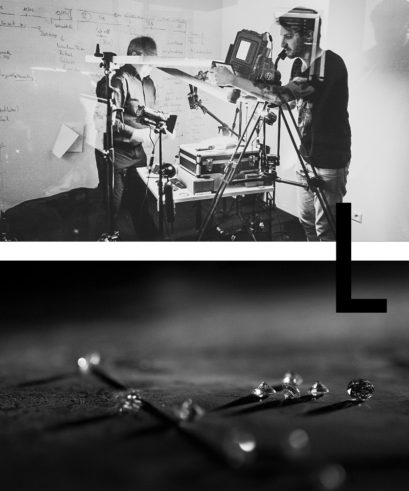
Tango de la Luz – this is the name given to the gemstone setting specially designed for the diamond. As you can see from the name, the setting was inspired by the tango “The Touch”. The stone is touched and danced around by light from all sides. The brilliance is reminiscent of the fire from which the stone originally sprang. Reflections in the setting multiply the optical properties of the diamond. The set stone thus appears larger than it actually is, and even the smallest of movements causes the stone to unfold its fascination. Goldsmith Rudi Lang, who developed the so-called “reflector setting” and applied for a patent, was keen to capture this fascination, passion and desire. He gave us an insight into his workshop and his work, accompanied us during the studio shoot and showed us the captivating world of diamonds.
