DEUKO
DEUKO 2023
For German Rotaract members, bringing a DeuKo to their own city is like bringing the Olympics or the soccer World Cup to their own city. It is the crowning glory of annual Rotaract events in Germany (yes, including Rotary) and actually in the whole of Europe. It was a huge honor for us to be the face of DeuKo 2023.
Rotaract Deutschland
After the previous German conferences fell victim to coronavirus and had to be moved online, there was no applicant for 2023 at the online DeuKo 2022 in Dortmund. In Constance, the members of the Rotaract Club then decided without further ado to submit an application in order to finally try to host a DeuKo in person again at the fourth attempt.
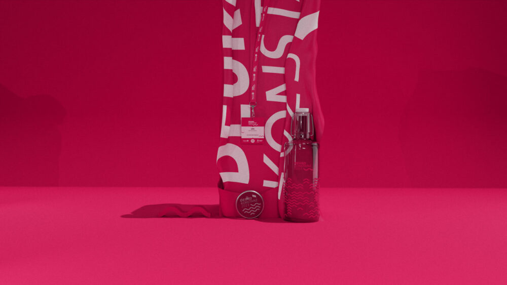
It was a courageous undertaking, as nobody knew at the time what we know today: namely that coronavirus would finally be defeated in 2023 and major events of this kind – a DeuKo has around 1,000 participants after all – would be allowed to take place again. The president of the Rotaract Club that year was Jannik Mittelstaedt – the similarity of the name is no coincidence. So it was immediately clear that LGM would become the main sponsor of DeuKo. We were responsible for the entire appearance including corporate design, slogan development, copywriting, website, social media account, motion design, photography and film production, the merchandise ideas and production and much more.


For LGM, by the way, after the DeuKo was before the DeuKo, because we were once again on board as a website sponsor for the DeuKo 2025. And we can well imagine being a partner to the wonderful people of the organizing teams again in the future. Feel free to contact us, dear Rotaractors.