Soho Lago Imagekampagne
Soho – Image Campaign
The new fashion store from Ulmer Mode in the Constance Lago Shopping Center is a great success. The concept of modern urban litestyle in a loft-like store is very well received by customers. It was these female customers that we focused on in our advertising campaign. The “SOHO LAGO Face 2018” photo campaign was such a success that on the day of the shoot we even had to put off candidates until the next time.


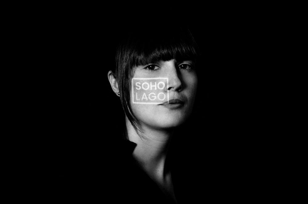
On a Saturday afternoon our photo studio was set up in the LAGO Shopping Center Konstanz. All participants were optimally prepared for the photo by the campaign partners: The team of ZIEGER FRISEURE styled the hair and the make-up artists of DOUGLAS took care of the make-up. The photos were taken in an elegant black-and-white look, with a special feature: the SOHO LAGO logo was projected onto the face. We took over 3,000 photos back to the agency that day. The best pictures were later posted on the SOHO LAGO online channels. And the best picture was used for print advertising. All participants were rewarded with shopping vouchers and received their picture as a souvenir.

We deliberately scattered the advertising for this campaign only at the point-of-sale, on the website, and on social media channels. The central approach of this campaign was to involve the target group in the advertising. And this in a direct as well as in an indirect way. This was because the images were subsequently placed as Facebook ads in the respective place of residence of the participants and in the immediate vicinity. This significantly increased the probability that the advertisements were consciously perceived. After all, anyone who sees an ad with a face from their circle of friends has a much higher level of attention due to automatic selective perception. In the end, this campaign gave everyone involved a lot of pleasure and showed one thing above all: The target group is interested in advertising campaigns when they are involved at eye level.