Soho Lago Imagekampagne

Soho – Image Campaign

The new fashion store from Ulmer Mode in the Constance Lago Shopping Center is a great success. The concept of modern urban litestyle in a loft-like store is very well received by customers. It was these female customers that we focused on in our advertising campaign. The “SOHO LAGO Face 2018” photo campaign was such a success that on the day of the shoot we even had to put off candidates until the next time.

Services:
Customer:
Soho Lago
Soho Lago Logo
Soho Lago Fotoaktion Social Media

On a Saturday afternoon our photo studio was set up in the LAGO Shopping Center Konstanz. All participants were optimally prepared for the photo by the campaign partners: The team of ZIEGER FRISEURE styled the hair and the make-up artists of DOUGLAS took care of the make-up. The photos were taken in an elegant black-and-white look, with a special feature: the SOHO LAGO logo was projected onto the face. We took over 3,000 photos back to the agency that day. The best pictures were later posted on the SOHO LAGO online channels. And the best picture was used for print advertising. All participants were rewarded with shopping vouchers and received their picture as a souvenir.

Soho Lago Fotoaktion Social Media

We deliberately scattered the advertising for this campaign only at the point-of-sale, on the website, and on social media channels. The central approach of this campaign was to involve the target group in the advertising. And this in a direct as well as in an indirect way. This was because the images were subsequently placed as Facebook ads in the respective place of residence of the participants and in the immediate vicinity. This significantly increased the probability that the advertisements were consciously perceived. After all, anyone who sees an ad with a face from their circle of friends has a much higher level of attention due to automatic selective perception. In the end, this campaign gave everyone involved a lot of pleasure and showed one thing above all: The target group is interested in advertising campaigns when they are involved at eye level.

Soho Lago Fotoaktion Social Media
Similar projects
All projects

Bädergesellschaft Konstanz Markenführung

Strategic brand management
Bädergesellschaft Konstanz

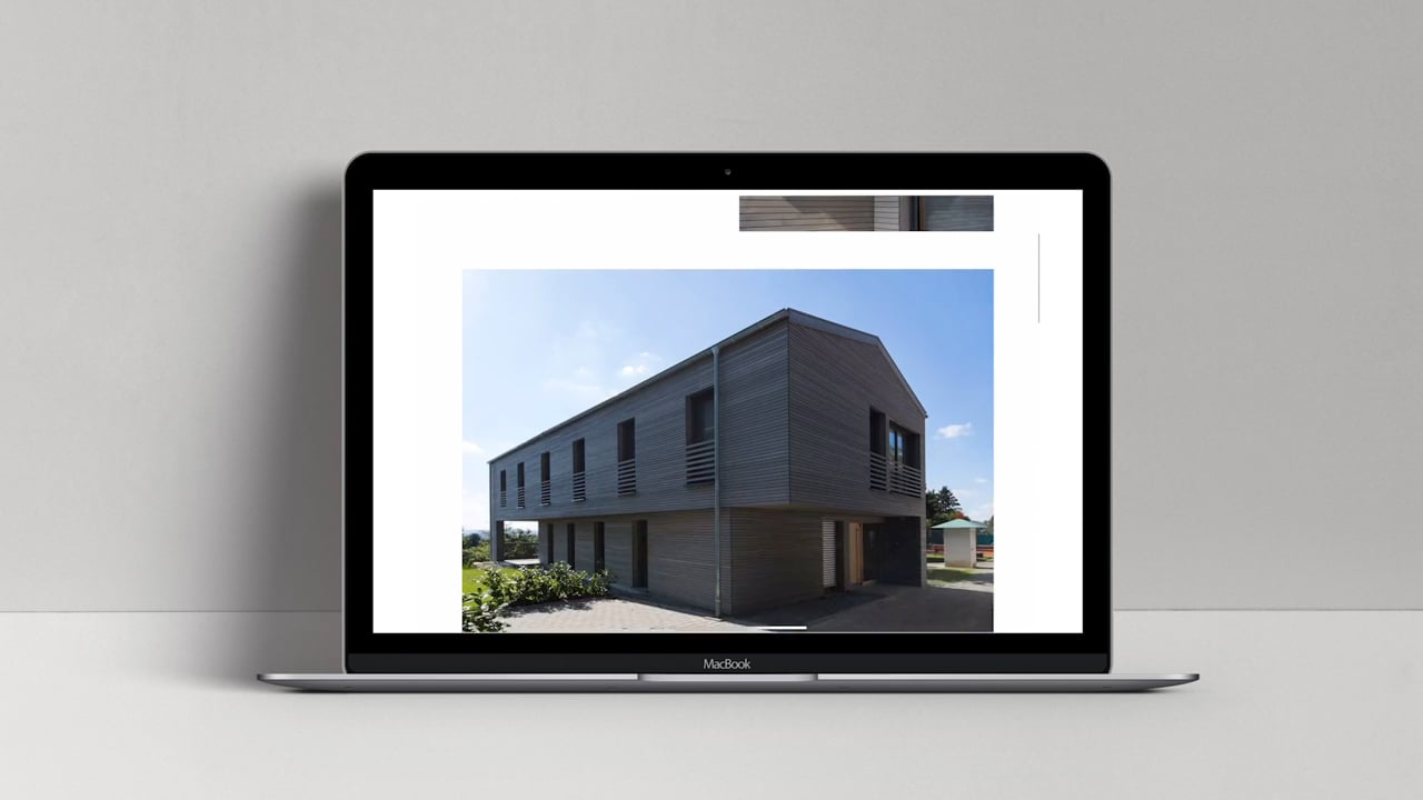
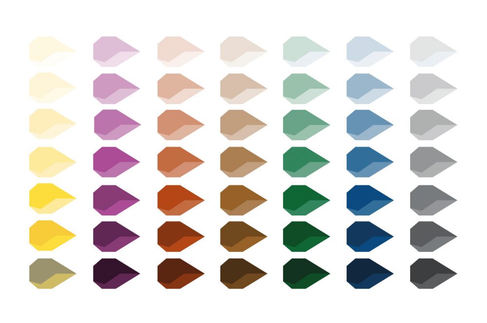
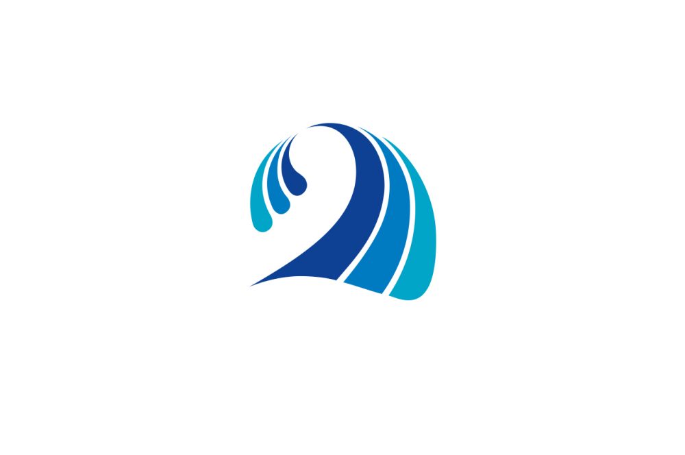
The city of Constance has the luxurious offer of a total of eight pools, including the Bodensee-Therme, the Schwaketenbad, the indoor pool on the Seerhein and five outdoor pools, four of which are open to the public free of charge. The corporate redesign is based on the modernized identification element, a stylized wave, which has stood for the Constance pools for many years. With this and the concept of color codes, the two most important recognition elements are adopted. Apart from that, everything is new.

Services:
Customer:
Bädergesellschaft Konstanz
Bädergesellschaft Konstanz Plakat

In this case, brand management means, for example, building a clean brand architecture with recognition and differentiation features at the same time. The wave as the primary unifying identification element, the color world as a way of differentiating the detailed offerings and bringing them together in the parent company Konstanzer Bäder. The successfully established typography of Bodensee-Therme Konstanz is inherited by all other spas and the parent company.

Bädergesellschaft Konstanz Werbefläche
Bädergesellschaft Konstanz Plakat

Brand management also means focusing on the central core messages in communication, especially billboard advertising. Everything that distracts is left out and subordinated to the communication goal, even if this is sometimes not easy at all, because there really is a lot of exciting stuff to tell. The hierarchy of messages is as simple as 1, 2, 3: The central motif immediately sets the context. The sender can be grasped in a fraction of a second. And a headline that subordinates itself hierarchically rounds things off.


similar projects
All Projects

Mile High 69 Gin Imagefilm

Like sex in the air

Distiller Julica Renn is also an enthusiastic pilot. With her love of experimentation, she is responsible for the composition of an extraordinary gin at the Burgunderhof family distillery on Lake Constance, which is steeped in tradition. Her declared goal: “As much passion as possible must go into the glass.” The result is the coveted “Mile High 69” gin, for which we realized the image film.

Services:
Customer:
Burgunderhof digestif’s GmbH

The story is based on the legendary Mile High Club. Anyone who has ever had sex on board an airplane belongs to the club. The first member was U.S. pilot Lawrence Sperry, who founded the Mile High Club in November 1916 together with a certain Waldo Polk and using an autopilot of his own design. Inspired by this world-famous Mile High Club, MILE HIGH 69 Gin promises an experience of a similarly special nature.

Our approach was to convey the core of the brand in under 100 seconds in a way that fits perfectly with the corporate identity. The concept tells the story based on the trailer, establishes the traditional craft, the quality and the protagonist, and with a tongue-in-cheek conclusion opens up a space of association that builds on the claim “Tastes like sex in the air.”

similar projects
All projects

Saurer Imagefilm

Saurer Imagefilm

Saurer is a leading global technology company focusing on machines, components and software for processing fiber and yarn. After the Saurer Group had developed a new visual identity, the worldwide rollout was scheduled for the industry’s largest trade fair in Barcelona. We were allowed to produce the central image video.

Services:
Customer:
Saurer Intelligent Technology AG

In a workshop, together with the clients, we condensed the core messages out of the countless communication contents and developed a concept and a tonality. Dynamic, driving, innovative, self-confident, spiced with a pinch of humor. In doing so, we consistently exploited the possibilities offered by Saurer’s new corporate design: Colors, typography, formal language. Speaking of form language: Saurer works with the dot, the most reduced glyph of the typeface. This is scaled and thus given weight. An ingeniously simple concept that we translated into motion design.

Not only did we quote the point in the context of animation, but we also set other contents of the film’s narrative strand, which does completely without a narrator, in motion semantically motivated typographically and graphically. If you look closely, you will find one fine detail after another. Be it letters that quote a typical machine motion sequence or that otherwise behave according to the content. Every movement is motivated, everything in the two-minute film has a reason. For all its attention to detail, the film also thrives on its speed: quick cuts to match the music – to the rhythm of the industry, as it were. The film reflects Saurer as a dynamic company with innovative strength and a focus on the future. Or as it says in the film: Swiss Precision, German Engineering, Chinese Speed.

We really enjoyed this project. LGM – we Love Graphics & Motion.

similar projects
All projects

architekt S Corporate Redesign

architekt S

Andreas Schumacher from Tettnang is a man of many talents: As an architect, he is the managing director of “teba”, a company that operates in the fields of real estate, residential construction and property management. At the same time, he manages a modern architectural office: architekt S. The external image of this office no longer suited this equally likeable and quality-conscious team, at the latest after the move to new premises. The client’s trust in our creativity enabled us to really start from scratch with the corporate redesign.

Services:
Customer:
architekt S

In search of a formally clear identification element, we examined the initials A and S and placed them graphically reduced in the context of building: a house, a street, both combined, pseudo-perspectively tilted. The letter S seemed even more important to us than the A, since it stands solitary in the name of the office. Therefore, from the too complex combination of A and S, we detached only the S and discovered the special effect of the “negative space” of this representation, that is, the image that our brain completes when we represent only the “tanks” within the two S-arcs.

The result was a graphic element with the association of a building and the S, which is recognizable at second glance. In combination with the typography, which harmonizes perfectly with this, a modern logo design was created, which is quickly remembered and carries a message: architekt S is the right provider for all those who have high demands on the formal quality of architecture.

We then continued this clear stance with all applications: stationery, square business cards, notebook with letterpress cover and color cut, construction fence banner through to the website, for which we not only developed the communication concept geared towards employer branding, but also wrote the image texts and designed and implemented the photography. 
similar projects
all projects

Entsorgungsbetriebe Konstanz Infografiken

Wastewater Treatment Plant Trail

The disposal companies of the city of Constance (EBK) take care of waste and water disposal. Dirty water is not simply disposed of, but is first treated in an elaborate process. In order to explain this process to the people of Constance and all other interested parties, there has long been a sewage plant nature trail. We were now allowed to completely redesign it.

Services:
Customer:
EBK – Disposal companies City of Constance

As a warm-up, so to speak, we provided a graphic update of the EBK logo in a preliminary step. We didn’t reinvent the wheel, but identified the one with the greatest graphic potential from the existing variations of the EBK logo and just put the finishing touches on it. This updated logo is much more compatible with our graphical concept for the display boards of the sewage treatment plant nature trail than the previous relief variant would have been.

For the infographics, we developed a reduced basic design based on a deliberately coarse form language and minimally indicated plasticity through light edges or shading. This visual principle runs through all the panels of the educational trail of the sewage treatment plant. Together with the customers, it was also possible to reduce the complexity of the information conveyed. Less is often more. That’s why we also worked on the content level. In combination with a design grid for the panels that neatly separates headings, main and marginal content, the result was a modern look that is fit for the years to come.

similar projects
all projects

Handwerk in Konstanz Kampagne

Handwerk in Konstanz

“Handwerk in Konstanz” (Crafts in Constance) is a free joint market presence of eight crafts businesses in Constance that are known and appreciated in the region for their quality and personality. Together with the participating companies, we developed a campaign for a bus of the Constance public utility company that is well worth seeing. Sympathetic illustrations complement the craftsmen photographed in typical activities and provide a lively overall picture to discover. Both the photo shoot and the illustrations were created in-house. The campaign is rounded off by the accompanying one-pager website www.handwerk-in-konstanz.de. We wish the “Handwerkerbus” a safe journey through the streets of our beautiful city.

Services:
Customer:
Eight craft enterprises from Constance


Similar projects
All projects

LGM Corporate Redesign

LGM Corporate Redesign

Lorth Gessler Mittelstaedt, known to clients simply as “LGM”, has been based in Constance as an agency since 1998. While the initial focus was on film production, our portfolio has evolved over the years into a full-fledged advertising agency that offers clients almost everything imaginable in the field of communication, from strategic brand management to corporate design to online and even film. This holistic, cross-media expertise is one of LGM’s competitive advantages.

Customer:
Customer:
Lorth Gessler Mittelstaedt

The high dynamics of performance evolution were also reflected in several redesigns that LGM’s visual identity has undergone over the years. The last adaptation was now about eight years ago and our visual identity no longer represented what our team now sees in us. Therefore, over the course of a year, we afforded ourselves what we also recommend to our customers: Before the redesign, we took an in-depth look at our brand and our values. On the basis of the brand values “modular”, “holistic”, “human” and “balanced”, which we defined together as a team, we finally developed our new visual identity with a dynamic design that, despite many variations, always appears to be from the same mould. The central element is the typogram of the three initials L G M.

We take great pleasure in translating the design into the many different applications. Although we are also at home in the digital world and feel very comfortable there, we do not forget print. And here we have fulfilled a long-cherished wish for the business cards: The finest letterpress printing on two layers of wonderfully soft 300-gram Gmund Cotton Linen Cream, both sides individually pressed and then laminated into a 600-gram statement. The approach of dynamic design was consistently followed through, which is why the typogram of each card is not the same as the other. The result is a number of unique pieces, and not just because of the different names.

similar projects
All projects

Aston Foods Full-Service

Aston Foods

Aston Foods designs and builds vacuum cooling systems for commercial and industrial bakeries. The special feature of vacuum cooling is the significantly reduced cooling time for baked goods, which has financial, quantitative and even qualitative advantages. Since the Freshup, the corporate design speaks a clearer and more modern language. Applications such as brochures, the website, but also an image film of the in-house Baking Center are part of the scope of our collaboration, as are people, image and product photography.

Services:
Customer:
Aston Foods

One highlight is the image brochure with its unusual cover picture: At first glance, it is all white. Blank. As if the printing had been forgotten. A closer look reveals the partial UV coating, which gives a hint of the logo and the “Cooling Waves”.

The brand essence of Aston Foods, the controlled vacuum, becomes the hook of the image brochure in this surprising way and is thematized in the editorial. What was initially striking because it broke through perceptual habits becomes a clever metaphor at second glance; after all, vacuum is the presence of nothing.

similar pojects
All Projekts

Reisewelt Montfort Corporate Redesign

Reisewelt Montfort – Wanderlust reinvented

Reisewelt Montfort is much more than just a friendly, regional and efficient travel agency. Reisewelt Montfort is an institution in Tettnang. For its twentieth anniversary, Reisewelt reinvented itself: complete renovation of the business premises and a complete redesign of the corporate identity. We were allowed to take over the latter.

Services:
Customer:
Reisewelt Montfort
Reisewelt Montfort Reisebüro Tettnang Logo
Reisewelt Montfort Reisebüro Tettnang Design

The central element of the new look is the logo. The initials of Reisewelt Montfort RM can be found in the signet. Perhaps at first glance, but at the latest at second glance, the vacation-hungry viewer also sees the mountains with a summit flag in this identification element. Or the sea with a sailboat. Or simply the sun beaming over the vacations that can be booked with Jürgen Niedermaier and his team. Even if not every vacation goes to the warmth, the warm color travel orange is chosen in the longing temperature of many holidaymakers.

Reisewelt Montfort Reisebüro Tettnang Design

The corporate design is all about inspiration: the typography is reminiscent of the fold-down display boards at the airport, the dots are reminiscent of the tear-off perforation on airline tickets, but also stand for the journey or the path to the destination. The whole design is modern, clean and simple. The icon world was developed to match and can be used universally. The appearance is rounded off by appealing animations.

Reisewelt Montfort Reisebüro Tettnang Design
similar projects
All projects
Lorth Gessler Mittelstaedt GmbH
Reichenaustr. 36

78467 Konstanz
+49 (0)7531.189550
kontaktnospam@nospamlgm.info
Facebook | Instagram
Impressum
Datenschutz
AGB
Privacy Settings
We use cookies to enhance your experience while using our website. If you are using our Services via a browser you can restrict, block or remove cookies through your web browser settings. We also use content and scripts from third parties that may use tracking technologies. You can selectively provide your consent below to allow such third party embeds. For complete information about the cookies we use, data we collect and how we process them, please check our Privacy Policy
Youtube
Consent to display content from - Youtube
Vimeo
Consent to display content from - Vimeo
Google Maps
Consent to display content from - Google