BSB Bordzeit Editorialdesign
BSB Bordzeit
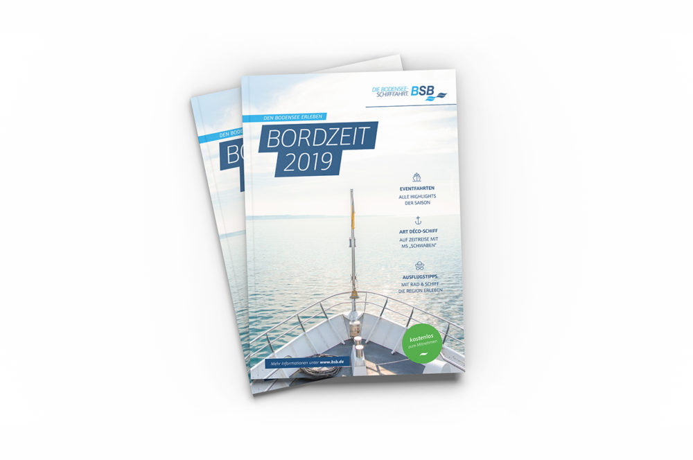
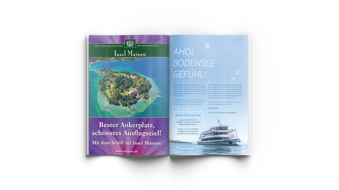
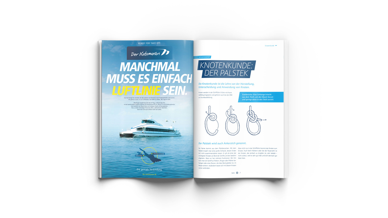
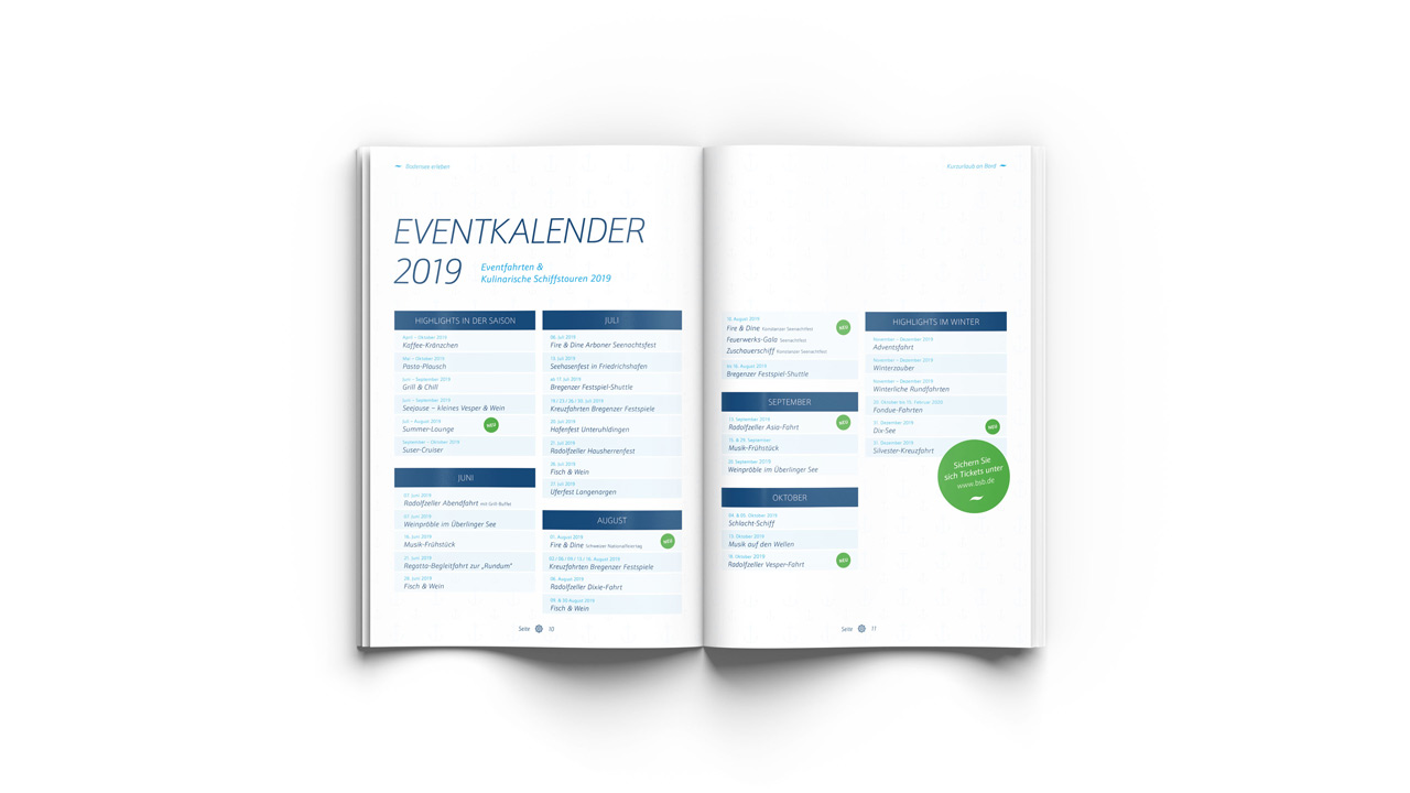
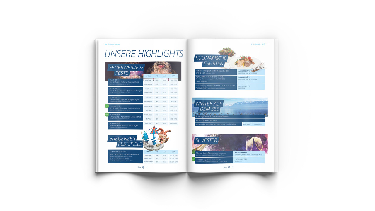
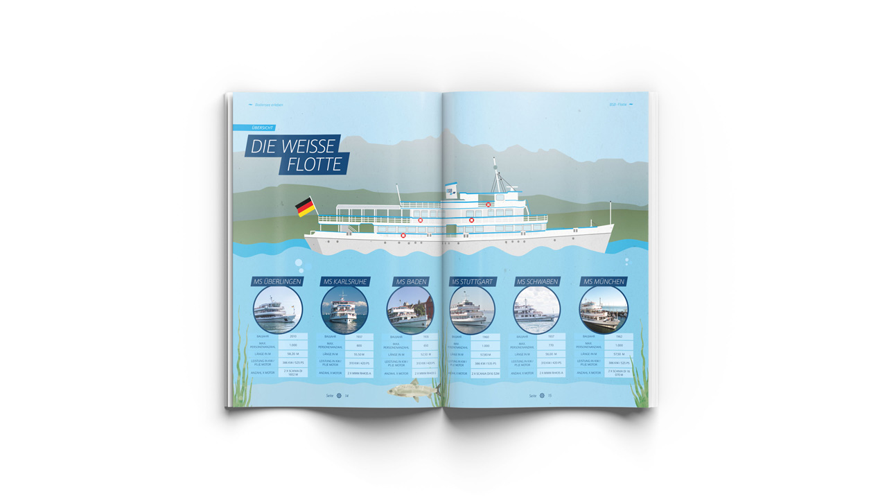
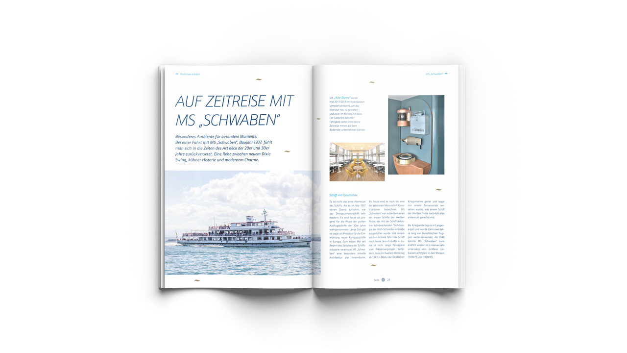
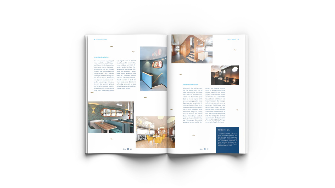
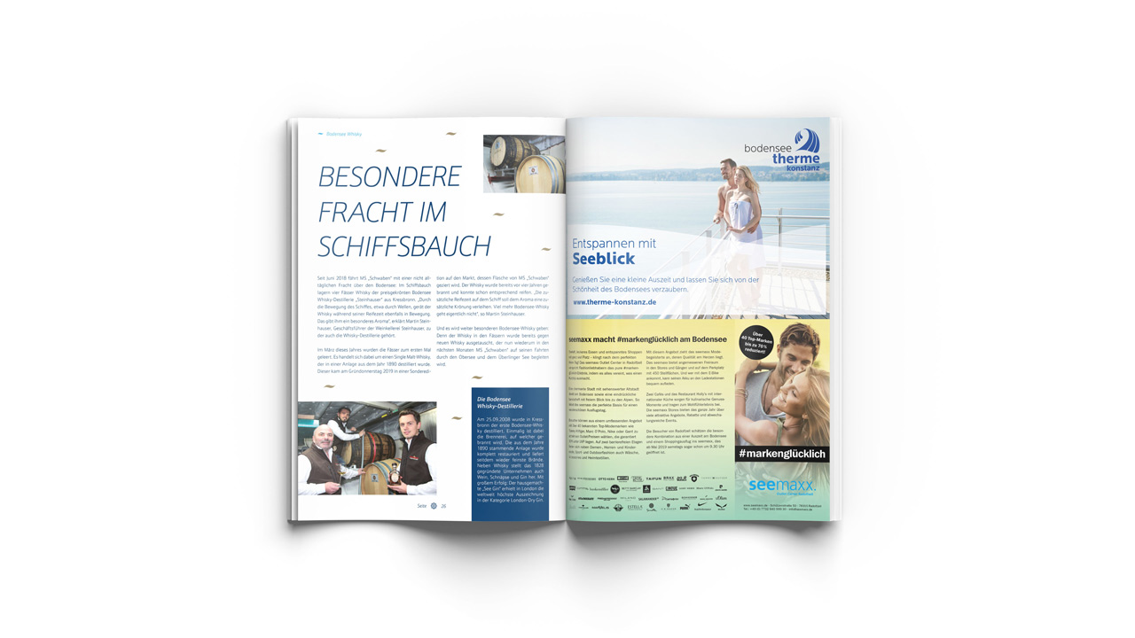
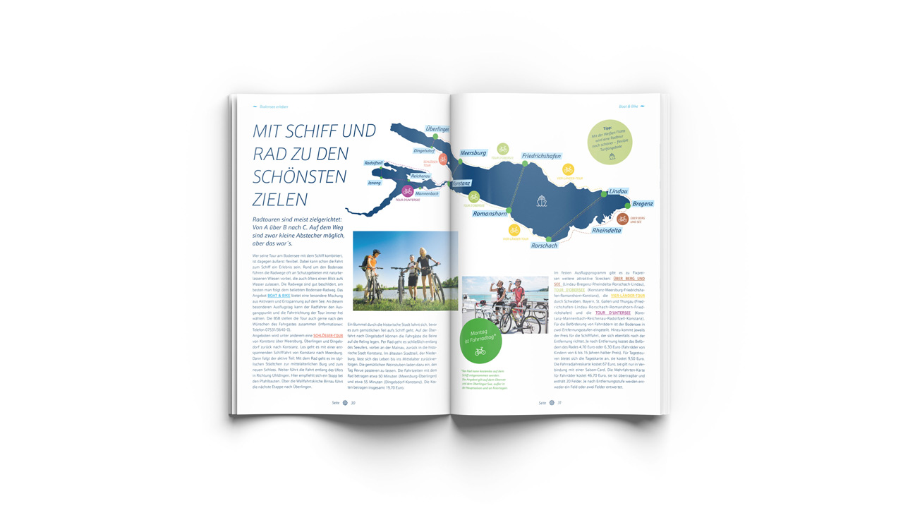
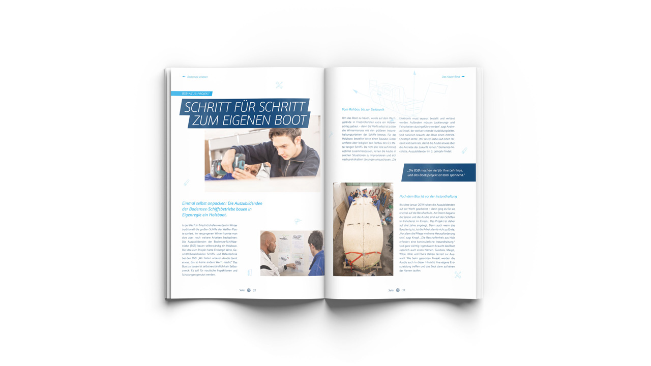
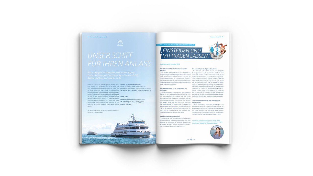
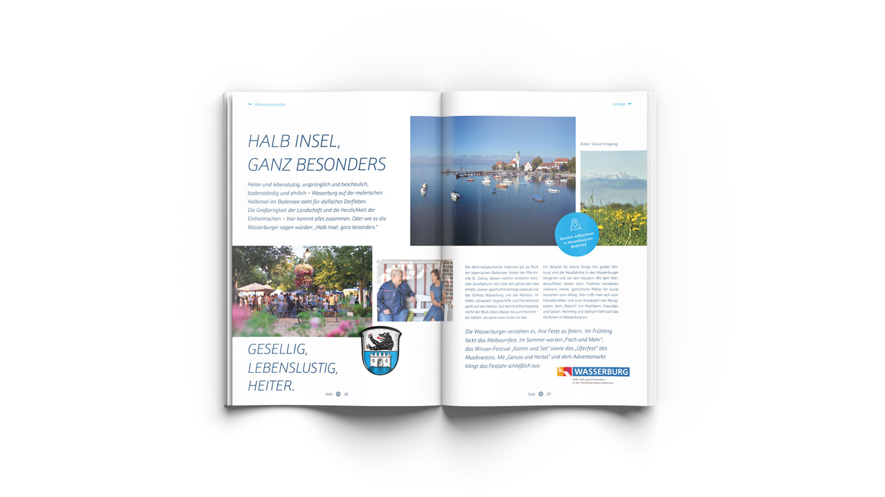
“Bordzeit” is a high-quality magazine that Bodensee-Schiffsbetriebe (BSB) has been displaying on its ships for a few years now and which is very popular with the target group. Articles worth reading about the shipping experience on Lake Constance complement the guests’ impressions. In 2019, we were allowed to take over the editorial design of this emotional print product and also contribute some conceptual ideas.
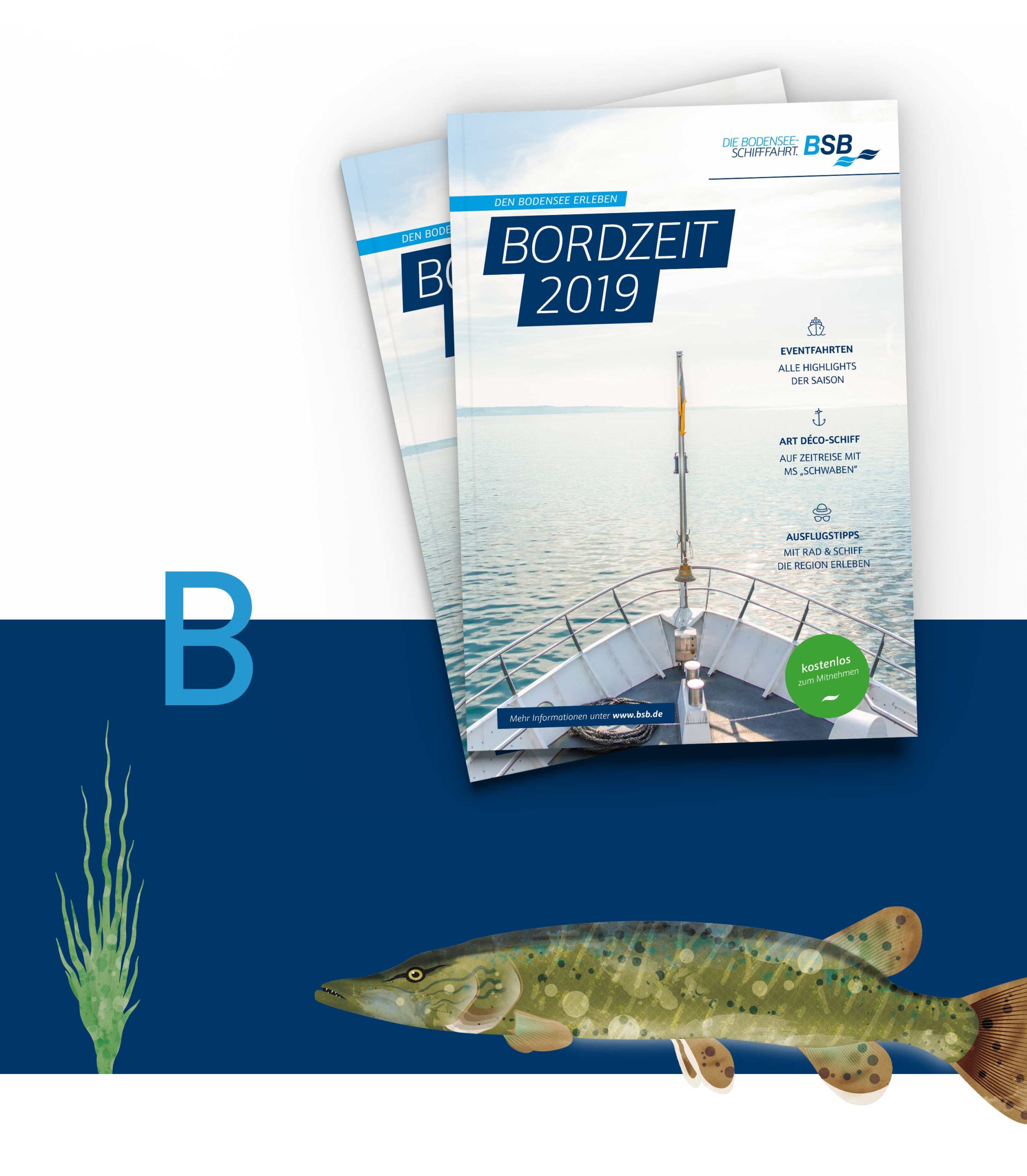
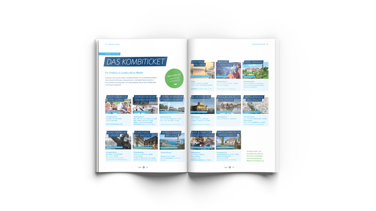
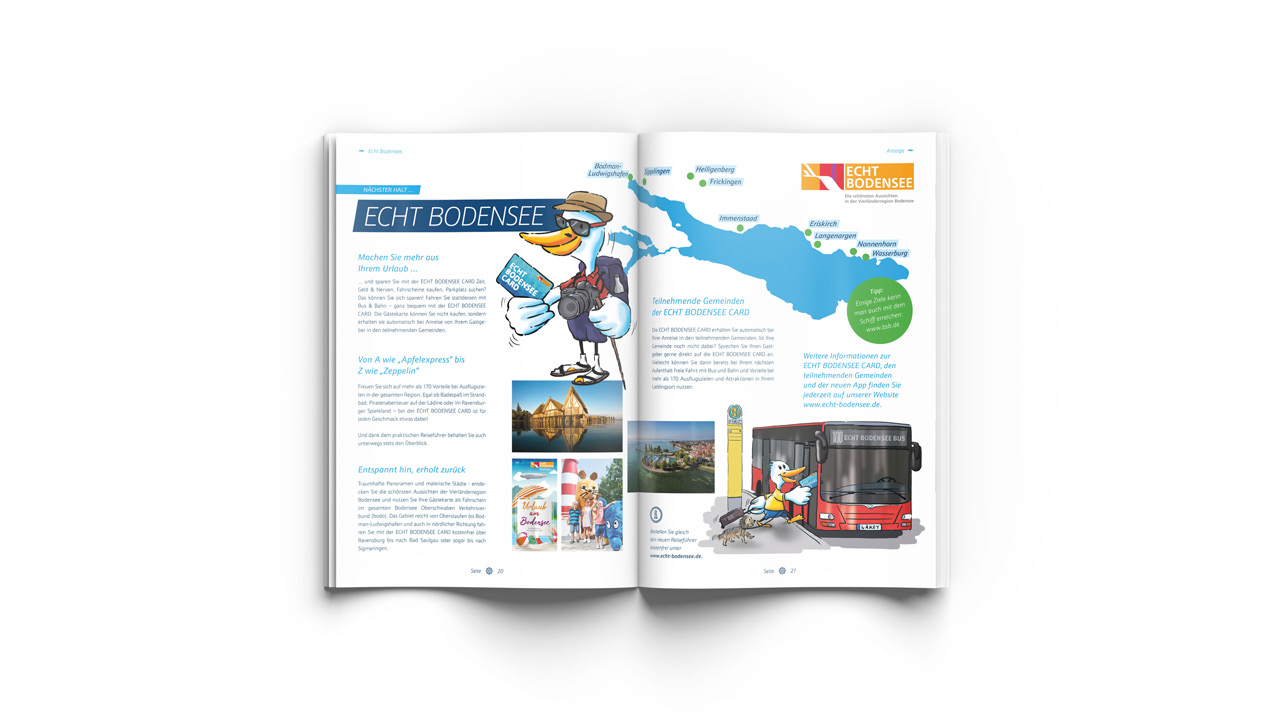
People who have time absorb messages much more consciously and sustainably. On the ships of the “White Fleet,” BSB and also its advertising partners, who position themselves with ads in the “Bordzeit,” reach a target group that values experience and enjoyment. The advertisers also benefit from the high brand value of the BSB. And of course from the time that people take on board the BSB ships. In addition to creating a modern design grid that strikes a balance between making good use of the available space and a visual lightness through the conscious use of white space, we also developed an illustration world that – following the special freedoms of editorial design – subordinates itself to the existing guidelines within the framework of corporate design.
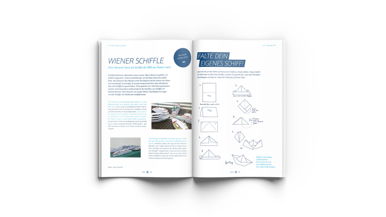
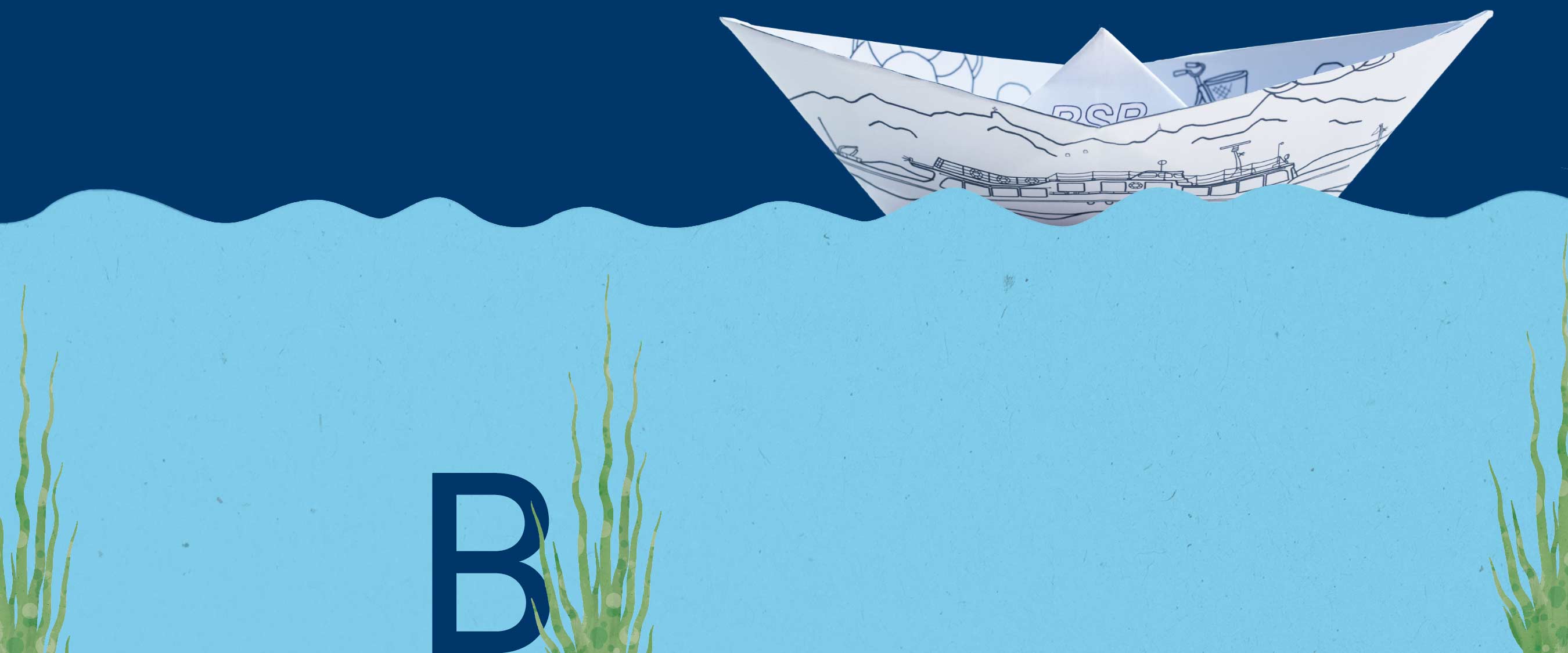
A boat trip is a wonderfully decelerating experience. Enjoying the scenic beauty of the Lake Constance region from the water, leafing through the “Bordzeit” at leisure and being inspired by the diverse stories has a special value. And we have also thought of the children. As a special, quasi-interactive element, we developed a simple paper folding ship to color in, which is presented in the magazine and available from the on-board staff, complete with crayons. This way, the adults take home the memory of a relaxing cruise – and the kids a cool BSB paper ship. We are already looking forward to “Bordzeit” 2020.
Seewandel Corporate Design
Seewandel Identity
Dass Edeka Baur nicht nur aus Konstanz, sondern auch aus vielen anderen Orten der Region nicht mehr wegzudenken ist, hat einen Grund. Es ist die Kombination aus Frische, Qualität und Einkaufserlebnis, das die Kunden überzeugt. Das 25-jährige Jubiläum ist eine wunderbare Gelegenheit, dies auf die ganz eigene, bodenständige Art und Weise zu feiern. Wir erhielten den Auftrag, die Jubiläums-Kampagne zu entwickeln.
Bei aller Freude über die erneute Zusammenarbeit mit unseren lieben Nachbarn war uns bewusst: Es ist für die Zielgruppe „nur“ ein weiteres Jubiläum. Klarheit in der Kommunikation und das Finden des Kerns der Botschaft waren daher die obersten Maximen. Wir entwickelten in mehreren Iterationsschleifen ein wertiges Signet und eine emotionale, kraftvolle Farbwelt. Beides kombinierten wir und reicherten es mit einer Textur aus Lebensmittel-Illustrationen an. Als Ergebnis entstanden zwei Umsetzungen: Eine als Button, der in seiner Kreisform eine hohe Kompatibilität zu verschiedenen Anwendungen on- wie offline mitbringt. Und eine zweite als eine Art Qualitätssiegel, das in Vertikalanwendungen wie zum Beispiel Fahnen bestens zur Geltung kommt.
Bei aller Freude über die erneute Zusammenarbeit mit unseren lieben Nachbarn war uns bewusst: Es ist für die Zielgruppe „nur“ ein weiteres Jubiläum. Klarheit in der Kommunikation und das Finden des Kerns der Botschaft waren daher die obersten Maximen. Wir entwickelten in mehreren Iterationsschleifen ein wertiges Signet und eine emotionale, kraftvolle Farbwelt. Beides kombinierten wir und reicherten es mit einer Textur aus Lebensmittel-Illustrationen an. Als Ergebnis entstanden zwei Umsetzungen: Eine als Button, der in seiner Kreisform eine hohe Kompatibilität zu verschiedenen Anwendungen on- wie offline mitbringt. Und eine zweite als eine Art Qualitätssiegel, das in Vertikalanwendungen wie zum Beispiel Fahnen bestens zur Geltung kommt.
Buy local
Buy Local Image brochure
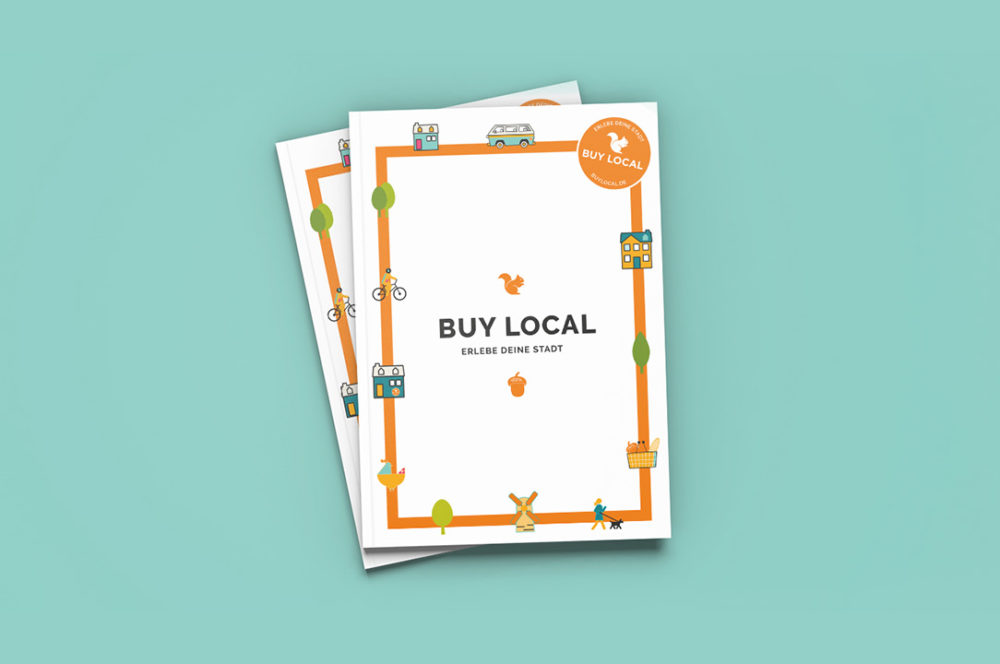
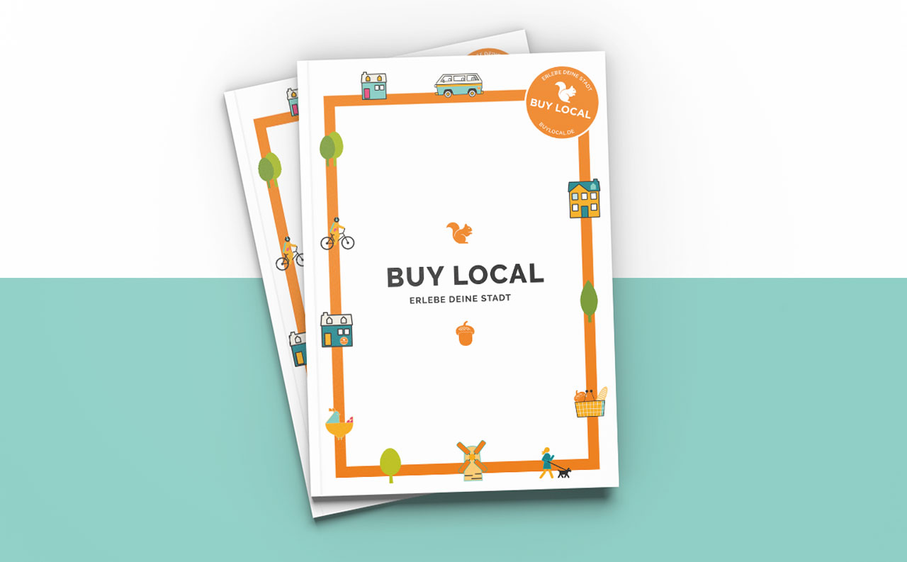
Buy Local is a nationwide and cross-industry association of regional traders, service providers and craftsmen and offers its members a lot of advantages, for example an umbrella brand image campaign for owner-managed businesses with a high personality factor. We were allowed to conceptualize and design the image brochure for Buy Local.
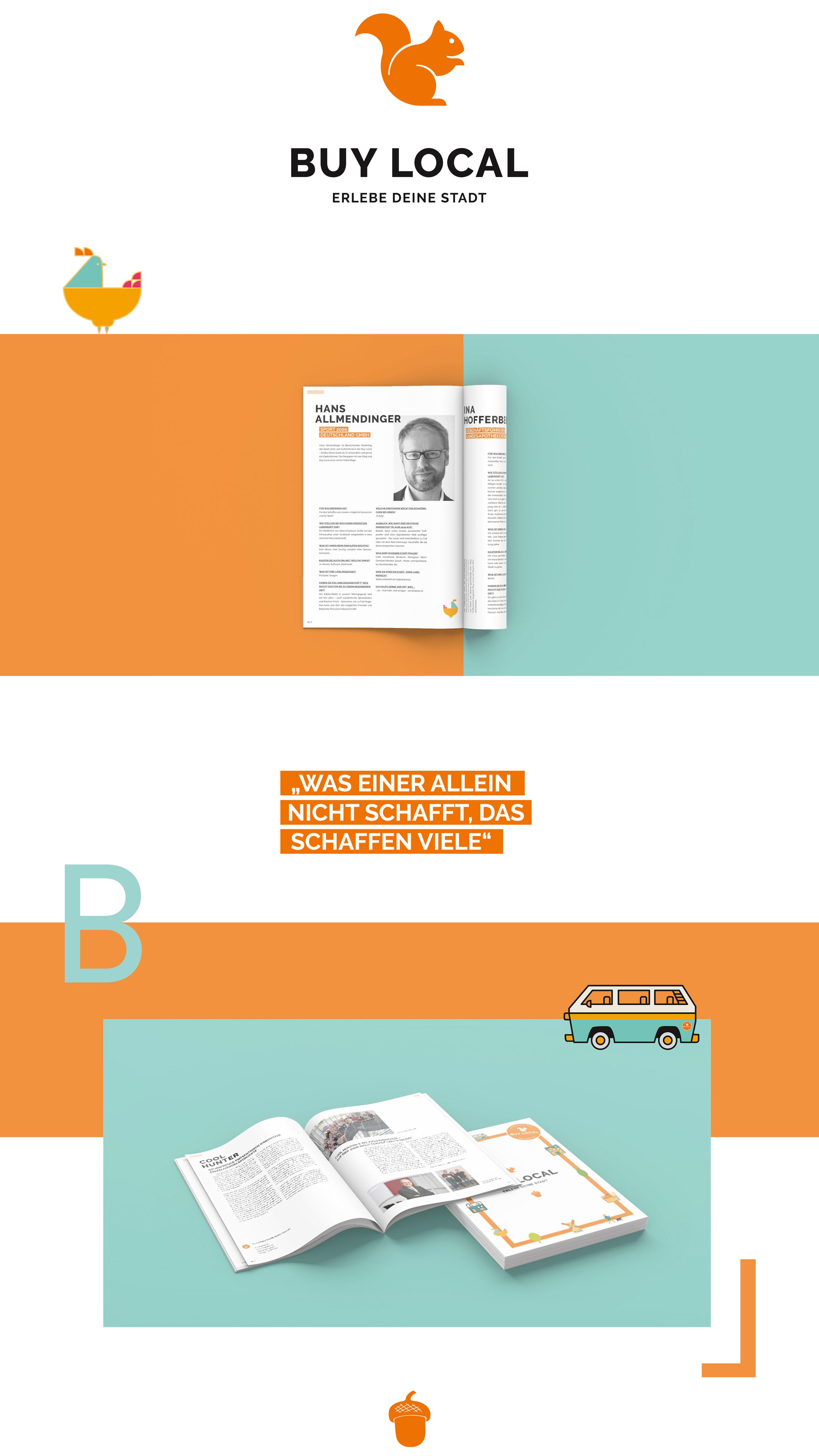

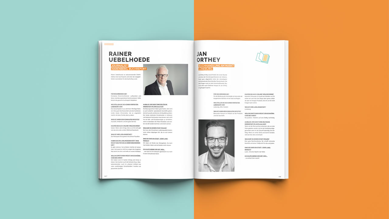
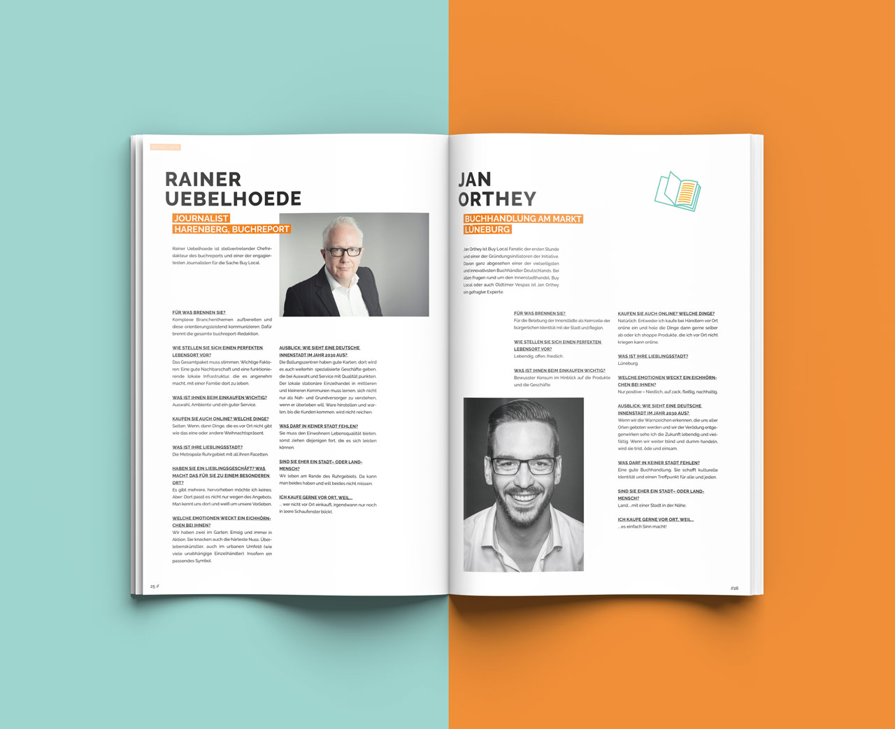
The starting point was the squirrel logo and the signal color orange. Otherwise, following the special position of editorial design in the overall context of corporate design, we were very free in the design of this emotional medium. The content is diverse: members are portrayed in interviews, Buy Local projects are described, background information is given, stories are told.
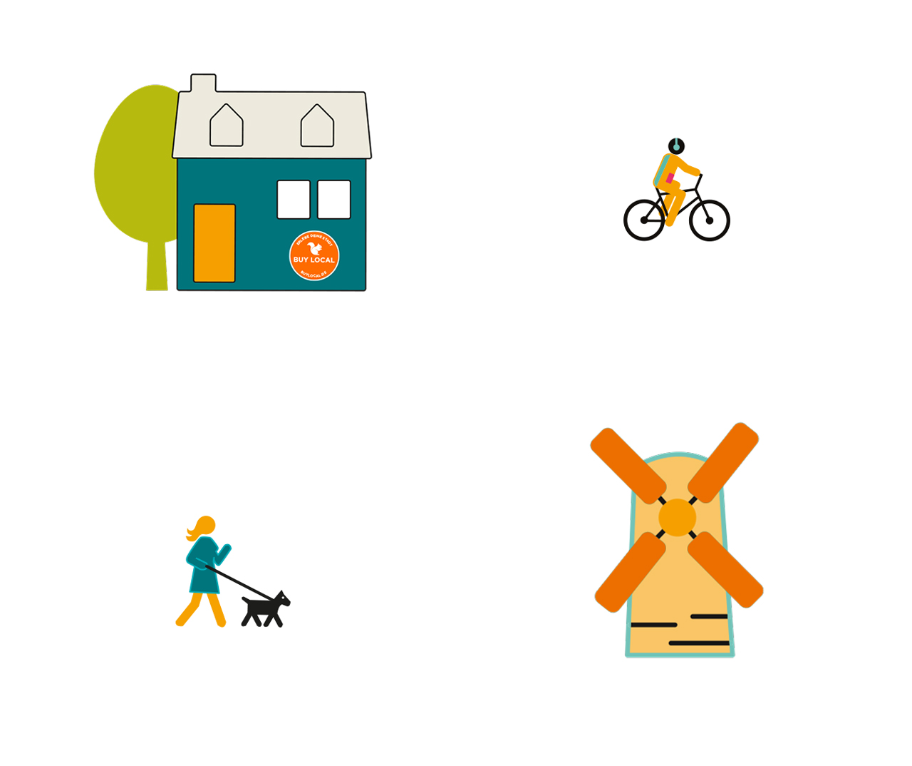
Interpreting Buy Local’s existing corporate design in the context of editorial design was a pleasure for us: headline transitions were defined, general typographic principles for this medium were conceived, and a clear yet lively design grid was defined. To round things off, we designed illustrations that help to bring regional features to the fore front. The result is a beautiful 44-page magazine that provides insights into the work of and the minds behind Buy Local.


Brothaus Baur Branding
Brothaus Baur – Brot & mehr
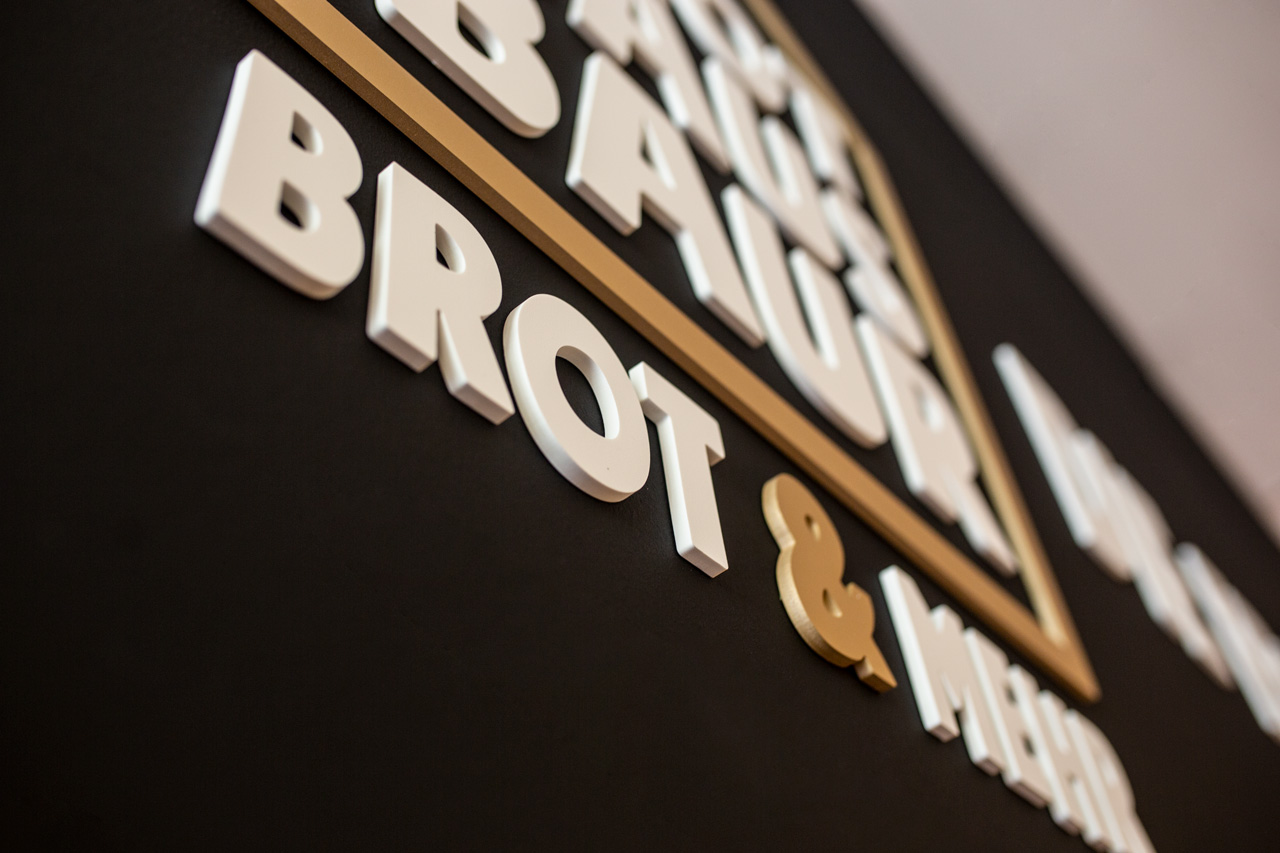
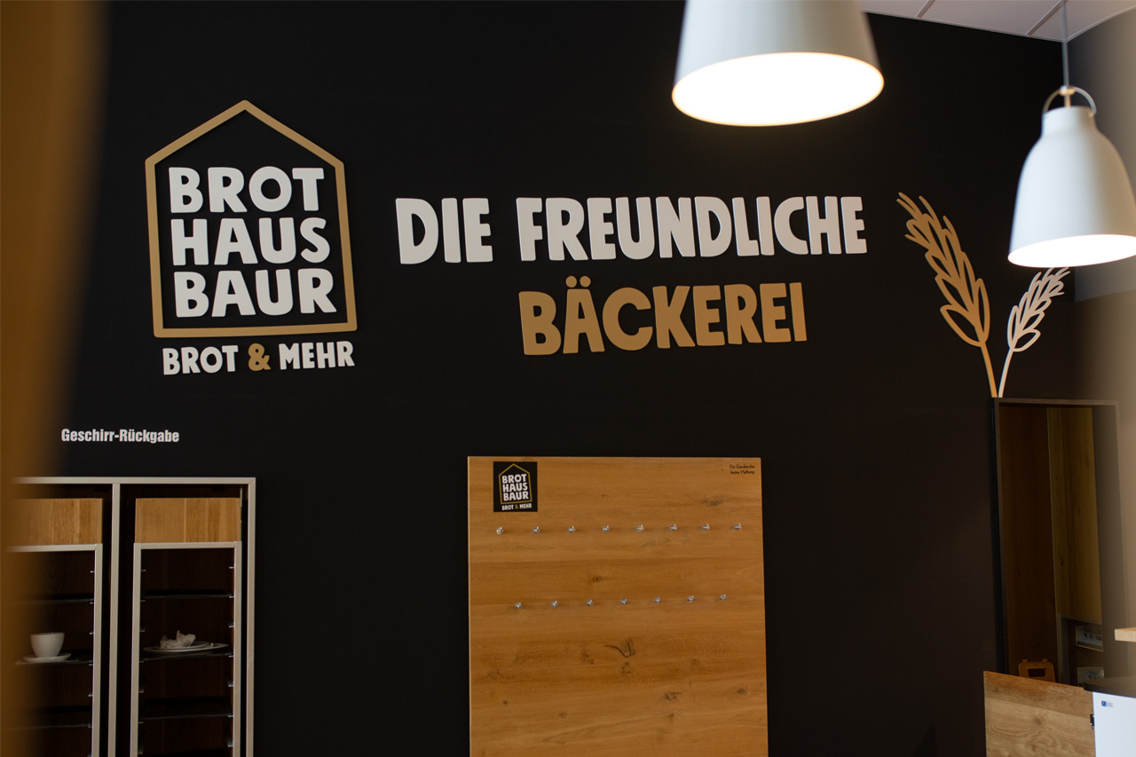
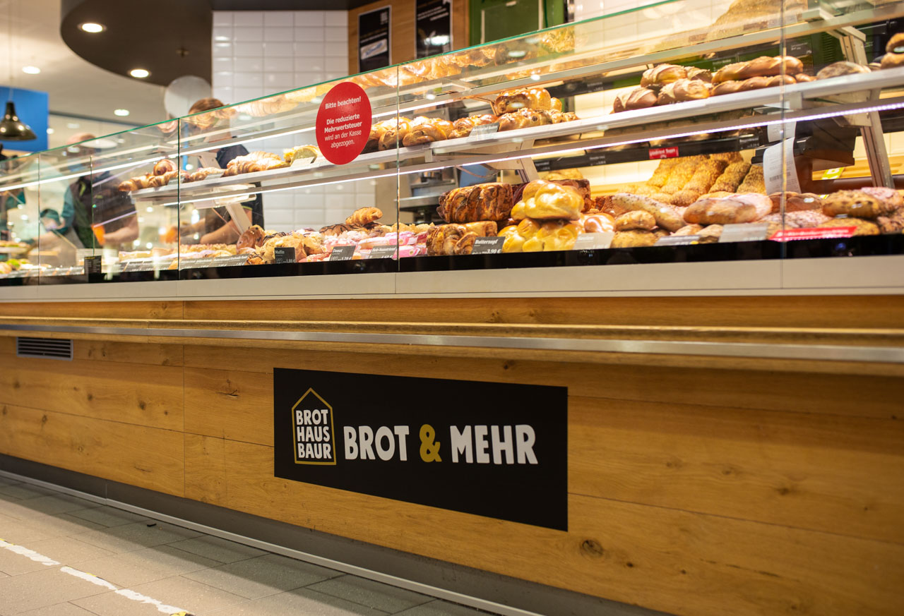
Brothaus Baur is a new brand from Edeka Baur. Initially, it is a pilot bakery in one of Edeka Baur’s grocery stores, which has replaced the previous offering. We were allowed to help a lot on the way to the new branding and not only to contribute to the naming, but also to develop the complete appearance including logo design, design of the print products up to the design of the lettering of the store equipment.
At the beginning of the project, the working title was “Market Bakery,” but we quickly realized that we had to go further. Values such as down-to-earthness, tradition and regionality played just as much a role as the realization that bread is simply part of shopping. The overly descriptive impression of the working title finally made us realize that the name Baur absolutely had to be a central component of the new brand. After all, Jürgen Baur’s stores stand for such outstanding quality and such a love for food that it simply made sense to use this charisma for the new bakery name as well. This is how the Brothaus Baur came into existence.

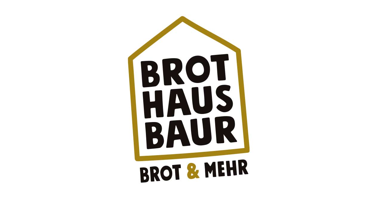
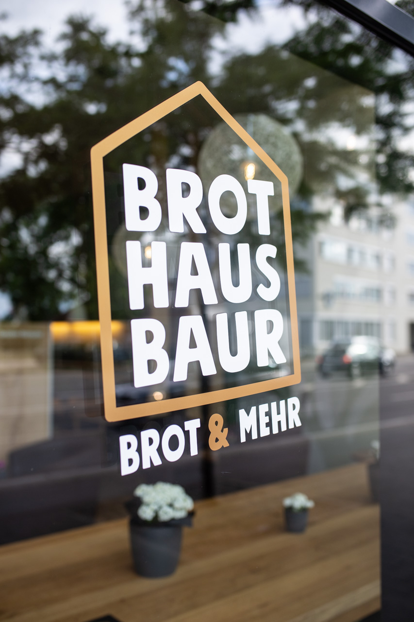
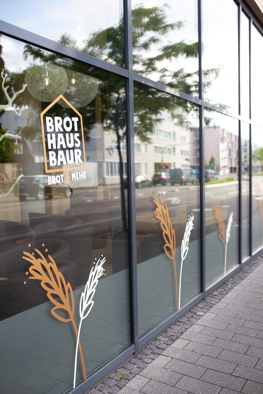
In the logo design, we were struck by the visually attractive triad of the words Brot, Haus and Baur, in which each individual word with its four letters has the same structure and can thus be set in perfect visual balance. Less is often more in design. And so we added only a basic house shape and a descriptive subline to the composition of the three words, which is also perfectly balanced in the harmony of the four-letter words under the signet – as a foundation, so to speak. As colors we chose black and gold.

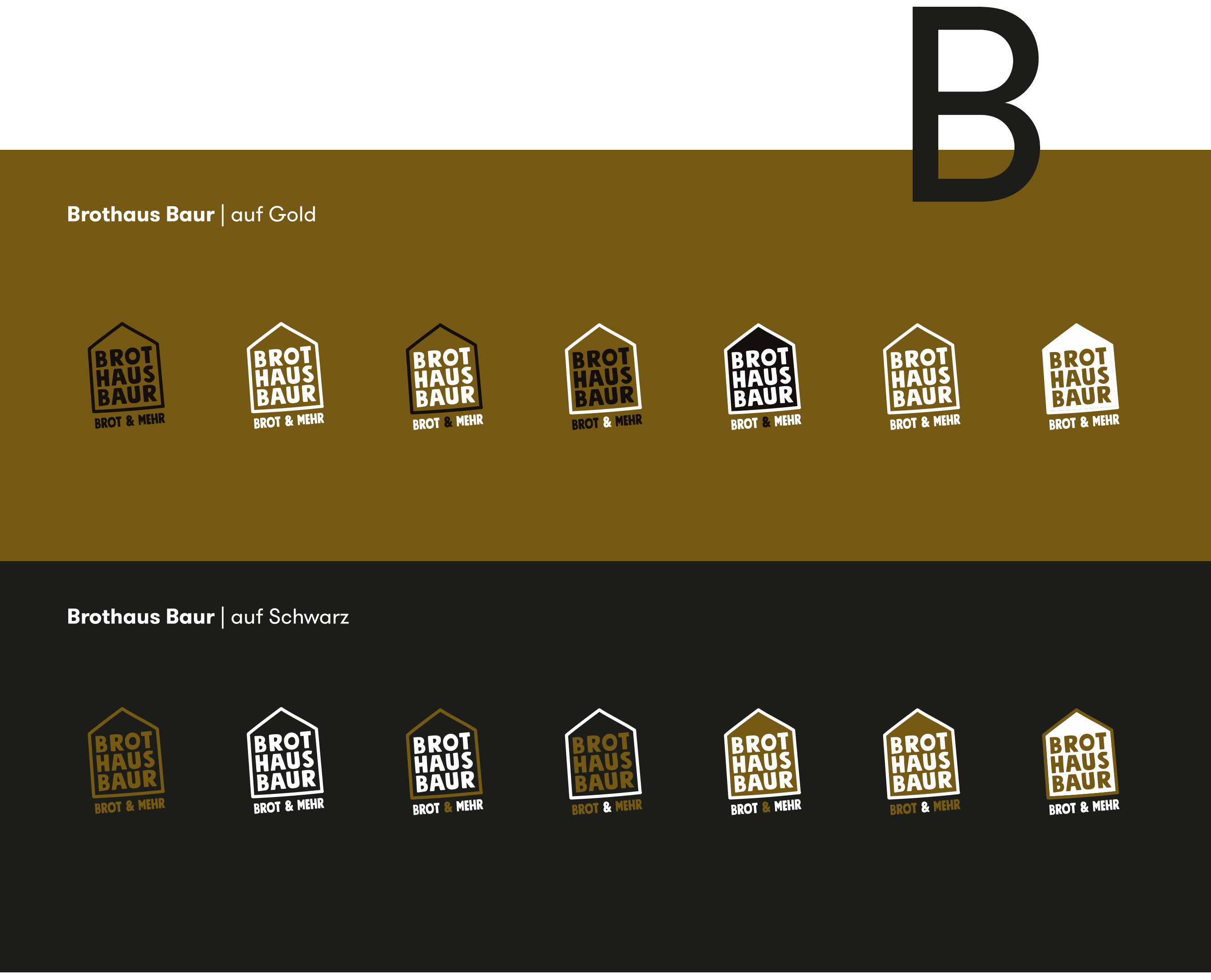

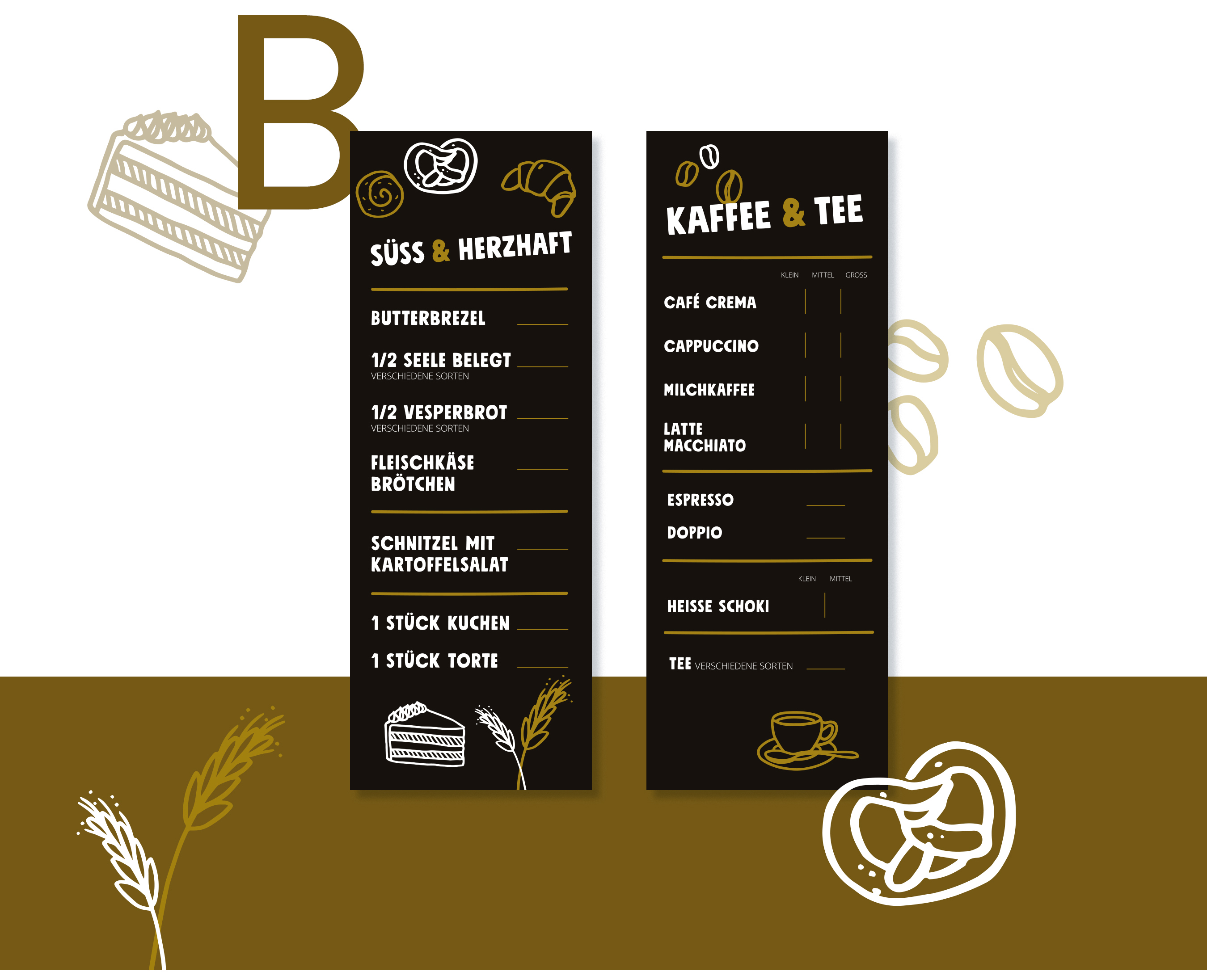
On the second communication level, in addition to a deliberately sympathetic and restrained claim, the overall image is supported by many beautiful hand-drawn illustrations that perfectly match the typography in terms of form language. A wonderful assignment and an equally wonderful collaboration with these super likeable clients. Thank you!


Constellium One-Stop-Shop Produktion
One-Stop-Shop media production
Constellium is a global manufacturer of aluminum products. For trade fairs, openings of research and production sites, internal and external communication, Constellium needs a variety of services from the field of media production. With our range of design, online, film production and photography services, we are just the right supplier.
Exhibition stand photography
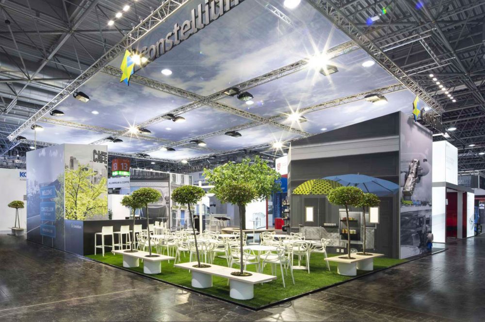
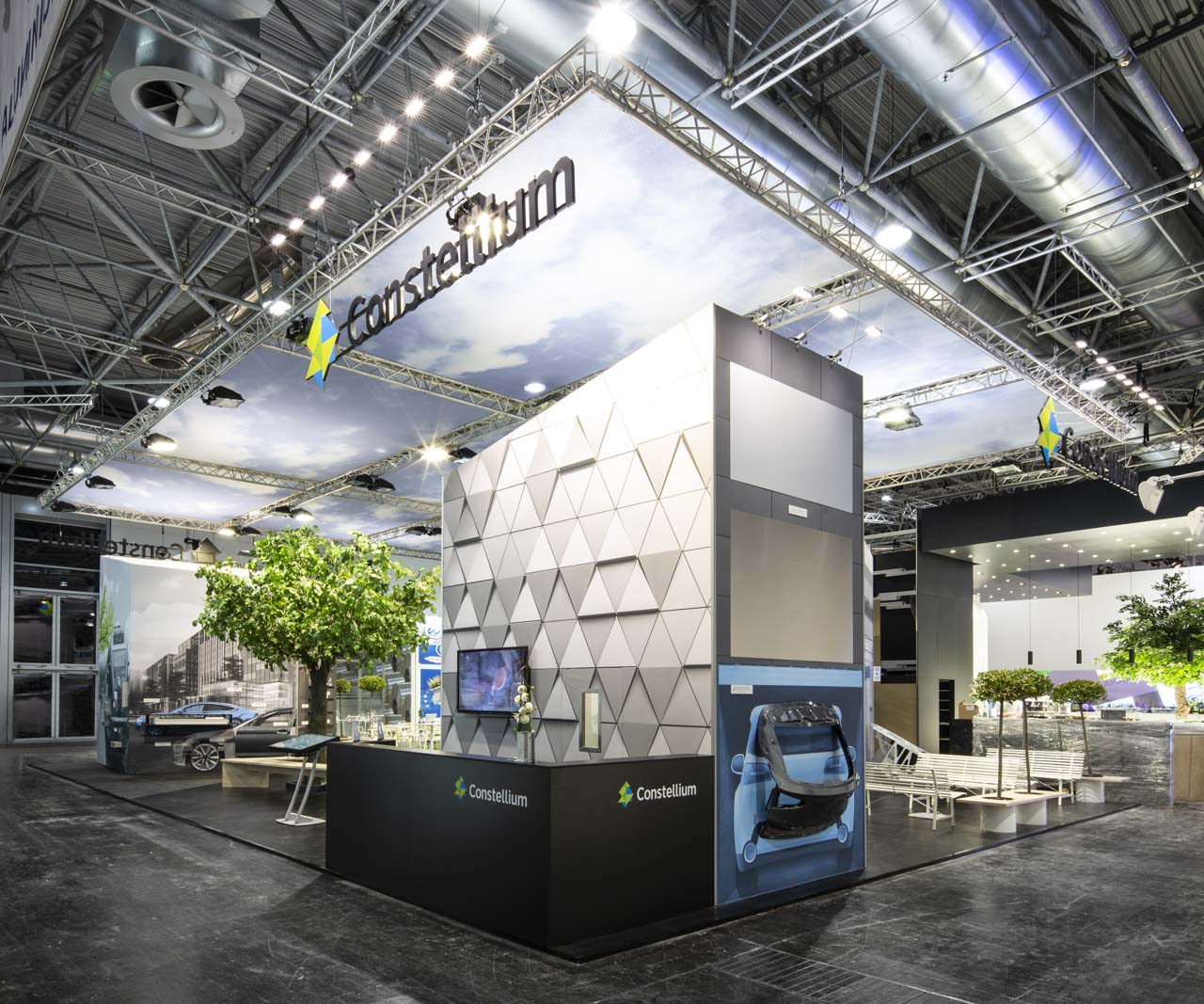
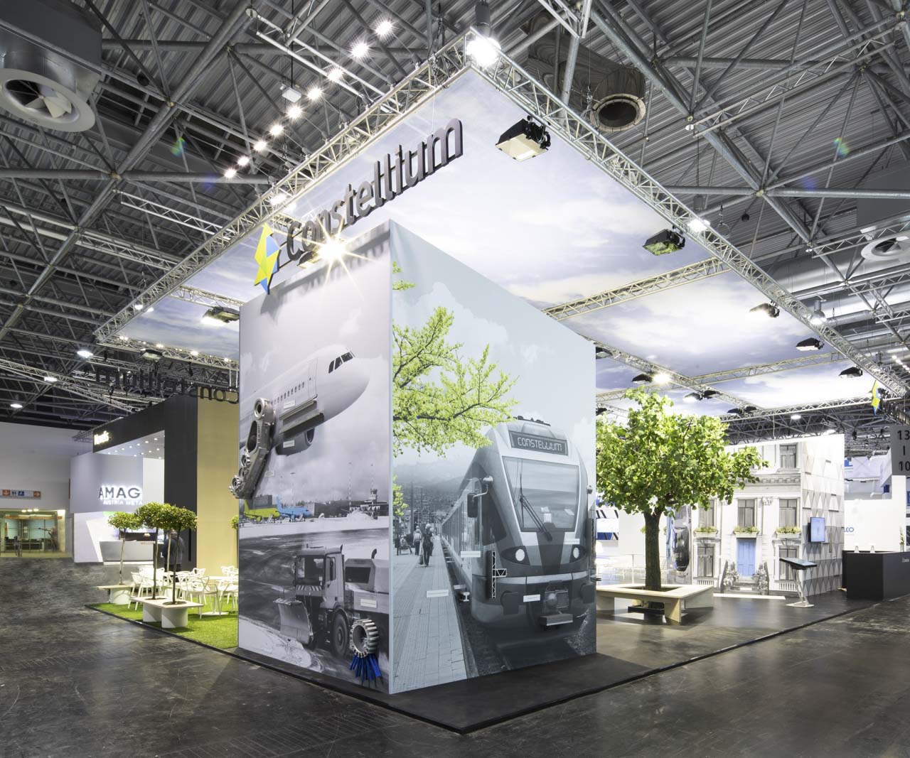
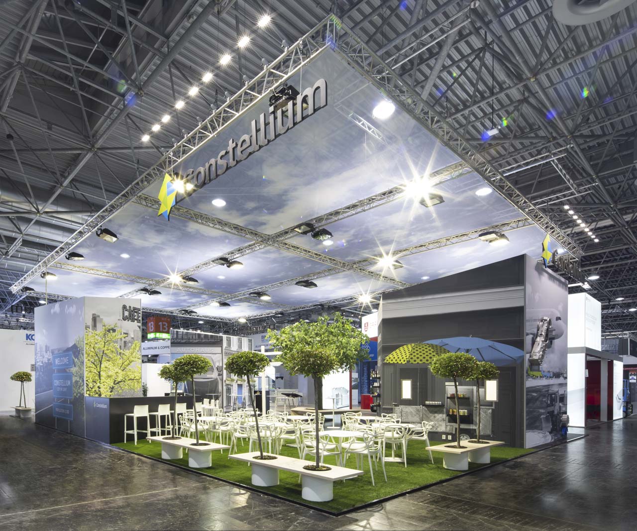
Trade show appearances are very important for Constellium to position themselves in the market. Months of preparation culminate in a presentation lasting only a few days. This is what happened at the world’s number one trade fair ALUMINIUM 2018 with a fabulous and award-winning stand created by the munich-based trade fair construction professionals from MEPLAN. The time window for the photography of such a booth is usually extremely small, as there are usually only a few hours between completion and the opening of the trade fair, at which the press release is sent out.



People photography
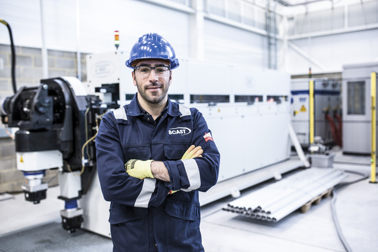
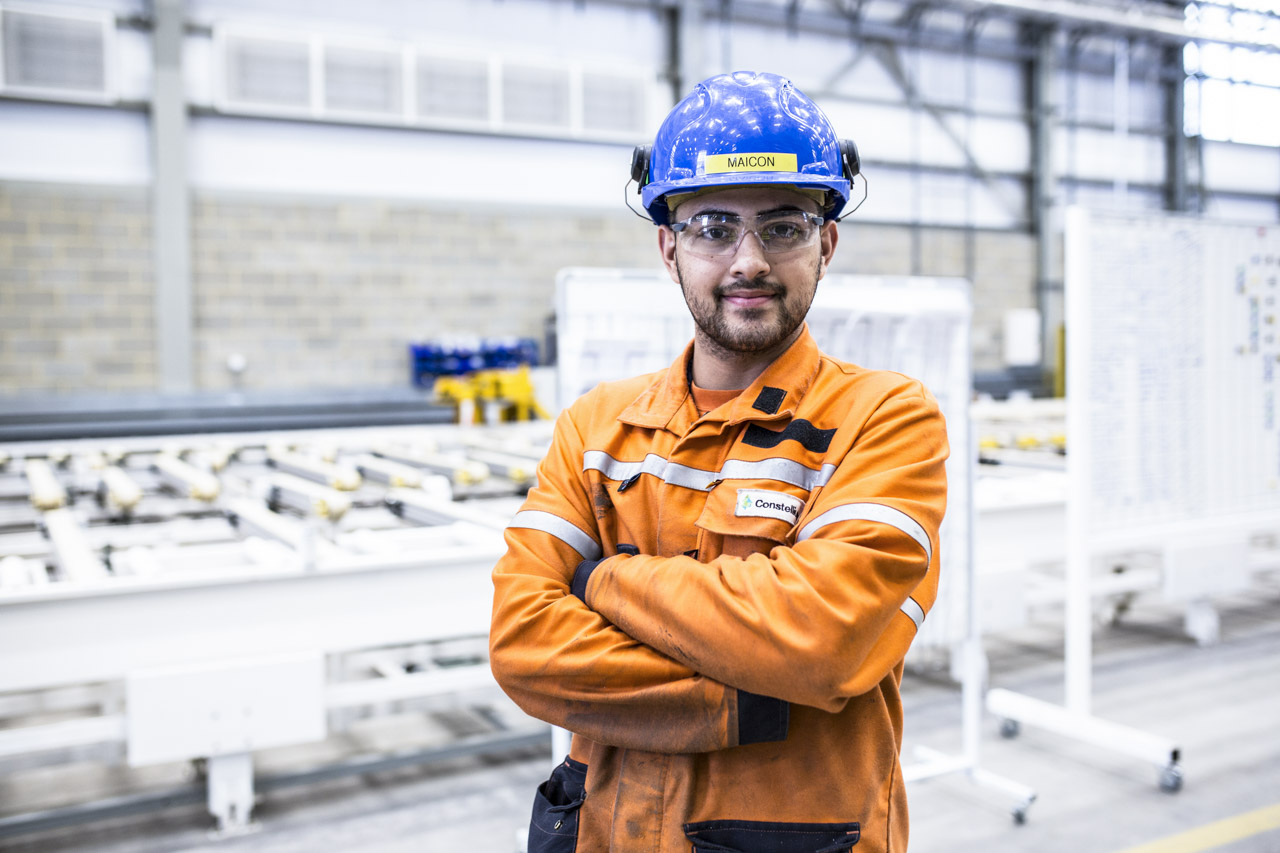
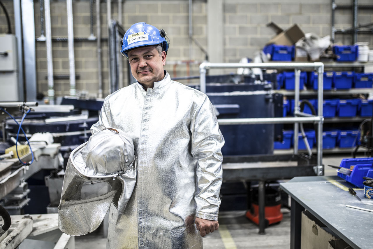
Proud of what we do – is the name of a campaign by Constellium that illustrates the high-quality products that the company and its team manufacture. It is also pride that is at the center of the image concept in the on-location people photography. Yet such a production is also possible on the fly – because we were in London primarily for filming and produced a whole series of photos of the employees on the side.


Reportage photography
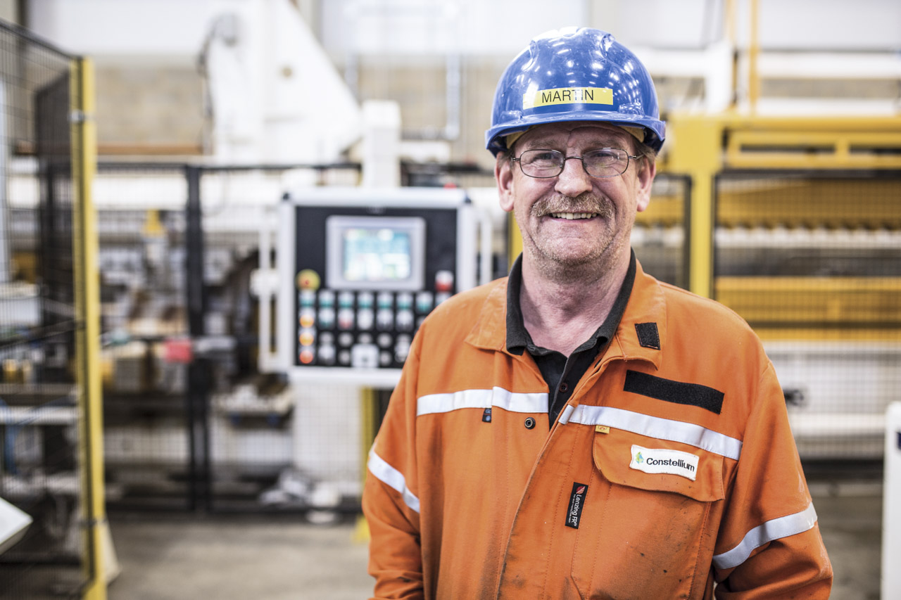
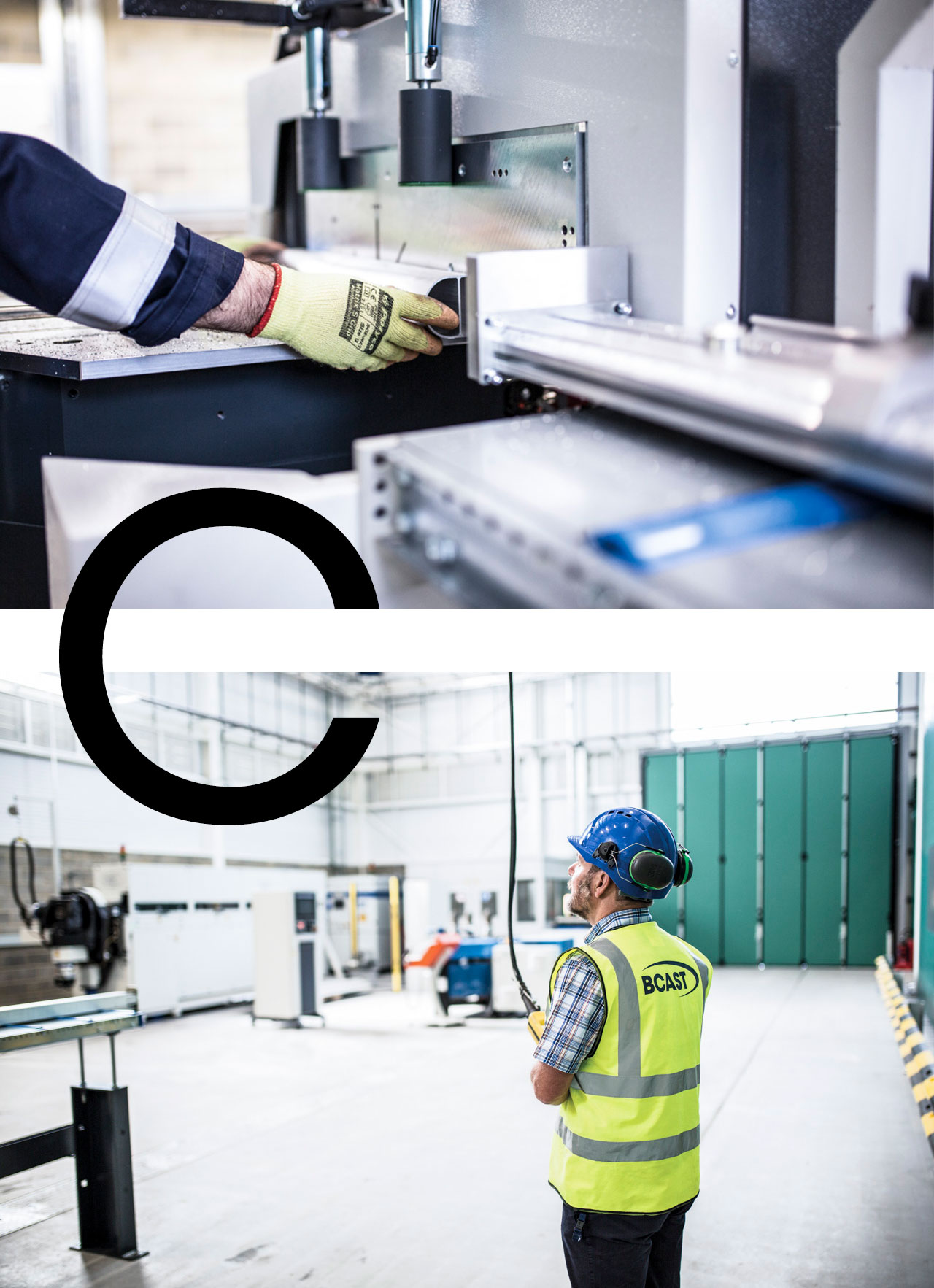
Perhaps the most underrated type of photography is reportage photography. It provides material that can be used in a wide variety of ways without much effort. It can be used to clarify processes and illustrate interrelationships. And quite incidentally, it also creates a versatile stock of press photos that massively simplify the creation of press releases.
Packshot
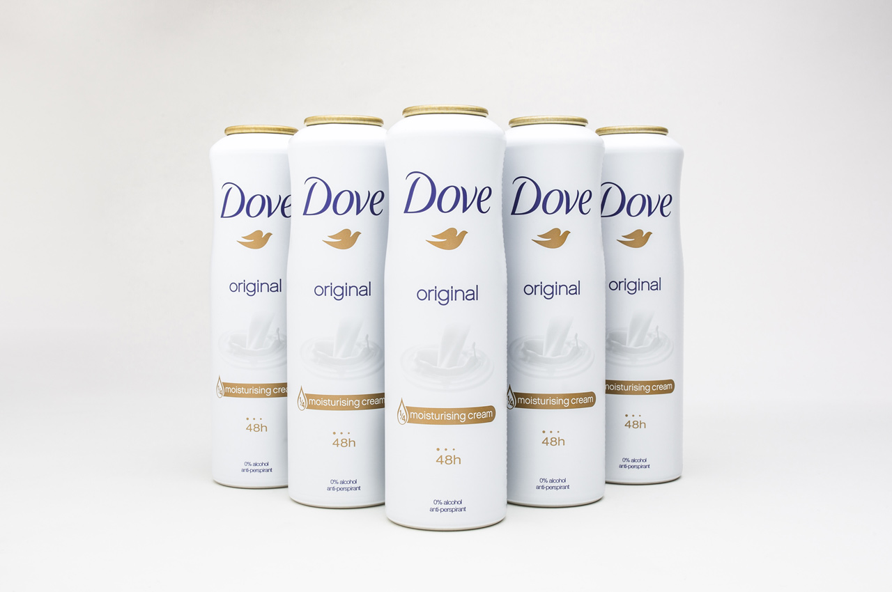
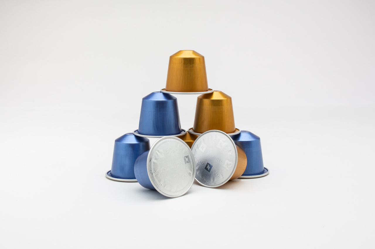
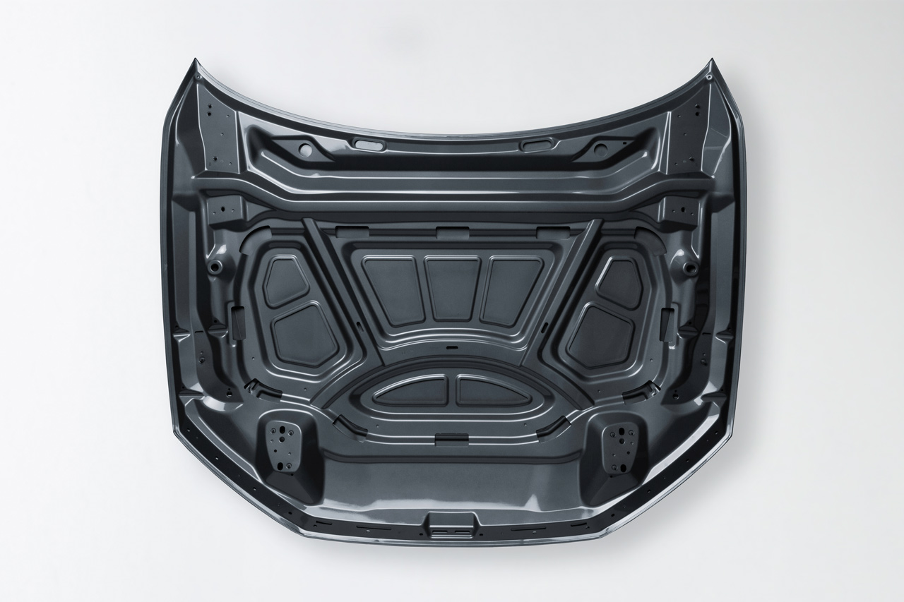
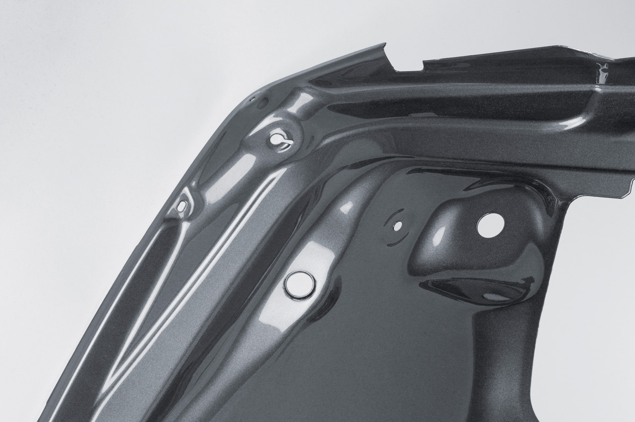
A manufacturer like Constellium is involved with its products in a variety of products. After a trade fair at which these products were presented collectively, it makes sense to photograph them professionally right away in order to be able to use the so-called “packshots” in publications and for internal communication. So the trade show kept us busy in our studio even afterwards.
laulima Branding
laulima – the fully agile competence center for manufacturing technologies
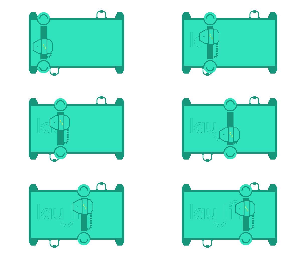
The laulima platform connects companies with manufacturing capacities with companies looking for a manufacturing solution, for example for small series or prototypes. The communication task was to combine an individual name with a fresh and dynamic appearance.
laulima
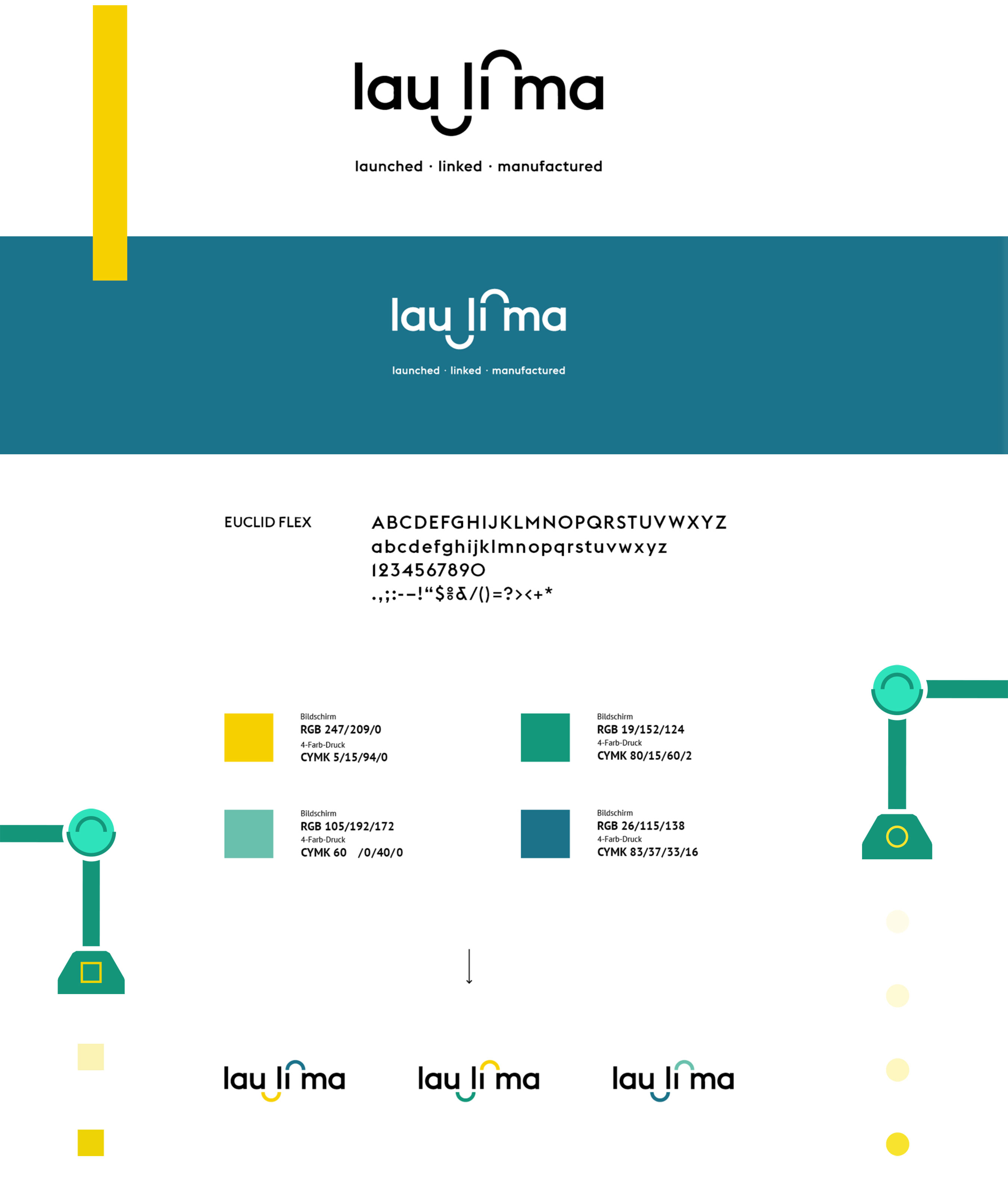
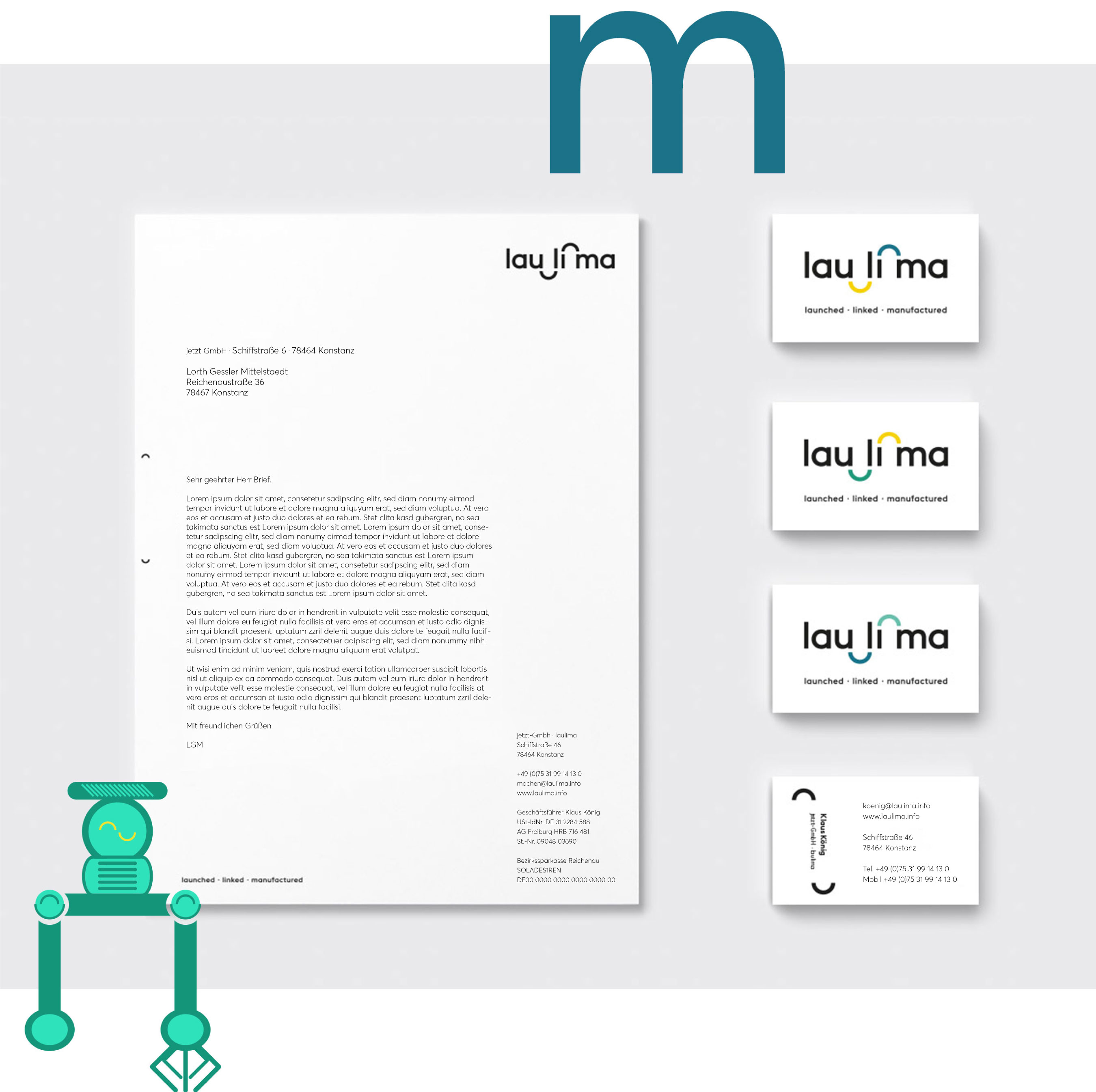
The name laulima results from a multi-stage creative process, the design should put the “connecting” in the foreground. With the semicircles and bridges, this was well achieved. A friendly typography paired with a “you” salutation underline the start-up character of the young brand. The appearance was then applied to print products and website in the next step
At the center of the website are two explanatory films that describe how laulima works and what benefits companies can generate. In the further course, the website will be extended by an extensive database connection.
Edeka Baur Jubiläumskampagne
25 Years Edeka Baur
There is a reason why Edeka Baur has become indispensable not only in Constance, but also in many other places in the region. It is the combination of freshness, quality and shopping experience that convinces customers. The 25th anniversary is a wonderful opportunity to celebrate this in its very own, down-to-earth way. We were commissioned to develop the anniversary campaign.
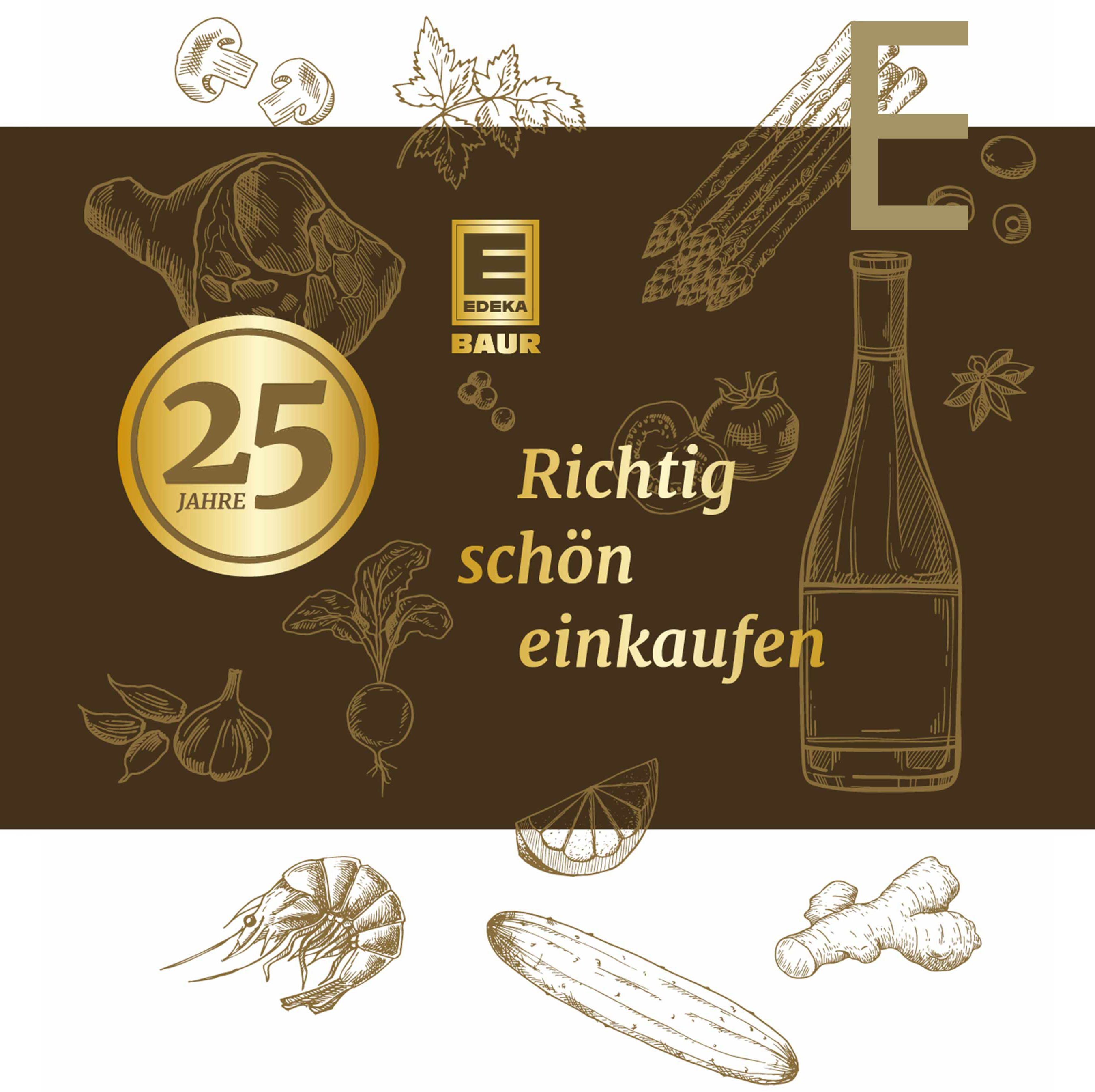
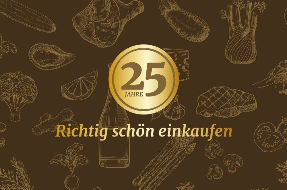
Despite all the joy about the renewed cooperation with our dear neighbors, we were aware: It is “just” another anniversary for the target group. Clarity in communication and finding the core of the message were therefore the top priorities. In several iteration loops, we developed a valuable signet and an emotional, powerful color world. We combined both and enriched them with a texture of food illustrations. The result was two implementations: One as a button, which in its circular shape brings a high compatibility to various applications on- and offline. And a second one as a kind of quality seal, which comes into its own in vertical applications such as flags.
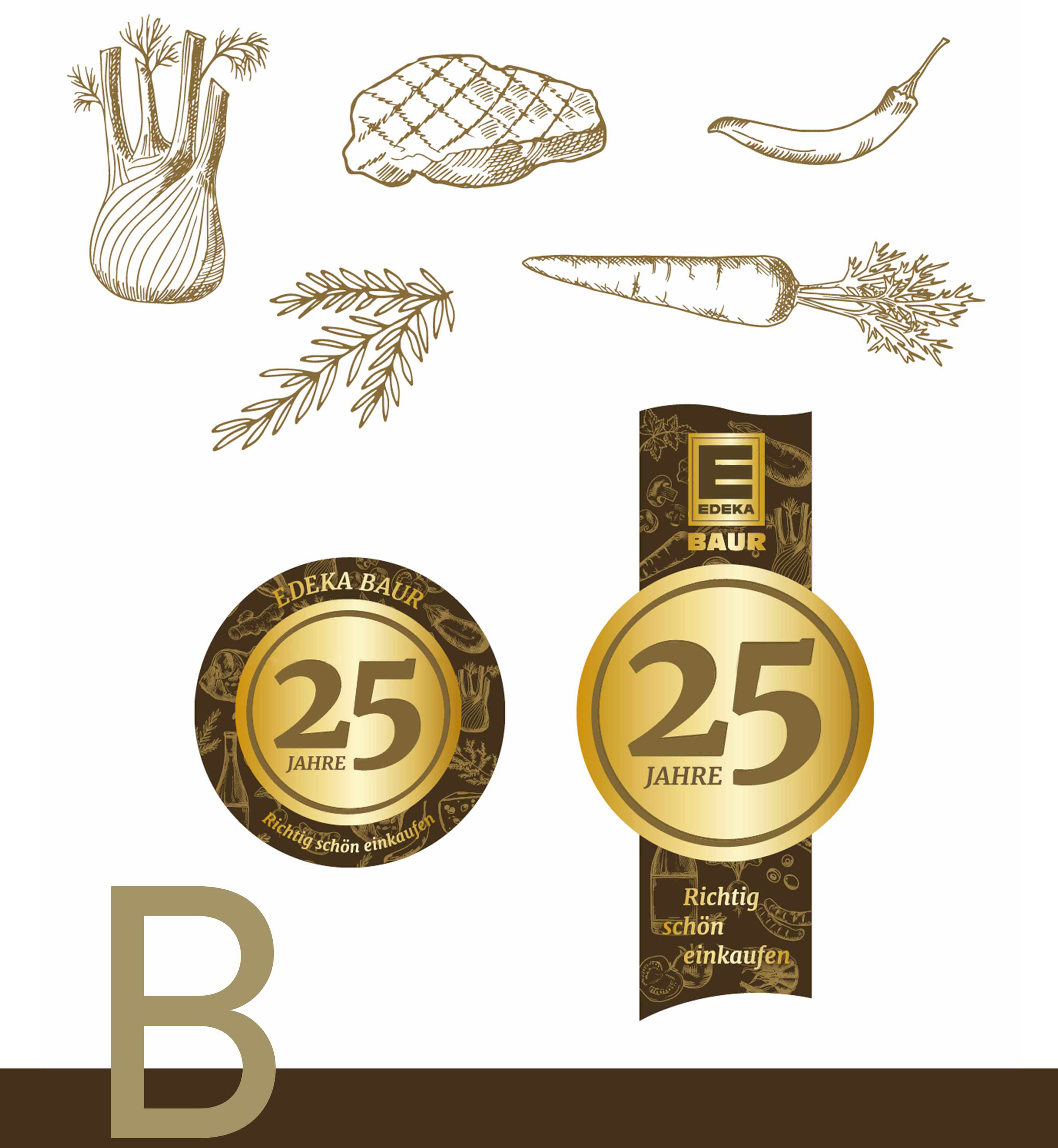
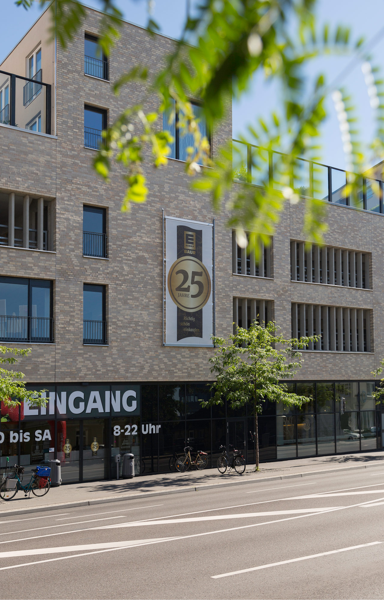
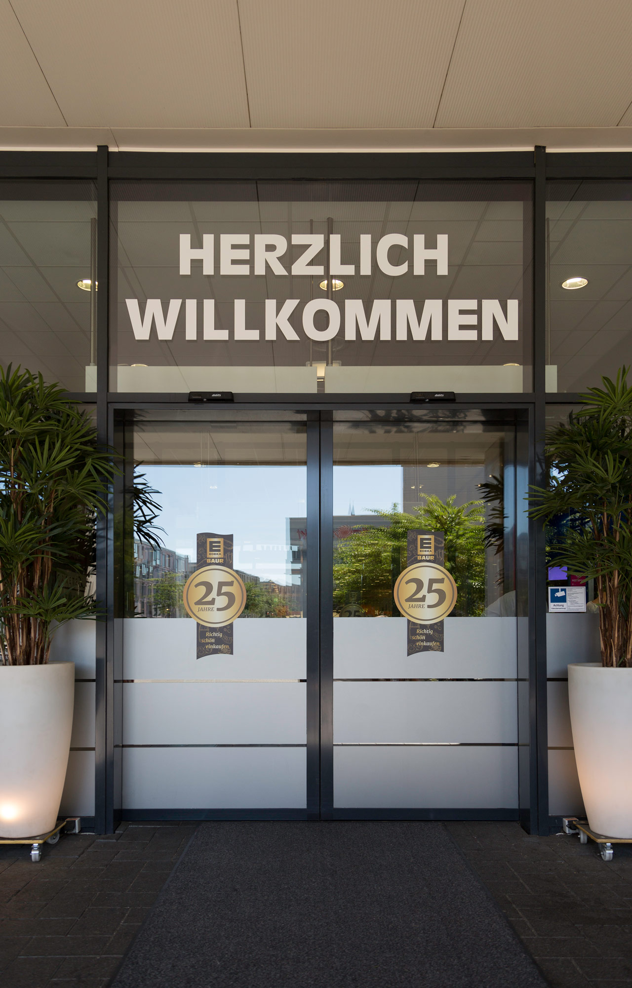
The anniversary design resulted in a campaign that will be played on various channels: As TV and radio commercials, on social media, on the company website, in an out-of-home billboard campaign, as point-of-sale branding, as customer and employee cards and, last but not least, on fancy buttons that all employees wear on their new professional clothing.
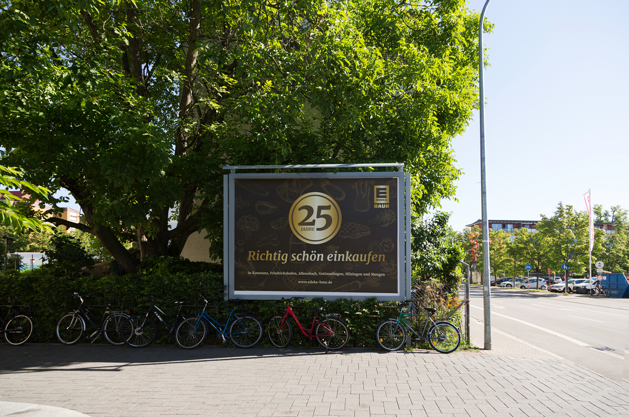
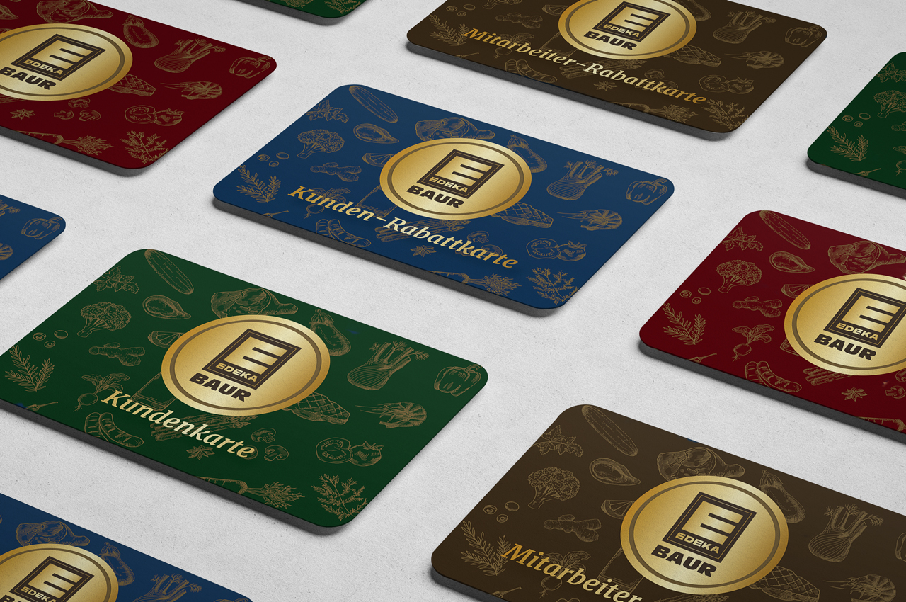
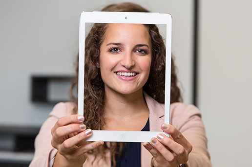
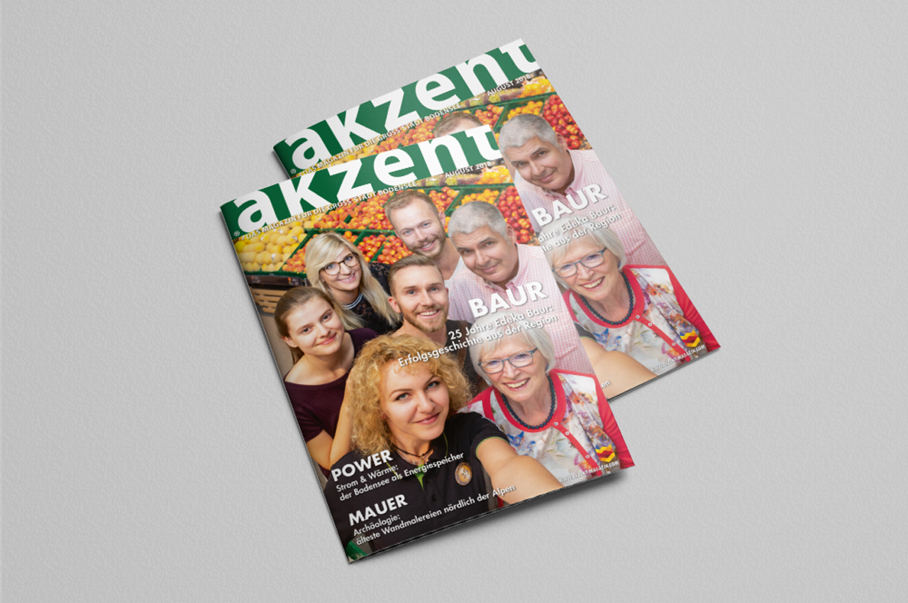
As an additional highlight, we were allowed to photograph the cover of the August issue of the lifestyle magazine Akzent. We translated the claim “Richtig schön einkaufen” into a picture concept: An Edeka Baur employee takes a selfie with customers of different age groups. Positive mood, credible actors – because the really were real employees and customers – and a positive, not exaggerated charisma were the result. It is not an exaggeration when we say: This job was a matter of the heart for us, because: We love our Edeka Baur.
Karlsstraßenfest Eventlogo
Karlstraßenfest in Tettnang
The Lions Club Tettnang Montfort organizes an annual fundraising event in the central shopping street of Tettnang, where money is raised for a good cause. A logo and design concept was needed for this event. As the agency of several resident companies at once, we took on this task pro bono.

Karlstraße is for the beautiful town of Tettnang something like the Champs-Élysées for Paris: a central shopping and strolling street with a beautiful ambience and numerous stores, restaurants and cafés. All the more so since the new pavement has given the street a new shine, it is a pleasure to stroll here. A special feature of Karlstrasse is the steady but moderate gradient, which gave the members of the Lions Club Tettnang Montfort the idea of a charity event: While there are always rubber duck races for good causes along river courses, the Lions are organizing a ball race that goes down Karlstrasse. The balls are sent into the race for an entry fee and whose ball is one of the first to roll through the finish line wins attractive prizes. The proceeds go to charitable causes. This race is one of the main attractions of the street festival, which was unceremoniously developed around it, and for which the organizers commissioned us to develop a logo.
Two central thoughts guided us in the conception: Firstly, the Karlstraßenfest should develop into a popular date in the Tettnang city calendar. To achieve this, it must radiate one thing above all: Joie de vivre. And secondly: The ball race is one component, but not the only one. It is a distinguishing feature from other festivals, as it is closely linked to the nature of Karlstrasse. Nevertheless: The term ball race does not appear textually in the logo, but it does as a graphic quotation.
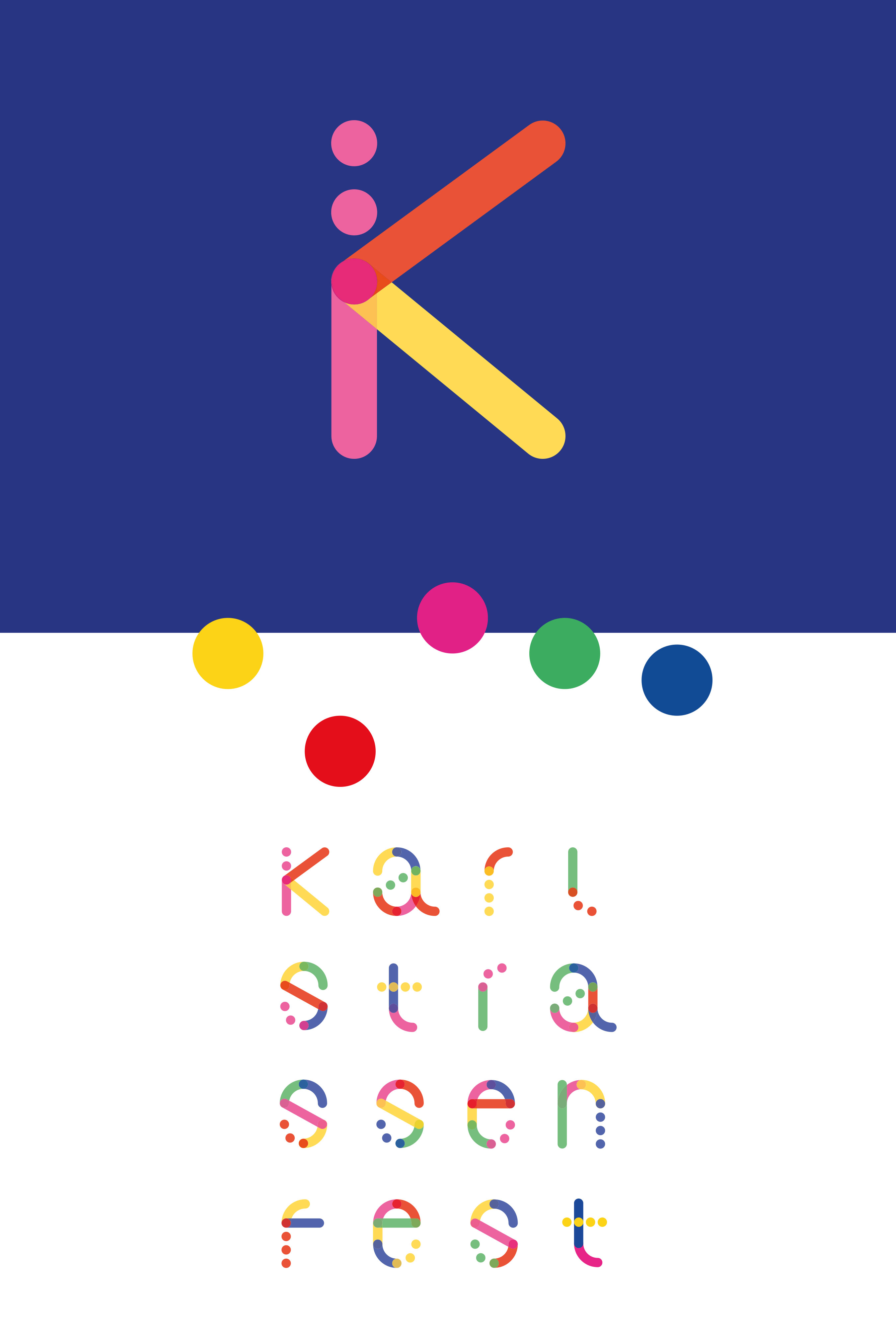
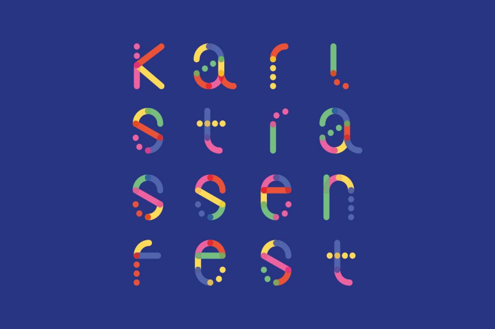
With an atomic design approach, we have ultimately brought these thoughts to the point. Because our logo design is created from dots that stand for the spheres as the smallest parts, the atoms of this design, so to speak. These atoms combine to form molecules: The sphere can be combined with other spheres or even distorted into a line. Lines and spheres combined together again make organisms: Letters.

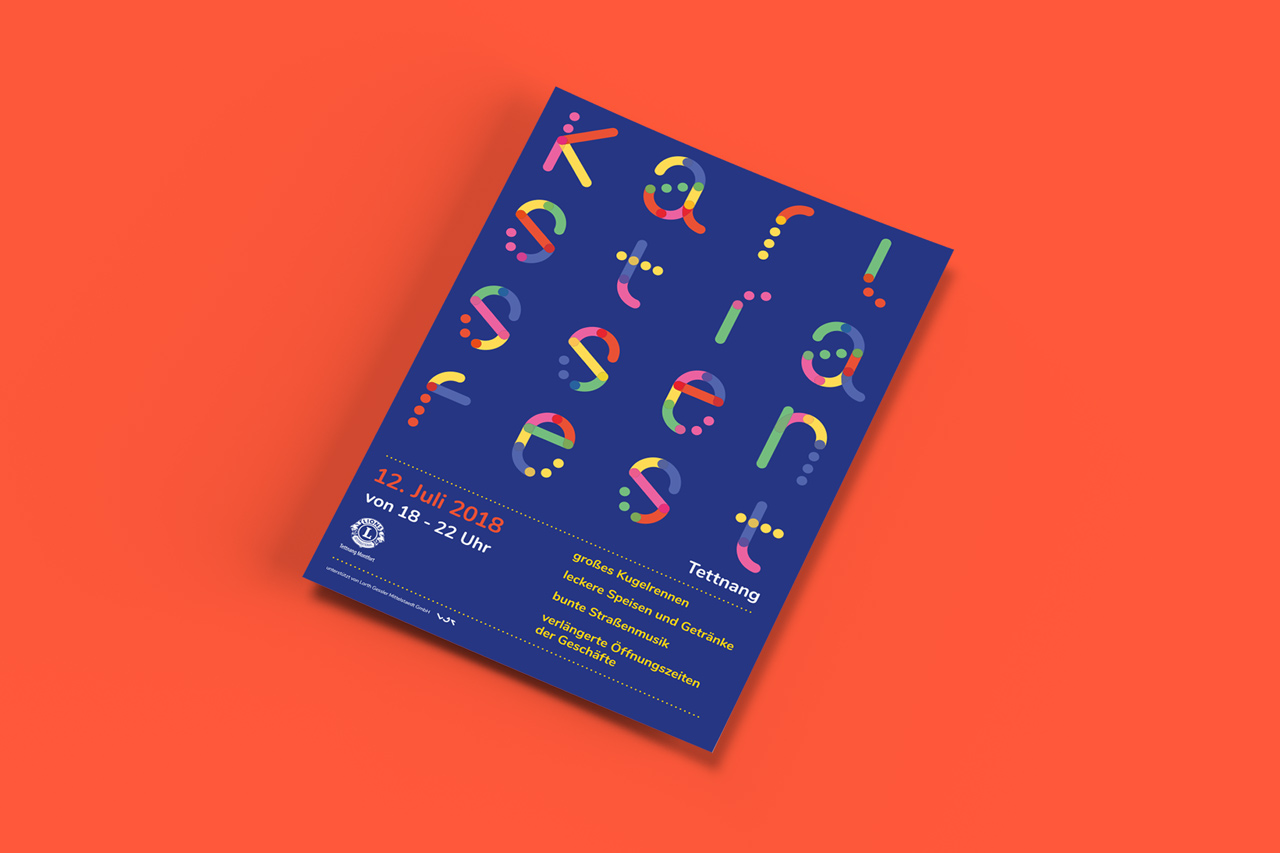
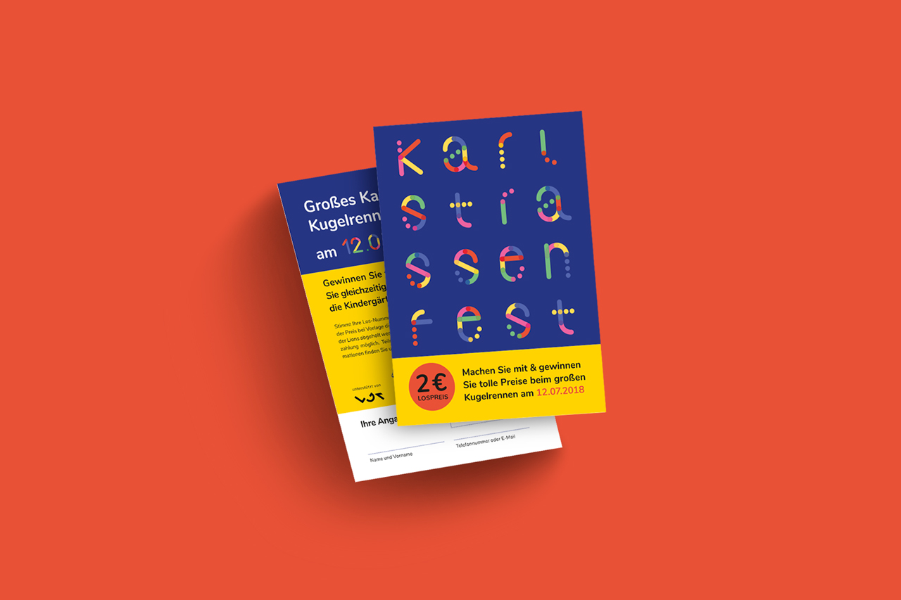

The result is the memorable, lively and super-modular sphere logo of the Karlstraßenfest. It works in all formats and perfectly on catchy posters. It’s also ideal for digital use, for example with animations for Facebook or Instagram.
It’s nice when we can let our creativity run free and do some good in the process.
Soho Lago Imagekampagne
Soho – Image Campaign
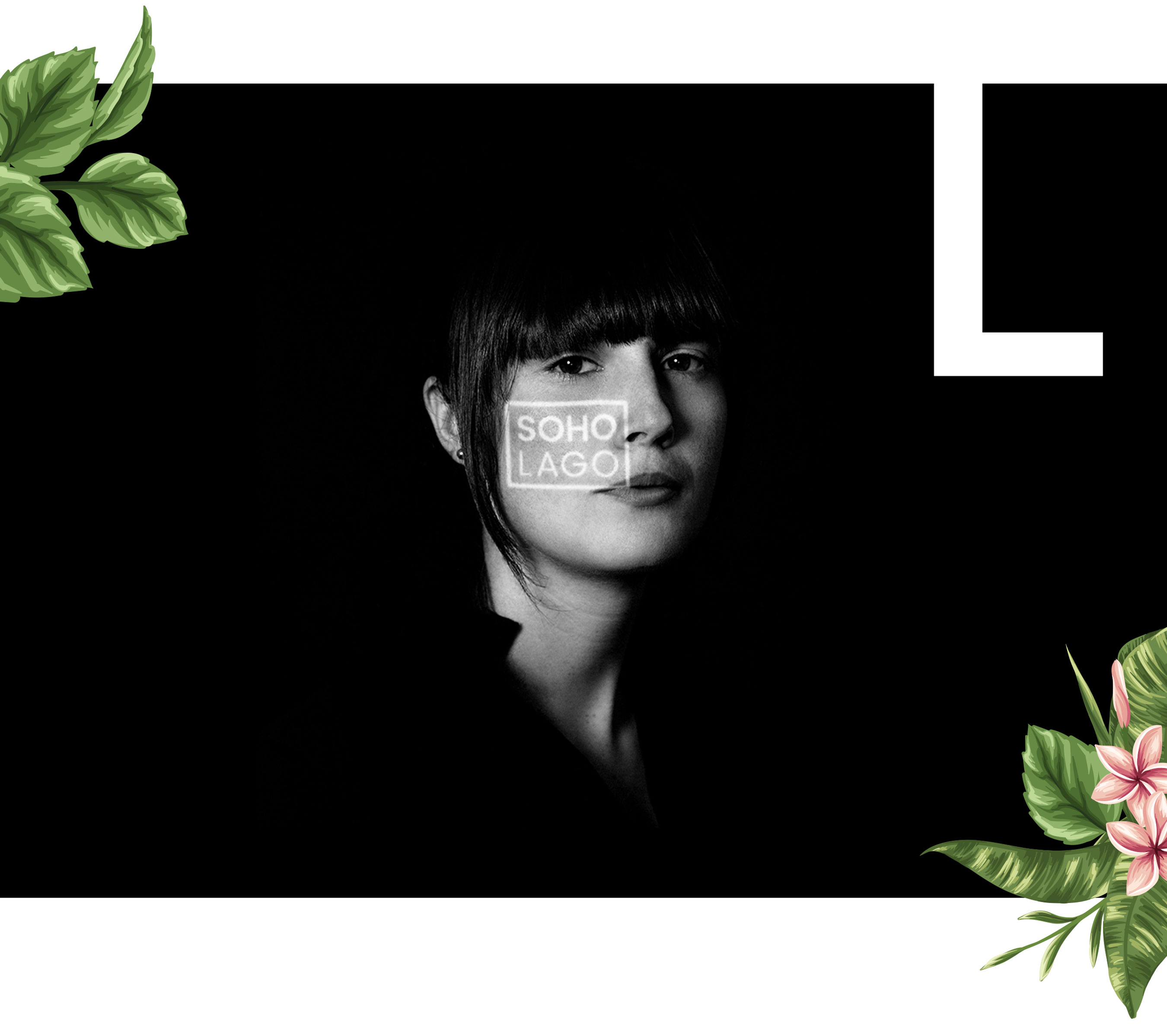
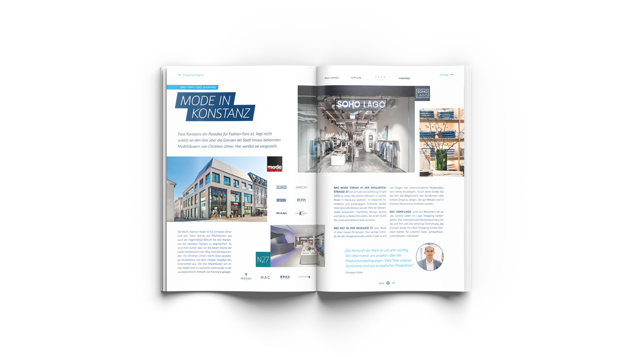
The new fashion store from Ulmer Mode in the Constance Lago Shopping Center is a great success. The concept of modern urban litestyle in a loft-like store is very well received by customers. It was these female customers that we focused on in our advertising campaign. The “SOHO LAGO Face 2018” photo campaign was such a success that on the day of the shoot we even had to put off candidates until the next time.
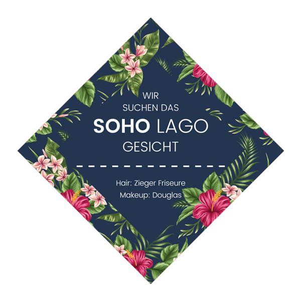
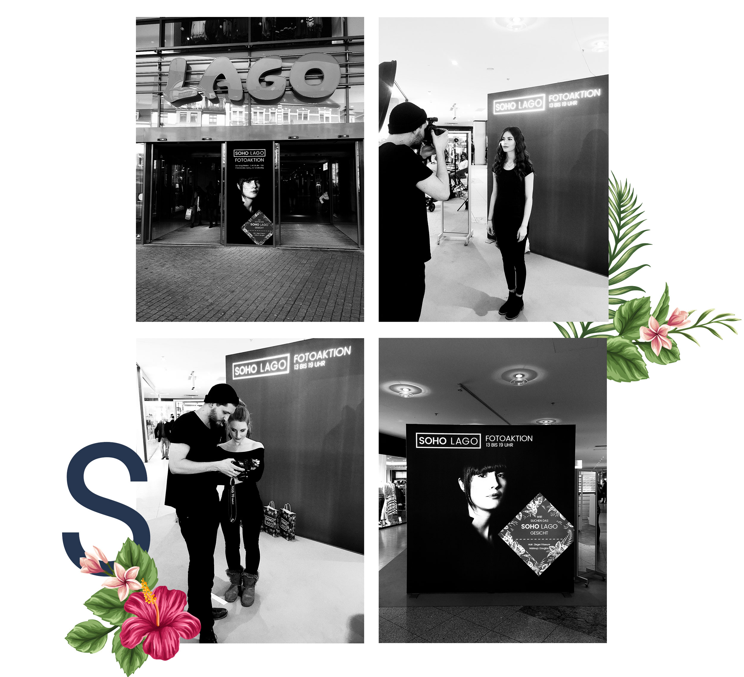
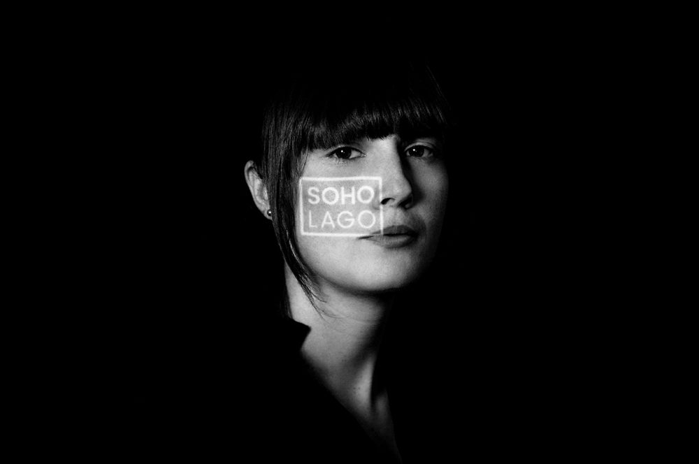
On a Saturday afternoon our photo studio was set up in the LAGO Shopping Center Konstanz. All participants were optimally prepared for the photo by the campaign partners: The team of ZIEGER FRISEURE styled the hair and the make-up artists of DOUGLAS took care of the make-up. The photos were taken in an elegant black-and-white look, with a special feature: the SOHO LAGO logo was projected onto the face. We took over 3,000 photos back to the agency that day. The best pictures were later posted on the SOHO LAGO online channels. And the best picture was used for print advertising. All participants were rewarded with shopping vouchers and received their picture as a souvenir.
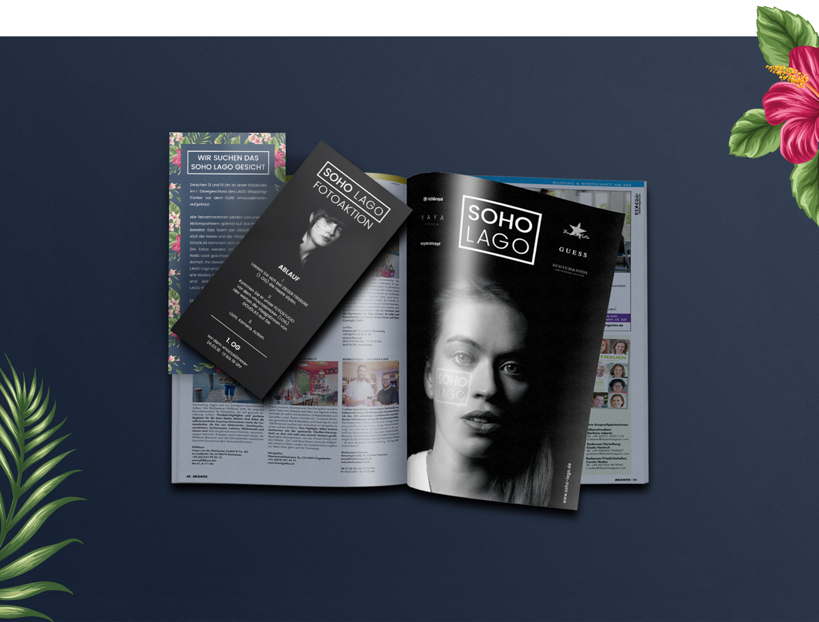
We deliberately scattered the advertising for this campaign only at the point-of-sale, on the website, and on social media channels. The central approach of this campaign was to involve the target group in the advertising. And this in a direct as well as in an indirect way. This was because the images were subsequently placed as Facebook ads in the respective place of residence of the participants and in the immediate vicinity. This significantly increased the probability that the advertisements were consciously perceived. After all, anyone who sees an ad with a face from their circle of friends has a much higher level of attention due to automatic selective perception. In the end, this campaign gave everyone involved a lot of pleasure and showed one thing above all: The target group is interested in advertising campaigns when they are involved at eye level.
