Soho Lago Branding
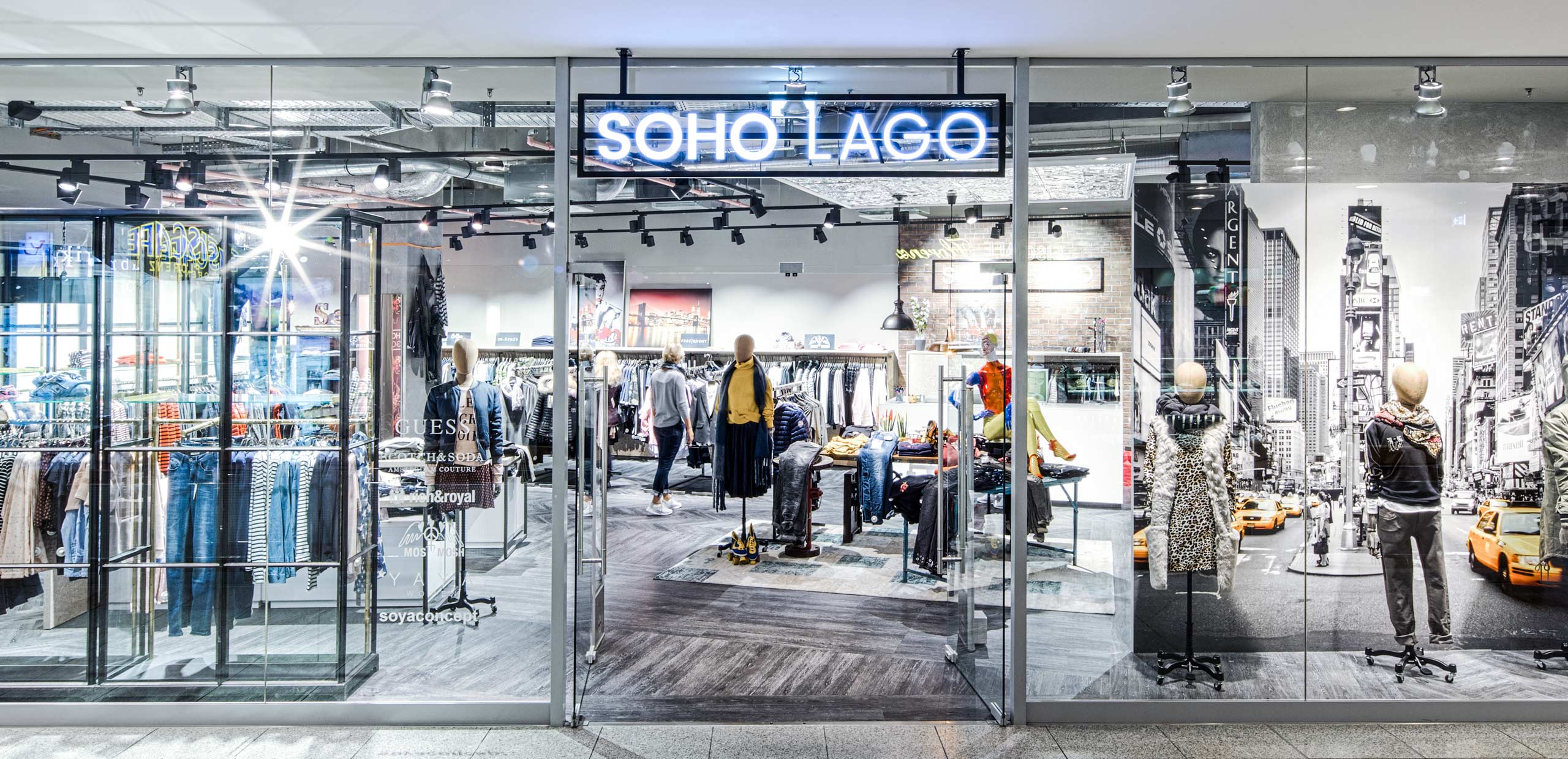
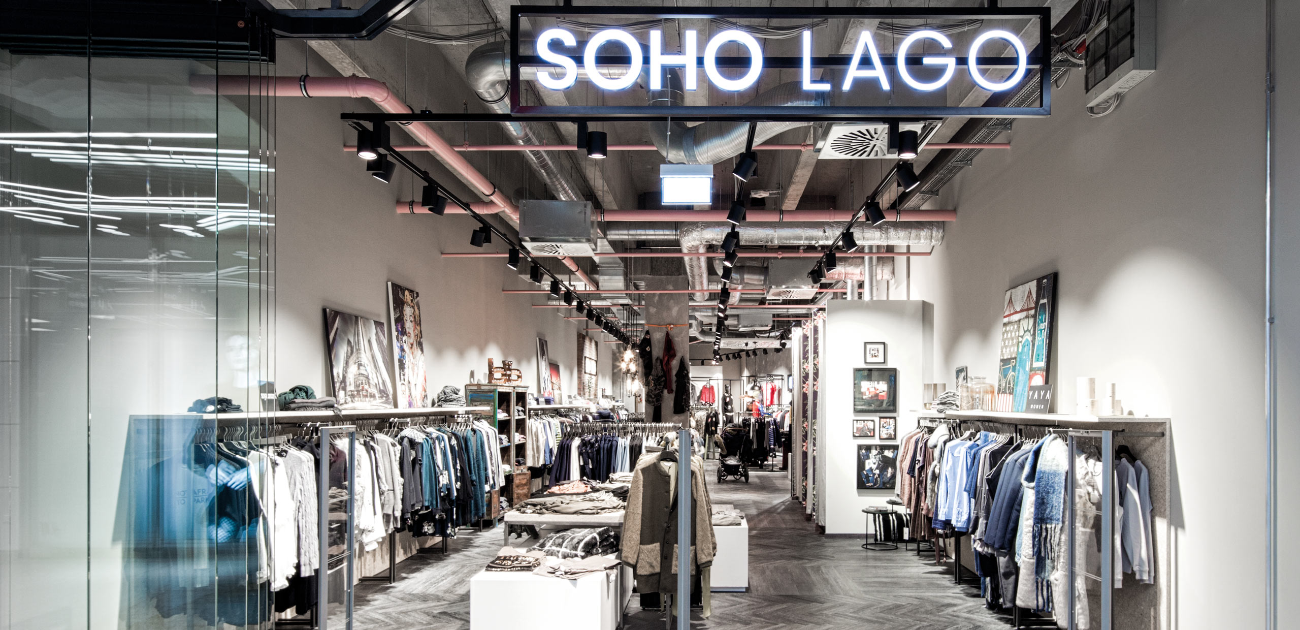
In our opinion, SOHO LAGO is the most beautiful store in Germany’s most successful shopping center, LAGO in Constance. Shopping there is an inspiring experience for women as well as for men. Many people have given their best to make it so good: the visionary Christian Ulmer, the shopfitting experts, the interior designers and many more. We were also allowed to do our part by developing the branding and corporate design.
Ulmer Mode GmbH & Co.KG
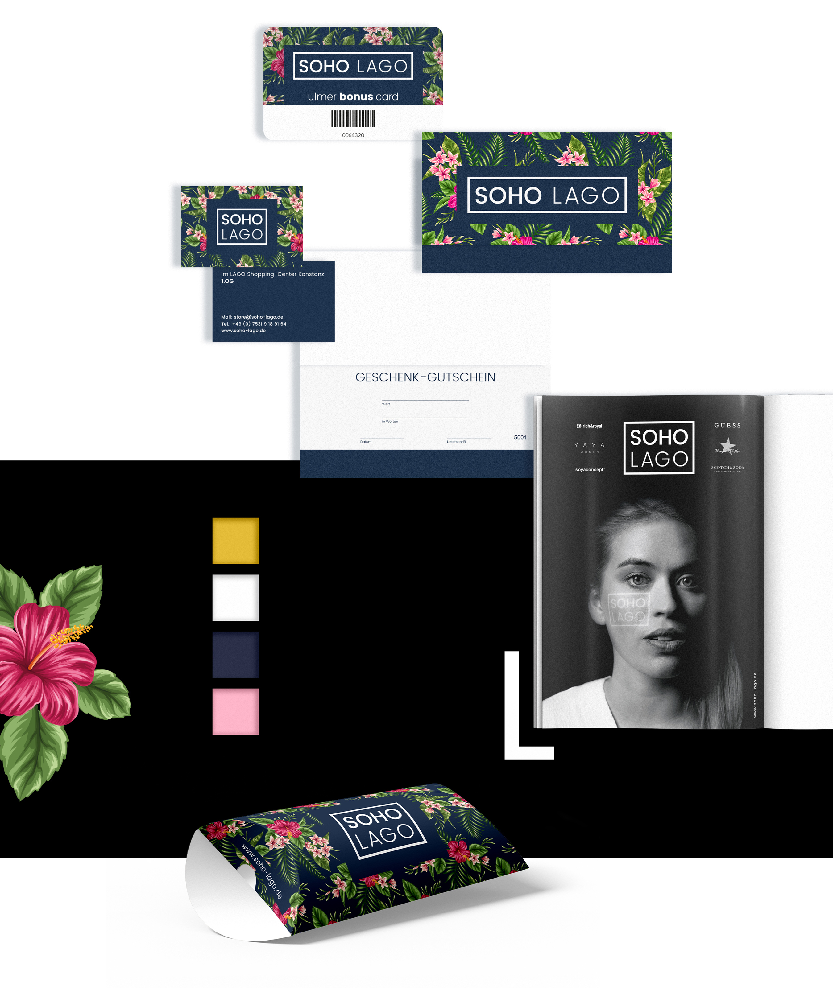
A branding project like this lives from the time and love you put into it. As was the case with the successful launch of the N27 years ago, the excellent chemistry between the client and our team proved itself again this time. First, we started the name search, which produced a whole series of suitable names. In the end, the decision fell clearly on a suggestion from the client, which we then gave a face: Soho Lago. Clarity in the design and in the choice of design elements was our credo.
We were helped by the definition of the target group. At the beginning, SOHO LAGO only sold fashion for women, which is why the formulation was purely female: Our customer is a vital, human and visually attractive woman who is successful at work but not a careerist. She is educated, but does not brag about it. She eats healthily, but is not averse to indulgence and occasionally lets things slide. She is empathetic and cares for her circle of friends. She is sexy in an unobtrusive way. She is sporty and relaxed at the same time: no overambitious goals, but feel-good fitness. She loves traveling, but is very happy where she lives.
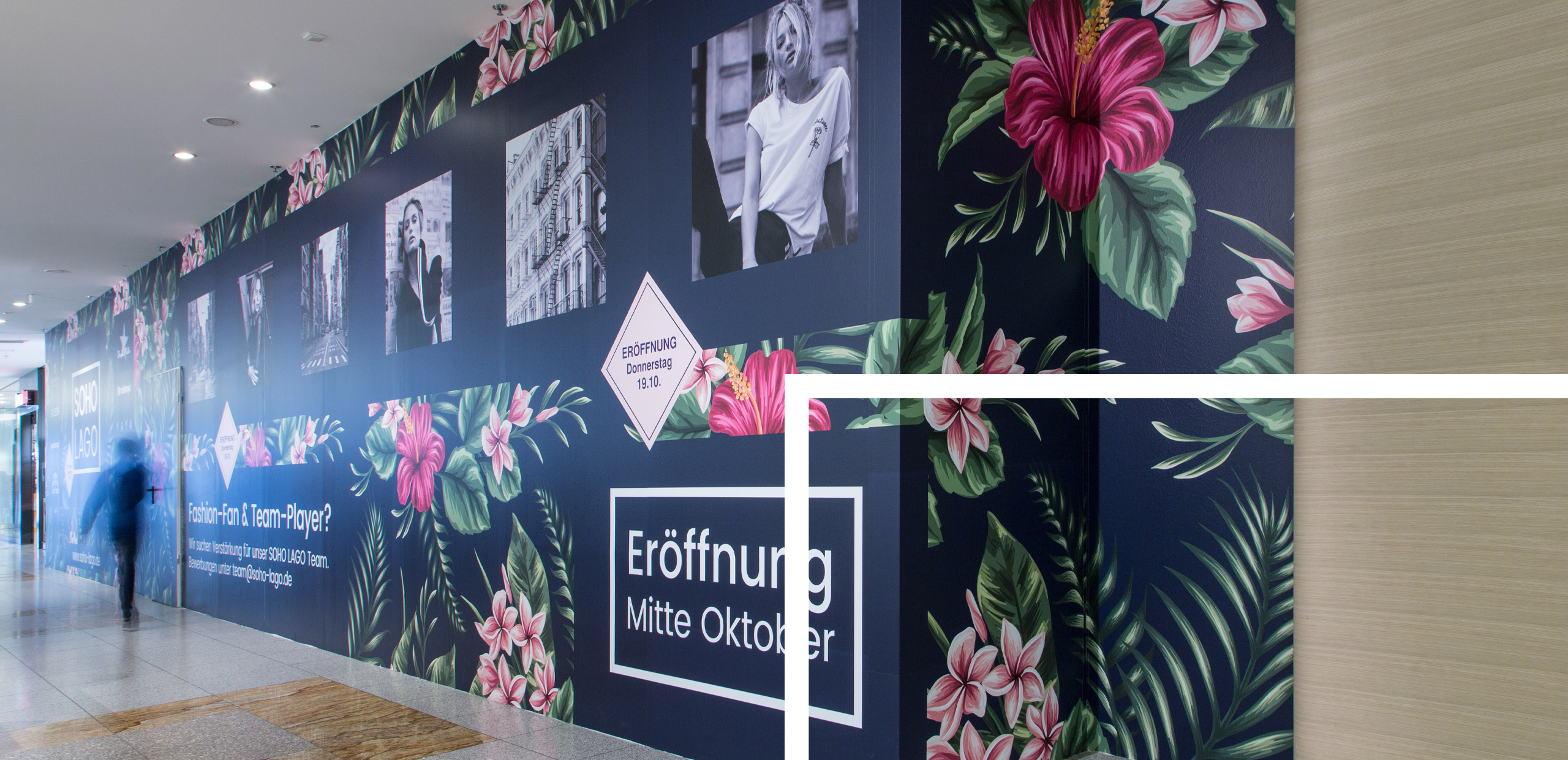
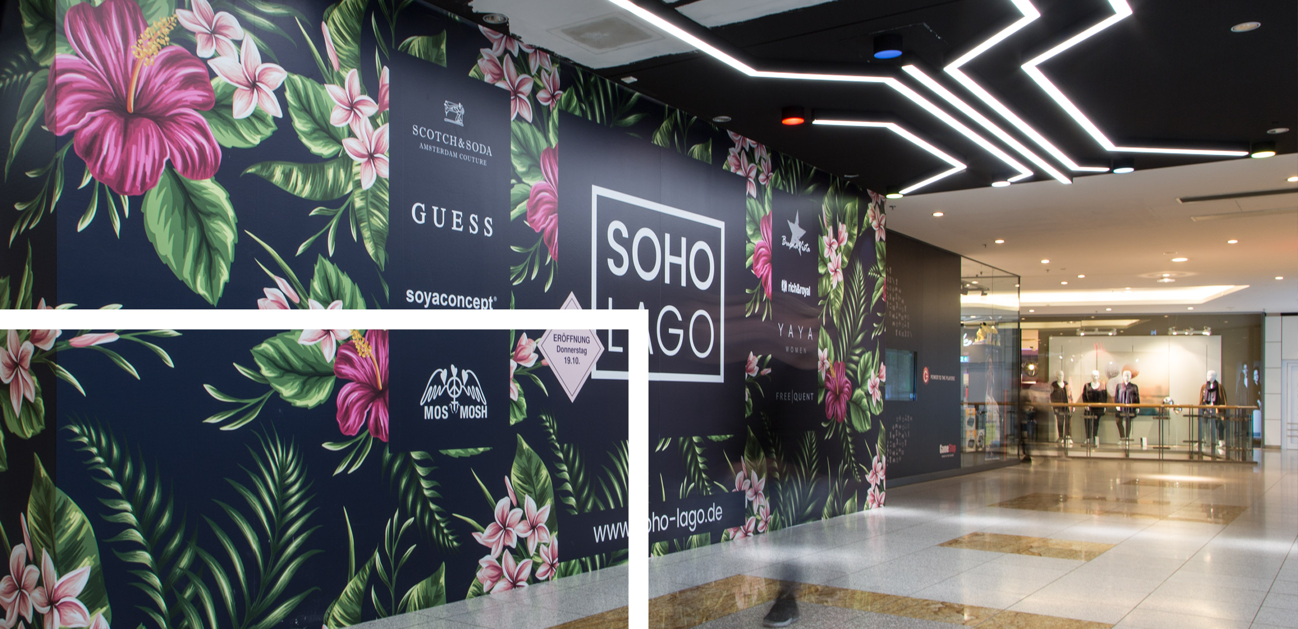
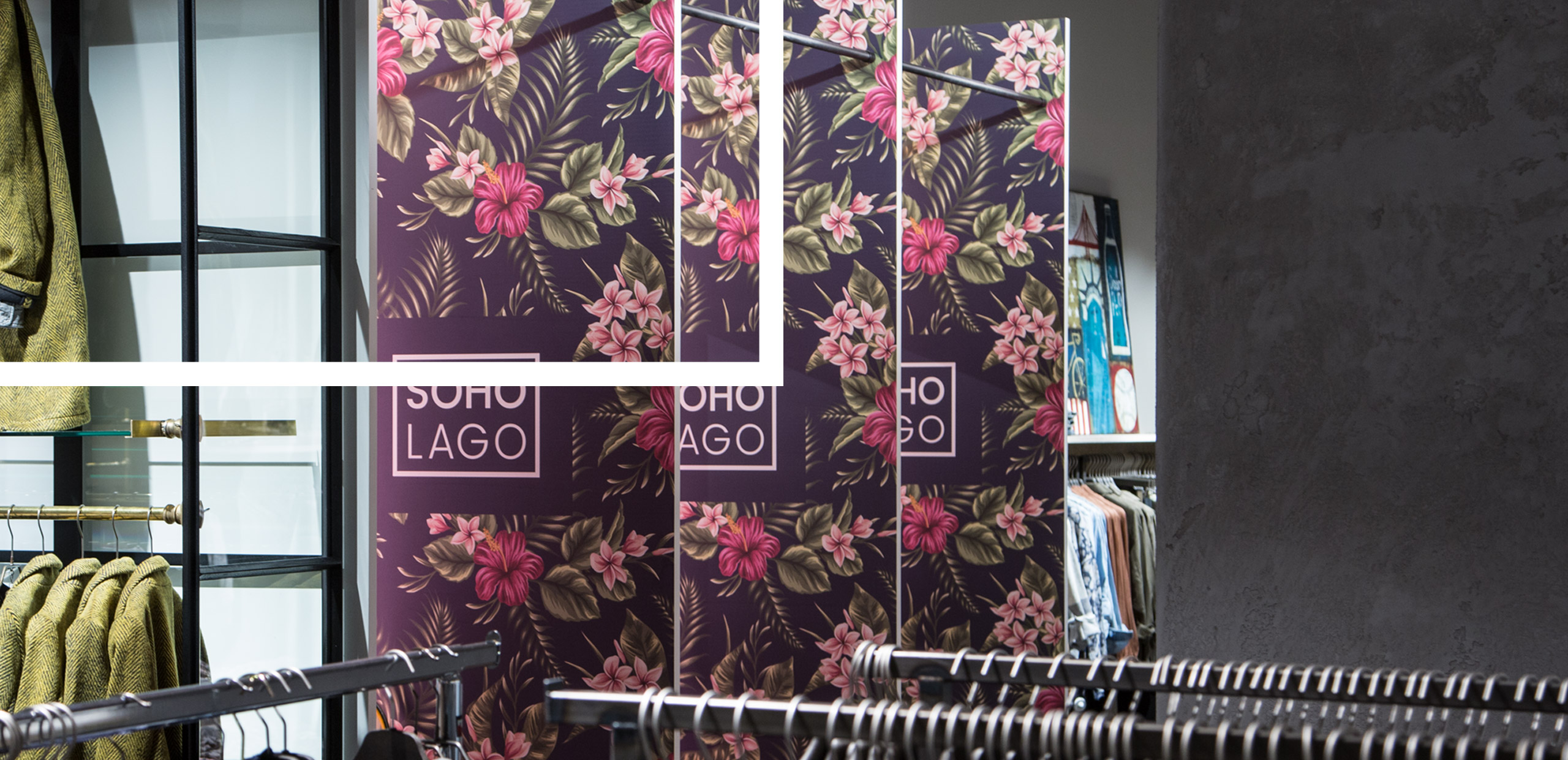
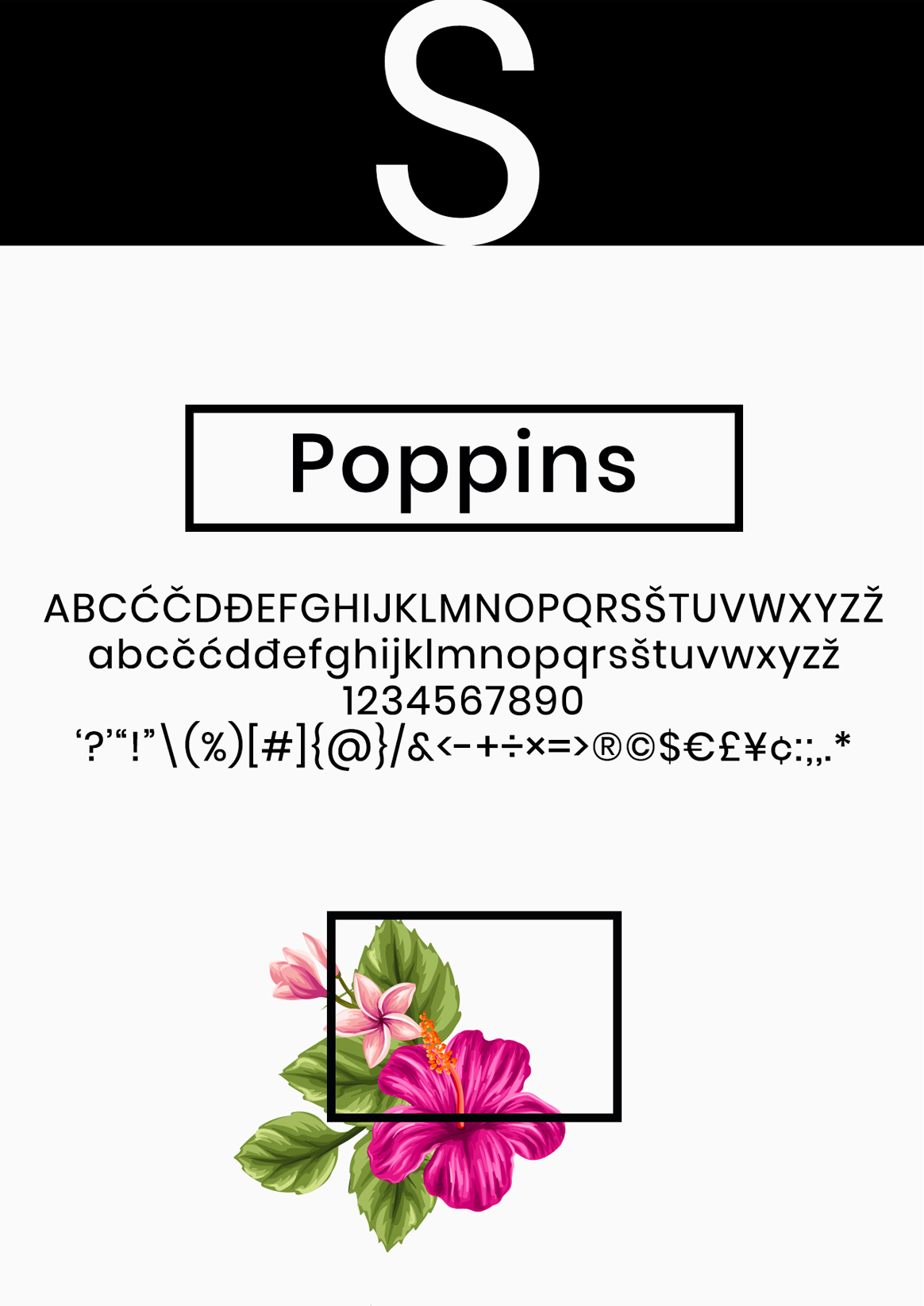
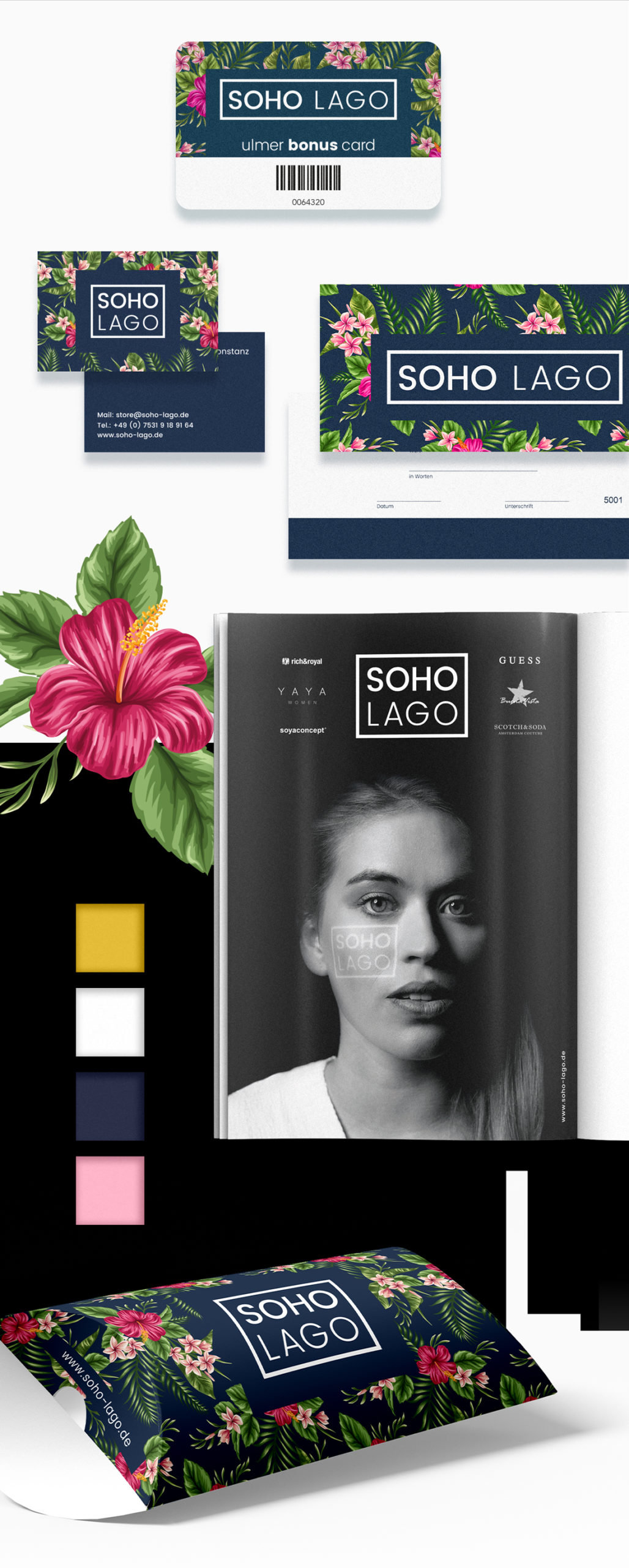
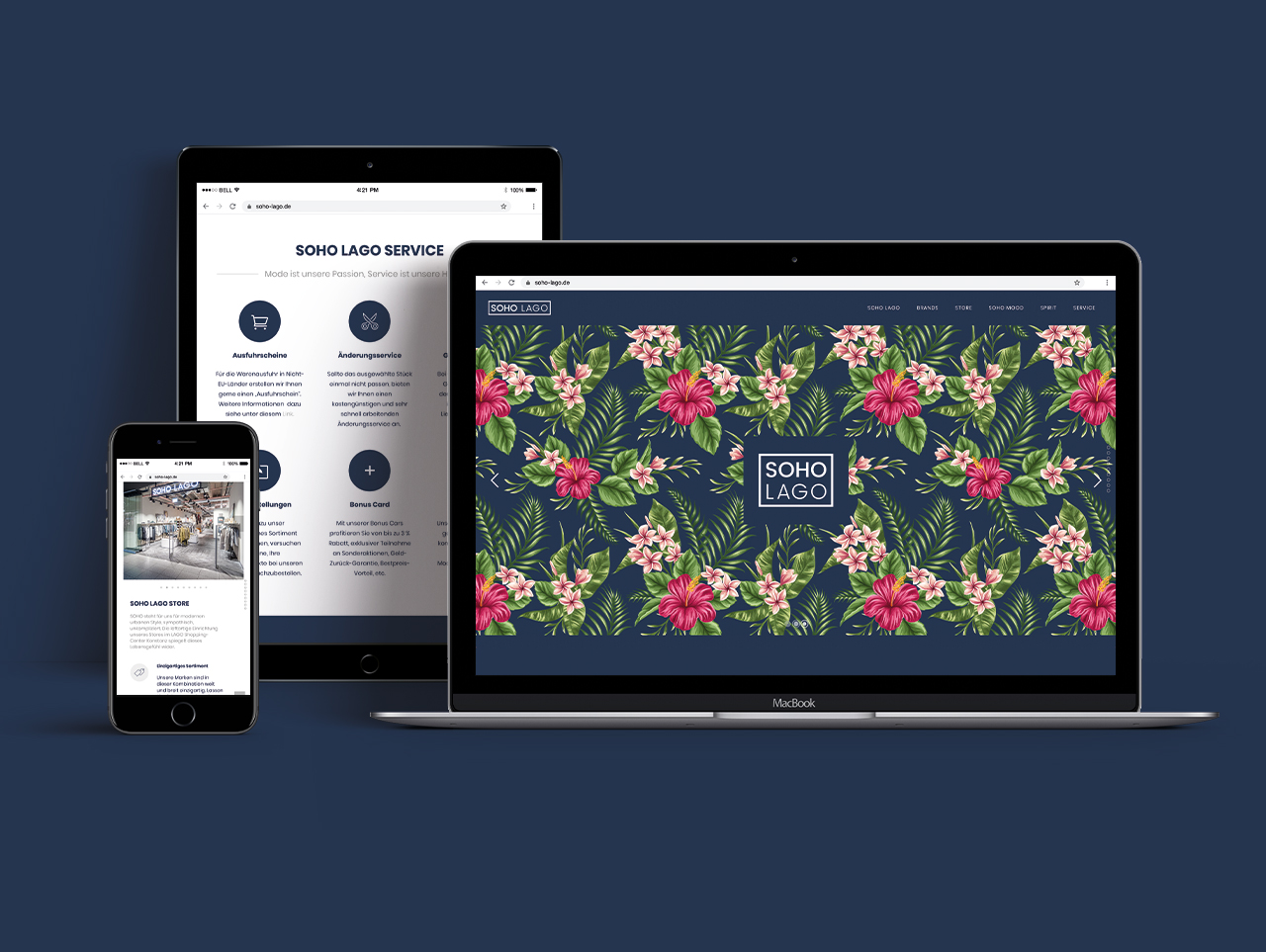
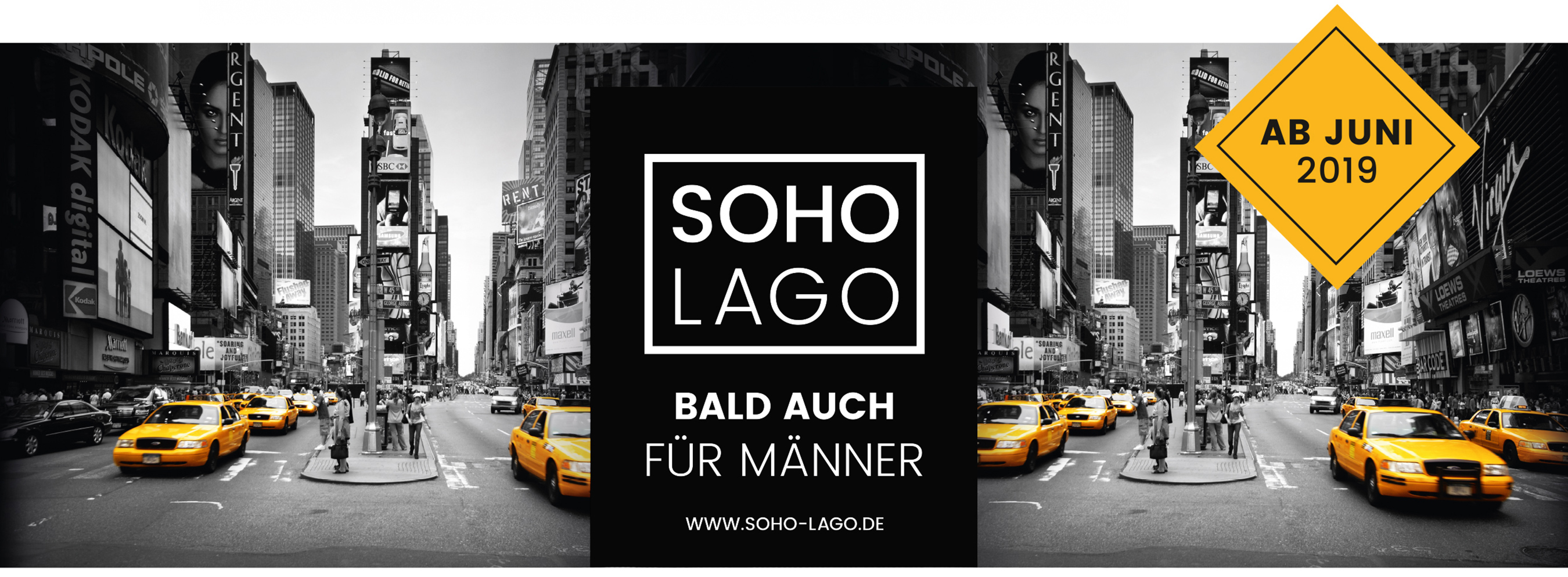
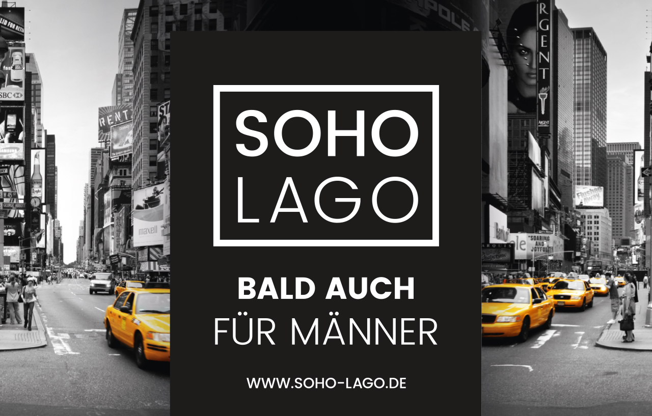
The tonality of SOHO LAGO’s visual and textual communication was derived from this definition. Self-confident. Not cool, but cosmopolitan. Headlines in English, other texts in German. We used the illustration of a tropical flower motif consisting of plumeria and hibiscus by the illustrator Volha Manusovich from the USA as a graphic-emotional counterpart to the clear lines and the deliberately versal logo typography in two font styles and the frame. The result is an image that can be used in a variety of ways and at the same time opens up a creative freedom that optimally conveys the visual identity across all media and is also compatible with the expansion of the range of products for men. We love branding.
