empen optik Website-Relaunch
From the point of view of the people in Tettnang and Friedrichshafen, Empen Optik is a genuine “local” company. Because owner Sven Empen is a Tettnang native with heart and soul and has learned the profession of master optician from scratch. For many years, we have had the privilege of accompanying one of Germany’s most innovative opticians in the fields of communication, design and marketing. After almost ten years, a website relaunch was now due.
Already in 2010 we realized the Empen Optik website, which functioned conceptually above average for a long time. This was due to the motto “Content is king”, which we followed by designing a vibrant website with a central, deliberately personal blog. Since then, the online world has changed completely. Whereas back then the mobile Internet was virtually non-existent, today it is the central starting point for most websites and online “social” offerings such as Facebook, Instagram and the like.
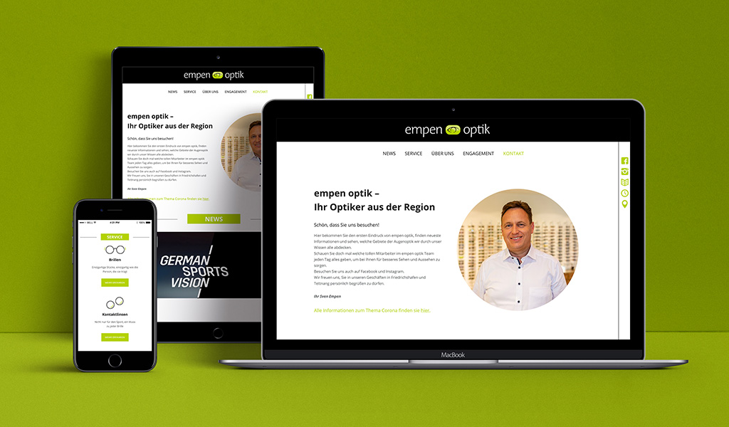
The new website builds on the strengths of the old homepage, but reinterprets them. We designed a modern, naturally responsive website with a tidy website structure, a pleasing start page approach and stylish little animations.
In contrast to many other websites, the boss first greets visitors personally. Only then do the striking, promotional topics follow in the form of a banner slider, below which is an area for smaller news items, before the versatile services are then hinted at with individualized icons and teaser texts, inviting visitors to “find out more”.
Following our credo that good websites already tell the whole story in a nutshell on the home page, the sites are briefly introduced below, but also the commitment and the awards are already presented.
We deliberately kept the navigation clear and distributed the menus according to target groups: the most important links in the main menu, on the right a “social bar” for the eye-catching yet non-disruptive promotion of social media channels and for quick links to frequently searched content. And at the very bottom, in the bottom navigation, the mandatory topics.
Overall, the design of the website is now significantly rejuvenated. The Empen green was picked up again as an accent color, but we gave the homepage even more lightness through generous use of white space. The illustration of corporate icons in Empen style was a consistent translation of the well-established corporate design into today’s visual spirit of the time.
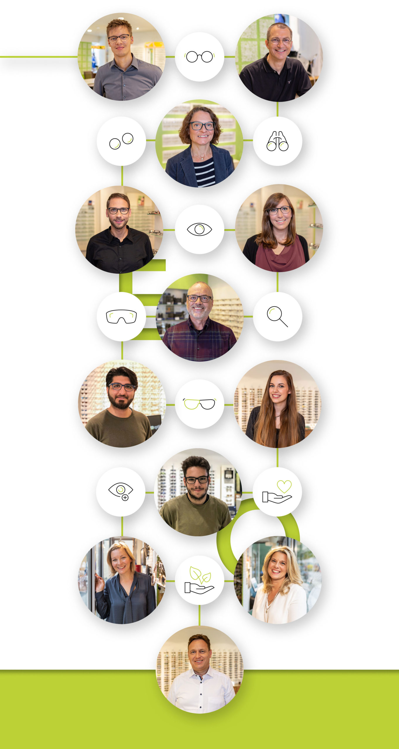
During photo shoots of the team and the premises on site, we efficiently gathered the necessary imagery to give the website a balance between graphic, typographic and photographic elements. Once again, it was a wonderful collaboration with one of our longest standing clients. Thank you, dear Sven.


