Champagne label design

Champagne label design

Until 2024, it was customary for future Rotary International (RI) presidents to proclaim a global theme for their presidency at Rotary International. Since 2025, however, this practice has been toned down, with the presidential theme becoming a message based on the charitable organisation’s strategic goals. For the Constance Hospital Foundation, we designed labels for piccolo sparkling wine bottles based on two annual themes for 2022 and 2024, as a local fundraising tool for the Constance Rotary Clubs.

Services:
graphic design

Customer:
Konstanzer Rotary Clubs

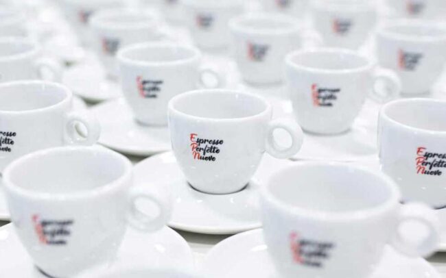
The sparkling wine bottles were part of the Konstanzer Kischtle joint fundraising project, which we also conceived and designed. When designing the labels for the sparkling wine, we drew inspiration from the annual themes of Jennifer Jones (Imagine Rotary) and Stephanie A. Urchick (The Magic of Rotary) for that year. We named the sparkling wine “Imagine” in 2022 and “The Magic” in 2024. However, we developed the concept and design completely independently of the annual motto design. This was due to artistic freedom as well as trademark law aspects. We did the same in 2019 when designing the virtual coffee brand Espresso Perfetto Nuovo (EPN), which is based on Rotary’s largest project, End Polio Now.

Designing beverage labels is a particularly enjoyable aspect of graphic design. We were delighted to be able to let our creativity run wild. The two special editions of Spitalkellerei’s regular Piccolo were sold exclusively as part of the Konstanzer Kischtle, giving several hundred people in the region the chance to enjoy these limited editions.

similar projects
all projects

Baur and the animals

Baur and the animals

Following the huge success of Brothaus Baur, Edeka Baur asked us to develop another new brand: a specialist pet food and supplies store. The branding process began with naming the store, continued with logo design and extended to the design of print products and store signage.

Services:
 
Customer: 
Edeka Baur

The working title of this project was EDEKA BAUR PET SHOP. But, of course, that couldn’t be the end of the story. A brand development process like this involves reaching certain milestones. First, we established three framework conditions for developing our ideas. The EDEKA BAUR reputation for quality, built up over decades, had to be utilised. BROTHAUS BAUR was our own benchmark. The 25-year campaign, which also originated from our company, was to provide us with additional inspiration.

Finding the right name is always a very special part of branding. Six ideas made it into the final selection, from which a clear winner emerged that we absolutely love: BAUR UND DIE TIERE. It opens up wonderful associations, unobtrusively integrates the BAUR quality assumption, and implicitly renews the brand promise. It is also very important to us that the name is phonetically beautiful and has a perfect syllable rhythm.

When designing the identifying element — known in technical jargon as a figurative mark, but commonly referred to as a logo — we wanted to create something to accompany the highly successful launch of BROTHAUS BAUR. The shape of the house, the colours and the typography — i.e. the choice of font for the word mark — were therefore already set. However, for this specific purpose and target group, we took it a step further and gave the house a function: a space for pets. There was room for a dog and a cat. This deliberate deviation from the benchmark did not affect recognisability in the overall context, but added the decisive emotional component to the design. EDEKA BAUR, BROTHAUS BAUR and BAUR UND DIE TIERE — Edeka Baur, bread house Baur and Baur and the animals — are, for us, a perfect triad.

similar projects
all projects

Design of bus advertising for fashion store

Design of bus advertising for fashion house

Warm & competent, exclusive & stylish – these are the values that the fashion houses under the ‘Ulmer Mode’ umbrella brand proudly uphold. Back in 2013, we had the pleasure of designing a bus advertisement for Christian Ulmer to promote the then newly opened N27 fashion house. A new edition of the bus has now been launched, featuring the “Mode Forum” as a second prominent sender.

Services:
graphic design, advertising

Customer:
Ulmer Mode

The primary design goal for the new bus advertisement was to maintain the recognisability of the previous design while creating a subtle “something-is-different” effect for observers. Since each side of the bus plays a unique role in terms of advertising impact due to varying contact times, it was important to showcase both fashion houses equally and avoid creating a visual disconnect.

The solution: a sophisticated color gradient transitioning between the corporate colors, petrol and black, which wraps seamlessly around the entire bus. In addition, the brand logos were placed at the maximum allowable size, surrounded by their respective fashion labels. To incorporate the corporate values into the new design, they were positioned along the roofline. This completed the layout with the attributes: warm & competent and exclusive & stylish.

On the driver’s side, greater attention was paid to the long-term impact and immediate recognition of the fashion houses. True to the motto: Good design is achieved when nothing more can be left out. The rear also highlights the fashion houses and their fashion brands, which are all brought together under the umbrella brand Ulmer Mode.

Since viewers facing the street have the longest contact time with the advertisement, the local location was deliberately chosen for advertising. A map in the middle of the bus shows the locations of all three fashion stores (because SOHO LAGO completes the trio of Ulm fashion stores) and outlines the possibility of getting off at the right stop. We have also thought of non-locals. They are offered the opportunity to scan a QR code which takes them to a digital map showing the locations of the fashion stores.

The design of the bus advertising has been modernized and expanded, and the previous sender is still clearly recognizable.

Similar projects
All projects

Developing a coffee brand for a good cause

Developing a coffee brand for a good cause

“End Polio Now” is a global campaign launched by Rotary International with the aim of eradicating poliomyelitis worldwide. The campaign has two main goals: to raise essential funds and to increase public awareness of this long-standing project. The mission was initiated in the late 1970s and was so ambitious that even the World Health Organization initially doubted its success. We are proud to have contributed to this cause with our creative idea.

Services:
 
Customer:
Rotary International

Effective advertising is empathetic and goal-oriented, and it resonates. One key tool for achieving this is the use of “memory anchors”, a sub-discipline of storytelling. We used these methods to develop a regional fundraising campaign for the largest public health project in history: the fight against polio.

As is often the case in communication, the decisive step was to pause at the start of the project and ask a few fundamental questions: Who is the target audience for my advertising? What is my core communication objective?

So, what exactly did I want to achieve – and with whom?

Our primary target group consisted of the Rotarians in Southwest Germany, specifically Rotary District 1930. This represents approximately 3,500 individuals across the region between Bruchsal, Lörrach, Lindau, Ulm, and Rottweil. Beyond this, we identified a secondary audience: the personal and professional networks of these members—including family, friends, and colleagues.

The communication goal was to reassure the primary audience that their decades-long commitment remains vital and that staying the course is essential. Each year, the clubs and their members contribute financially to this global initiative. Naturally, after such a long period, a certain “donor fatigue” can set in. Our task was to counter this.

To do so, we filtered the vast amount of available information down to the most relevant facts. We identified the actual annual cost per member as the central piece of communication. Our aim was to put this amount into perspective, following the logic: “In reality, it’s not that much.”

This led us to develop a “memory anchor” designed to be shared and retold. The line of argument, which Jan Mittelstaedt—then Rotary Governor of the district—presented during his club visits, was as follows.

Lately, wonderful coffee shops have been popping up in cities everywhere. Places where you can sit back and enjoy very special coffee creations. Take the Espresso Perfetto Nuovo, for example — a creation that we completely made up. This drink symbolises all the small luxuries we treat ourselves to in sidewalk cafés today. But what does this have to do with END POLIO NOW? Let’s find out.

  • Rotary asks every club to contribute 1,500 dollars annually to END POLIO NOW.
  • With approximately 1,150 Rotary Clubs in Germany, that totals 1,725,000 dollars.
  • Our German clubs have nearly 59,000 members. This breaks down to about 29 dollars per member per year, or 2 dollars and 44 cents per month.
  • In euros, that’s almost exactly: 2.

So, the next time you walk past a café with a chalkboard listing the specials, please think of the ESPRESSO PERFETTO NUOVO—the EPN coffee. Remember that, on average, it costs us Rotarians just one of these coffees per month to keep our greatest project running. If you enjoyed the story of the Espresso Perfetto Nuovo, you can now drink from cups designed exclusively for this fictional brand. A cup and saucer set costs 16 euros. Around 10 euros from every sale goes directly to End Polio Now, which is then tripled by the Gates Foundation. It’s a great deal: you pay 16 euros, Polio Plus receives 30 euros—enough for around 60 vaccinations—and you get to keep a beautiful porcelain cup. By the way: the cup also makes an excellent gift for clients, employees, or guest speakers.

Similar Projects
all projects

Uli Burchardt Web Design

Uli Burchardt Webdesign

To mark the publication of his second book, “Menschenschutzgebiet” (Human Sanctuary), the Lord Mayor of Konstanz, Uli Burchardt, commissioned us to relaunch his website – which we had previously designed during his mayoral election campaign. Thanks to the new design concept, the website now appears clean, modern and clearly structured.

Services:
Online

Customer:
Uli Burchardt

Vision: Gutes Leben für alle Die nachhaltige, digitale
Stadt der Zukunft wird
Ein Teil der Natur werden.
Und der beste Lebens-
Raum, den es für uns
Menschen je gab.
Wenn ich gefragt werde, ob das sein muss, dass ein OB neben dem ohnehin knallvoll gepackten Kalender auch noch ein Buch schreibt, und wenn ich gefragt werde, wie das denn geht – dann sage ich, dass manchmal die Gedanken, wenn sie toben wie Kinder, die nicht beschäftigt sind, eine sinnvolle Beschäftigung brauchen. Und dass ich schreiben liebe. Nein, ich habe die Weisheit nicht mit Löffeln gefressen aber ich bringe viel Praxiswissen mit. Und ich profitiere beim Schreiben von den Querverbindungen in meinem Lebenslauf - Biobauer und Förster, Manager und Unternehmensberater, Multi-Aufsichtsrat und OB. Ich versuche, die Ökologie, die Ökonomie und das Soziale, also das Dreieck der Nachhaltigkeit, aus eigener praktischer Erfahrung in diesen Bereichen miteinander zu verbinden und neue Perspektiven zu entdecken. U B Es ist die Summe mehrerer kleinerer Einzelentscheidungen, die bei einer Website
eine Wirkung entfalten. Im Falle von Uli Burchardts Onepager sind es zum Beispiel
die kleinen, liebevollen und thematisch passenden Animationen. Aber auch die
großzügige Nutzung von Weißraum (ein Begriff, der sich auch auf andere Farben
bezieht) und das typografische Konzept tragen einen wichtigen Teil bei.

Ein besonderes, subtiles Stilmittel, sind die Textmarker-Animationen, die wir als Effekt
und zur visuellen Strukturierung der Texte einsetzen. Texte erscheinen auf der Headline-
Ebene teils als Typewriter-Stil, teils aber auch als ganzer Block, und dann erhalten sie
im Nachgang noch Auszeichnungen, die an die Markierung durch einen Textmarker
erinnern. Dieses Zitat aus unserer analogen Lebensrealität macht die Inhalte nahbar
und menschlich.
Uli Burchardt

Those who remember our election campaign for Uli Burchardt will notice that the new website draws heavily on the visual concept from that time. The reason is simple: we still believe that the typography, colour palette and graphic language perfectly reflect his personality and values. So, we recycled a lot – digital sustainability, so to speak.

And, although we are admittedly biased, we highly recommend the book to everyone. In “Menschenschutzgebiet” (Human Sanctuary), Burchardt summarises with remarkable clarity why a holistic view of environmental protection is so essential. It is a truly worthwhile read, and a perfect catalyst for the constructive discussions that so many people are surely longing for in these times.

similar projects
all projects

Anniversary brochure for Kliniken Schmieder Print design

Jubiläumsbroschüre Kliniken Schmieder Printdesign

75 years after its founding in 1950, Kliniken Schmieder has six locations in Baden-Württemberg, serves around 14,000 patients a year, and has 2,300 employees. To mark this special milestone, a unique anniversary brochure has been published. We were privileged to design and produce this brochure, along with the accompanying anniversary logo and several illustrations.

Services:
Logo design, illustration, print design

Customer:
Kliniken Schmieder

Several professionals were involved in this project. Everything was coordinated by the wonderful and charming PR and communications team at Kliniken Schmieder, led by Markus Stadtmüller. On the editorial side, Kerstin Conz and Regine Weisbrod from Biographie-Werkstatt am See took the lead, while the photography was created by Ulrike Sommer. This collaboration was truly special to us.

We developed a total of four approaches for the anniversary logo. The variant chosen was the one we had given the working title, “Zusammen” (Together). Our guiding principle was: Our promise of quality is only made possible through the collaboration of different people and locations – visualised here through lines, layers and overlaps. The colours suggest the diversity of the staff and their specialisations. The logo features variable arrangements of lines, which indicate adaptation to change and serve as a stabiliser for the brand’s core. In this way, the lines also indirectly represent future viability.

When designing the brochure, it was important for us to create a modern layout that implicitly conveys the expertise and innovative strength of Kliniken Schmieder: clear lines, a bold use of white space, and clean typography with high legibility. The design also features minimalist graphics, a modern approach to typography, and a deliberate visual structuring of the various content segments – partly achieved through the strategic use of gold as a spot colour, both for emphasis and as a background. 

Illustration Vorlage

We enriched this graphically clean and fresh overall look with hand-drawn illustrations. Used in just the right dosage, they add a human and analogue element to the brochure’s overall impression – providing a warm counterpoint to the technical precision.

Similar projects
All Projects

Annie Times

Annie Times: Name development and branding for a restaurant

The Edeka BAUR E-Center in Konstanz is, by far, the most beautiful food market in the region. We even know of former locals who, whenever they return to their hometown, make a point of shopping here to experience the authentic passion for food. We have already had the pleasure of developing the names and corporate designs for two other shops in the mall: the bakery and the pet well-being store. As the saying goes, all good things come in threes – so we were thrilled to take on the complete branding for the newly redesigned restaurant as well.

Services:
Corporate design, branding, logo design, outdoor advertising, naming, print design

Customer:
fresh produce markets Baur


The Edeka BAUR E-Center in Konstanz is, by far, the most beautiful food market in the region. We even know of former locals who, whenever they return to their hometown, make a point of shopping here to experience the authentic passion for food. We have already had the pleasure of developing the names and corporate designs for two other shops in the mall: the bakery and the pet well-being store. As the saying goes, all good things come in threes – so we were thrilled to take on the complete branding for the newly redesigned restaurant as well.

It all started with the naming process. Various ideas were based on different approaches—including the trend of naming restaurants after a first name in the genitive case, with or without a permissible apostrophe. Yes, in this context, it is permissible. We can already hear the critics calling it a “Deppenapostroph” (idiot’s apostrophe). But that is not the case. Here is a brief digression: although an apostrophe in the genitive case of proper names for shops or restaurants is not the standard rule in German, it is a recognised exception according to the Duden dictionary. It is generally used to clarify the base form of the name. Furthermore, we find it to be the ideal choice as it provides a clear distinction from the plural form. End of digression.

During the naming phase, twenty ideas were in the running, five of which made it to the final round. None of these five ended up being the name of choice, because, as is often the case in creative processes, a new idea emerged along the way, which was formulated by the client and then further developed by us. Ultimately, everyone was happy and convinced. This process proves once again that our core LGM value, Balance [click here], also translates perfectly to the collaboration between our clients and ourselves. You can read more about this naming journey in our blog post [click here].

For the final decision, we established two hypotheses, one of which was consciously discarded. The first was that the name had to fit perfectly into the phrase, “Komm, wir gehen ins …” (“Let’s go to…”). The second was that the name should integrate into the existing brand family, alongside “Brothaus Baur” and the pet shop “Baur und die Tiere”. We eventually threw this second hypothesis overboard because the chosen name, Annie Times, was so powerful that it didn’t need to lean on the other brands.

Annie Times is a name with many virtues. It is phonetically pleasing, has a great rhythm, and is easy to pronounce. Combined with the logo design, it creates an impression of quality, accessibility, and a personal touch. Who knows – perhaps it refers to “Aunt Annie,” who once delighted her family and friends with her culinary skills and is remembered so fondly. In her home, the world was still a place of comfort, and sharing good food was a central part of life. At the same time, the name carries the message that guests can dine there whenever they wish, as the restaurant is open continuously, from morning until evening.

In the logo design phase, we quickly committed to a fine, delicate and sophisticated style. The interior design concepts provided valuable cues as to how the restaurant would eventually look, and how our designs would fit into that space. We opted for high-quality, handwriting typography with a calligraphic touch. One typeface we identified fit the vision perfectly, but had one weakness – while the combination of statement capitals and extremely flat minuscules (lowercase letters) gave it a unique character, it compromised legibility. We corrected this specifically for the logo, where instant brand recognition is essential.

As the project progressed, we created outdoor advertising that is regularly featured on the building, various print products, and a digital signage concept. The latter can be easily maintained by our clients in their daily operations using standard tools – yes, PowerPoint – and presents the menu offers on screens above the counter in a highly legible and stylish design. We are immensely proud of the result, and are also delighted that the food at Annie Times is truly excellent. We can highly recommend the egg breakfast, for example. Nom nom.

similar projects
all projects

Edeka Baur: Advertising campaign for reopening after renovation

Edeka Baur: Advertising campaign for reopening after renovation

After two years of renovation, Edeka Baur on Romanshorner Platz in Friedrichshafen reopened. When a renovation takes this long, a visible campaign is needed to raise awareness of the reopening in the city. This includes poster advertising, print advertising, radio advertising, social media advertising, as well as creative, unexpected advertising. We had the pleasure of working with the wonderful Edeka Baur marketing team.

Services:
Campaign, advertising, texting, graphic design, photography, motion design, print design

Customer:
Edeka Baur

The starting point for this project was complex. For various reasons, the renovation had taken a long time – yet the citizens of Friedrichshafen remained curious about what was happening and, above all, when it would be finished. One quote from the briefing particularly stuck with us:

“Many people are asking us: When are you finally going to reopen?”

Because it was clear that there would be a reopening. The renovation process was also being communicated through the press.

The public looked forward to the new store, which had been given a completely new character through its interior design. The Edeka branding is intentionally understated here; once inside, visitors experience Edeka only as a wordmark, with no further visual or colour-based references to the corporate identity. Instead, the store design features subtle nods to the proximity of the lake.

Our analysis revealed that, in the perception of customers, there is no other “pure” Edeka in Friedrichshafen. Two other providers belonging to the Edeka Group do not position themselves as such. Furthermore, the stores in the suburbs of Fischbach and Ailingen are not perceived as being part of Friedrichshafen itself. As noted: this is purely about perception, not rational facts. Romanshorner Platz is well known due to its central location and the bus station – it requires very little explanation. The primary goal of our assignment was to communicate the reopening and announce the date and location, i.e., when and where.Our analysis revealed that, in the perception of customers, there is no other “pure” Edeka in Friedrichshafen. Two other providers belonging to the Edeka Group do not position themselves as such. Furthermore, the stores in the suburbs of Fischbach and Ailingen are not perceived as being part of Friedrichshafen itself. As noted: this is purely about perception, not rational facts. Romanshorner Platz is well known due to its central location and the bus station – it requires very little explanation.

We began by analysing the existing landscape of brand communication. It was striking that the Edeka Meta Corporate Design was immediately recognisable in all successful examples: white, yellow, black, touches of blue, the characteristic typography, the imagery, the yellow heart, the black chalkboard, and the logo. It is worth noting that adherence to this Meta Design is by no means universal, as individual retailers enjoy a high degree of autonomy. Edeka Baur, for instance, shows a keen sense for the most appropriate visual positioning in Konstanz and elsewhere. However, for the reopening campaign, our recommendation was to lean fully into the established Edeka look – ensuring that the target audience would immediately recognise the sender.

Our design relies on a high contrast between a dark background and light typography, ensuring excellent long-distance legibility. Short headlines with a clear typographic hierarchy guide the viewer, while the combination of real people and clear messaging proves most effective: Jürgen Baur and his team act as authentic brand ambassadors. Our conceptual approach uses Out-of-Home advertising as the campaign’s starting point – being maximally reduced, the idea can easily be extended across other channels. To break through habitual visual patterns, we reduced the sender to its smallest conceivable element: the iconic “E”. We interpreted the “E” as a placeholder for the entire shopping experience that has been missed for so long. The primary message is unmistakable: Edeka in Friedrichshafen is finally back, from 14 October.

Without the “E”, Friedrichshafen simply isn’t complete – after all, the letter appears twice in the city’s name. The long wait is implied by the one-word headline “NDLICH” (the German word for “finally”, stripped of its initial “E”). The resolution follows immediately, clarifying that this is no typo: “FRIDRICHSHAFN gets its E back.” Below this are the brand logo and the details regarding time and place. A neat side effect: the name BAUR is actually spelled without an ‘E’ anyway – a pleasant coincidence. However, the key to breaking visual habits is the word “NDLICH”, as the correct spelling begins with the very letter that has been missing for so long.

Together with the Edeka Baur marketing team, we rolled out the campaign across a wide range of channels – including billboards, radio spots, print advertisements, and Instagram Reels, as well as a local activation featuring promotional bicycles and brand ambassadors. It was, once again, a huge pleasure. Many thanks to the entire Edeka Baur team.

similar projects
all projects

DEUKO

DEUKO 2023

For German Rotaract members, bringing a DeuKo to their own city is like bringing the Olympics or the soccer World Cup to their own city. It is the crowning glory of annual Rotaract events in Germany (yes, including Rotary) and actually in the whole of Europe. It was a huge honor for us to be the face of DeuKo 2023.

Services:
 

After the previous German conferences fell victim to coronavirus and had to be moved online, there was no applicant for 2023 at the online DeuKo 2022 in Dortmund. In Constance, the members of the Rotaract Club then decided without further ado to submit an application in order to finally try to host a DeuKo in person again at the fourth attempt.

It was a courageous undertaking, as nobody knew at the time what we know today: namely that coronavirus would finally be defeated in 2023 and major events of this kind – a DeuKo has around 1,000 participants after all – would be allowed to take place again. The president of the Rotaract Club that year was Jannik Mittelstaedt – the similarity of the name is no coincidence. So it was immediately clear that LGM would become the main sponsor of DeuKo. We were responsible for the entire appearance including corporate design, slogan development, copywriting, website, social media account, motion design, photography and film production, the merchandise ideas and production and much more.

On the way to the logo, we tested a lot and let off steam – after all, we were our own customer. In the end, our penchant for clarity and reduction prevailed in the logo: The only elements were the event name DEUKO KONSTANZ 2023, set in capital letters and three different font styles of the Rotary house font Frutiger, and the use of the tilde glyph, which we used as a metaphor for Lake Constance and developed graphically into a wave shape.

These elements could now be used as a dynamic logo and combined differently depending on the application, which has great advantages in terms of the different aspect ratios of the images. After all, a profile picture on Instagram has different requirements than a vertically aligned cantilever flag.

When writing the text, we focused on the central message, from which we also derived the slogan: The reunion of Rotaractors at Lake Constance would be what everyone had been looking forward to for so long. Accordingly, the slogan was then hashtag-ready and with a deliberate spelling mistake: #endlichseenwirunswieder

For LGM, by the way, after the DeuKo was before the DeuKo, because we were once again on board as a website sponsor for the DeuKo 2025. And we can well imagine being a partner to the wonderful people of the organizing teams again in the future. Feel free to contact us, dear Rotaractors.

Similar Projects
All Projects

Georgs Genussmanufaktur

Georgs Genussmanufaktur

Georg Schönberger is an experienced chef and dietician. He is also the namesake of Georgs Genussmanufaktur, a local food start-up that he founded together with his partner Hannah Müller in 2022. At Georg’s, everything revolves around high-quality food – first and foremost great homemade pasta.

Services:
Campaign, outdoor advertising, print design
 
Customer: 
Georgs Genussmanufaktur GmbH

In times when consumers can learn more than ever about highly processed foods, it is local producers like Georgs Genussmanufaktur that can make a difference. In the face of globalized competition, start-ups like Georg and Hannah only have one chance: they focus on top quality. That’s why they offer regional organic delicatessen products with the Bioland seal and pasta made using the bronze process.

After the test phase, Georg’s pasta has also been available in the local Edeka supermarket for a while and the regionally well-known Fuchshof has also been selling pasta made in Constance. So far, advertising has primarily been through personal contacts and the feedback from customers has always been very good. But there was a lack of broader awareness. And that’s where we came in. Georgs commissioned us to design an advertising campaign for billboards and city lights.

Our analysis: Although the bronze process is a quality aspect, it should not be cited as the main argument, as it is now also used by large manufacturers to differentiate themselves. Much more important is a genuinely unique selling proposition (USP): Made in Constance with regional organic raw materials. The positioning must be clearly regional and organic.

But even with this insight, there was still a major challenge: the logo has to be “learned” by the target group so that Georg’s pasta is recognized at the point of sale in the huge range on offer. Outdoor advertising can be a very effective means of communication, but the transfer of the message to the actual purchase is crucial for success.

Our starting point was the existing logo, the packaging, various product photos and the website – all created by Georg and Hannah together with third parties and with a lot of love and personal commitment.

We first needed a key visual that we could play on all channels and that would be gradually learned by the target group. Our solution: the name needed a face. We convinced Georg to become part of the key visual with his picture in the form of an illustration. But this approach had to be more than just a modern drawing of a cooking process, as used for some other products.

We wanted to create a kind of “Hipp effect”: Georg’s name and face stand for the highest regional organic quality.

But the illustration alone is not enough. We have to bring the name and logo to mind so that both are recognized at the point of sale. We have found a solution to this problem that breaks through perceptual habits and at the same time has what it takes to become a long-term campaign slogan.

Antoine de Saint-Exupéry once said: “Perfection obviously comes not when you have nothing more to add, but when you have nothing more to take away.” Our approach for the campaign slogan is also based on the maximum reduction of what we received from Georg and Hannah: the letter G, which is the central recognition feature in the logo alongside a few other elements.

We detached this “G” from the logo and created a slogan that contains the promise of regionality and that people “stumble” across because it breaks a habit of perception:

G for regional.

By using the same font and color, the connection to the logo is established and the initial irritation is quickly dispelled by the subline and the centrally printed logo. But the short time spent thinking about it is enough to set an anchor in the target group’s memory, which will hopefully return in front of the shelf with the many pasta offerings. Together with the illustration and the product photo, the slogan forms a strong team in terms of recognition, which is supported in-store by other elements such as displays, shelf tabs and so on.

We wish Georg and Hannah every success on their way to becoming a local insider tip. Because this niche is a good place to grow.

similar projects
All Projects

Lorth Gessler Mittelstaedt GmbH
Reichenaustr. 36
78467 Konstanz

+49 (0)7531.189550
kontaktnospam@nospamlgm.info
Facebook | Instagram

Impressum
Datenschutz
AGB