Maurer Atmos
Maurer-Atmos Middleby GmbH is the global technology partner and one of the leading suppliers in the field of thermal product processing. Or to put it another way: If anyone knows about smoking, cooking, baking, cooling or drying food, it is “Maurer”, as the traditional company is simply known by its customers. Already a few years ago we conceived the campaign “Made with a Maurer” and now we were allowed to be active again.
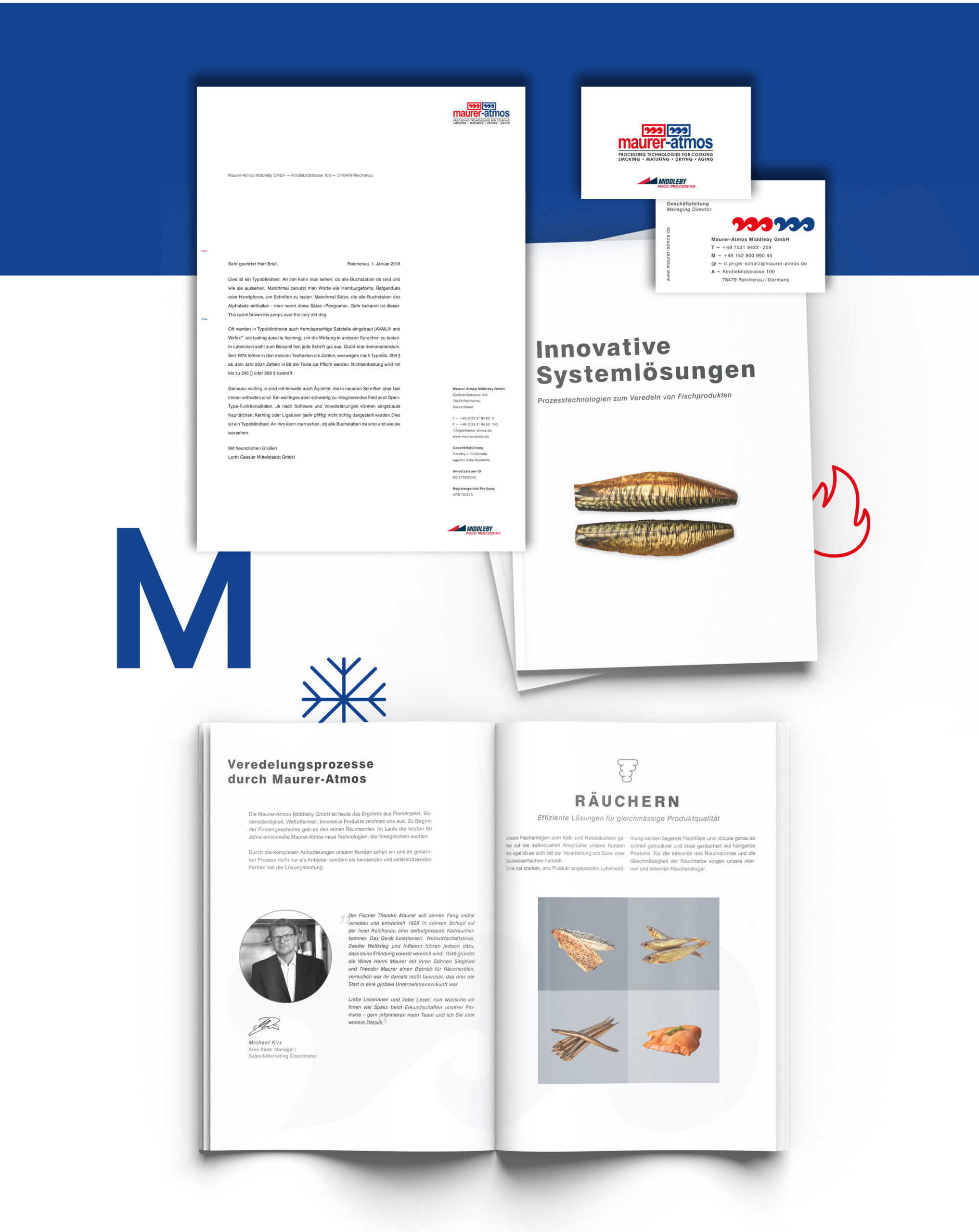
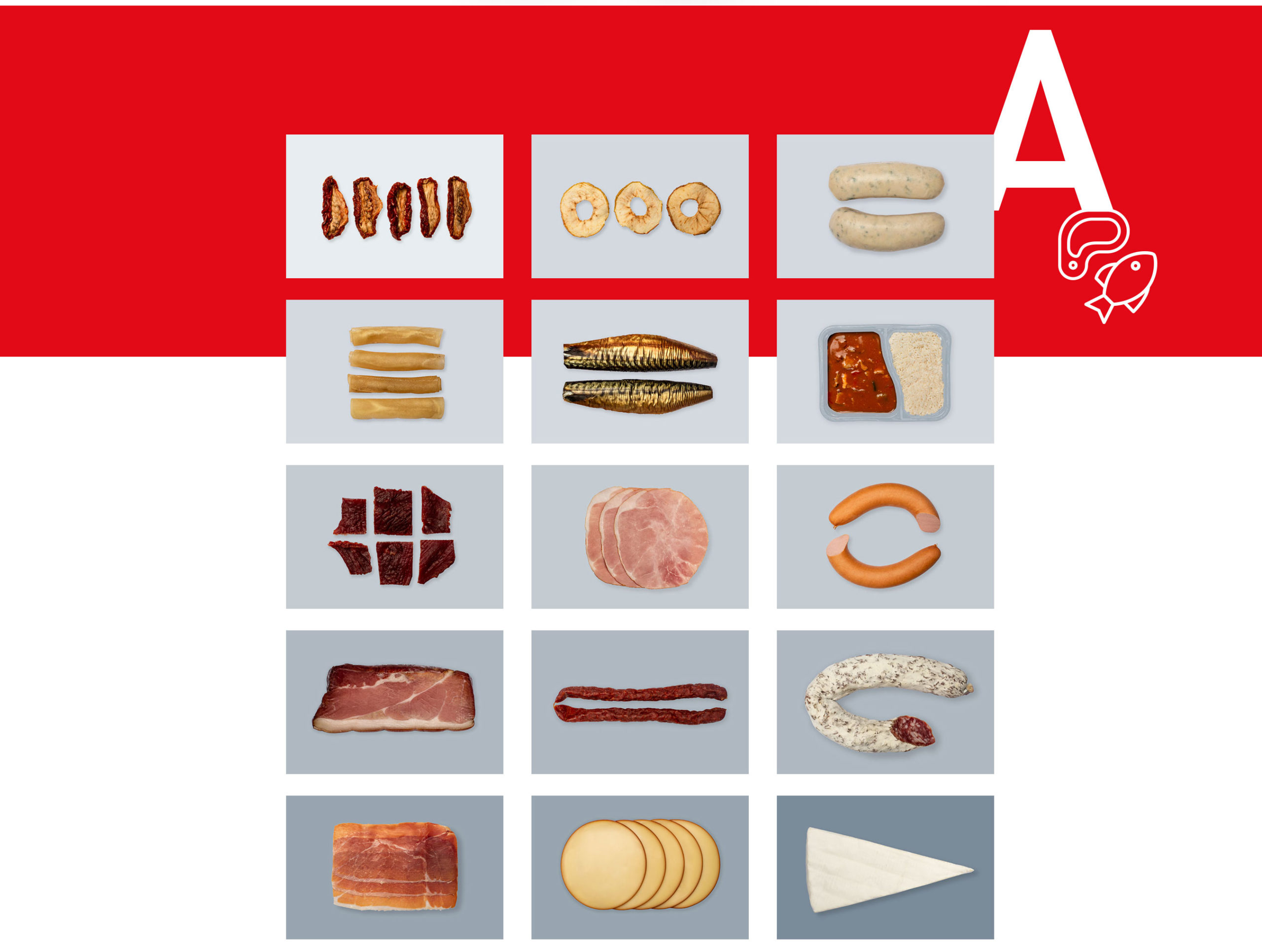
Initially, the goal of the project was a corporate redesign. A few iterations later, it was clear that we would not change the existing look. Instead, it became clear that a freshup was the way to go. So the logo remained unchanged, but the rest of the design was unified and modernized. The look is now cleaner, more graphic and, in terms of the image concept, with a clear line: color is brought into play by the Maurer logo, by the Maurer products and by the end products made with them. Otherwise, Maurer remains restrained in the silver-gray machine look.
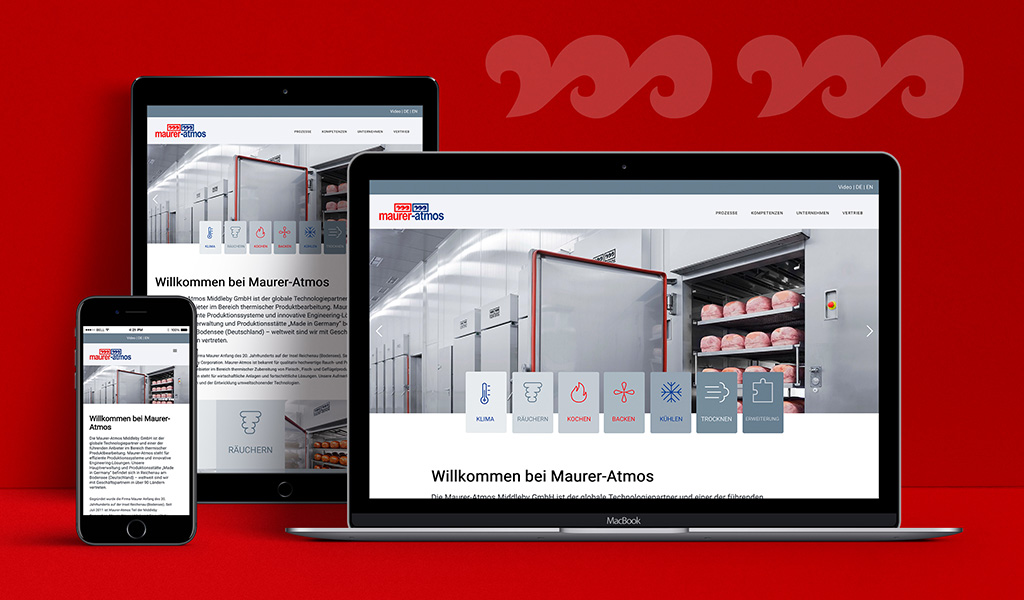
On the way to the freshup, a whole range of printed matter was created, including two chic brochures. The project was rounded off with a completely new website, which is bilingual and already prepared for other languages. The website is based on a new structure in which the approach to the machines from the customer’s point of view is through the various processes. These processes were redefined, which also runs through the print communication. We developed suitable icons for this. On the website, the processes are teased out via a slider sub-navigation on each page. The entire structure was revised in terms of content and simplified for better userabiity. With this, Maurer is ready to take off for new goals.


