Krümelkiste Konstanz visual identity
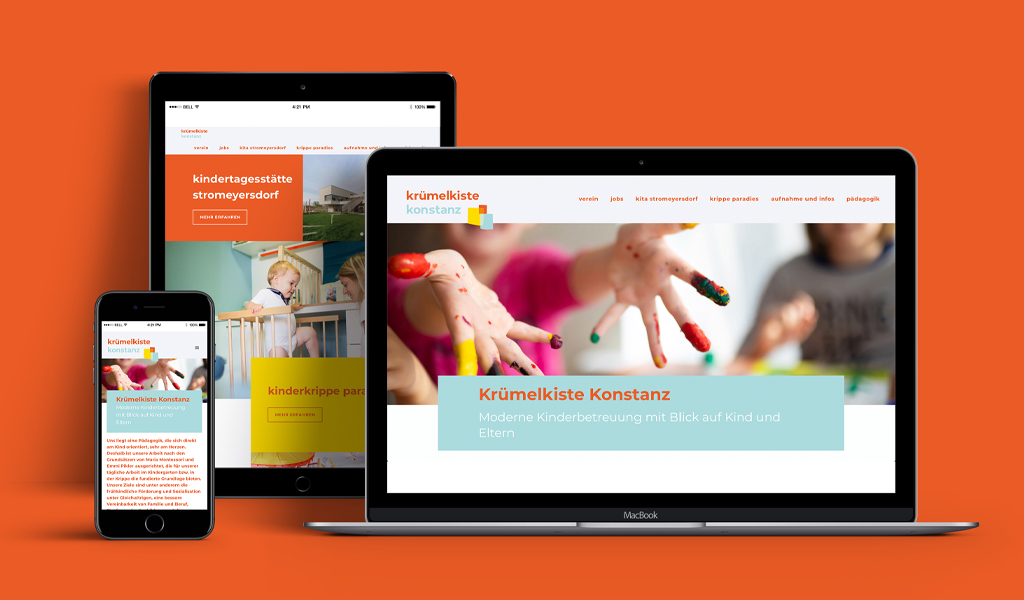
The Krümelkiste Konstanz is more than a daycare center. It is an association, a concept, has two locations and is characterized by an outstanding capacity for further development. Founded in the early nineties by FH students as a playgroup for their children, it succeeded in gaining recognition and support from the city, then cooperation with the Seitenbau company, and finally membership in the Paritätischer Wohlfahrtverband. We were allowed to create a corporate forward design, new image and people photography, a homepage and many creative applications for the Krümelkiste.
Ever since 1998, when we founded our agency in the Technology Center Constance, we felt it was a matter of course for us to contribute to our city within the scope of our possibilities. We still see it that way today. We offer special conditions to institutions that do something for our community. The Krümelkiste is such an institution. That’s why it was a special pleasure for us to be able to work here comprehensively.
In the beginning, all we really needed was a new website. The old one was no longer up to date in terms of content, design and concept. On the way to our goal, however, we realized that this new development was also an opportunity for a corporate forward design. In contrast to corporate redesign, forward design retains the basic appearance of the brand as far as possible. A clear change is allowed, but a learned visual identity should remain recognizable.
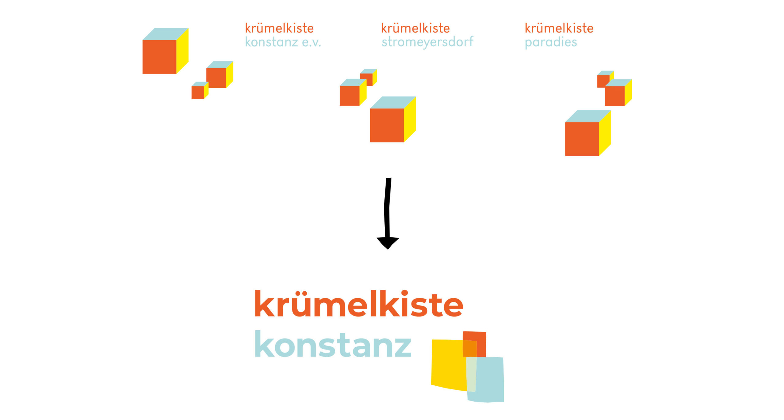
The Krümelkiste already had a corporate design created by professionals. It reflected in its impression the clarity of the architecture of the building in Turmstraße, the geometric. It also used the crate as a design element, which was used in a modular way according to the principles of Dynamic Design. In our derivation of the new logo, we didn’t want to lose the boxes, and we also wanted to keep the color concept. However, in the design we were looking more for the reference to the child, to the interactions between people.

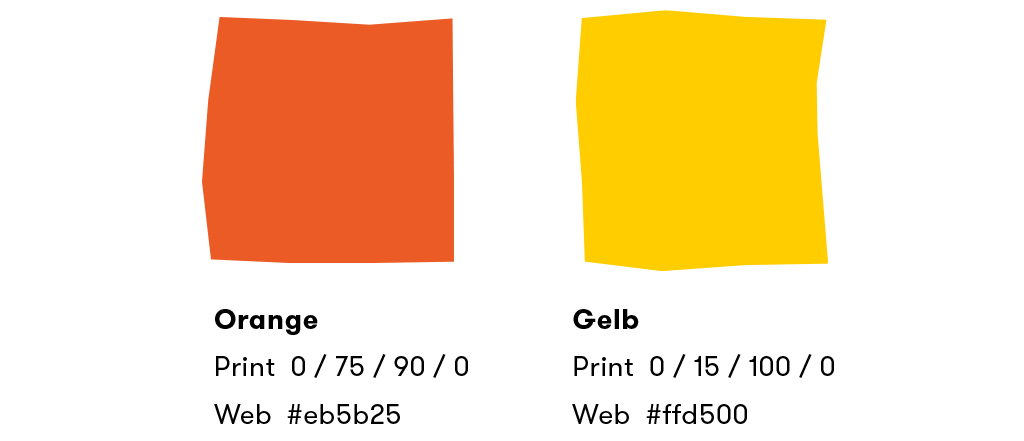
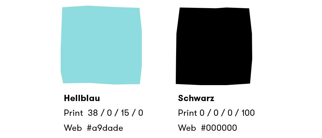
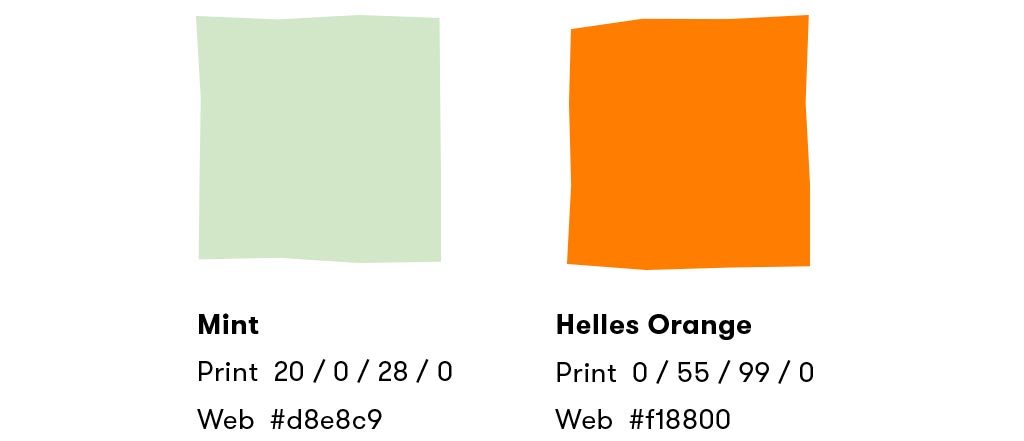
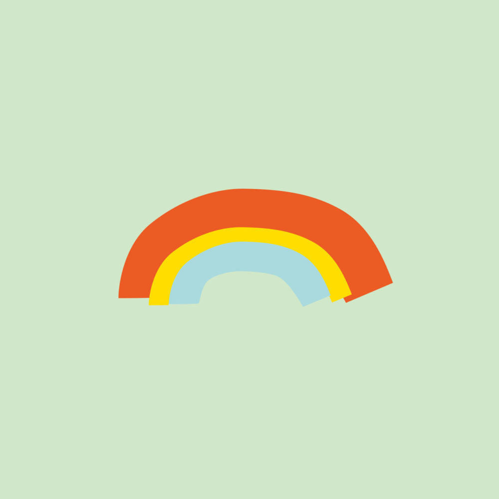
Our basic idea is based on playing with tracing paper. This memory of childhood was the starting point. Who has not experienced this in kindergarten: If you stuck colorful tracing paper to the window, the sun shone through and the paper glowed wonderfully. And if you overlaid different papers, new colors emerged. Through these overlays within the figurative mark, we created the new secondary colors of mint green and light orange, which we used to round out the existing color system.
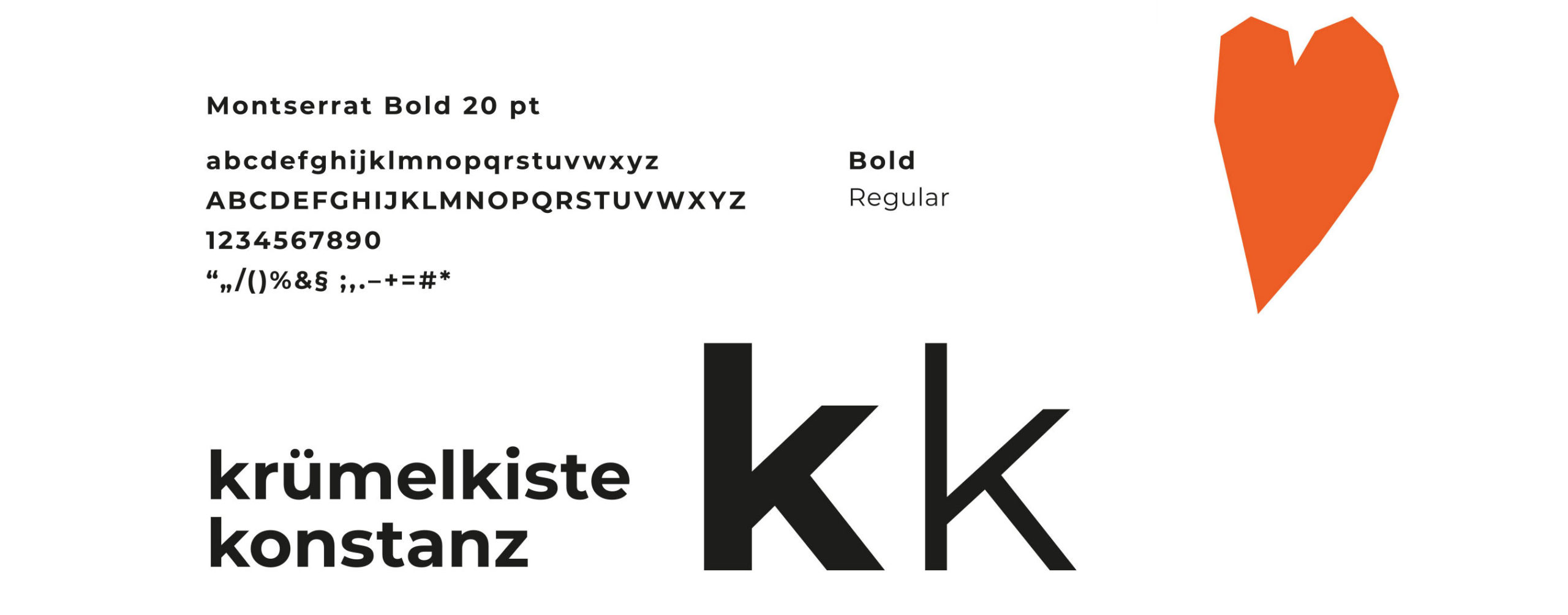
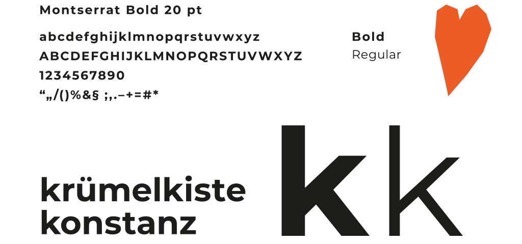
We also chose a new path for the typography, without denying the old one. The new typeface is a little rounder, more striking, less formal, less straight and, thanks to the stronger typeface cut, fits perfectly with the new logo. In the juxtaposition, it can be clearly seen: Despite the quite significant change, the brand is still recognizable.
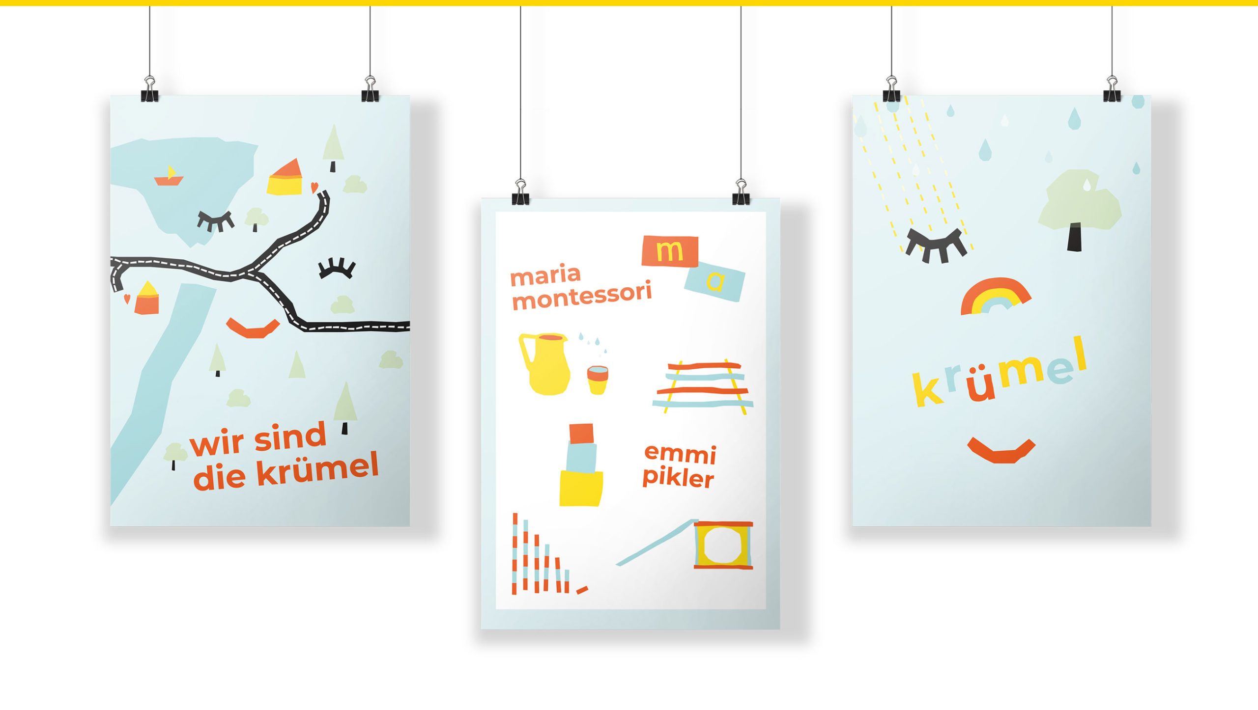
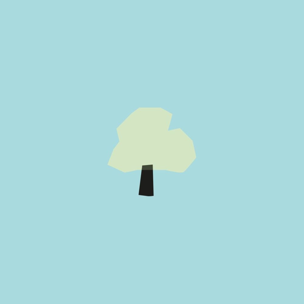
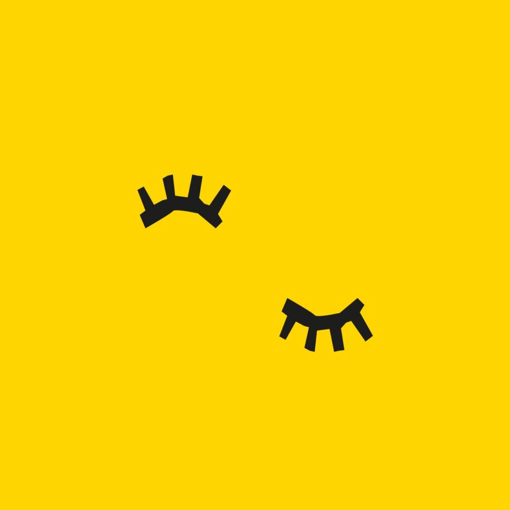
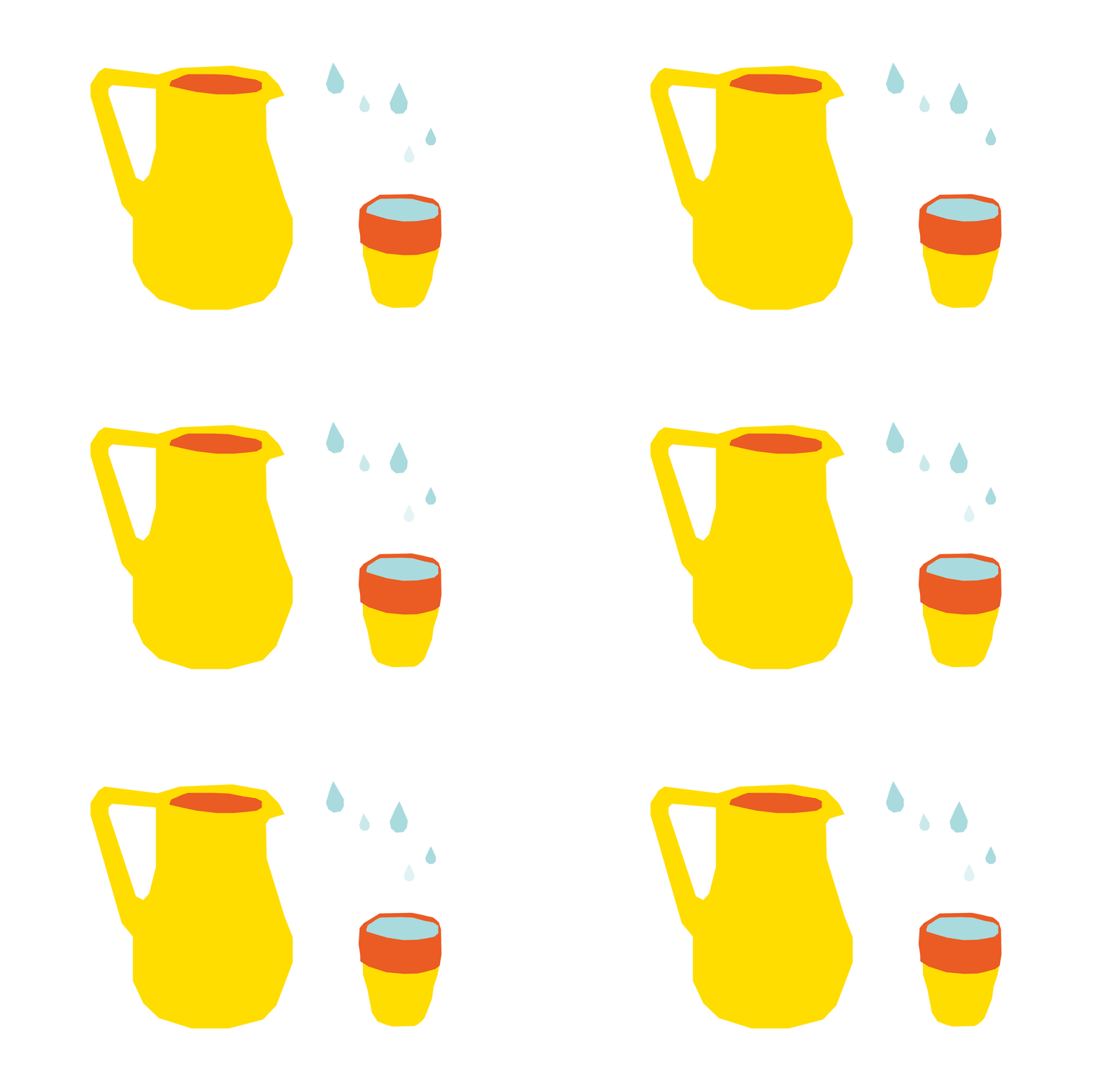
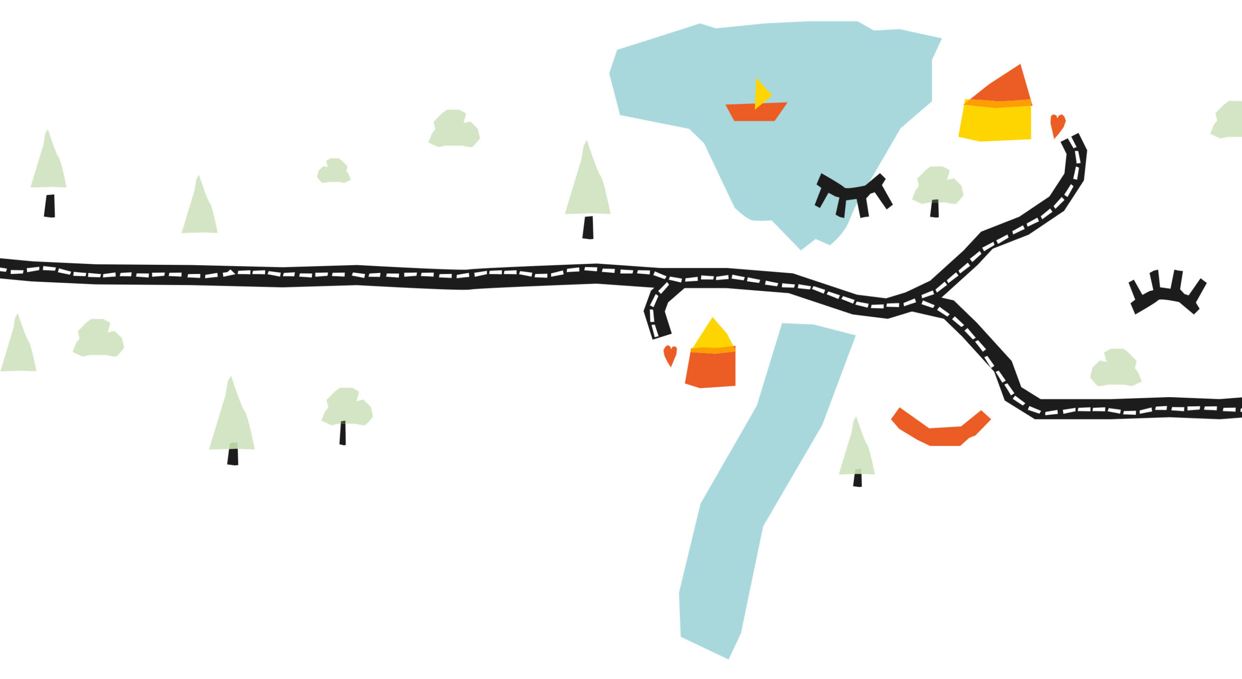
We continued to build on this basis and developed many illustrations to match the logo, emphasizing the playful, childlike, friendly character: All simplified depictions of themes from the surroundings of the two crumb boxes: the Seerhein, a sailboat, trees, the boxes as locations, but also symbols of happy childhood, for example laughter or eyes with long eyelashes, because that’s what children draw.
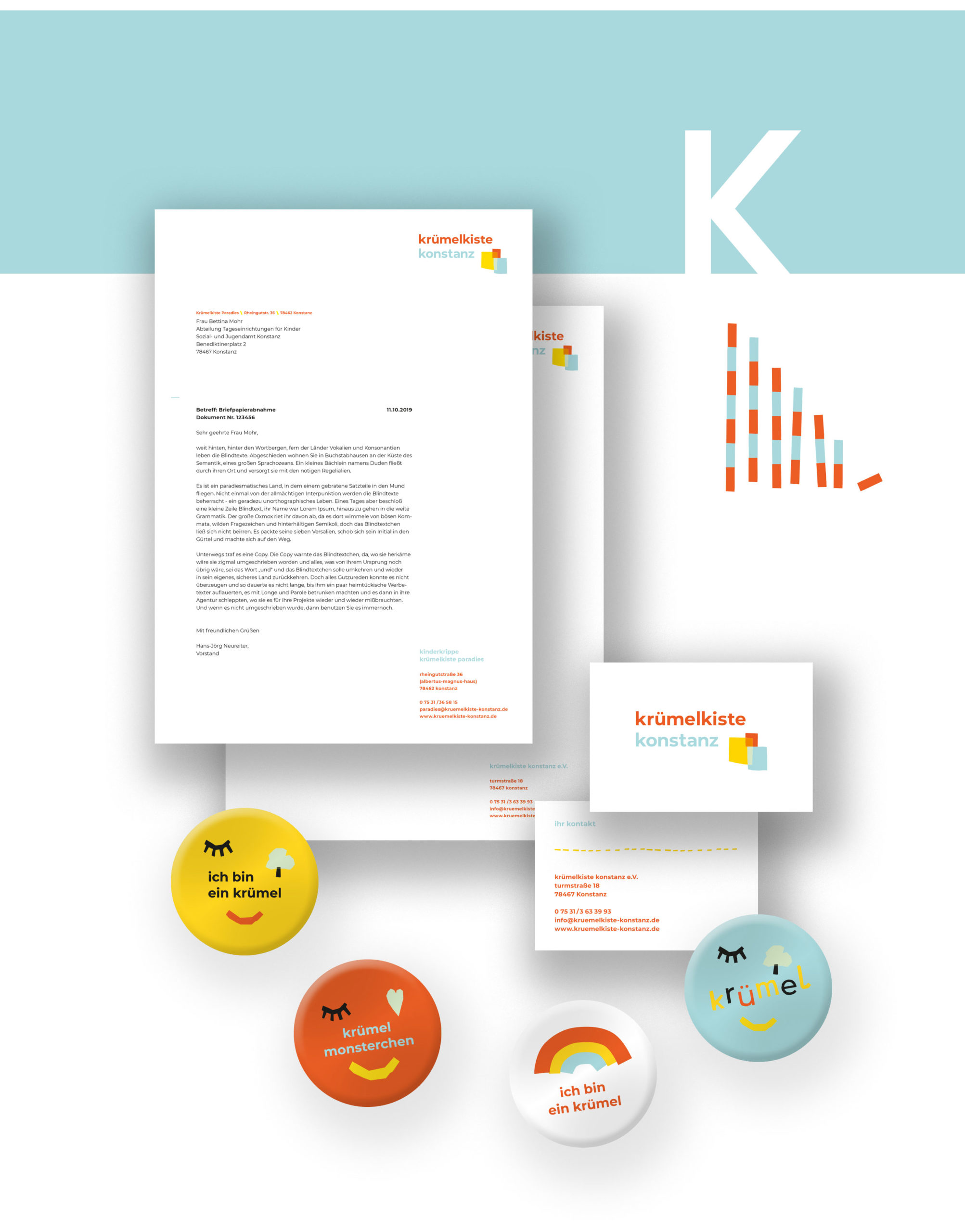
This cornucopia of illustrations then gave rise to further applications. For example, small animations to discover on the website, colorful buttons to pin on, or even posters on which contextual quotes from the educational concepts on which the crumb boxes are based are also included as design elements.
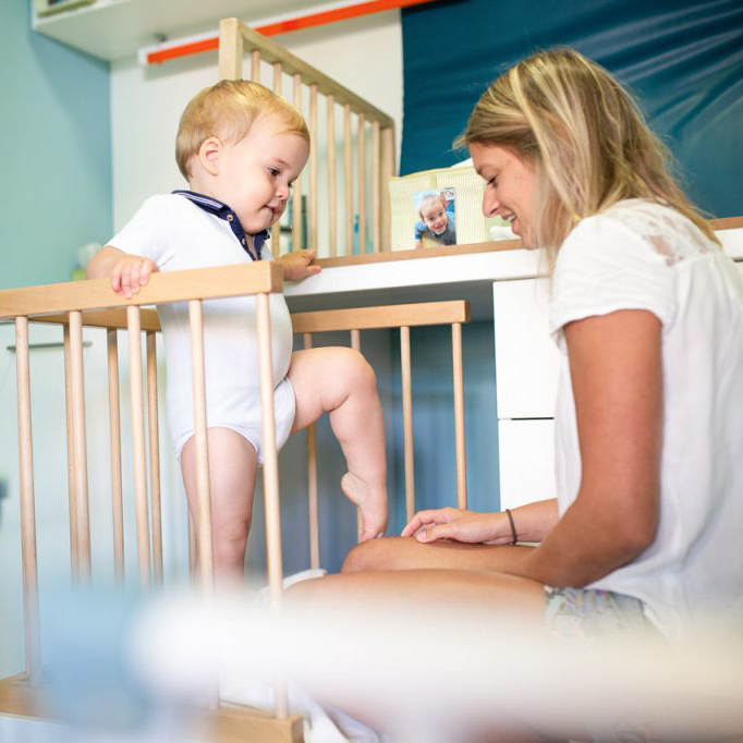
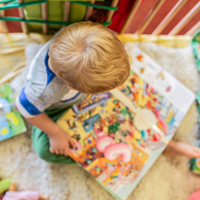
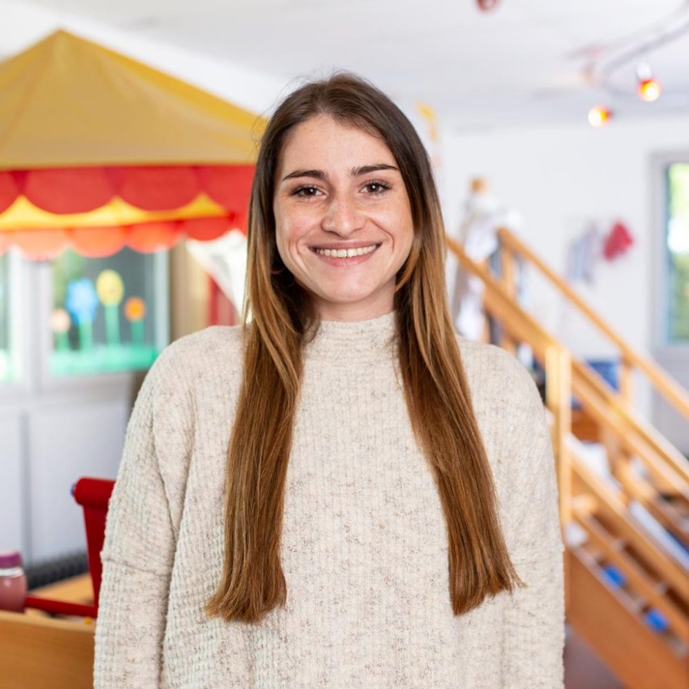
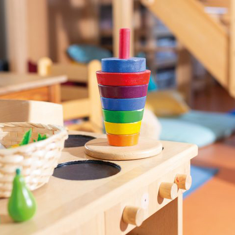
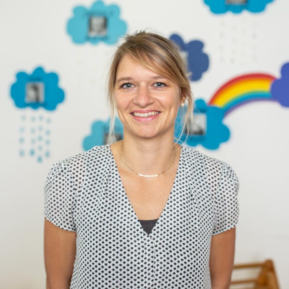
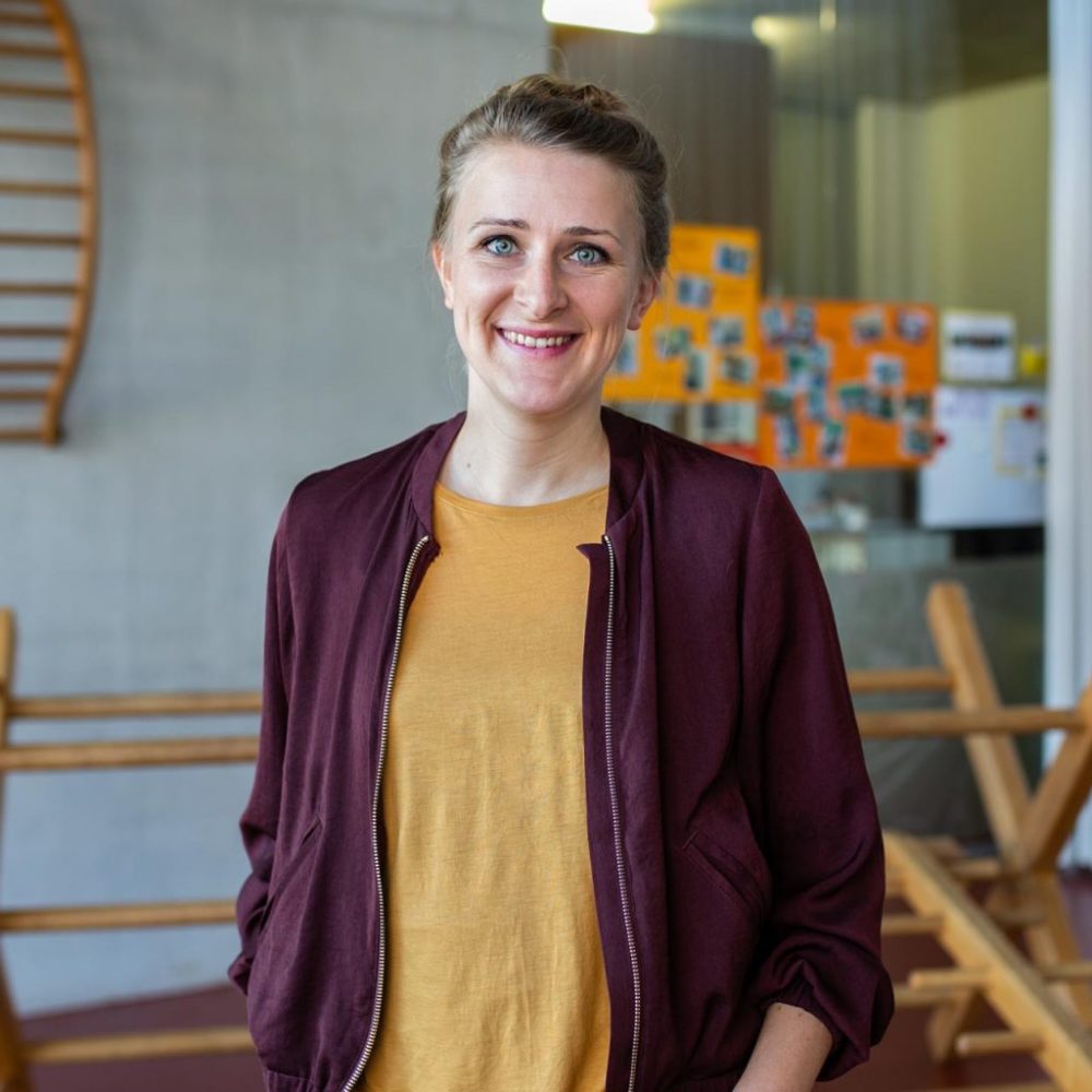
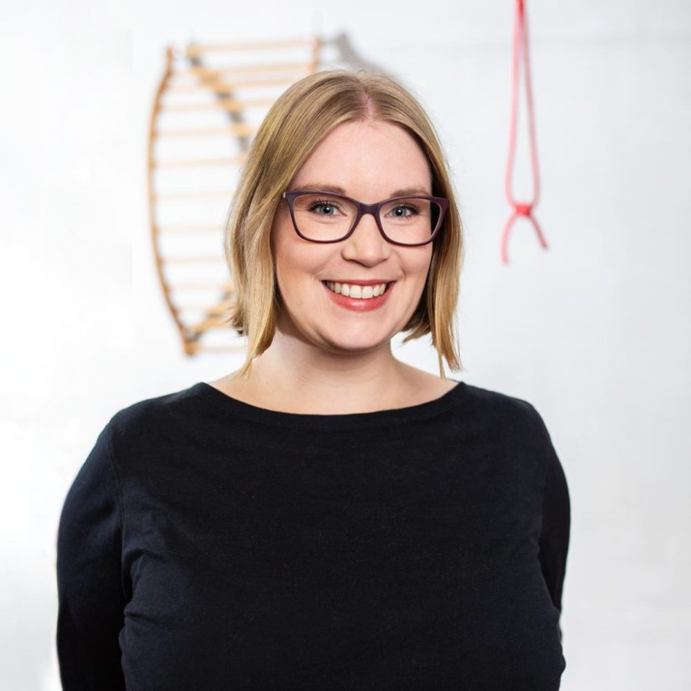
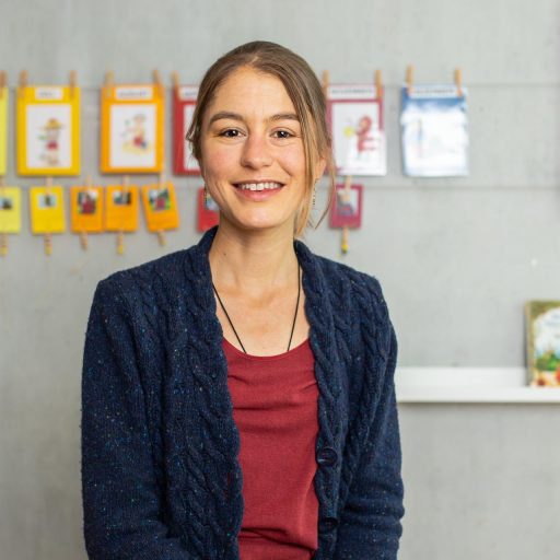
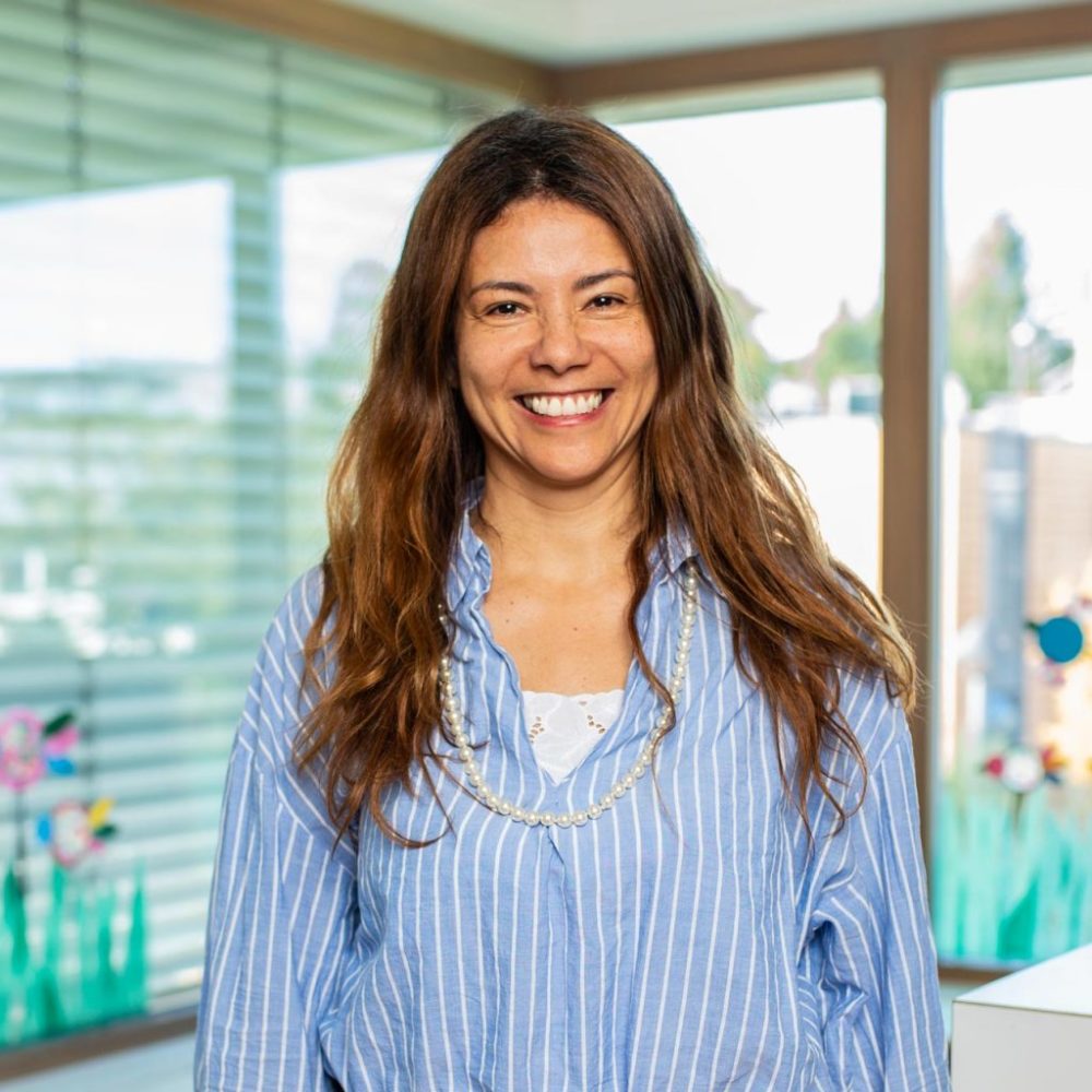
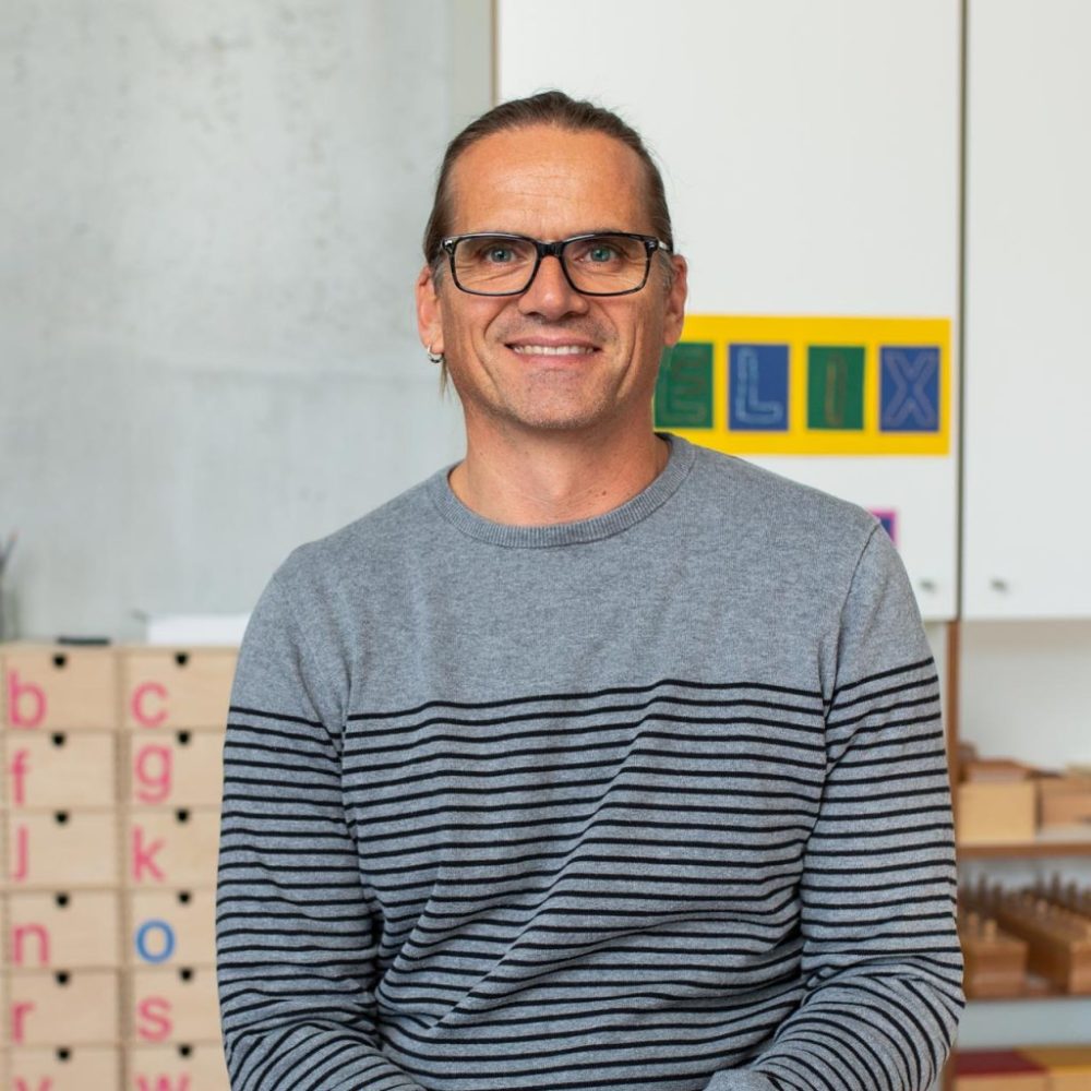
These graphic elements are juxtaposed with our interior photography, reportage photography and people photography, which provide insights into the world of the two crumb boxes on the website in bright colors and with beaming faces.
But we are far from finished with this state of affairs, because there is still so much to discover for us playchildren of graphic design. We are looking forward to it.
