Gasthaus Kreuz Corporate Design
Gasthaus Kreuz is one of the newest and at the same time most traditional culinary addresses in the whole of Singen (Hohentwiel). It was closed for two years before it reopened in 2019 after extensive renovation and became one of the most popular addresses in the city basically straight away. We were allowed to take over the brand development and design and realize the applications.
Design and Logo
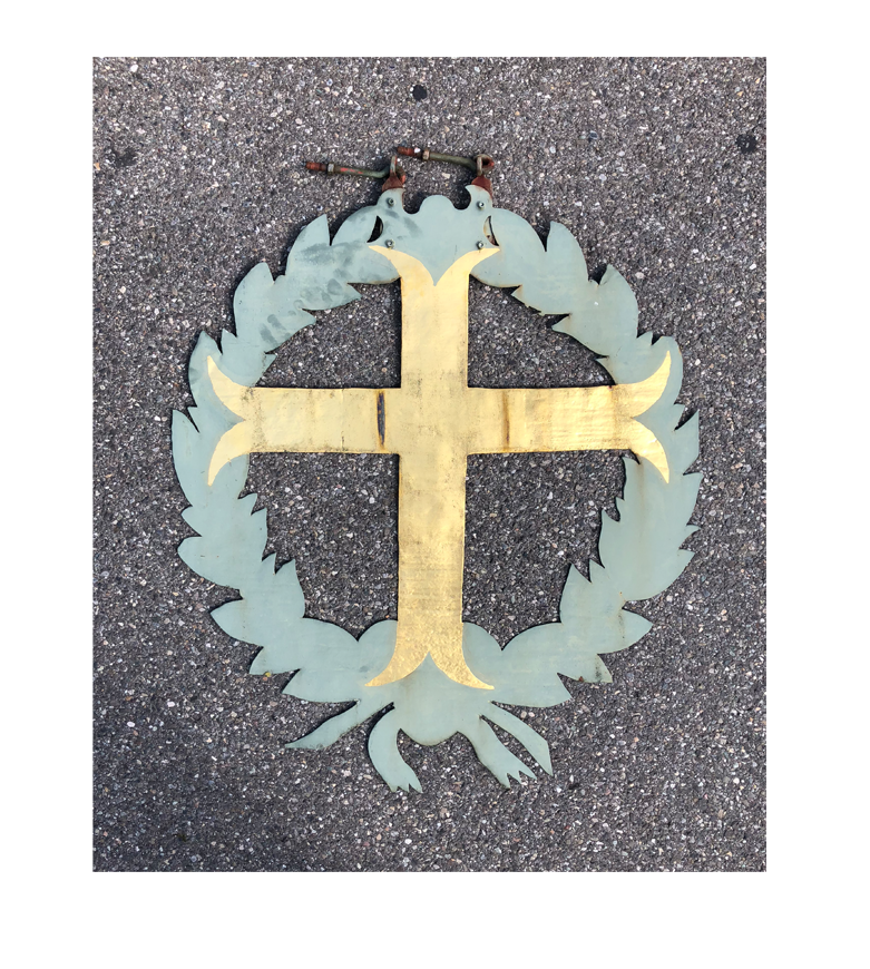
In the beginning there was a sign. Or better: it was lying. On the ground in front of the house under renovation in the heart of the city of Singen. A cell phone photo of this original sign, which had hung on the house for so many years and attracted guests. Plus the enthusiastic words of the founder Sebastian Kopitzki, who had a clear vision of what the new cross should one day become. That’s all it took to gain access to the brand development of the Gasthaus Kreuz.
The sign, as old and nostalgic as it was, was ideally suited as a starting point for the logo, or more precisely for the figurative mark, to which a wordmark was added. This lettering is a combination of a very modern Grostekt font that runs a bit higher and is deliberately set in a more spationed way to create more white space for more lightness. In this font, the word “GASTHAUS” is set, deliberately in capitals, so as to give the overall look of this descriptive term a self-contained effect.
Because of this and also because of the smaller representation, the term visually recedes into the background and gives way to the actual distinguishing term, the name of the house “Kreuz”. And this in two respects. Because in addition to the different optical weighting, we have also decided to actually write the word “Kreuz” in front of the word “Gasthaus”, even though it is used the other way around in linguistic usage. This trick enhances the special effect of the composition.
Typography
The word “kreuz” is set in a modern serif font with the feel of a Fraktur font, which has a bit of a calligraphy feel to it. We decided to keep the entire word in minuscules, i.e. lowercase letters. This is because the lowercase k has a slight swing and runs a bit more harmoniously than it would have if we had used the uppercase. The capital K would also have visually exerted too much pressure and thus brought the overall composition into an imbalance.

Colors
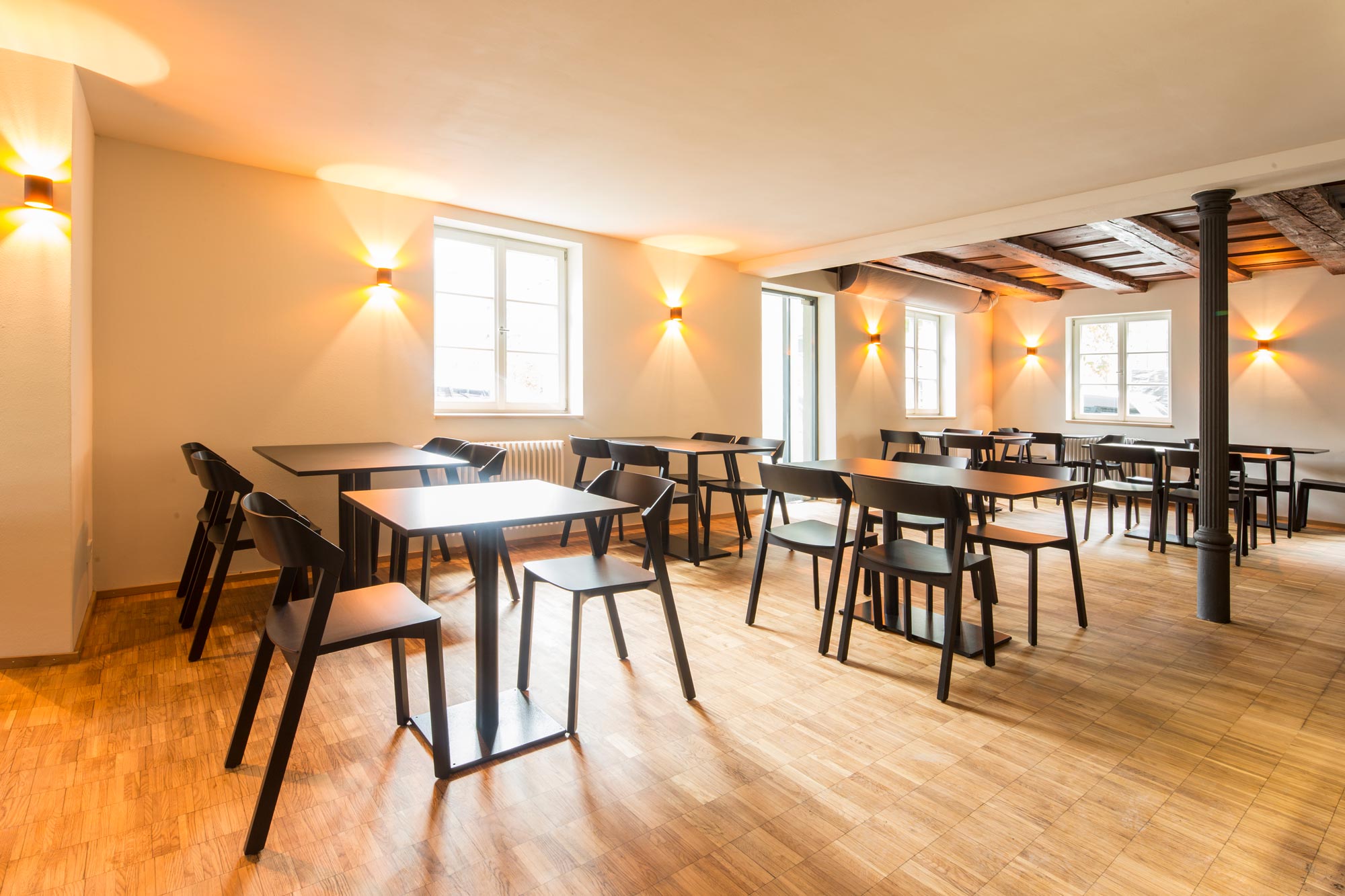
For the colors, we oriented ourselves to several starting points. On the one hand, on what we knew from the interior architecture co-designed by the Singen artist Harald F. Müller, and on the other hand, on what was already present through the inventory – gold and green in the old sign. And finally, in the fine definition, we find colors that also appear in the kitchen: The greens are reminiscent of sage and olives, the gold tone could also be a mustard yellow, the reds are reminiscent of berries, but also of raw tuna, for example. Together this resulted in a wonderfully aesthetic, credible, noble and at the same time down-to-earth color climate with an award color.
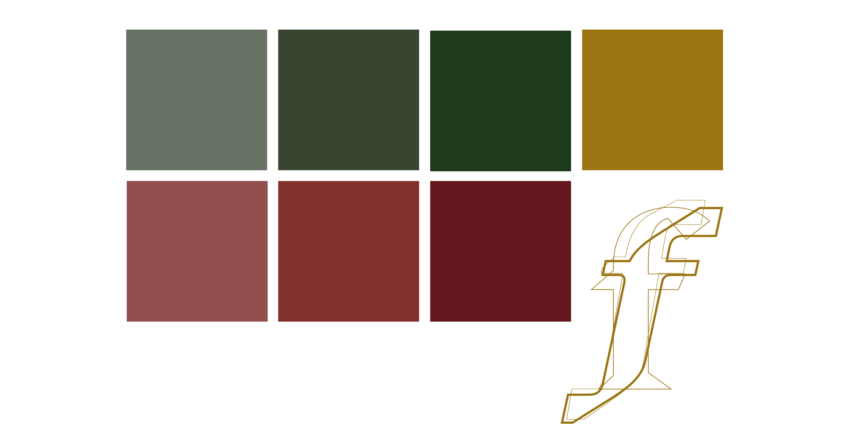
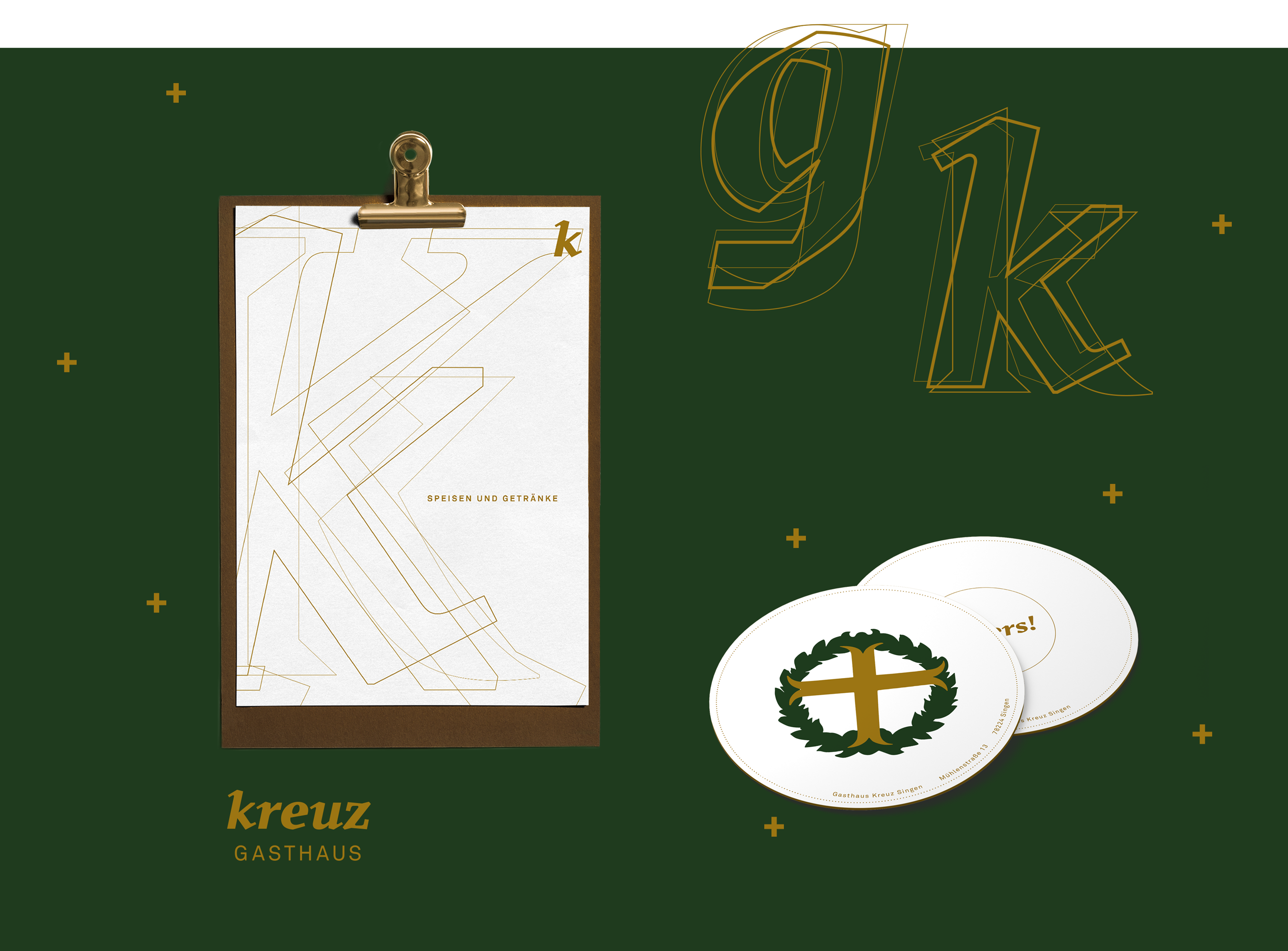
Logo and colors were found. But there was still something missing. A nostalgic association was constantly resonating in the background. We found a way to materialize this on the level of decorative elements. The original sign has something medieval about it, reminiscent of fairy tale books. And fairy tale books always begin with a large decorative initial, i.e. an oversized first letter, in order to start the story in a more figurative way. We transferred this idea into the design for the Gasthaus Kreuz and thus our decorative letters were created, which do not fulfill any concrete rational function, but complete the overall picture. In the original implementation, they are outline letters, which lie on top of each other and become increasingly finer. For the sake of effect, we also mixed in other fonts. The result is high aesthetic value and versatility.
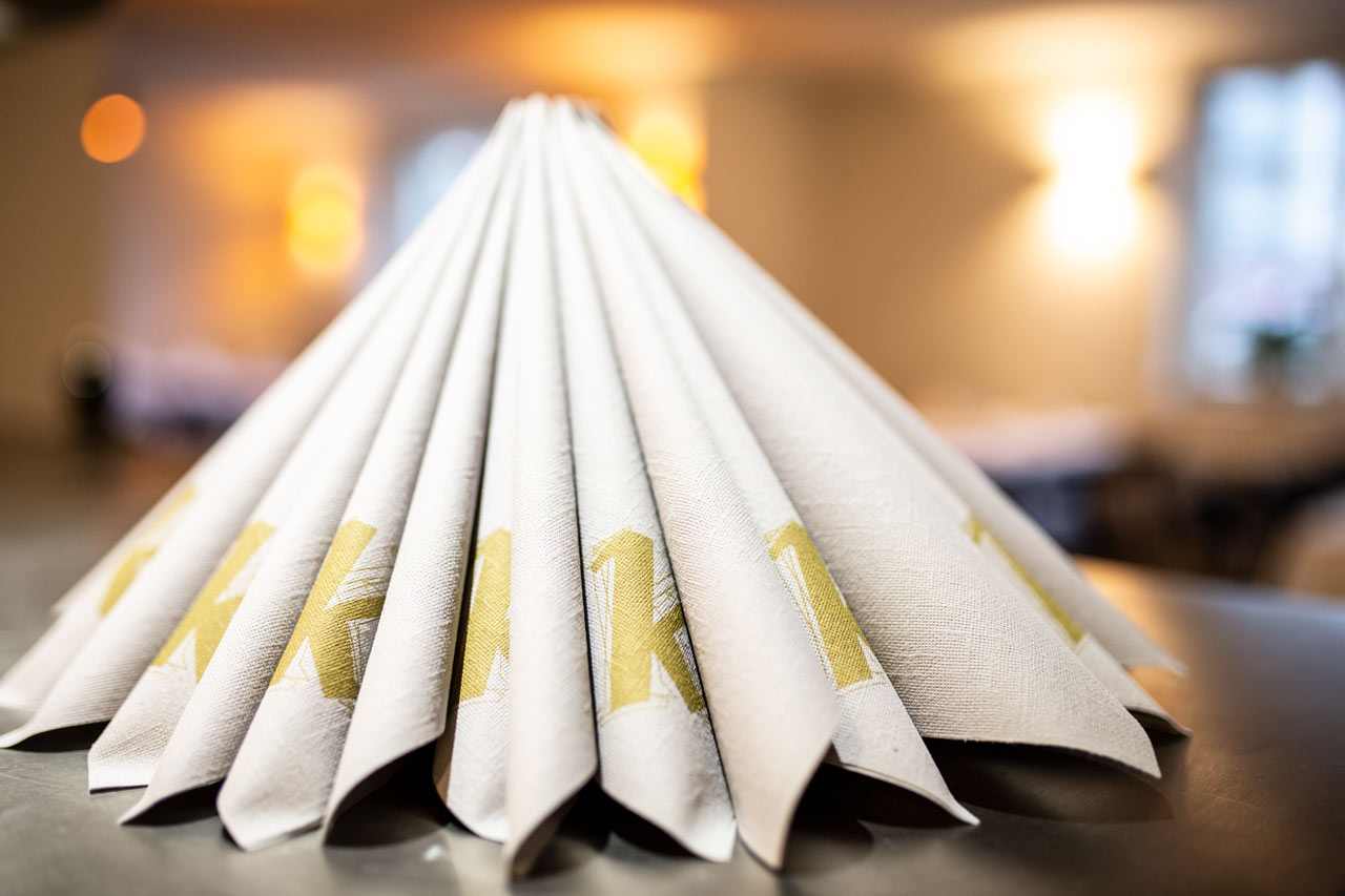
One of the applications of the corporate design is the food and beverage menu with its lead page featuring a Pantone gold tone, gold clip and wooden board. Stylish and at the same time flexibly updatable in everyday life. The beer mat with a “Cheers” on one side and the figurative mark on the other is also an example of the versatility of the look with its clean lines and plenty of white space, as are the napkins with logo and decorative initial.
Photography
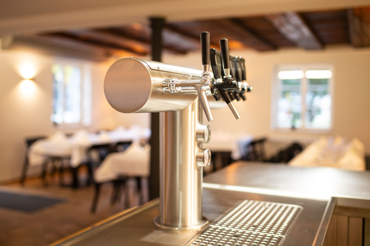
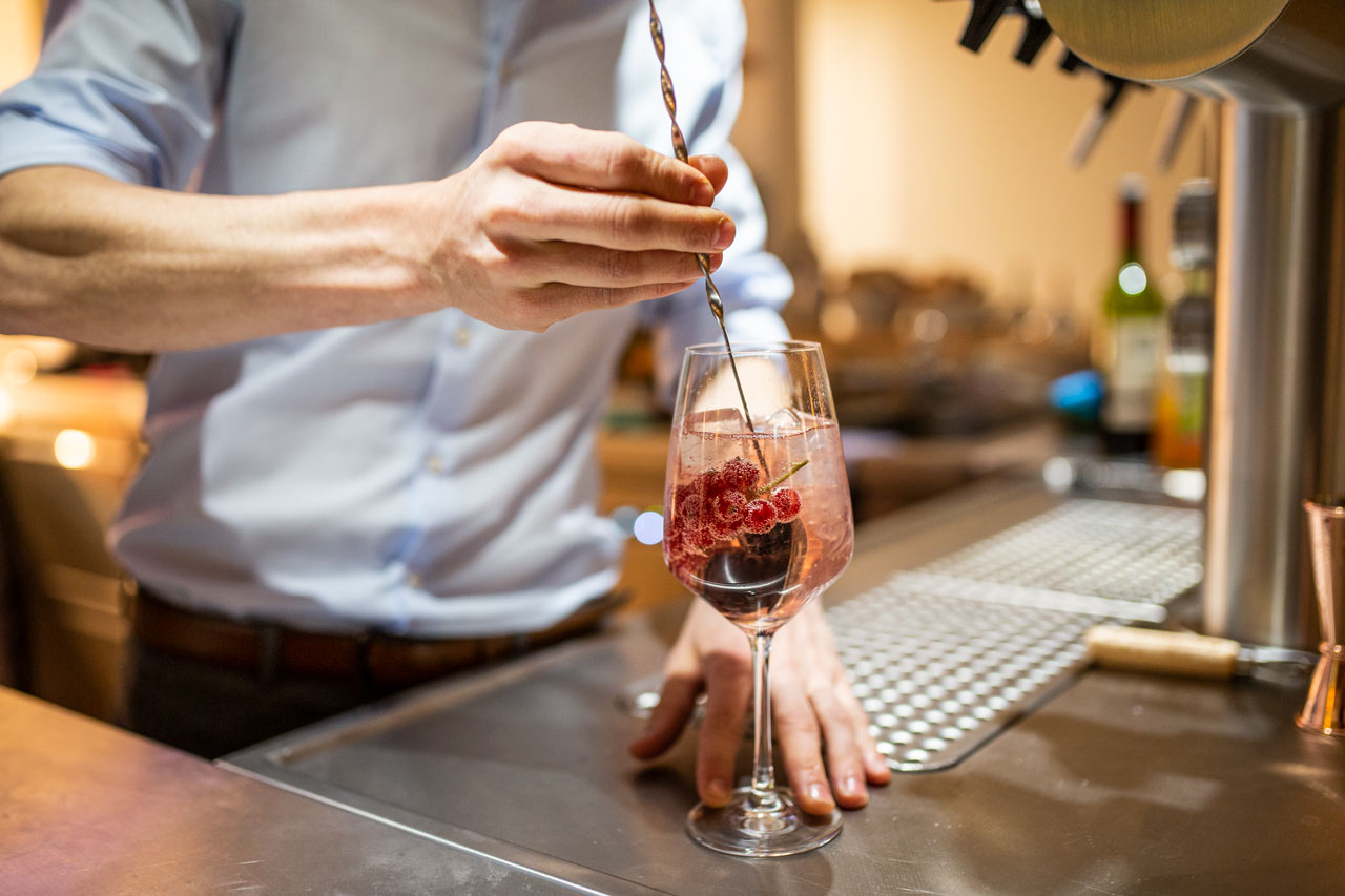
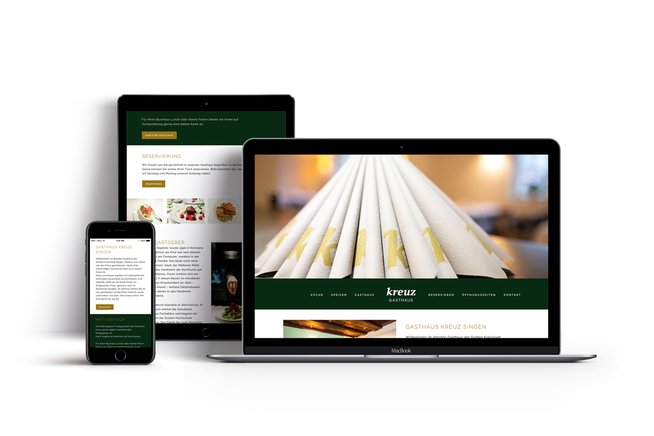
For the photography, we spent half a day in the regular routine of the Gasthaus Kreuz and created an emotional reportage documentary photography, where the target group is up close and personal with the preparation of the food. Natural, warm light and real, beautiful, aesthetic photography, only very subtly post-processed, fits perfectly with the color climate and the look and feel of the corporate design.
