Entsorgungsbetriebe Konstanz Infografiken

Wastewater Treatment Plant Trail

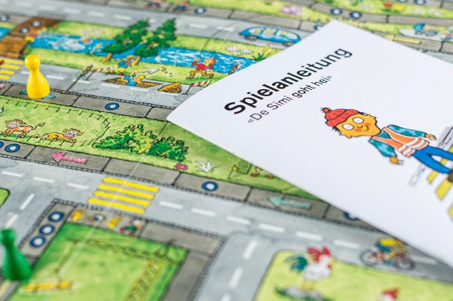
The disposal companies of the city of Constance (EBK) take care of waste and water disposal. Dirty water is not simply disposed of, but is first treated in an elaborate process. In order to explain this process to the people of Constance and all other interested parties, there has long been a sewage plant nature trail. We were now allowed to completely redesign it.

Services:
Print Design, Logo Design, Illustration

Customer:
EBK – Disposal companies City of Constance

As a warm-up, so to speak, we provided a graphic update of the EBK logo in a preliminary step. We didn’t reinvent the wheel, but identified the one with the greatest graphic potential from the existing variations of the EBK logo and just put the finishing touches on it. This updated logo is much more compatible with our graphical concept for the display boards of the sewage treatment plant nature trail than the previous relief variant would have been.

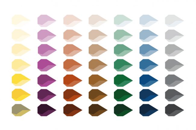
For the infographics, we developed a reduced basic design based on a deliberately coarse form language and minimally indicated plasticity through light edges or shading. This visual principle runs through all the panels of the educational trail of the sewage treatment plant. Together with the customers, it was also possible to reduce the complexity of the information conveyed. Less is often more. That’s why we also worked on the content level. In combination with a design grid for the panels that neatly separates headings, main and marginal content, the result was a modern look that is fit for the years to come.

similar projects
all projects

Handwerk in Konstanz Kampagne

Handwerk in Konstanz

“Handwerk in Konstanz” (Crafts in Constance) is a free joint market presence of eight crafts businesses in Constance that are known and appreciated in the region for their quality and personality. Together with the participating companies, we developed a campaign for a bus of the Constance public utility company that is well worth seeing. Sympathetic illustrations complement the craftsmen photographed in typical activities and provide a lively overall picture to discover. Both the photo shoot and the illustrations were created in-house. The campaign is rounded off by the accompanying one-pager website www.handwerk-in-konstanz.de. We wish the “Handwerkerbus” a safe journey through the streets of our beautiful city.

Services:
Campaign, PhotographyIllustration, Online

Customer:
Eight craft enterprises from Constance


Similar projects
All projects

LGM Corporate Redesign

LGM Corporate Redesign

Lorth Gessler Mittelstaedt, known to clients simply as “LGM”, has been based in Constance as an agency since 1998. While the initial focus was on film production, our portfolio has evolved over the years into a full-fledged advertising agency that offers clients almost everything imaginable in the field of communication, from strategic brand management to corporate design to online and even film. This holistic, cross-media expertise is one of LGM’s competitive advantages.

Services:
Corporate Design, Branding, Online, Print Design

Customer:
Lorth Gessler Mittelstaedt

The high dynamics of performance evolution were also reflected in several redesigns that LGM’s visual identity has undergone over the years. The last adaptation was now about eight years ago and our visual identity no longer represented what our team now sees in us. Therefore, over the course of a year, we afforded ourselves what we also recommend to our customers: Before the redesign, we took an in-depth look at our brand and our values. On the basis of the brand values “modular”, “holistic”, “human” and “balanced”, which we defined together as a team, we finally developed our new visual identity with a dynamic design that, despite many variations, always appears to be from the same mould. The central element is the typogram of the three initials L G M.

We take great pleasure in translating the design into the many different applications. Although we are also at home in the digital world and feel very comfortable there, we do not forget print. And here we have fulfilled a long-cherished wish for the business cards: The finest letterpress printing on two layers of wonderfully soft 300-gram Gmund Cotton Linen Cream, both sides individually pressed and then laminated into a 600-gram statement. The approach of dynamic design was consistently followed through, which is why the typogram of each card is not the same as the other. The result is a number of unique pieces, and not just because of the different names.

similar projects
All projects

Aston Foods Full-Service

Aston Foods

Aston Foods designs and builds vacuum cooling systems for commercial and industrial bakeries. The special feature of vacuum cooling is the significantly reduced cooling time for baked goods, which has financial, quantitative and even qualitative advantages. Since the Freshup, the corporate design speaks a clearer and more modern language. Applications such as brochures, the website, but also an image film of the in-house Baking Center are part of the scope of our collaboration, as are people, image and product photography.

Services:
Corporate Design, Film, Print Design, Photography

Customer:
Aston Foods

One highlight is the image brochure with its unusual cover picture: At first glance, it is all white. Blank. As if the printing had been forgotten. A closer look reveals the partial UV coating, which gives a hint of the logo and the “Cooling Waves”.

The brand essence of Aston Foods, the controlled vacuum, becomes the hook of the image brochure in this surprising way and is thematized in the editorial. What was initially striking because it broke through perceptual habits becomes a clever metaphor at second glance; after all, vacuum is the presence of nothing.

similar pojects
All Projekts

Reisewelt Montfort Corporate Redesign

Reisewelt Montfort – Wanderlust reinvented

Reisewelt Montfort is much more than just a friendly, regional and efficient travel agency. Reisewelt Montfort is an institution in Tettnang. For its twentieth anniversary, Reisewelt reinvented itself: complete renovation of the business premises and a complete redesign of the corporate identity. We were allowed to take over the latter.

Services:
Corporate Design, Logo Design, Print Design, Illustration, Motion Design

Customer:
Reisewelt Montfort

Reisewelt Montfort Reisebüro Tettnang Logo
Reisewelt Montfort Reisebüro Tettnang Design

The central element of the new look is the logo. The initials of Reisewelt Montfort RM can be found in the signet. Perhaps at first glance, but at the latest at second glance, the vacation-hungry viewer also sees the mountains with a summit flag in this identification element. Or the sea with a sailboat. Or simply the sun beaming over the vacations that can be booked with Jürgen Niedermaier and his team. Even if not every vacation goes to the warmth, the warm color travel orange is chosen in the longing temperature of many holidaymakers.

Reisewelt Montfort Reisebüro Tettnang Design

The corporate design is all about inspiration: the typography is reminiscent of the fold-down display boards at the airport, the dots are reminiscent of the tear-off perforation on airline tickets, but also stand for the journey or the path to the destination. The whole design is modern, clean and simple. The icon world was developed to match and can be used universally. The appearance is rounded off by appealing animations.

Reisewelt Montfort Reisebüro Tettnang Design
similar projects
All projects

cobra computer’s brainware Printdesign

cobra computer’s brainware

cobra computer’s brainware is the provider of an innovative Customer Relationship Management CRM system, which is available in various expansion stages for different target groups. The company, which like us is based in Constance on Lake Constance, commissioned us to fresh up its corporate image. A job in which we were able to use our graphic skills as well as our illustrative skills.

Services:
Illustration, Corporate Design,
Print Design

customer:
cobra

Cobra Illustrationen

In the course of the corporate redesign, which we started with a brand workshop, we reworked the product logos and developed a graphic concept for all applications based on the small “c”, which has a high recognition value due to the striking geometric logo font. It can be found in graphic areas as well as in diagrams.

Cobra Illustrationen

To contrast the clean look with something organic, we developed an emotional and creative illustration style that combines wonderfully with the clear form language of the brochure. The illustrations make it possible to completely dispense with the stock-photo aesthetic that is common in brochures of this kind. The second major advantage is that topics can be illustrated in an appealing way that might otherwise appear a little dry. The consistent focus on these design elements results in a beautiful, coherent overall picture.

similar projects
all projects

Blickle Kinderhaus Corporate Design

Blickle Kinderhaus

The real estate market is empty, estate agents can hardly get hold of interesting properties. In these times, individual positioning is particularly important. Inspired by Peter Blickle’s focus on families, we developed the project “Blickle Kinderhaus”. The core of this project is the annual realization of a project that exclusively benefits children. The visible sign is the Kinderhaus-Mobil.

Service:
Campaign, Logo Design, Print Design, Online

Customer:
Blickle Immobilien GmbH

The logo is composed of the figurative sign and the word mark “Blickle Kinderhaus – Ein Projekt von Blickle Immobilien”. The house of the figurative sign is not rectangular. The furniture dances playfully in the basic shape of the house. The color scheme is in the basic colors of the children’s world.

This unconventional way of thinking / shape was also conceived and realized for the Ape.
The converted Vespa “Ape” is not only colorful, but bears surprises: Inside there are complete walk-in houses for the children to assemble themselves. The children can build their own house. The project is promoted through flyers, appearances at children’s festivals and press work. When the Kinderhaus-Mobil is not in use, it is a cost-effective advertising medium for Blickle Immobilien.
The enthusiasm of the children after the first performance showed that the Kinderhaus-Mobil will be a highlight at every children’s festival in the future.


similar
Alle Projects

Aquinsa Corporate Redesign

Unification of the elements

Aquinsa is a holistic service provider for complete renovations after fire or water damage. The core element of the corporate redesign is a diamond, which functions as the smallest particle – quasi as an atom – of the design concept. A striking feature of the company name AQUINSA is the letter A at the beginning and at the end. This letter A is the starting point for the logo. It first becomes a stylized house roof. The house roof can be broken down into diamonds that resemble the shape of a drop and a flame.

Services:
Corporate Design, Print Design, Online

Customer:
Aquinsa

Aquinsa Logo

From this smallest building block, the logo is constructed in two variants: a blue one for a drop, a yellow one for a flame. The flame stands for the fire damage, the drop for the water damage. Thus, these elements unite with a diamond.

The diamond is also used in the word mark to optimize the letter Q as a cauda. And it becomes the basis of the entire graphic system for all printed materials and the website.

The new corporate design is used in various media. One of these is an image brochure with a special feature that only becomes apparent to the viewer on closer inspection: It can be flipped through endlessly.
This is made possible by a special binding method in which the cover is given three wings as a Z-fold. Both folds are staple-bound to form the center of two halves of the brochure.
One half plays the theme of fire and the other the theme of water. Once one theme has reached the end, the other theme starts automatically when the last page is turned.
A kind of perpetual motion machine of print design.

Aquinsa Webanwendungen
Similar Projects
All Projects

Simi Sicherli Didaktische Konzeption

Simi Sicherli – playful learning

The instruction service of the Thurgau cantonal police, together with the cartoon character Simi Sicherli, visits several hundred kindergartens every year and practices with the youngest children how to be safe pedestrians. The new Simi Sicherli box from “Verkehrssicherheit Thurgau”, which includes a board game and an audio CD with a radio play, provides additional support for this work.

Services:
Didactic conception, Development of educational game, radio play and animated film

Customer:
Kantonspolizei Thurgau, Schweiz

External partners: Illustration: Bruno Nadler, Grafik: Herbert Schreiner, Kindergarten-Didaktik: Lea Meili

To really understand how children of kindergarten age are taught about safety on the sidewalk and when crossing crosswalks, we took part in a visit by a police officer to a kindergarten and observed very closely the way they were addressed and the learning content conveyed. In addition, we conducted an interview with the president of the Thurgau Kindergarten Conference, Tanja Kroha, who is a kindergarten teacher herself and was able to contribute valuable experience from everyday kindergarten life.

On this basis, we then developed an integrated overall concept. We divided the learning content into five main chapters and wrote a story based on these chapters. It was important to us that each chapter also works on its own. This means that we don’t have to tell the whole story each time, but can also focus on individual topics that seem particularly important at the time.

With this method, we succeeded in accommodating all learning content in the story. In parallel, we developed the board game in which Simi walks home from kindergarten and experiences many situations. The situations are based 1:1 on the story, which means that the children can find all the learning content on the board. The goal of the game is to be the first to arrive home, but to follow the traffic rules.

On the way, Simi passes several crosswalks that shorten the route, but he can only cross them if he has first drawn all four collectible coins from a small bag. The different collecting coins stand for the four-sounding phrase “warte, luege, lose, laufe” (wait, look, listen, go), which is familiar to children in Thurgau. After all, according to this concept, children at the crosswalk should ensure that they cross the road well and safely.

In addition to the board game and the CD with the story and songs, the Simi box also contains a Simi hand puppet, which was designed by the Simi project group with the participation of graphic designer Herbert Schreiner in collaboration with the team of traffic instructors from the Thurgau Cantonal Police.

To round off the overall concept of story and board game, we produced an enlargement of the partial section of the game board for each of the five partial stories on a solid cardboard, which has the respective partial story printed on the back for the kindergarten teacher to read aloud. In this way, the story can also be told in a circle of chairs.

The project was accompanied by Lea Meili, who summarized the didactic concept for the kindergarten teachers in the accompanying booklet and thus ensured that the Simi-Box will stand up to critical scrutiny.

Due to the great success of the Simi-Box, the Thurgau Cantonal Police decided the following year to have us realize our idea of deriving a film from the radio play and the board game. To do this, we isolated the individual elements, added backgrounds that had not existed before, since the artist Bruno Nadler had created the drawing of the game board as a complete work, and animated them on the overall plan. We then added tracking shots, chose different frames, and in this way brought the story to life. So now Simi is also in motion. And we already had an idea for the next application: How about a Simi computer game? We would be ready …
similar projects
All projects

Volksbank Konstanz Mitgliedermehrwertkampagne

Members benefits campaign Volksbank

Volksbank is more than just a bank. It is locally anchored, nationally networked, committed to its members and democratically organized. This is also how Volksbank Konstanz puts it on its website. The cooperative idea “What one cannot do alone, many can” is even part of the UNESCO cultural heritage. We were allowed to design and implement the member advertising campaign for our Volksbank Konstanz.

Services:
Campaign, Print Design, Photography

Customer:
Volksbank Konstanz

Volksbank Konstanz Mitgliedermehrwertkampgane Plakat


The campaign’s chain of reasoning, which is based on the nationwide benefits program for members, is coherent: Members have advantages with many providers thanks to their golden BankCard. This is particularly interesting for regional companies, as it is sufficient to pay with the golden Volksbank card to receive the added value. And vice versa, this also creates added value for these regional companies, as it enables them to find and retain customers in the region. And the third winner is the Volksbank, which thus makes membership even more attractive.

To illustrate these benefits, we featured four selected regional partners in the advertising campaign, addressing different segments of the overall target group. From young to old, from sports enthusiasts to nature lovers. In the process, Volksbank’s regional partners became part of the advertising backdrop, whether it was the iconic architecture of the relaxation room at Bodensee-Therme Konstanz, a deer at Allensbach Wildlife and Leisure Park, or the team and even fans of HSG Konstanz. We think: It doesn’t get more regional than this.

similar projects
All projects

Lorth Gessler Mittelstaedt GmbH
Reichenaustr. 36
78467 Konstanz

+49 (0)7531.189550
kontaktnospam@nospamlgm.info
Facebook | Instagram

Impressum
Datenschutz
AGB