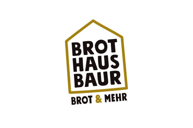
Brothaus Baur Branding

Brothaus Baur – Brot & mehr

Brothaus Baur is a new brand from Edeka Baur. Initially, it is a pilot bakery in one of Edeka Baur’s grocery stores, which has replaced the previous offering. We were allowed to help a lot on the way to the new branding and not only to contribute to the naming, but also to develop the complete appearance including logo design, design of the print products up to the design of the lettering of the store equipment.

Services:
 
Customer:
Edeka Baur
 

At the beginning of the project, the working title was “Market Bakery,” but we quickly realized that we had to go further. Values such as down-to-earthness, tradition and regionality played just as much a role as the realization that bread is simply part of shopping. The overly descriptive impression of the working title finally made us realize that the name Baur absolutely had to be a central component of the new brand. After all, Jürgen Baur’s stores stand for such outstanding quality and such a love for food that it simply made sense to use this charisma for the new bakery name as well. This is how the Brothaus Baur came into existence.

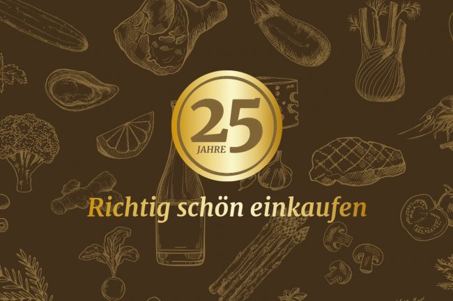
In the logo design, we were struck by the visually attractive triad of the words Brot, Haus and Baur, in which each individual word with its four letters has the same structure and can thus be set in perfect visual balance. Less is often more in design. And so we added only a basic house shape and a descriptive subline to the composition of the three words, which is also perfectly balanced in the harmony of the four-letter words under the signet – as a foundation, so to speak. As colors we chose black and gold.

On the second communication level, in addition to a deliberately sympathetic and restrained claim, the overall image is supported by many beautiful hand-drawn illustrations that perfectly match the typography in terms of form language. A wonderful assignment and an equally wonderful collaboration with these super likeable clients. Thank you!

similar projects
all projects

Constellium One-Stop-Shop Produktion

One-Stop-Shop media production

Constellium is a global manufacturer of aluminum products. For trade fairs, openings of research and production sites, internal and external communication, Constellium needs a variety of services from the field of media production. With our range of design, online, film production and photography services, we are just the right supplier.

Services:
Photography, Film, Print Design

Customer:
Constellium

Exhibition stand photography

Trade show appearances are very important for Constellium to position themselves in the market. Months of preparation culminate in a presentation lasting only a few days. This is what happened at the world’s number one trade fair ALUMINIUM 2018 with a fabulous and award-winning stand created by the munich-based trade fair construction professionals from MEPLAN. The time window for the photography of such a booth is usually extremely small, as there are usually only a few hours between completion and the opening of the trade fair, at which the press release is sent out.

People photography

Proud of what we do – is the name of a campaign by Constellium that illustrates the high-quality products that the company and its team manufacture. It is also pride that is at the center of the image concept in the on-location people photography. Yet such a production is also possible on the fly – because we were in London primarily for filming and produced a whole series of photos of the employees on the side.

Reportage photography

Perhaps the most underrated type of photography is reportage photography. It provides material that can be used in a wide variety of ways without much effort. It can be used to clarify processes and illustrate interrelationships. And quite incidentally, it also creates a versatile stock of press photos that massively simplify the creation of press releases.

Packshot

A manufacturer like Constellium is involved with its products in a variety of products. After a trade fair at which these products were presented collectively, it makes sense to photograph them professionally right away in order to be able to use the so-called “packshots” in publications and for internal communication. So the trade show kept us busy in our studio even afterwards.

similar projects
all projects

laulima Branding

laulima – the fully agile competence center for manufacturing technologies

The laulima platform connects companies with manufacturing capacities with companies looking for a manufacturing solution, for example for small series or prototypes. The communication task was to combine an individual name with a fresh and dynamic appearance.

Services:
Logo Design, Corporate Design, Illustration, Motion DesignPrintdesign, Online

Customer:
laulima
laulima

The name laulima results from a multi-stage creative process, the design should put the “connecting” in the foreground. With the semicircles and bridges, this was well achieved. A friendly typography paired with a “you” salutation underline the start-up character of the young brand. The appearance was then applied to print products and website in the next step

laulima

At the center of the website are two explanatory films that describe how laulima works and what benefits companies can generate. In the further course, the website will be extended by an extensive database connection.

Similar projects
All projects

Edeka Baur Jubiläumskampagne

25 Years Edeka Baur

There is a reason why Edeka Baur has become indispensable not only in Constance, but also in many other places in the region. It is the combination of freshness, quality and shopping experience that convinces customers. The 25th anniversary is a wonderful opportunity to celebrate this in its very own, down-to-earth way. We were commissioned to develop the anniversary campaign.

Services:
Campaign, Print Design

Customer:
Edeka Baur

Edeka Baur richtig schön einkaufen

Despite all the joy about the renewed cooperation with our dear neighbors, we were aware: It is “just” another anniversary for the target group. Clarity in communication and finding the core of the message were therefore the top priorities. In several iteration loops, we developed a valuable signet and an emotional, powerful color world. We combined both and enriched them with a texture of food illustrations. The result was two implementations: One as a button, which in its circular shape brings a high compatibility to various applications on- and offline. And a second one as a kind of quality seal, which comes into its own in vertical applications such as flags.

Edeka Baur richtig schön einkaufen

The anniversary design resulted in a campaign that will be played on various channels: As TV and radio commercials, on social media, on the company website, in an out-of-home billboard campaign, as point-of-sale branding, as customer and employee cards and, last but not least, on fancy buttons that all employees wear on their new professional clothing.

As an additional highlight, we were allowed to photograph the cover of the August issue of the lifestyle magazine Akzent. We translated the claim “Richtig schön einkaufen” into a picture concept: An Edeka Baur employee takes a selfie with customers of different age groups. Positive mood, credible actors – because the really were real employees and customers – and a positive, not exaggerated charisma were the result. It is not an exaggeration when we say: This job was a matter of the heart for us, because: We love our Edeka Baur.

Similar projects
all projects

Karlsstraßenfest Eventlogo

Karlstraßenfest in Tettnang

The Lions Club Tettnang Montfort organizes an annual fundraising event in the central shopping street of Tettnang, where money is raised for a good cause. A logo and design concept was needed for this event. As the agency of several resident companies at once, we took on this task pro bono.

Services:
Corporate Design, Logodesign,
Motion Design

Customer:
Lions Club Tettnang Montfort

Karlstraße is for the beautiful town of Tettnang something like the Champs-Élysées for Paris: a central shopping and strolling street with a beautiful ambience and numerous stores, restaurants and cafés. All the more so since the new pavement has given the street a new shine, it is a pleasure to stroll here. A special feature of Karlstrasse is the steady but moderate gradient, which gave the members of the Lions Club Tettnang Montfort the idea of a charity event: While there are always rubber duck races for good causes along river courses, the Lions are organizing a ball race that goes down Karlstrasse. The balls are sent into the race for an entry fee and whose ball is one of the first to roll through the finish line wins attractive prizes. The proceeds go to charitable causes. This race is one of the main attractions of the street festival, which was unceremoniously developed around it, and for which the organizers commissioned us to develop a logo.

Two central thoughts guided us in the conception: Firstly, the Karlstraßenfest should develop into a popular date in the Tettnang city calendar. To achieve this, it must radiate one thing above all: Joie de vivre. And secondly: The ball race is one component, but not the only one. It is a distinguishing feature from other festivals, as it is closely linked to the nature of Karlstrasse. Nevertheless: The term ball race does not appear textually in the logo, but it does as a graphic quotation.

With an atomic design approach, we have ultimately brought these thoughts to the point. Because our logo design is created from dots that stand for the spheres as the smallest parts, the atoms of this design, so to speak. These atoms combine to form molecules: The sphere can be combined with other spheres or even distorted into a line. Lines and spheres combined together again make organisms: Letters.

The result is the memorable, lively and super-modular sphere logo of the Karlstraßenfest. It works in all formats and perfectly on catchy posters. It’s also ideal for digital use, for example with animations for Facebook or Instagram.

It’s nice when we can let our creativity run free and do some good in the process.

similar projects
All projects

Soho Lago Imagekampagne

Soho – Image Campaign

The new fashion store from Ulmer Mode in the Constance Lago Shopping Center is a great success. The concept of modern urban litestyle in a loft-like store is very well received by customers. It was these female customers that we focused on in our advertising campaign. The “SOHO LAGO Face 2018” photo campaign was such a success that on the day of the shoot we even had to put off candidates until the next time.

Services:
Campaign, Print Design, Photography

Customer:
Soho Lago

Soho Lago Logo
Soho Lago Fotoaktion Social Media

On a Saturday afternoon our photo studio was set up in the LAGO Shopping Center Konstanz. All participants were optimally prepared for the photo by the campaign partners: The team of ZIEGER FRISEURE styled the hair and the make-up artists of DOUGLAS took care of the make-up. The photos were taken in an elegant black-and-white look, with a special feature: the SOHO LAGO logo was projected onto the face. We took over 3,000 photos back to the agency that day. The best pictures were later posted on the SOHO LAGO online channels. And the best picture was used for print advertising. All participants were rewarded with shopping vouchers and received their picture as a souvenir.

Soho Lago Fotoaktion Social Media

We deliberately scattered the advertising for this campaign only at the point-of-sale, on the website, and on social media channels. The central approach of this campaign was to involve the target group in the advertising. And this in a direct as well as in an indirect way. This was because the images were subsequently placed as Facebook ads in the respective place of residence of the participants and in the immediate vicinity. This significantly increased the probability that the advertisements were consciously perceived. After all, anyone who sees an ad with a face from their circle of friends has a much higher level of attention due to automatic selective perception. In the end, this campaign gave everyone involved a lot of pleasure and showed one thing above all: The target group is interested in advertising campaigns when they are involved at eye level.

Soho Lago Fotoaktion Social Media
Similar projects
All projects

Bädergesellschaft Konstanz Markenführung

Strategic brand management
Bädergesellschaft Konstanz

The city of Constance has the luxurious offer of a total of eight pools, including the Bodensee-Therme, the Schwaketenbad, the indoor pool on the Seerhein and five outdoor pools, four of which are open to the public free of charge. The corporate redesign is based on the modernized identification element, a stylized wave, which has stood for the Constance pools for many years. With this and the concept of color codes, the two most important recognition elements are adopted. Apart from that, everything is new.

Services:
Branding, Corporate Design,
Logo DesignPrint Design

Customer:
Bädergesellschaft Konstanz

Bädergesellschaft Konstanz Plakat

In this case, brand management means, for example, building a clean brand architecture with recognition and differentiation features at the same time. The wave as the primary unifying identification element, the color world as a way of differentiating the detailed offerings and bringing them together in the parent company Konstanzer Bäder. The successfully established typography of Bodensee-Therme Konstanz is inherited by all other spas and the parent company.

Bädergesellschaft Konstanz Werbefläche
Bädergesellschaft Konstanz Plakat

Brand management also means focusing on the central core messages in communication, especially billboard advertising. Everything that distracts is left out and subordinated to the communication goal, even if this is sometimes not easy at all, because there really is a lot of exciting stuff to tell. The hierarchy of messages is as simple as 1, 2, 3: The central motif immediately sets the context. The sender can be grasped in a fraction of a second. And a headline that subordinates itself hierarchically rounds things off.


similar projects
All Projects

Mile High 69 Gin Imagefilm

Like sex in the air

Distiller Julica Renn is also an enthusiastic pilot. With her love of experimentation, she is responsible for the composition of an extraordinary gin at the Burgunderhof family distillery on Lake Constance, which is steeped in tradition. Her declared goal: “As much passion as possible must go into the glass.” The result is the coveted “Mile High 69” gin, for which we realized the image film.

Services:
Campaign, Film

Customer:
Burgunderhof digestif’s GmbH

The story is based on the legendary Mile High Club. Anyone who has ever had sex on board an airplane belongs to the club. The first member was U.S. pilot Lawrence Sperry, who founded the Mile High Club in November 1916 together with a certain Waldo Polk and using an autopilot of his own design. Inspired by this world-famous Mile High Club, MILE HIGH 69 Gin promises an experience of a similarly special nature.

Our approach was to convey the core of the brand in under 100 seconds in a way that fits perfectly with the corporate identity. The concept tells the story based on the trailer, establishes the traditional craft, the quality and the protagonist, and with a tongue-in-cheek conclusion opens up a space of association that builds on the claim “Tastes like sex in the air.”

similar projects
All projects

Saurer Imagefilm

Saurer Imagefilm

Saurer is a leading global technology company focusing on machines, components and software for processing fiber and yarn. After the Saurer Group had developed a new visual identity, the worldwide rollout was scheduled for the industry’s largest trade fair in Barcelona. We were allowed to produce the central image video.

Services:
Motion Design, Film

Customer:
Saurer Intelligent Technology AG

In a workshop, together with the clients, we condensed the core messages out of the countless communication contents and developed a concept and a tonality. Dynamic, driving, innovative, self-confident, spiced with a pinch of humor. In doing so, we consistently exploited the possibilities offered by Saurer’s new corporate design: Colors, typography, formal language. Speaking of form language: Saurer works with the dot, the most reduced glyph of the typeface. This is scaled and thus given weight. An ingeniously simple concept that we translated into motion design.

Not only did we quote the point in the context of animation, but we also set other contents of the film’s narrative strand, which does completely without a narrator, in motion semantically motivated typographically and graphically. If you look closely, you will find one fine detail after another. Be it letters that quote a typical machine motion sequence or that otherwise behave according to the content. Every movement is motivated, everything in the two-minute film has a reason. For all its attention to detail, the film also thrives on its speed: quick cuts to match the music – to the rhythm of the industry, as it were. The film reflects Saurer as a dynamic company with innovative strength and a focus on the future. Or as it says in the film: Swiss Precision, German Engineering, Chinese Speed.

We really enjoyed this project. LGM – we Love Graphics & Motion.

similar projects
All projects

architekt S Corporate Redesign

architekt S

Andreas Schumacher from Tettnang is a man of many talents: As an architect, he is the managing director of “teba”, a company that operates in the fields of real estate, residential construction and property management. At the same time, he manages a modern architectural office: architekt S. The external image of this office no longer suited this equally likeable and quality-conscious team, at the latest after the move to new premises. The client’s trust in our creativity enabled us to really start from scratch with the corporate redesign.

Services:
Logo DesignCorporate Design,
Print Design, Photography, Online

Customer:
architekt S

In search of a formally clear identification element, we examined the initials A and S and placed them graphically reduced in the context of building: a house, a street, both combined, pseudo-perspectively tilted. The letter S seemed even more important to us than the A, since it stands solitary in the name of the office. Therefore, from the too complex combination of A and S, we detached only the S and discovered the special effect of the “negative space” of this representation, that is, the image that our brain completes when we represent only the “tanks” within the two S-arcs.

The result was a graphic element with the association of a building and the S, which is recognizable at second glance. In combination with the typography, which harmonizes perfectly with this, a modern logo design was created, which is quickly remembered and carries a message: architekt S is the right provider for all those who have high demands on the formal quality of architecture.

We then continued this clear stance with all applications: stationery, square business cards, notebook with letterpress cover and color cut, construction fence banner through to the website, for which we not only developed the communication concept geared towards employer branding, but also wrote the image texts and designed and implemented the photography. 
similar projects
all projects

Lorth Gessler Mittelstaedt GmbH
Reichenaustr. 36
78467 Konstanz

+49 (0)7531.189550
kontaktnospam@nospamlgm.info
Facebook | Instagram

Impressum
Datenschutz
AGB