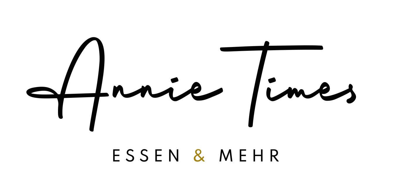
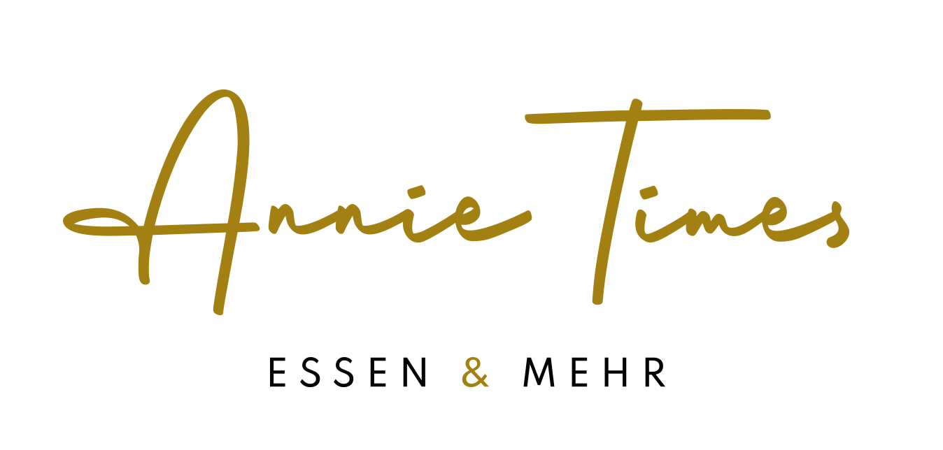
Annie Times: Name development and branding for a restaurant
The Edeka BAUR E-Center in Konstanz is, by far, the most beautiful food market in the region. We even know of former locals who, whenever they return to their hometown, make a point of shopping here to experience the authentic passion for food. We have already had the pleasure of developing the names and corporate designs for two other shops in the mall: the bakery and the pet well-being store. As the saying goes, all good things come in threes – so we were thrilled to take on the complete branding for the newly redesigned restaurant as well.
Services:
Corporate design, branding, logo design, outdoor advertising, naming, print design
Customer:
fresh produce markets Baur
The Edeka BAUR E-Center in Konstanz is, by far, the most beautiful food market in the region. We even know of former locals who, whenever they return to their hometown, make a point of shopping here to experience the authentic passion for food. We have already had the pleasure of developing the names and corporate designs for two other shops in the mall: the bakery and the pet well-being store. As the saying goes, all good things come in threes – so we were thrilled to take on the complete branding for the newly redesigned restaurant as well.
It all started with the naming process. Various ideas were based on different approaches—including the trend of naming restaurants after a first name in the genitive case, with or without a permissible apostrophe. Yes, in this context, it is permissible. We can already hear the critics calling it a “Deppenapostroph” (idiot’s apostrophe). But that is not the case. Here is a brief digression: although an apostrophe in the genitive case of proper names for shops or restaurants is not the standard rule in German, it is a recognised exception according to the Duden dictionary. It is generally used to clarify the base form of the name. Furthermore, we find it to be the ideal choice as it provides a clear distinction from the plural form. End of digression.
During the naming phase, twenty ideas were in the running, five of which made it to the final round. None of these five ended up being the name of choice, because, as is often the case in creative processes, a new idea emerged along the way, which was formulated by the client and then further developed by us. Ultimately, everyone was happy and convinced. This process proves once again that our core LGM value, Balance [click here], also translates perfectly to the collaboration between our clients and ourselves. You can read more about this naming journey in our blog post [click here].
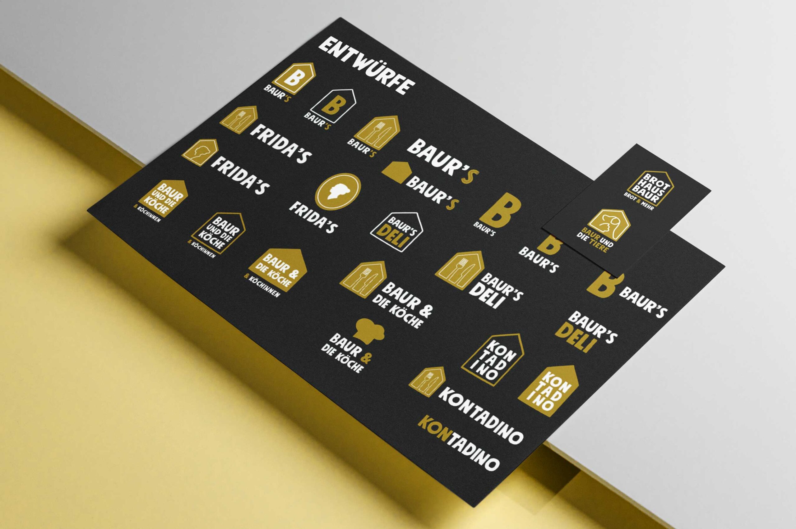
For the final decision, we established two hypotheses, one of which was consciously discarded. The first was that the name had to fit perfectly into the phrase, “Komm, wir gehen ins …” (“Let’s go to…”). The second was that the name should integrate into the existing brand family, alongside “Brothaus Baur” and the pet shop “Baur und die Tiere”. We eventually threw this second hypothesis overboard because the chosen name, Annie Times, was so powerful that it didn’t need to lean on the other brands.
Annie Times is a name with many virtues. It is phonetically pleasing, has a great rhythm, and is easy to pronounce. Combined with the logo design, it creates an impression of quality, accessibility, and a personal touch. Who knows – perhaps it refers to “Aunt Annie,” who once delighted her family and friends with her culinary skills and is remembered so fondly. In her home, the world was still a place of comfort, and sharing good food was a central part of life. At the same time, the name carries the message that guests can dine there whenever they wish, as the restaurant is open continuously, from morning until evening.

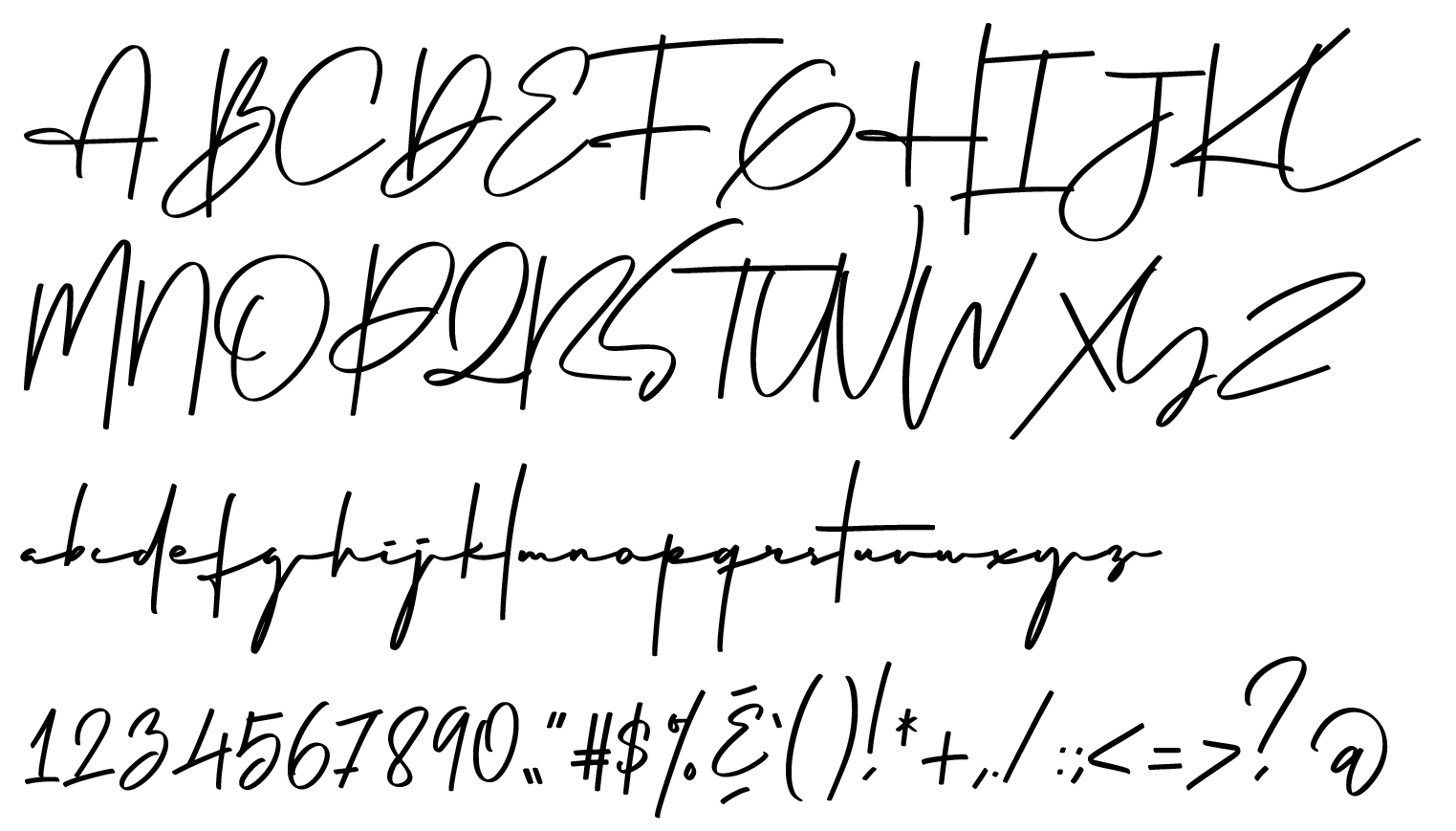
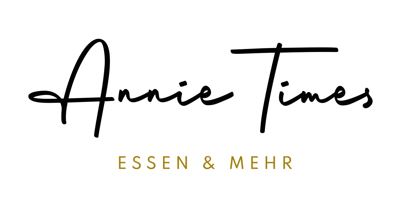
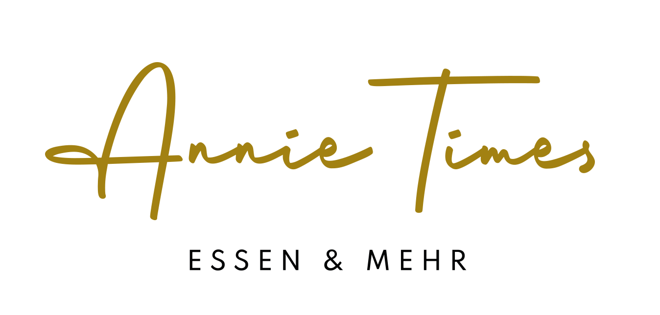
In the logo design phase, we quickly committed to a fine, delicate and sophisticated style. The interior design concepts provided valuable cues as to how the restaurant would eventually look, and how our designs would fit into that space. We opted for high-quality, handwriting typography with a calligraphic touch. One typeface we identified fit the vision perfectly, but had one weakness – while the combination of statement capitals and extremely flat minuscules (lowercase letters) gave it a unique character, it compromised legibility. We corrected this specifically for the logo, where instant brand recognition is essential.
As the project progressed, we created outdoor advertising that is regularly featured on the building, various print products, and a digital signage concept. The latter can be easily maintained by our clients in their daily operations using standard tools – yes, PowerPoint – and presents the menu offers on screens above the counter in a highly legible and stylish design. We are immensely proud of the result, and are also delighted that the food at Annie Times is truly excellent. We can highly recommend the egg breakfast, for example. Nom nom.
