Corporate Design-„rennovation“
“Tettnanger Bau- und Betreuungsgesellschaft” is well known in Tettnang under the abbreviation “teba”. No wonder, after all, the family-run company has been on site for half a century. The services offered by teba include the construction and sale of attractive condominiums in prime locations in Tettnang and the surrounding area. The group of companies also includes independent property management. The third main pillar of teba is the brokerage of valuable real estate. In the course of a corporate forward design we were allowed to give teba a still recognizable but nevertheless new face.
teba Wohn- und Gewerbebau Immobilien GmbH
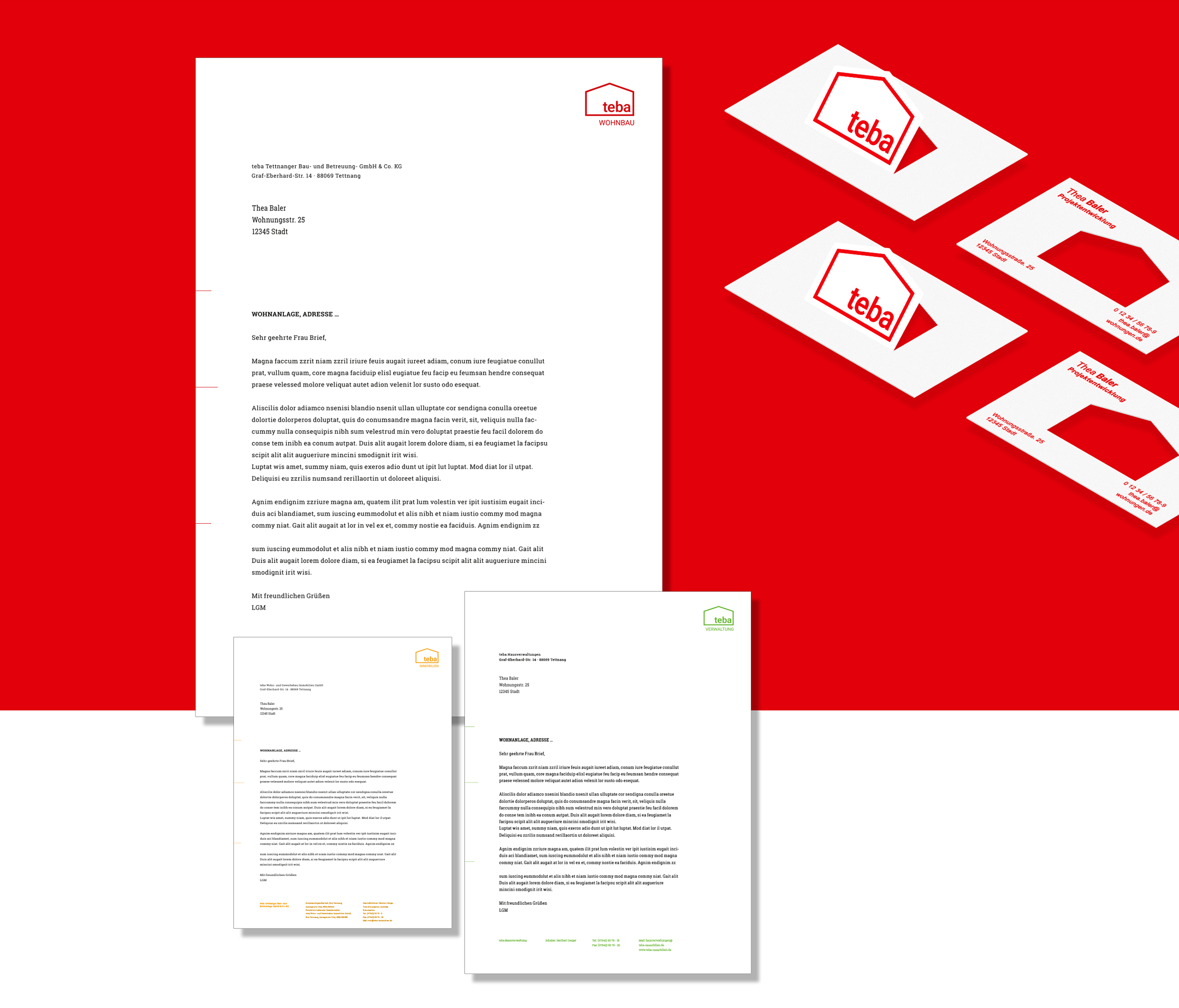
The challenge in this task was, on the one hand, not to change the visual identity of a well-known local company too much, but on the other hand, the new appearance should radiate a modernity and freshness that is both zeitgeisty and timeless. To achieve this, we modernized the identification element, i.e. the word-image brand, in a way that is often done with living space nowadays when it is being renovated: We created space to breathe while at the same time reducing it. To do this, we removed the chimney of the old logo, reduced the line thickness of the signet and typography, and gave the word mark more breathing room within the figurative mark. “Courage to go white” is what this approach has always been called in our industry.
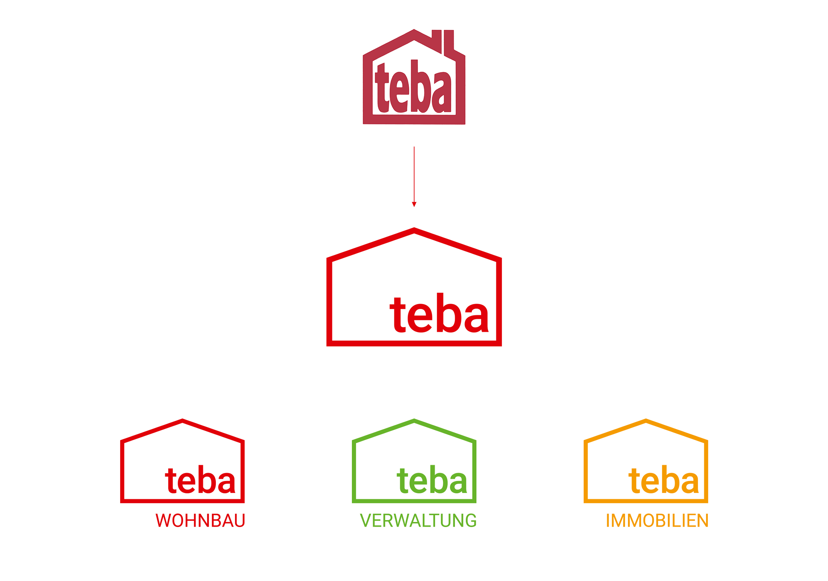
The effect of the new corporate design is now much more refined, fresher and also freer. With an additionally established color code, teba also differentiates between the various areas. As a special eye-catcher, we came up with a creative business card that is pre-cut and where the recipients of the card can build a house themselves by simply folding it. This first impression is not easily forgotten. Just as we have very positive memories of the wonderfully sympathetic collaboration with this modern, yet down-to-earth team. Many thanks to the teba team.

