LGM Corporate Redesign
Lorth Gessler Mittelstaedt, known to clients simply as “LGM”, has been based in Constance as an agency since 1998. While the initial focus was on film production, our portfolio has evolved over the years into a full-fledged advertising agency that offers clients almost everything imaginable in the field of communication, from strategic brand management to corporate design to online and even film. This holistic, cross-media expertise is one of LGM’s competitive advantages.
Services:
Corporate Design, Branding, Online, Print Design
Customer:
Lorth Gessler Mittelstaedt
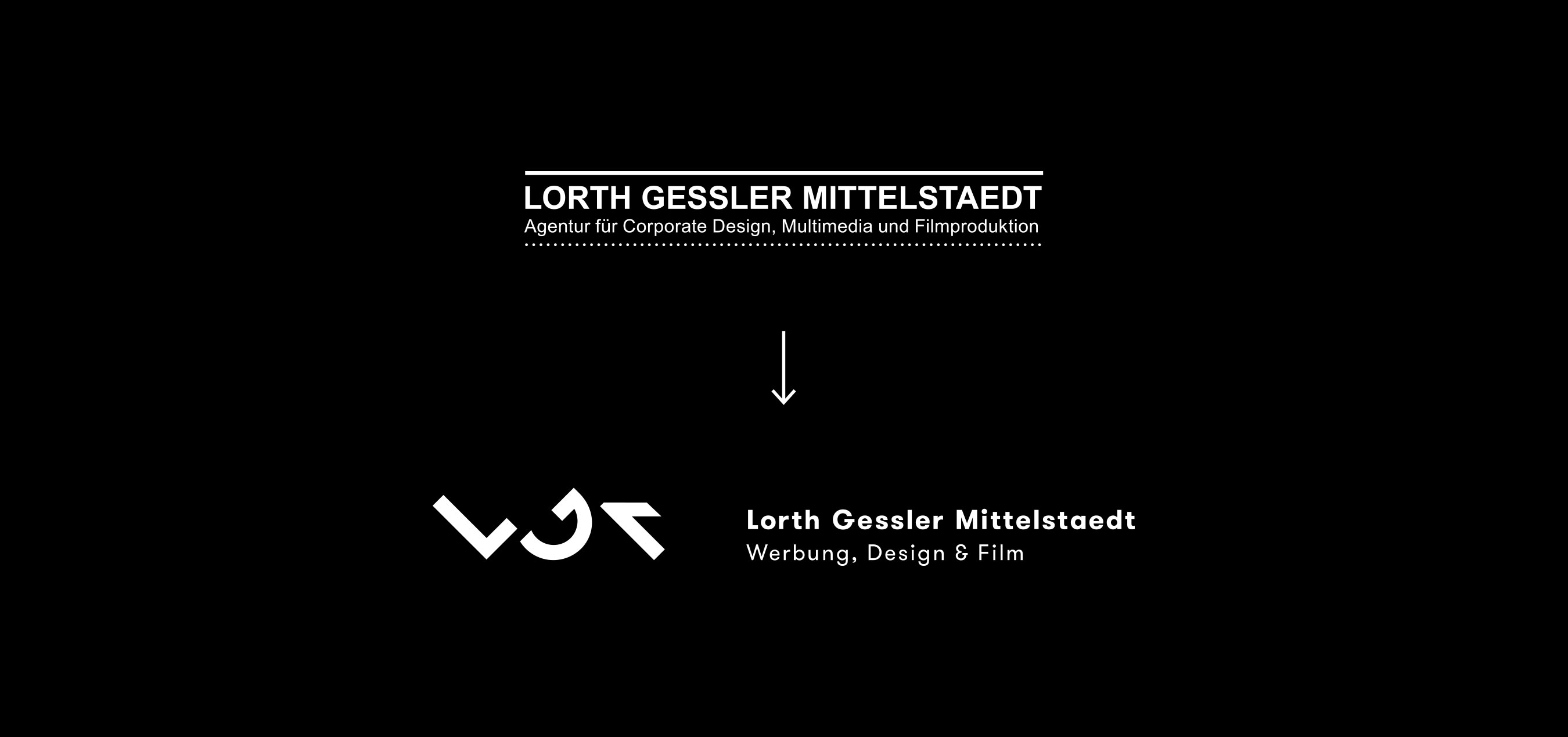
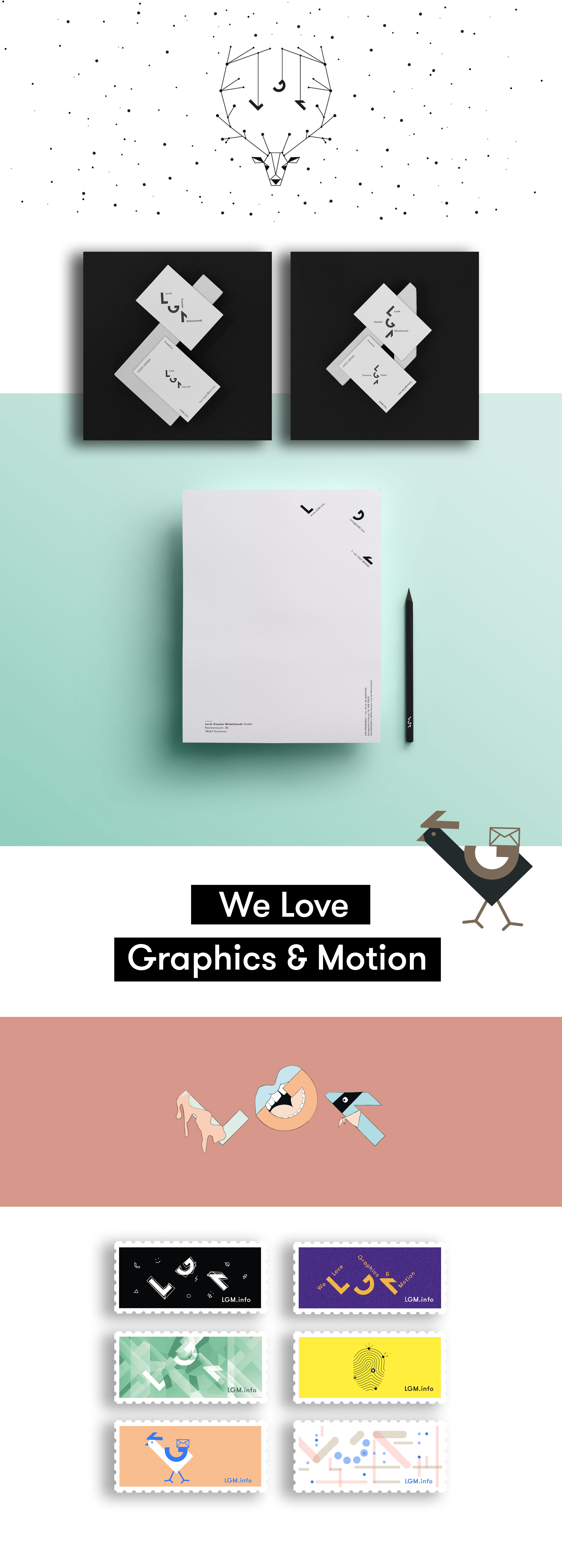
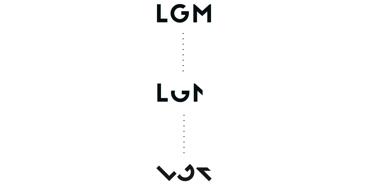
The high dynamics of performance evolution were also reflected in several redesigns that LGM’s visual identity has undergone over the years. The last adaptation was now about eight years ago and our visual identity no longer represented what our team now sees in us. Therefore, over the course of a year, we afforded ourselves what we also recommend to our customers: Before the redesign, we took an in-depth look at our brand and our values. On the basis of the brand values “modular”, “holistic”, “human” and “balanced”, which we defined together as a team, we finally developed our new visual identity with a dynamic design that, despite many variations, always appears to be from the same mould. The central element is the typogram of the three initials L G M.
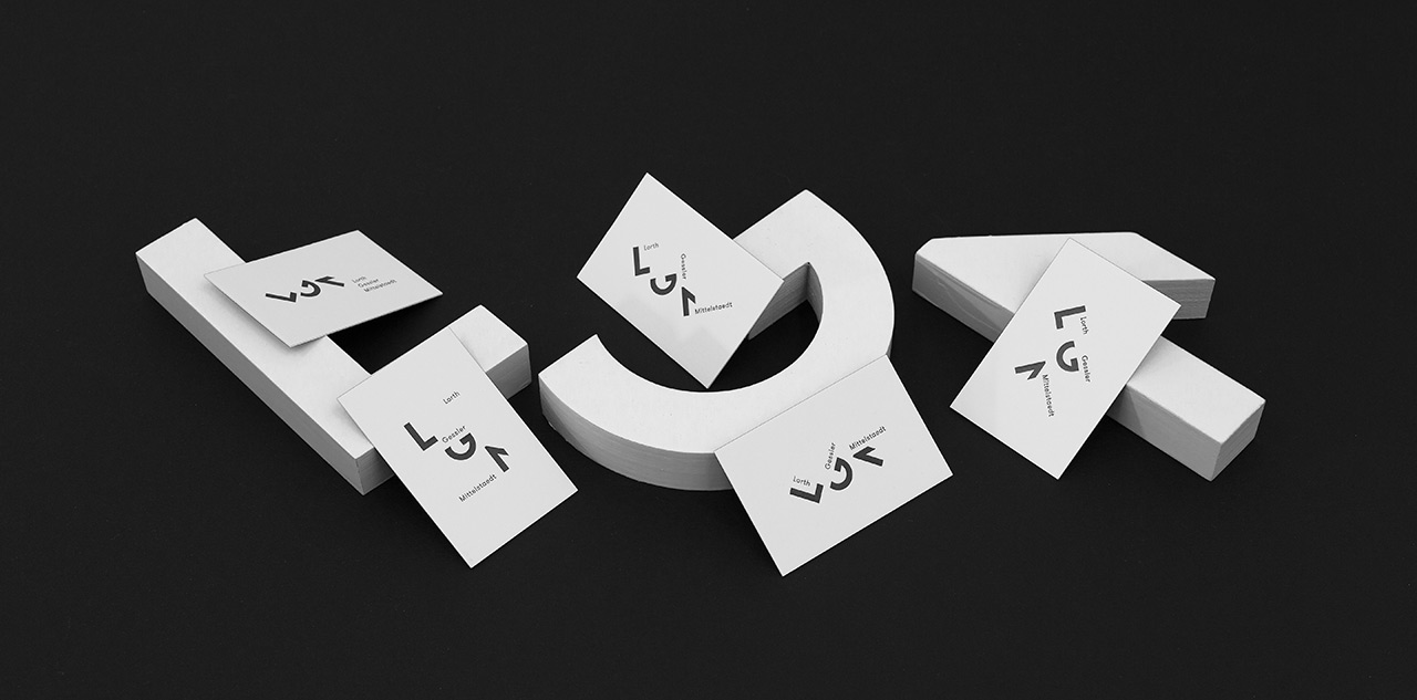
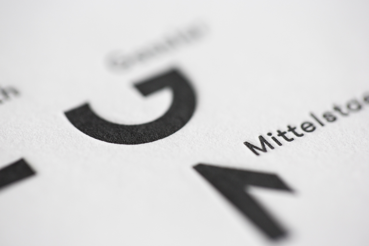
We take great pleasure in translating the design into the many different applications. Although we are also at home in the digital world and feel very comfortable there, we do not forget print. And here we have fulfilled a long-cherished wish for the business cards: The finest letterpress printing on two layers of wonderfully soft 300-gram Gmund Cotton Linen Cream, both sides individually pressed and then laminated into a 600-gram statement. The approach of dynamic design was consistently followed through, which is why the typogram of each card is not the same as the other. The result is a number of unique pieces, and not just because of the different names.
