Karlstraßenfest in Tettnang
The Lions Club Tettnang Montfort organizes an annual fundraising event in the central shopping street of Tettnang, where money is raised for a good cause. A logo and design concept was needed for this event. As the agency of several resident companies at once, we took on this task pro bono.
Services:
Corporate Design, Logodesign,
Motion Design
Customer:
Lions Club Tettnang Montfort

Karlstraße is for the beautiful town of Tettnang something like the Champs-Élysées for Paris: a central shopping and strolling street with a beautiful ambience and numerous stores, restaurants and cafés. All the more so since the new pavement has given the street a new shine, it is a pleasure to stroll here. A special feature of Karlstrasse is the steady but moderate gradient, which gave the members of the Lions Club Tettnang Montfort the idea of a charity event: While there are always rubber duck races for good causes along river courses, the Lions are organizing a ball race that goes down Karlstrasse. The balls are sent into the race for an entry fee and whose ball is one of the first to roll through the finish line wins attractive prizes. The proceeds go to charitable causes. This race is one of the main attractions of the street festival, which was unceremoniously developed around it, and for which the organizers commissioned us to develop a logo.
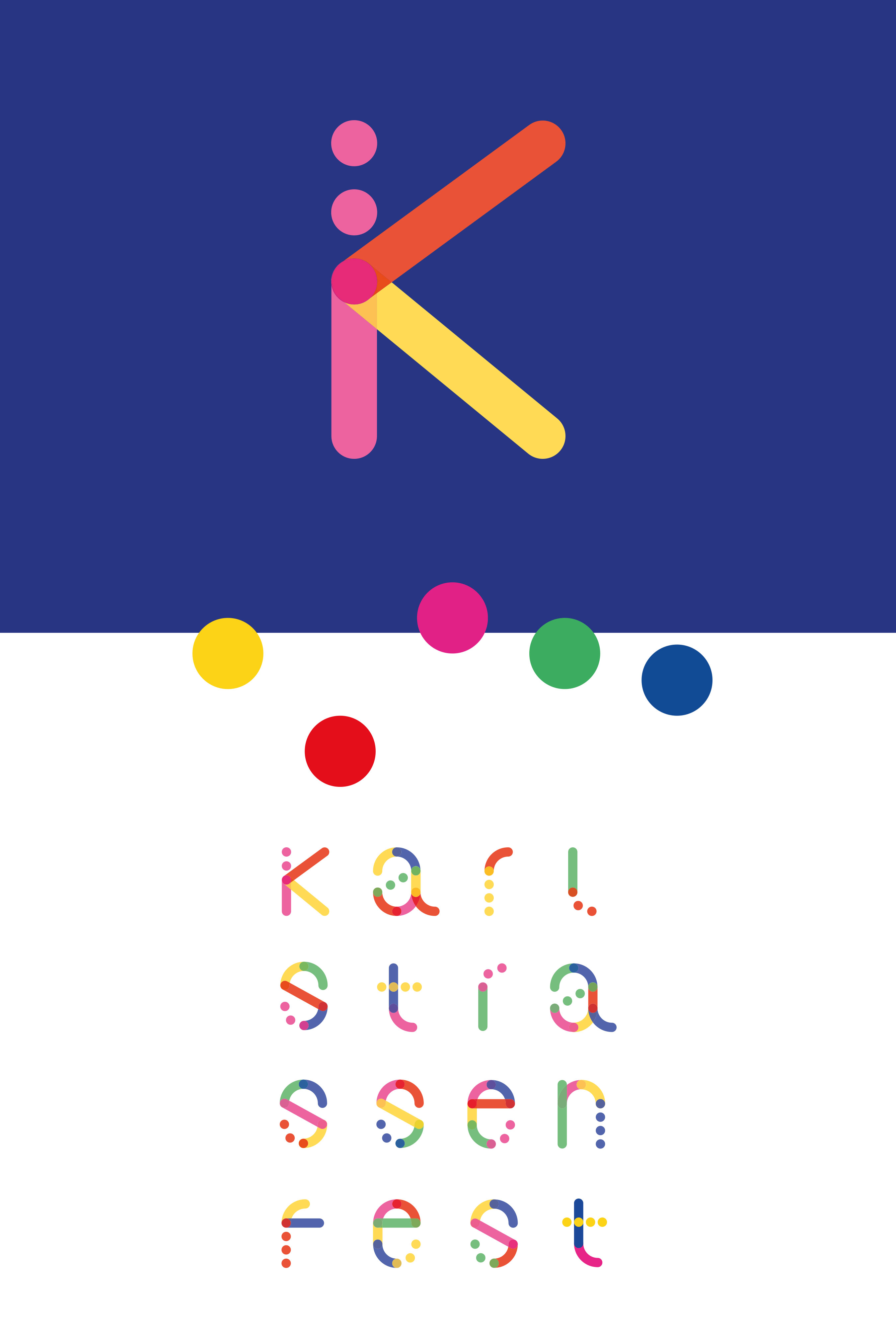
Two central thoughts guided us in the conception: Firstly, the Karlstraßenfest should develop into a popular date in the Tettnang city calendar. To achieve this, it must radiate one thing above all: Joie de vivre. And secondly: The ball race is one component, but not the only one. It is a distinguishing feature from other festivals, as it is closely linked to the nature of Karlstrasse. Nevertheless: The term ball race does not appear textually in the logo, but it does as a graphic quotation.

With an atomic design approach, we have ultimately brought these thoughts to the point. Because our logo design is created from dots that stand for the spheres as the smallest parts, the atoms of this design, so to speak. These atoms combine to form molecules: The sphere can be combined with other spheres or even distorted into a line. Lines and spheres combined together again make organisms: Letters.


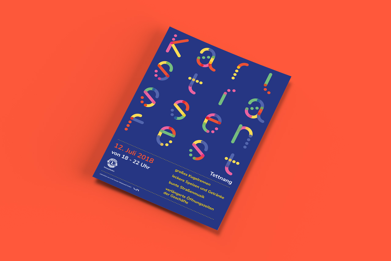
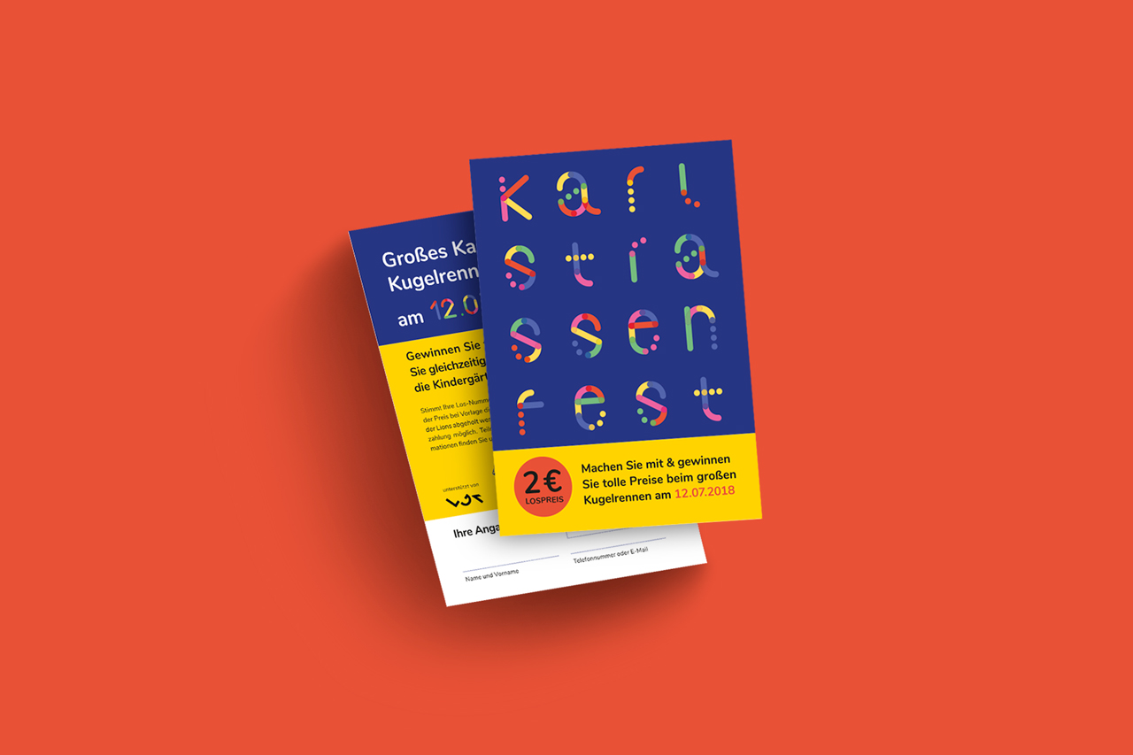
The result is the memorable, lively and super-modular sphere logo of the Karlstraßenfest. It works in all formats and perfectly on catchy posters. It’s also ideal for digital use, for example with animations for Facebook or Instagram.
It’s nice when we can let our creativity run free and do some good in the process.