Georgs Genussmanufaktur
Georg Schönberger is an experienced chef and dietician. He is also the namesake of Georgs Genussmanufaktur, a local food start-up that he founded together with his partner Hannah Müller in 2022. At Georg’s, everything revolves around high-quality food – first and foremost great homemade pasta.
In times when consumers can learn more than ever about highly processed foods, it is local producers like Georgs Genussmanufaktur that can make a difference. In the face of globalized competition, start-ups like Georg and Hannah only have one chance: they focus on top quality. That’s why they offer regional organic delicatessen products with the Bioland seal and pasta made using the bronze process.

After the test phase, Georg’s pasta has also been available in the local Edeka supermarket for a while and the regionally well-known Fuchshof has also been selling pasta made in Constance. So far, advertising has primarily been through personal contacts and the feedback from customers has always been very good. But there was a lack of broader awareness. And that’s where we came in. Georgs commissioned us to design an advertising campaign for billboards and city lights.
Our analysis: Although the bronze process is a quality aspect, it should not be cited as the main argument, as it is now also used by large manufacturers to differentiate themselves. Much more important is a genuinely unique selling proposition (USP): Made in Constance with regional organic raw materials. The positioning must be clearly regional and organic.
But even with this insight, there was still a major challenge: the logo has to be “learned” by the target group so that Georg’s pasta is recognized at the point of sale in the huge range on offer. Outdoor advertising can be a very effective means of communication, but the transfer of the message to the actual purchase is crucial for success.
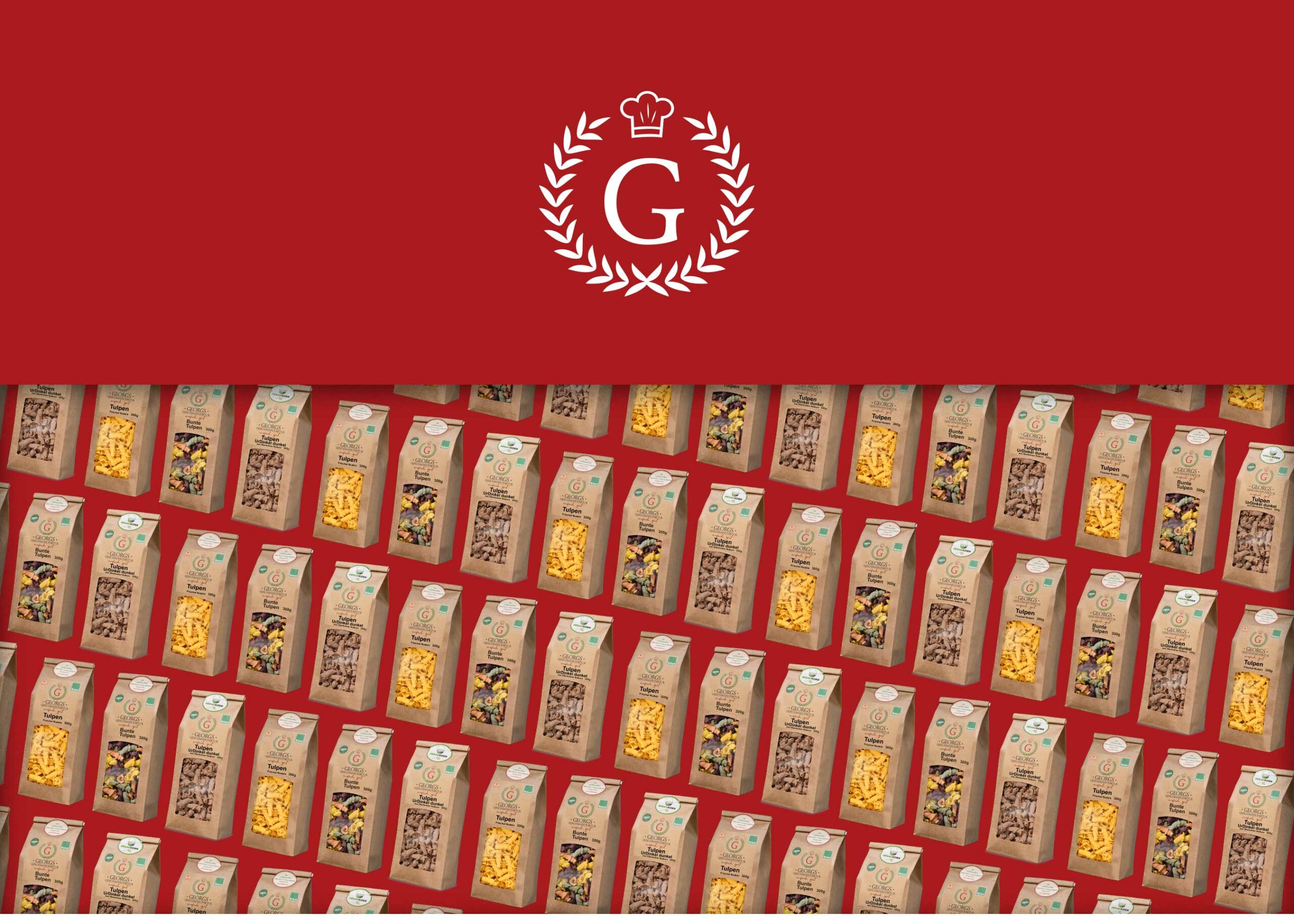
Our starting point was the existing logo, the packaging, various product photos and the website – all created by Georg and Hannah together with third parties and with a lot of love and personal commitment.
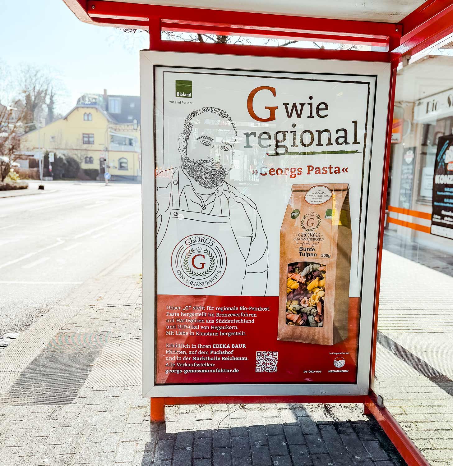
We first needed a key visual that we could play on all channels and that would be gradually learned by the target group. Our solution: the name needed a face. We convinced Georg to become part of the key visual with his picture in the form of an illustration. But this approach had to be more than just a modern drawing of a cooking process, as used for some other products.
We wanted to create a kind of “Hipp effect”: Georg’s name and face stand for the highest regional organic quality.
But the illustration alone is not enough. We have to bring the name and logo to mind so that both are recognized at the point of sale. We have found a solution to this problem that breaks through perceptual habits and at the same time has what it takes to become a long-term campaign slogan.
Antoine de Saint-Exupéry once said: “Perfection obviously comes not when you have nothing more to add, but when you have nothing more to take away.” Our approach for the campaign slogan is also based on the maximum reduction of what we received from Georg and Hannah: the letter G, which is the central recognition feature in the logo alongside a few other elements.
We detached this “G” from the logo and created a slogan that contains the promise of regionality and that people “stumble” across because it breaks a habit of perception:
G for regional.
By using the same font and color, the connection to the logo is established and the initial irritation is quickly dispelled by the subline and the centrally printed logo. But the short time spent thinking about it is enough to set an anchor in the target group’s memory, which will hopefully return in front of the shelf with the many pasta offerings. Together with the illustration and the product photo, the slogan forms a strong team in terms of recognition, which is supported in-store by other elements such as displays, shelf tabs and so on.

We wish Georg and Hannah every success on their way to becoming a local insider tip. Because this niche is a good place to grow.
