Brothaus Baur – Brot & mehr
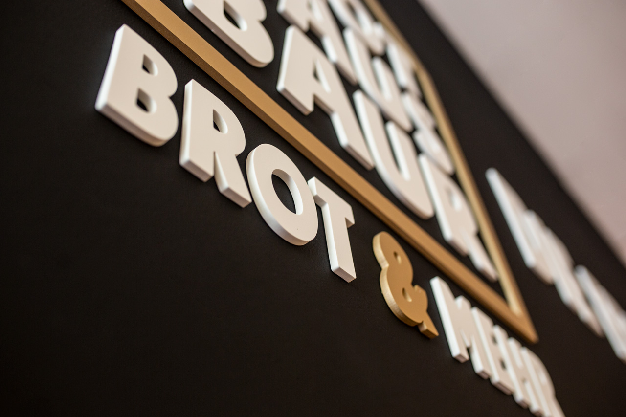
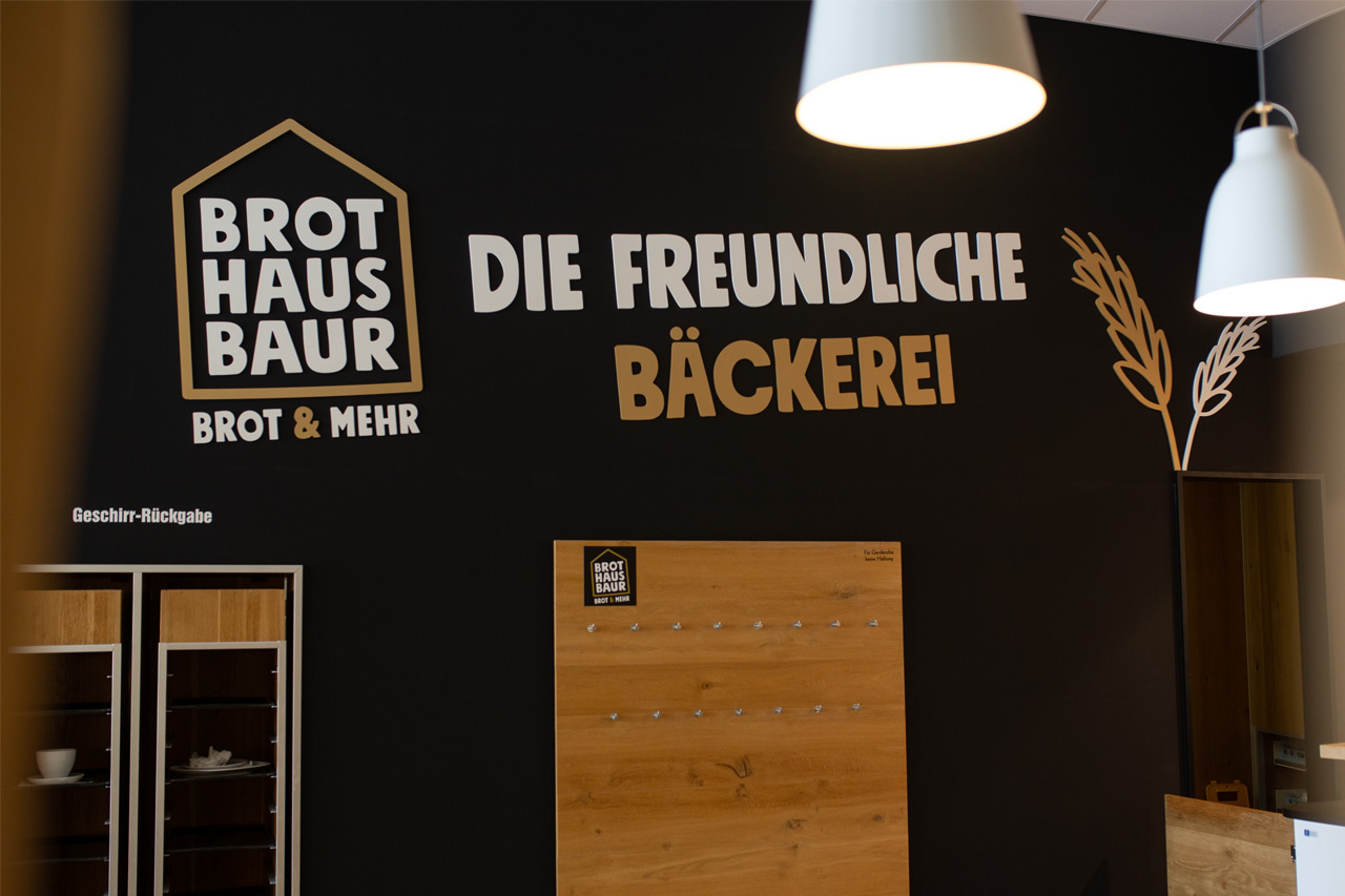
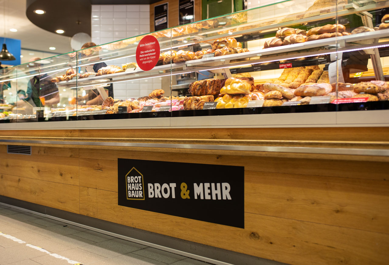
Brothaus Baur is a new brand from Edeka Baur. Initially, it is a pilot bakery in one of Edeka Baur’s grocery stores, which has replaced the previous offering. We were allowed to help a lot on the way to the new branding and not only to contribute to the naming, but also to develop the complete appearance including logo design, design of the print products up to the design of the lettering of the store equipment.
At the beginning of the project, the working title was “Market Bakery,” but we quickly realized that we had to go further. Values such as down-to-earthness, tradition and regionality played just as much a role as the realization that bread is simply part of shopping. The overly descriptive impression of the working title finally made us realize that the name Baur absolutely had to be a central component of the new brand. After all, Jürgen Baur’s stores stand for such outstanding quality and such a love for food that it simply made sense to use this charisma for the new bakery name as well. This is how the Brothaus Baur came into existence.
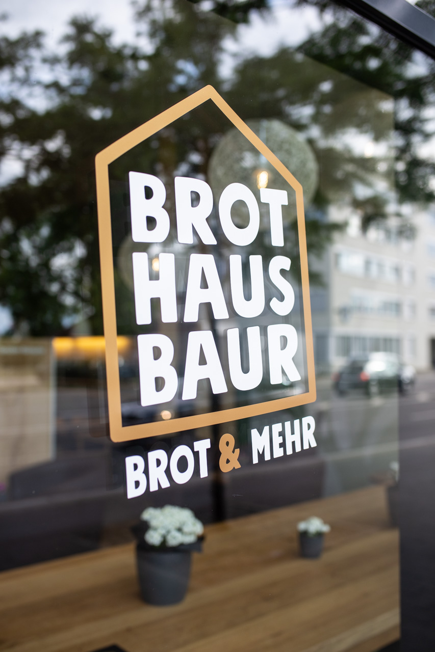
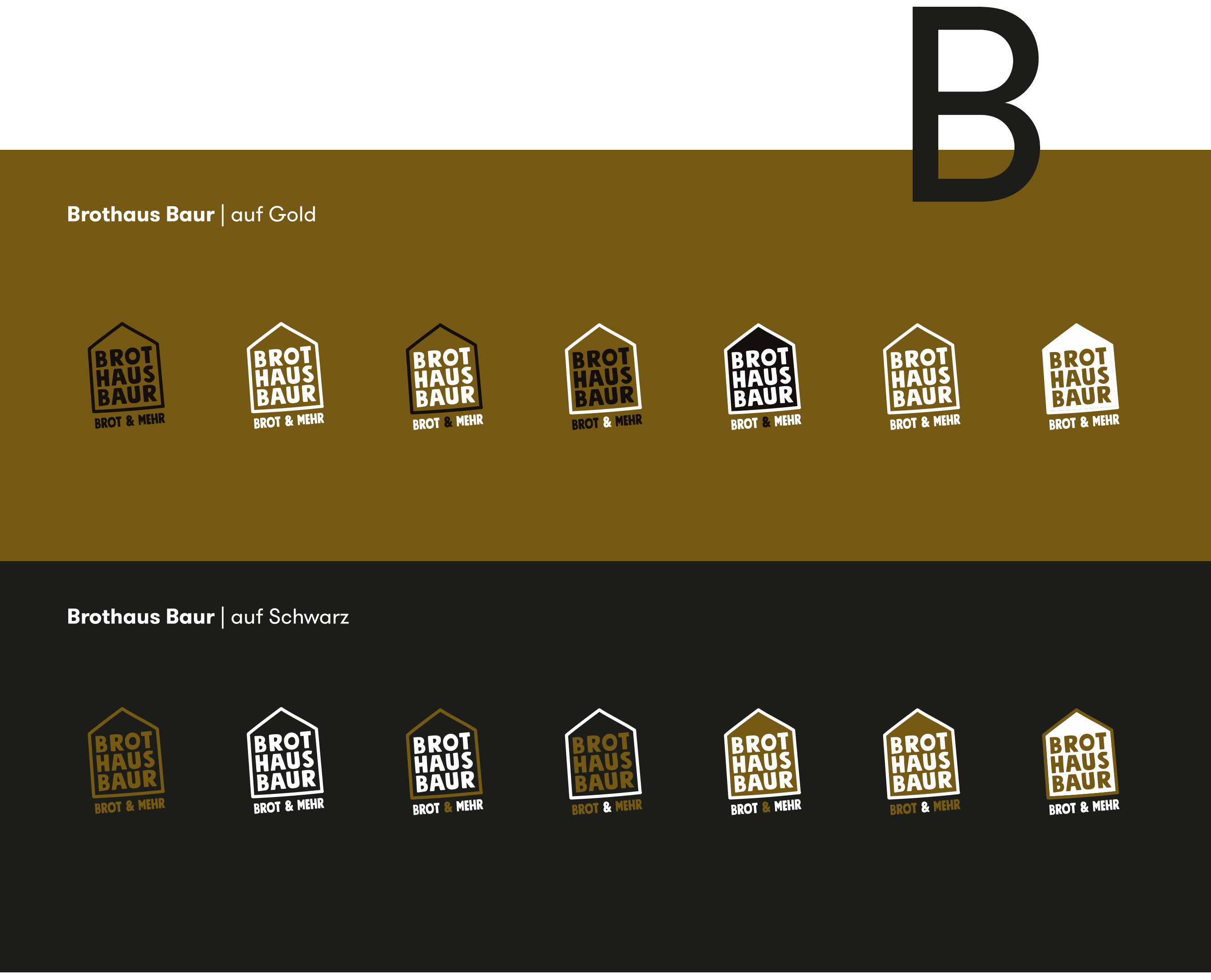
In the logo design, we were struck by the visually attractive triad of the words Brot, Haus and Baur, in which each individual word with its four letters has the same structure and can thus be set in perfect visual balance. Less is often more in design. And so we added only a basic house shape and a descriptive subline to the composition of the three words, which is also perfectly balanced in the harmony of the four-letter words under the signet – as a foundation, so to speak. As colors we chose black and gold.
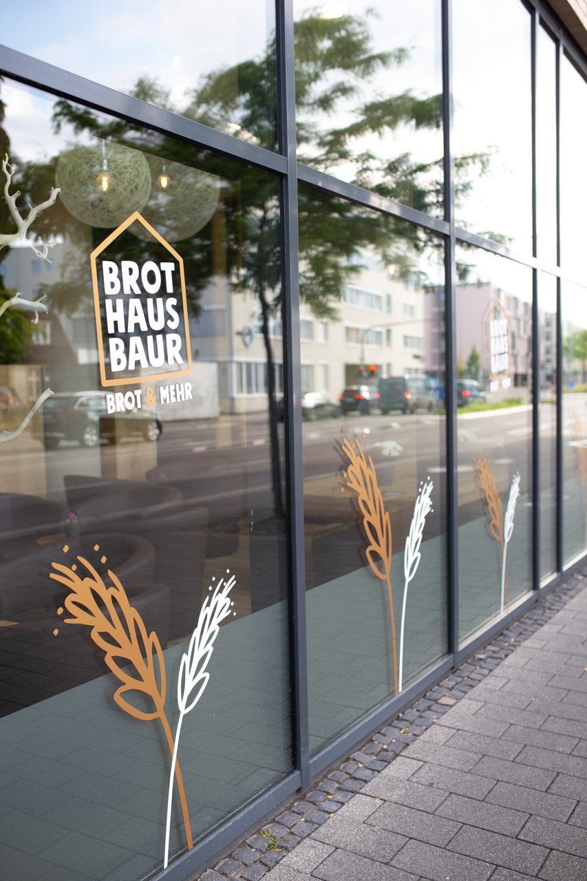
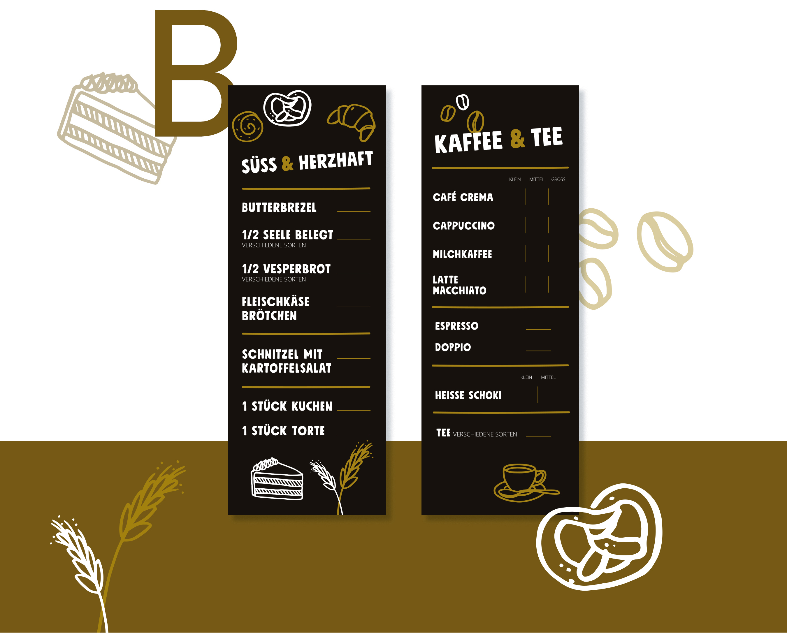
On the second communication level, in addition to a deliberately sympathetic and restrained claim, the overall image is supported by many beautiful hand-drawn illustrations that perfectly match the typography in terms of form language. A wonderful assignment and an equally wonderful collaboration with these super likeable clients. Thank you!
