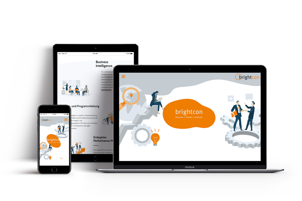
Brightcon Website Relaunch
Brightcon is a Swiss company founded in 2008, which specializes in operational and strategic information management and business intelligence.
We have been supporting Brightcon since the development of the corporate design and were now allowed to redesign and realize the website.
If you say everything, you say nothing. Following this credo, we developed a super slim and maximally reduced website for our client Brightcon, which is graphically airy and, following the Pareto principle, only deals with those questions to which answers are needed in order to get a first impression and to recognize whether one is part of the target group. All too often, senders of information try to provide as many stakeholders as possible with as much information as possible. With the result that no one is left with anything.

In order to offer a high degree of efficiency in this project, we opted for an illustrative, graphic and typographic visual approach with the abandonment of photography. The corporate color orange, which was much more prominent on the old website, is used more as a highlight color on the new website. By licensing high-quality illustrations, which we combined individually, a fresh, interactive look and feel was created. And by deliberately reducing complexity, we were able to vividly present the content without using empty visual shells.
As a concise visual element, an organic-looking animation of an orange surface in the style of a lava lamp welcomes visitors. This surface is both a symbol for development and for the forecasting process. When scrolling or swiping, subtle parallax effects give the website a very special lightness, subconsciously paying tribute to the brand image of a dynamic, modern company. And the use of a contextual “tag cloud” at the bottom of the home page allowed us to convey the complexity of the wide field Brightcon is thematically on, despite the simplification.


