architekt S
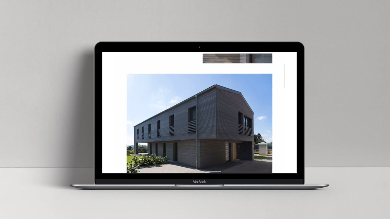
Andreas Schumacher from Tettnang is a man of many talents: As an architect, he is the managing director of “teba”, a company that operates in the fields of real estate, residential construction and property management. At the same time, he manages a modern architectural office: architekt S. The external image of this office no longer suited this equally likeable and quality-conscious team, at the latest after the move to new premises. The client’s trust in our creativity enabled us to really start from scratch with the corporate redesign.
Services:
Logo Design, Corporate Design,
Print Design, Photography, Online
Customer:
architekt S
In search of a formally clear identification element, we examined the initials A and S and placed them graphically reduced in the context of building: a house, a street, both combined, pseudo-perspectively tilted. The letter S seemed even more important to us than the A, since it stands solitary in the name of the office. Therefore, from the too complex combination of A and S, we detached only the S and discovered the special effect of the “negative space” of this representation, that is, the image that our brain completes when we represent only the “tanks” within the two S-arcs.
The result was a graphic element with the association of a building and the S, which is recognizable at second glance. In combination with the typography, which harmonizes perfectly with this, a modern logo design was created, which is quickly remembered and carries a message: architekt S is the right provider for all those who have high demands on the formal quality of architecture.