Unification of the elements
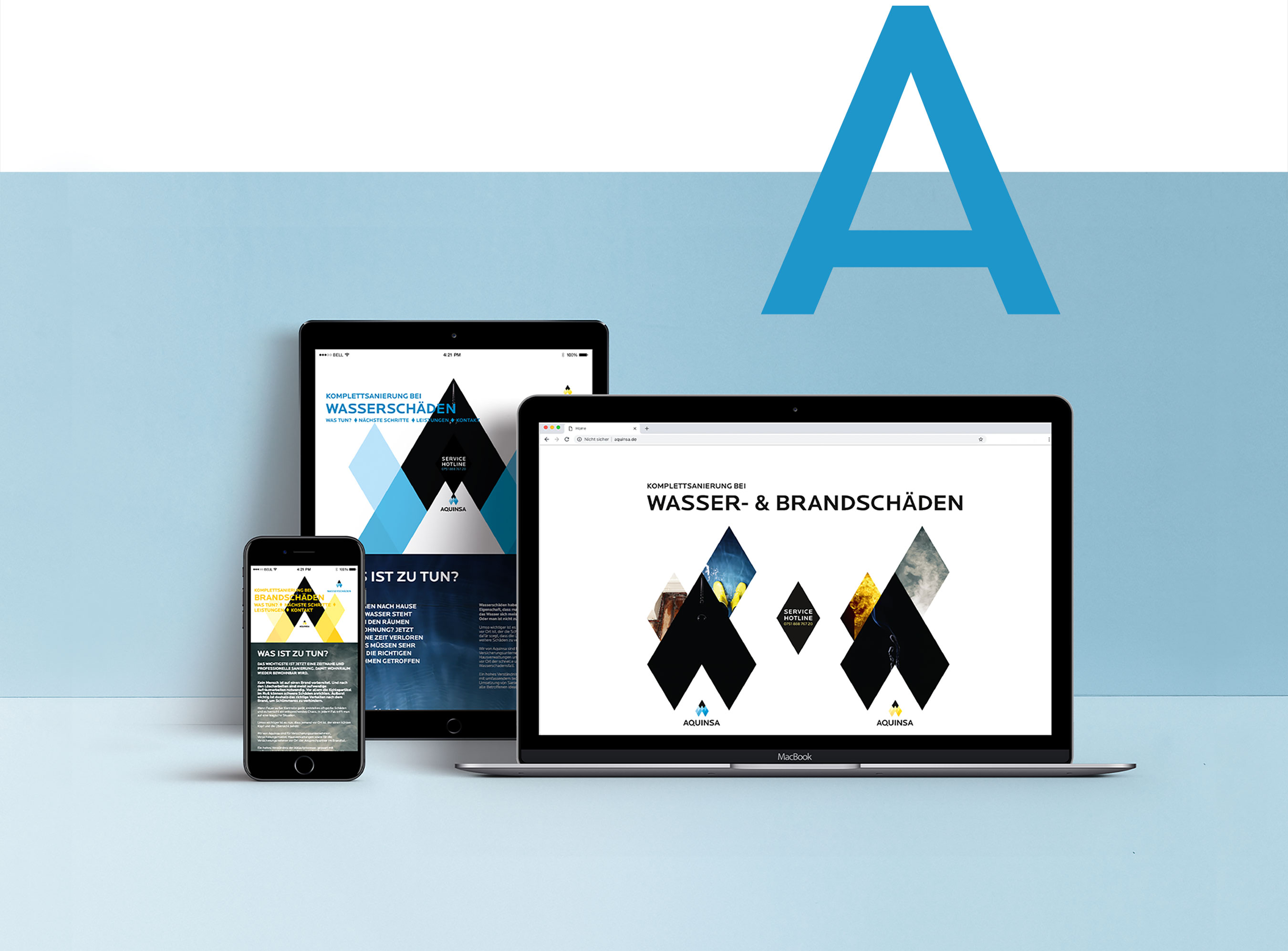
Aquinsa is a holistic service provider for complete renovations after fire or water damage. The core element of the corporate redesign is a diamond, which functions as the smallest particle – quasi as an atom – of the design concept. A striking feature of the company name AQUINSA is the letter A at the beginning and at the end. This letter A is the starting point for the logo. It first becomes a stylized house roof. The house roof can be broken down into diamonds that resemble the shape of a drop and a flame.
Services:
Corporate Design, Print Design, Online
Customer:
Aquinsa
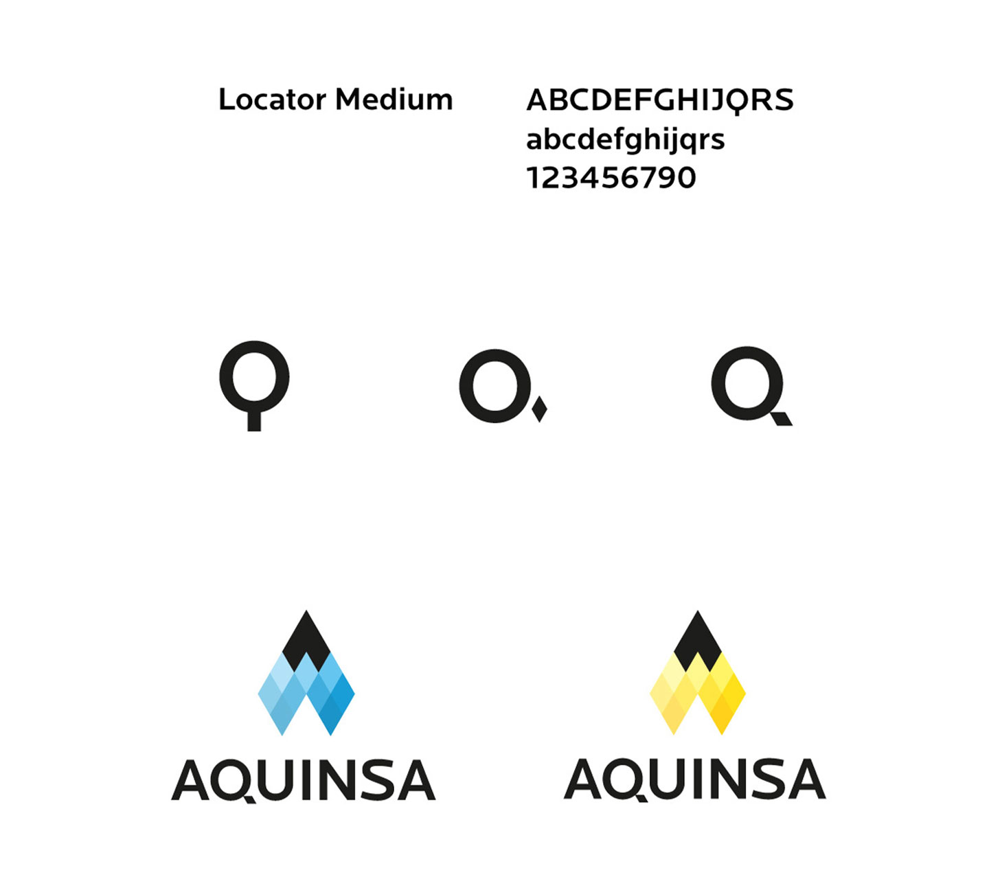
From this smallest building block, the logo is constructed in two variants: a blue one for a drop, a yellow one for a flame. The flame stands for the fire damage, the drop for the water damage. Thus, these elements unite with a diamond.
The diamond is also used in the word mark to optimize the letter Q as a cauda. And it becomes the basis of the entire graphic system for all printed materials and the website.
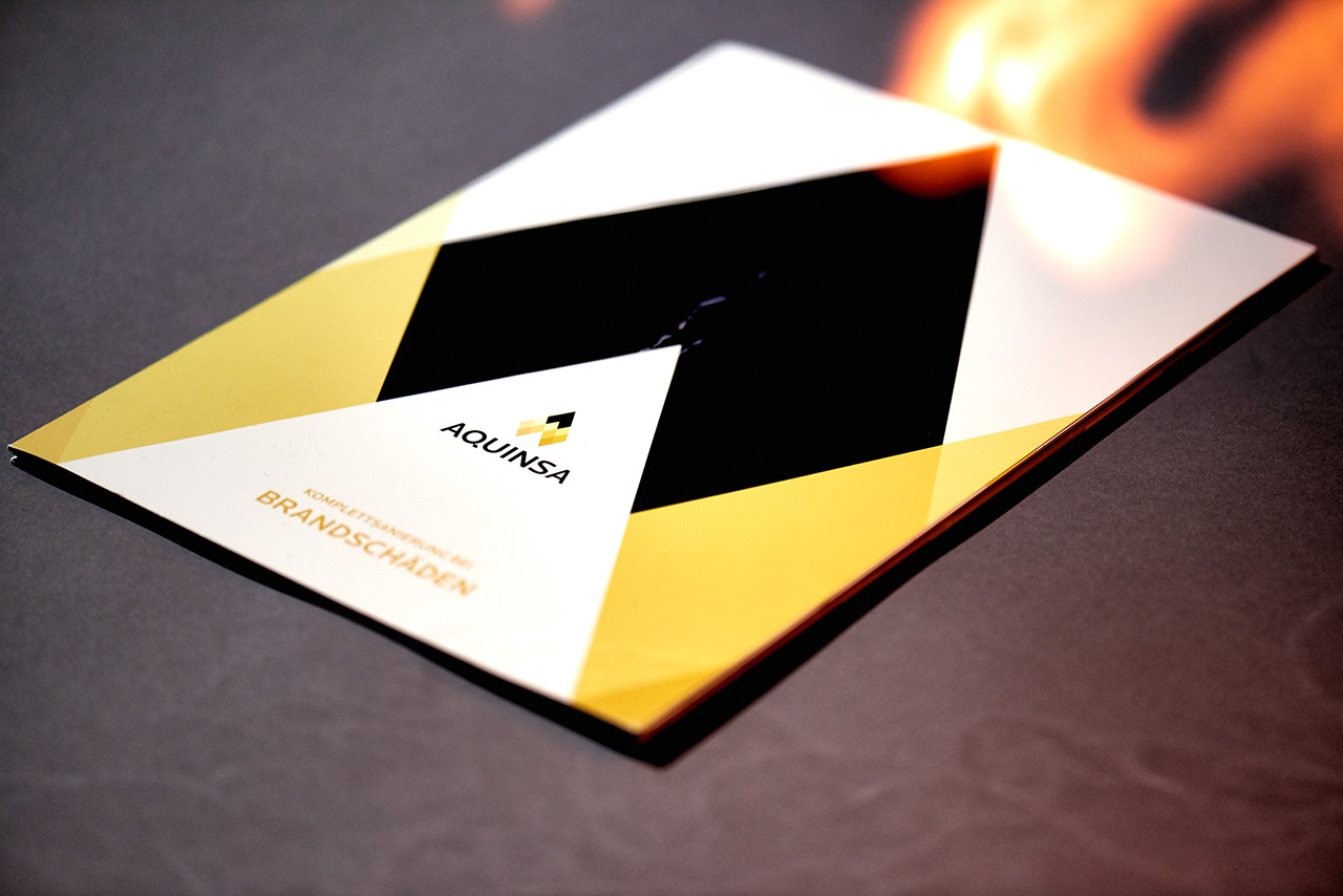
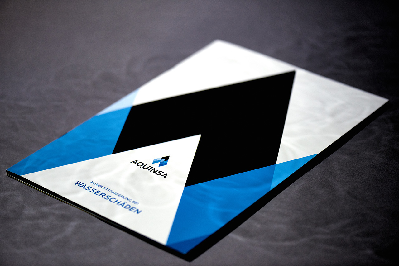
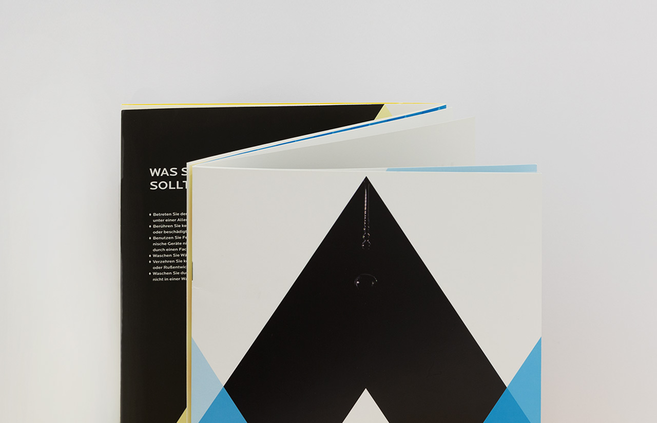
The new corporate design is used in various media. One of these is an image brochure with a special feature that only becomes apparent to the viewer on closer inspection: It can be flipped through endlessly.
This is made possible by a special binding method in which the cover is given three wings as a Z-fold. Both folds are staple-bound to form the center of two halves of the brochure.
One half plays the theme of fire and the other the theme of water. Once one theme has reached the end, the other theme starts automatically when the last page is turned.
A kind of perpetual motion machine of print design.
