Saurer Imagefilm
Saurer is a leading global technology company focusing on machines, components and software for processing fiber and yarn. After the Saurer Group had developed a new visual identity, the worldwide rollout was scheduled for the industry’s largest trade fair in Barcelona. We were allowed to produce the central image video.
Services:
Motion Design, Film
Customer:
Saurer Intelligent Technology AG
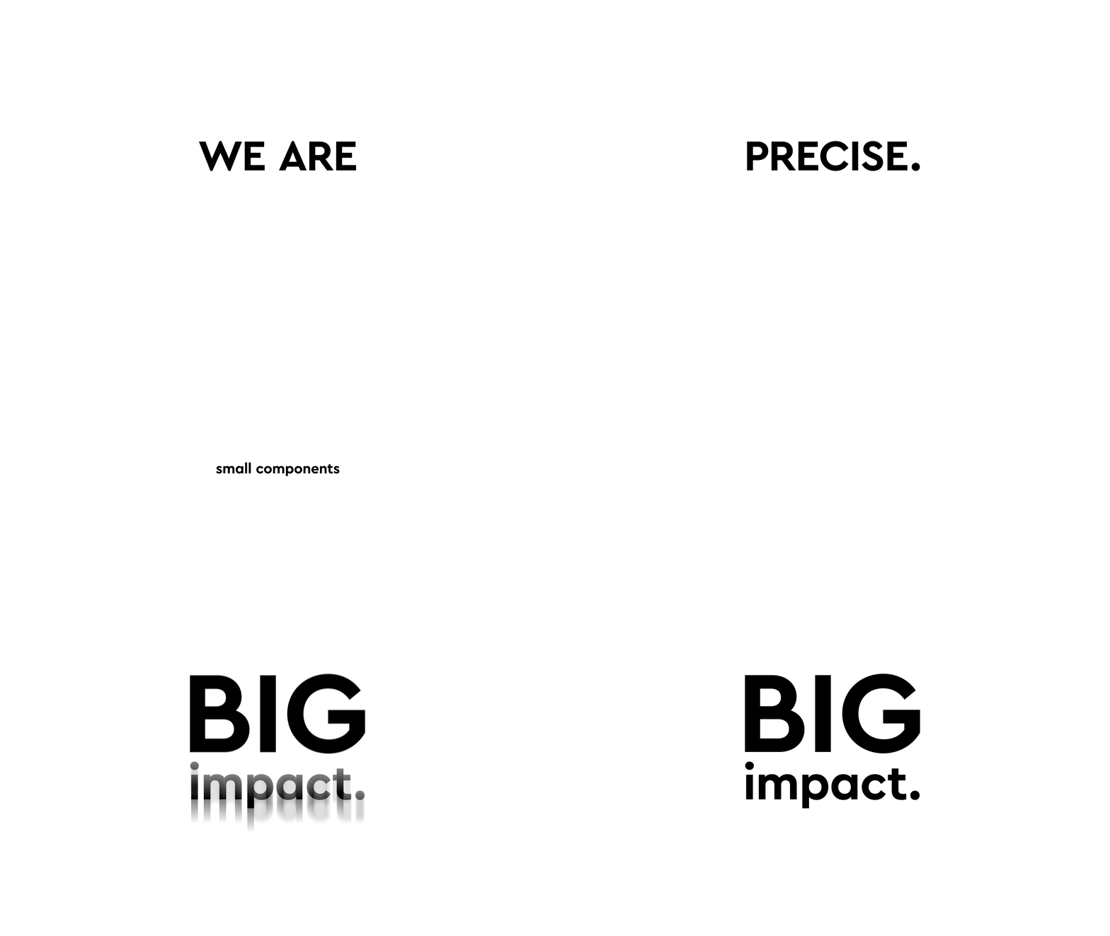
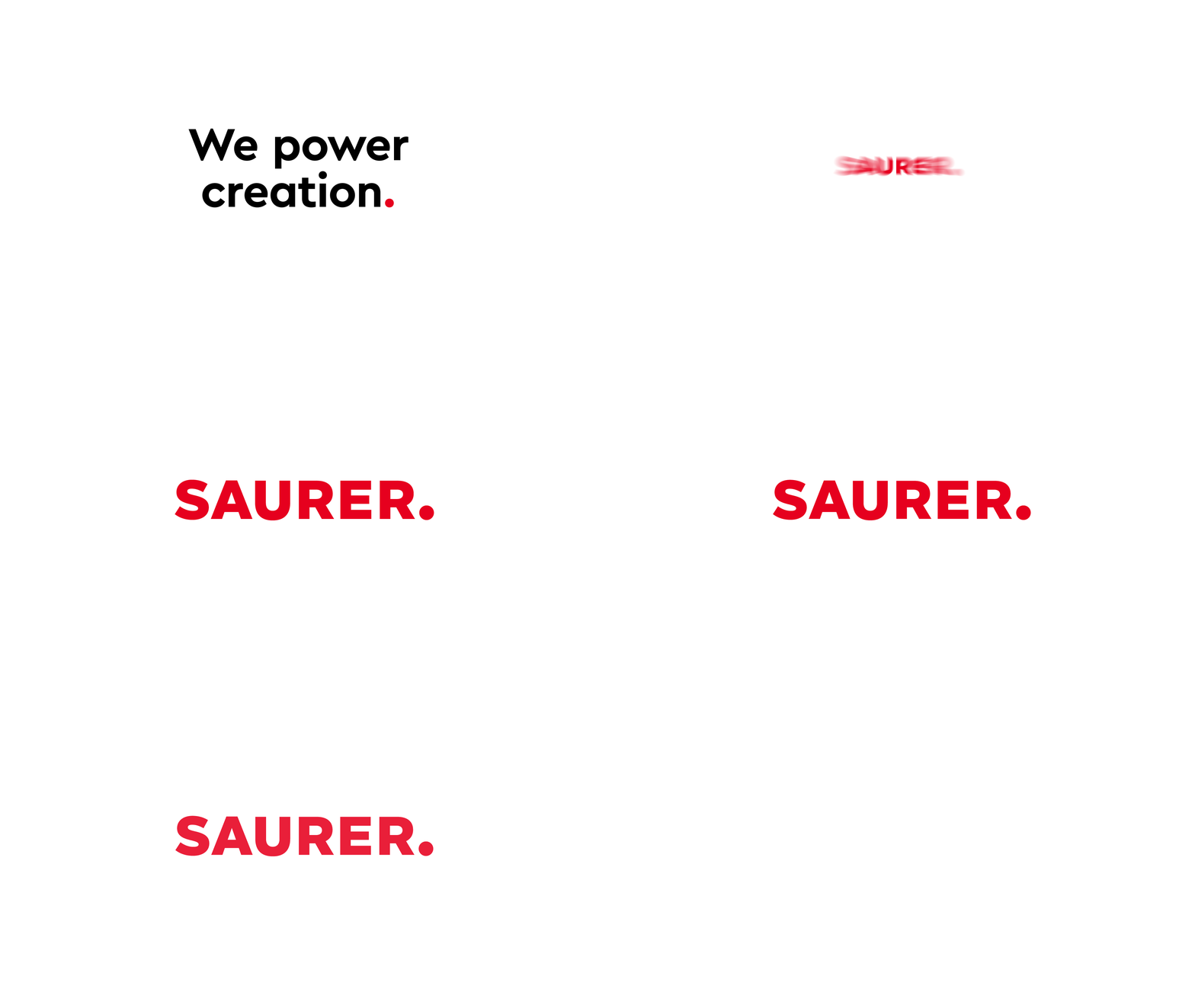
In a workshop, together with the clients, we condensed the core messages out of the countless communication contents and developed a concept and a tonality. Dynamic, driving, innovative, self-confident, spiced with a pinch of humor. In doing so, we consistently exploited the possibilities offered by Saurer’s new corporate design: Colors, typography, formal language. Speaking of form language: Saurer works with the dot, the most reduced glyph of the typeface. This is scaled and thus given weight. An ingeniously simple concept that we translated into motion design.

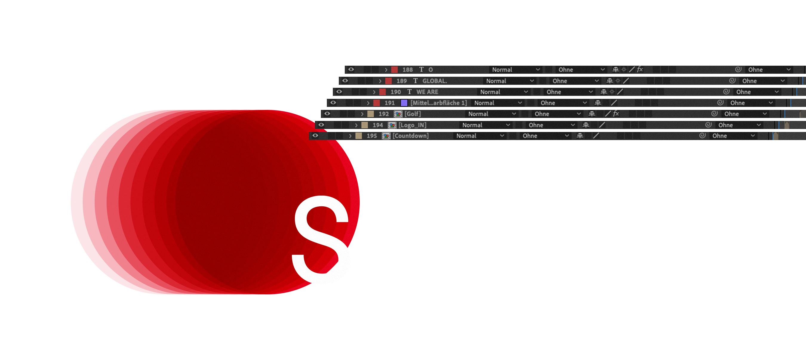

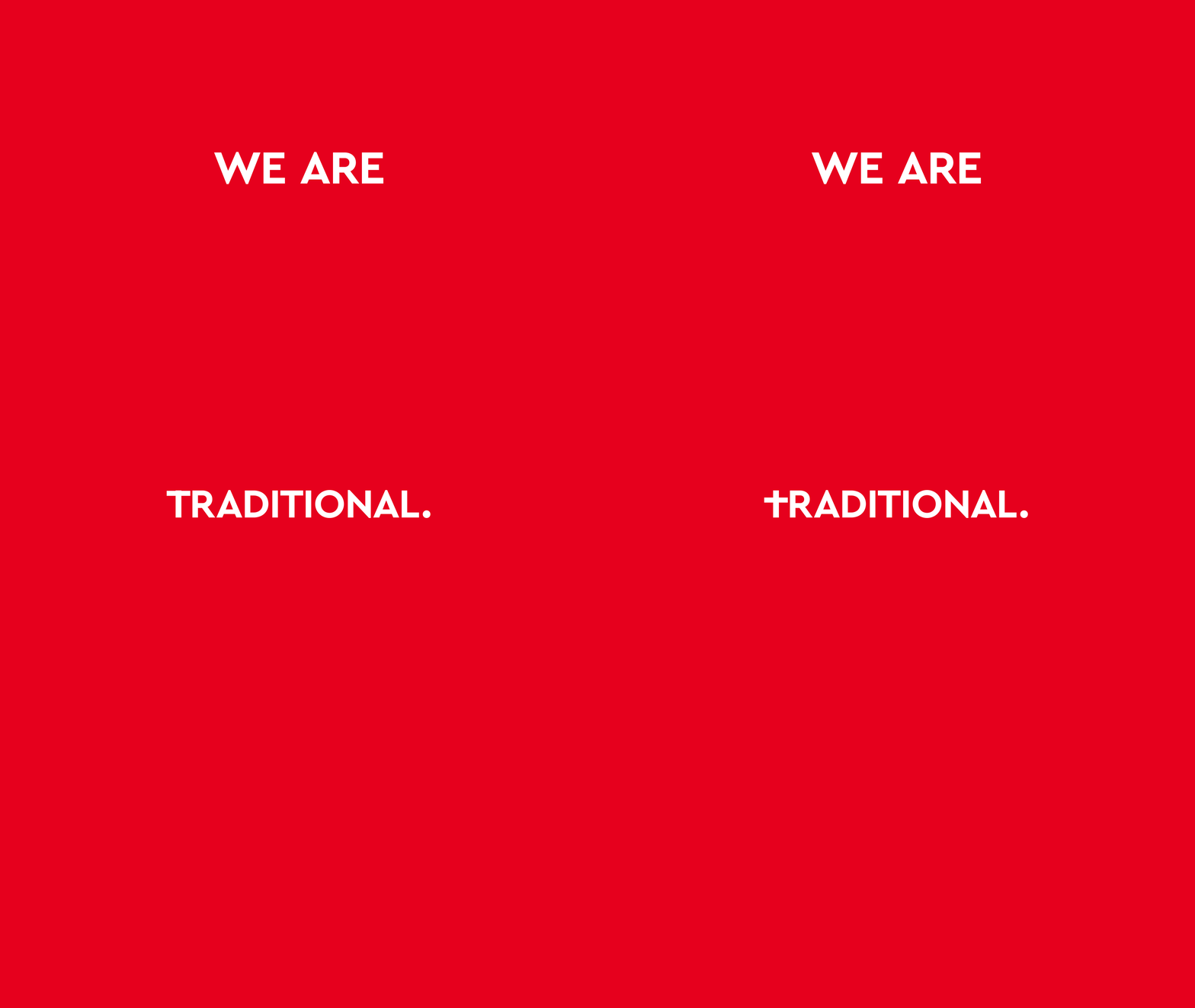


Not only did we quote the point in the context of animation, but we also set other contents of the film’s narrative strand, which does completely without a narrator, in motion semantically motivated typographically and graphically. If you look closely, you will find one fine detail after another. Be it letters that quote a typical machine motion sequence or that otherwise behave according to the content. Every movement is motivated, everything in the two-minute film has a reason. For all its attention to detail, the film also thrives on its speed: quick cuts to match the music – to the rhythm of the industry, as it were. The film reflects Saurer as a dynamic company with innovative strength and a focus on the future. Or as it says in the film: Swiss Precision, German Engineering, Chinese Speed.
We really enjoyed this project. LGM – we Love Graphics & Motion.

