Reisewelt Montfort – Wanderlust reinvented
Reisewelt Montfort is much more than just a friendly, regional and efficient travel agency. Reisewelt Montfort is an institution in Tettnang. For its twentieth anniversary, Reisewelt reinvented itself: complete renovation of the business premises and a complete redesign of the corporate identity. We were allowed to take over the latter.
Services:
Corporate Design, Logo Design, Print Design, Illustration, Motion Design
Customer:
Reisewelt Montfort

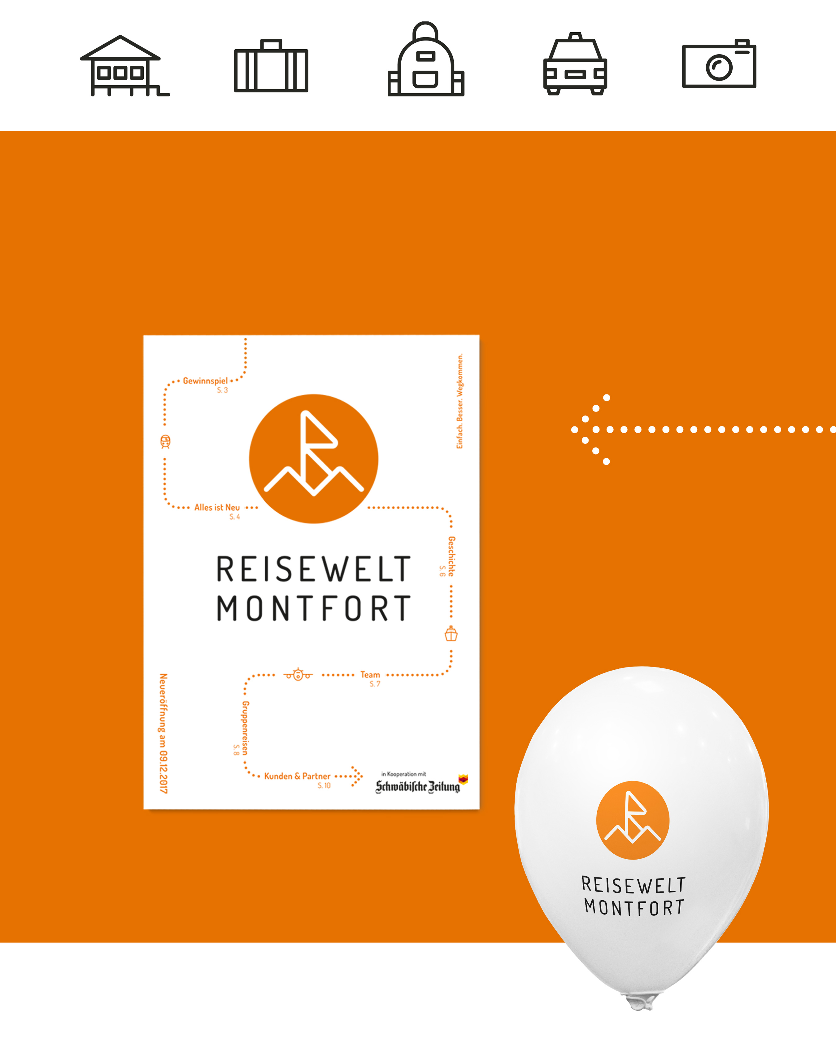
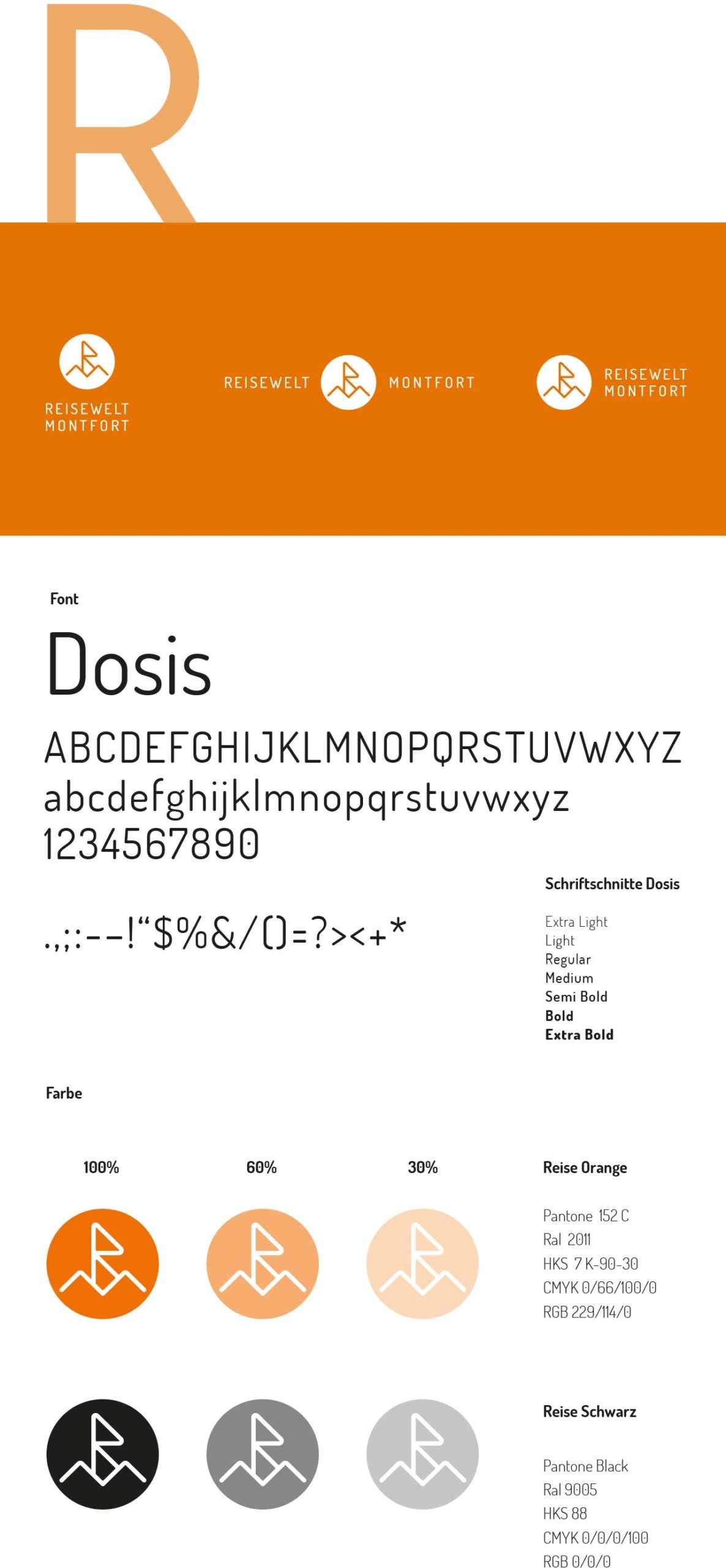
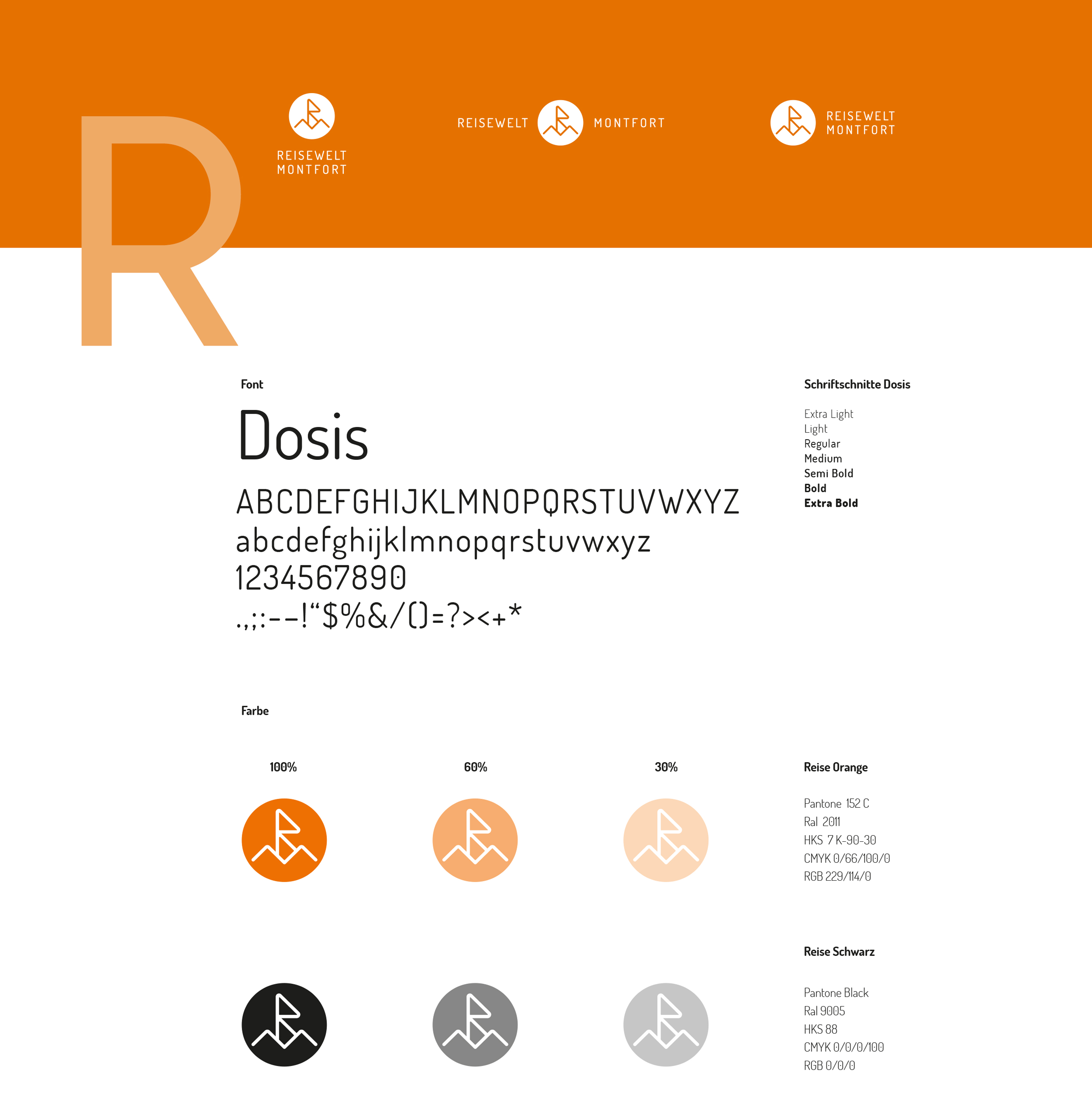
The central element of the new look is the logo. The initials of Reisewelt Montfort RM can be found in the signet. Perhaps at first glance, but at the latest at second glance, the vacation-hungry viewer also sees the mountains with a summit flag in this identification element. Or the sea with a sailboat. Or simply the sun beaming over the vacations that can be booked with Jürgen Niedermaier and his team. Even if not every vacation goes to the warmth, the warm color travel orange is chosen in the longing temperature of many holidaymakers.
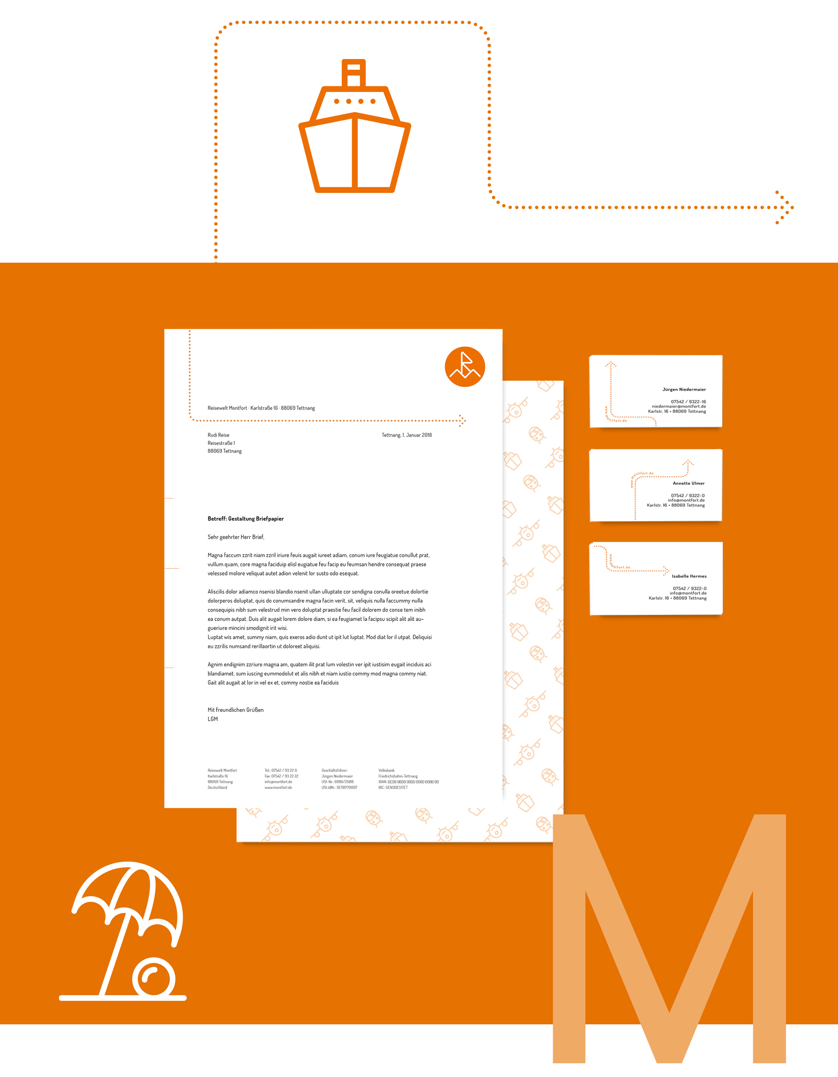
The corporate design is all about inspiration: the typography is reminiscent of the fold-down display boards at the airport, the dots are reminiscent of the tear-off perforation on airline tickets, but also stand for the journey or the path to the destination. The whole design is modern, clean and simple. The icon world was developed to match and can be used universally. The appearance is rounded off by appealing animations.
